React Accessibility: Practical ARIA Best Practices
A practical React guide to ARIA—when to use it, when not to, plus patterns for focus, labels, widgets, and testing.

Image used for representation purposes only.
Why ARIA in React matters (and when it doesn’t)
Accessible Rich Internet Applications (WAI-ARIA) can make complex React interfaces usable for people who rely on assistive technologies. But ARIA is a precision tool: use it only when native HTML can’t express the behavior you need. In practice, most accessibility wins in React come from semantic HTML first, with ARIA filling specific gaps.
This guide distills practical ARIA patterns for React components—what to use, what to avoid, and how to test reliably.
Principle 1: Prefer native semantics over ARIA
Before adding any aria-* attributes or roles, ask: can a semantic element do this already?
- Use button, not div role=‘button’.
- Use a elements with href for navigation.
- Use ul/li for lists, nav for site navigation, main for primary content, form/label/input for forms, table for tabular data.
- Use details/summary for disclosure where appropriate.
Reasons to prefer native elements:
- Built-in keyboard support (Space/Enter on buttons, arrow keys in inputs, Tab order, etc.)
- Better default semantics across assistive tech and browsers
- Less ARIA to maintain as state changes
As a rule of thumb: no ARIA is better than bad ARIA.
Principle 2: The labeling trio (aria-label, aria-labelledby, aria-describedby)
Clear, programmatic labels are essential for screen reader users.
- aria-label: Provide an explicit, invisible label. Useful when there is no on-screen text.
- aria-labelledby: Reference visible text elsewhere in the DOM. Preferable when a visual label exists.
- aria-describedby: Attach supplementary description (help text, hints, dynamic status). Do not use it as the primary label.
Example: an icon-only button
<button
  type='button'
  aria-label='Close dialog'
  onClick={onClose}
>
  <CloseIcon aria-hidden='true' focusable='false' />
</button>
Example: referencing visible label text
<label id='search-label' htmlFor='site-search'>Search the site</label>
<input id='site-search' type='search' aria-labelledby='search-label' />
Add helpful descriptions without polluting the label:
<p id='pw-help'>Use at least 12 characters with a symbol.</p>
<label htmlFor='pw'>Password</label>
<input id='pw' type='password' aria-describedby='pw-help' />
Tips:
- Avoid stacking aria-label and aria-labelledby on the same element; the label calculation rules can be unpredictable—pick one.
- Keep IDs stable across renders so references don’t break.
Principle 3: Keyboard and focus come first
ARIA doesn’t make non-interactive elements focusable or keyboard-operable by itself. In React, every interactive control must:
- Be reachable by Tab (or Shift+Tab) in a logical order
- Have a visible focus indicator
- Support keyboard activation (Enter/Space) and expected navigation patterns
If you must create a custom control (ideally, don’t), wire keyboard behavior correctly:
// A last-resort pattern: a custom 'button' using a div
function FauxButton({ onPress, children }) {
  const onKeyDown = (e) => {
    if (e.key === 'Enter' || e.key === ' ') {
      e.preventDefault();
      onPress?.(e);
    }
  };
  return (
    <div
      role='button'
      tabIndex={0}
      aria-pressed='false'
      onClick={onPress}
      onKeyDown={onKeyDown}
      style={{ outline: 'none' }}
    >
      {children}
    </div>
  );
}
Better: just use button.
Managing focus in React
React re-renders can move or unmount nodes. Guard against accidental focus loss:
- Don’t remount focused elements unnecessarily—keep stable keys.
- After opening a dialog, move focus to the first interactive element.
- Return focus to the triggering control when the dialog closes.
const triggerRef = React.useRef(null);

function openDialog() {
  setOpen(true);
}

function closeDialog() {
  setOpen(false);
  // Restore focus to the trigger
  triggerRef.current?.focus();
}

<button ref={triggerRef} onClick={openDialog}>Open settings</button>
Roving tabindex vs aria-activedescendant
For composite widgets (menus, tablists, toolbars, listboxes), use one of two patterns:
- Roving tabindex: only the currently focused item has tabIndex=0, the rest are -1. Focus moves to items directly.
- aria-activedescendant: focus stays on the container; it points to the active item’s ID. Good when the container must keep DOM focus (e.g., an input with a typeahead listbox).
Keep arrow key handling consistent with the widget’s design pattern.
Principle 4: Announce dynamic changes with live regions
When UI updates aren’t triggered by focus or navigation, use live regions so screen readers are notified.
- aria-live=‘polite’: announce when the user is idle (non-disruptive)
- aria-live=‘assertive’: interrupt immediately (use sparingly)
- role=‘status’ (polite) and role=‘alert’ (assertive) are convenient shorthands
function CartStatus({ count }) {
  return (
    <p role='status' aria-live='polite'>
      {count === 0 ? 'Cart is empty' : `${count} item${count > 1 ? 's' : ''} in cart`}
    </p>
  );
}
Use React state changes to update the live region content; keep messages concise and meaningful.
Principle 5: Visibility, aria-hidden, and inert
- aria-hidden=‘true’ removes an element and its subtree from the accessibility tree. Don’t set it on focusable/interactive elements; it creates traps.
- inert makes content unfocusable and untabbable, and hides it from assistive tech. It’s useful to disable the page behind a modal. Treat inert as progressive enhancement and test across browsers.
// During an open modal, mark the background as inert
<main inert={isModalOpen ? '' : undefined}>
  ...
</main>
Tip: Do not use display:none or visibility:hidden on a focused element; blur or move focus first.
Common React widgets and their ARIA maps
Dialog (modal)
- role=‘dialog’ (or ‘alertdialog’ for urgent confirmations)
- aria-modal=‘true’
- label via aria-label or aria-labelledby
- Initial focus set inside; return focus on close; trap focus while open
<div role='dialog' aria-modal='true' aria-labelledby='dlg-title'>
  <h2 id='dlg-title'>Preferences</h2>
  ...
</div>
Use React Portal to render above the app, and implement a focus trap plus Escape to close.
Tabs
- role=‘tablist’ on the container
- role=‘tab’ on tabs; aria-selected on active; each tab controls a tabpanel via aria-controls
- role=‘tabpanel’ with aria-labelledby referencing its tab
- Arrow keys move between tabs; Tab moves into panel content
<div role='tablist' aria-label='Project views'>
  <button role='tab' aria-selected='true' aria-controls='panel-overview' id='tab-overview'>Overview</button>
  <button role='tab' aria-selected='false' aria-controls='panel-issues' id='tab-issues'>Issues</button>
</div>
<section role='tabpanel' id='panel-overview' aria-labelledby='tab-overview'>...</section>
<section role='tabpanel' id='panel-issues' aria-labelledby='tab-issues' hidden>...</section>
Menu / Menu button
- The button controlling the menu should have aria-haspopup=‘menu’ and aria-expanded reflecting state
- The menu container role=‘menu’; items role=‘menuitem’ (or menuitemcheckbox/menuitemradio)
- Arrow keys navigate vertically; Escape closes; Tab usually closes and moves focus out
<button
  aria-haspopup='menu'
  aria-expanded={open}
  aria-controls='user-menu'
  onClick={() => setOpen((v) => !v)}
>
  Account
</button>
<ul role='menu' id='user-menu' hidden={!open}>
  <li role='menuitem'><button type='button'>Profile</button></li>
  <li role='menuitem'><button type='button'>Sign out</button></li>
</ul>
Accordion
- Each header is a button with aria-expanded; it controls a region via aria-controls
- The region has role=‘region’ with aria-labelledby referencing the header
<button
  id='acc-h1'
  aria-expanded={open}
  aria-controls='acc-p1'
  onClick={() => setOpen((v) => !v)}
>
  Shipping details
</button>
<section id='acc-p1' role='region' aria-labelledby='acc-h1' hidden={!open}>
  ...
</section>
Listbox (typeahead)
- role=‘listbox’ on the popup; options role=‘option’ with aria-selected on the active one
- Use aria-activedescendant on the input to indicate the active option
<input
  type='text'
  role='combobox'
  aria-expanded={open}
  aria-controls='city-list'
  aria-autocomplete='list'
  aria-activedescendant={activeId || undefined}
/>
<ul role='listbox' id='city-list'>
  {cities.map((c) => (
    <li id={`opt-${c.id}`} role='option' aria-selected={c.id === activeId} key={c.id}>
      {c.name}
    </li>
  ))}
</ul>
Forms and validation: announce errors and states
- Use label elements associated with inputs via htmlFor
- Mark invalid fields with aria-invalid=‘true’
- Use aria-errormessage to point to an element that describes the error specifically
- For summary errors, role=‘alert’ can announce immediately when a form fails
<label htmlFor='email'>Email</label>
<input id='email' type='email' aria-invalid={!!error} aria-errormessage={error ? 'email-err' : undefined} />
<p id='email-err' role='alert' hidden={!error}>{error}</p>
Skip links and landmark roles
- Provide a visible-on-focus “Skip to main content” link that targets the main landmark
- Use landmark elements: header, nav, main, aside, footer; add aria-labels to distinguish multiple nav or aside regions
<a href='#main' className='skip-link'>Skip to main content</a>
<main id='main'>...</main>
React-specific gotchas and tips
- Unknown attributes: ARIA attributes are passed through to the DOM. Prefer valid aria-* and role values; typos have no effect.
- Conditional rendering: when hiding content that may contain focus, move focus first to a safe target (e.g., the triggering button) to avoid focus ending up on the document body.
- Portals and stacking contexts: when using Portals for modals, ensure background is inert or aria-hidden to prevent virtual cursor access to behind-the-scene content.
- Virtualized lists: preserve programmatic relationships (e.g., aria-setsize and aria-posinset when feasible) and never re-use IDs across unmounted items.
- Don’t over-describe: aria-describedby should not be used for verbose paragraphs that update frequently; brevity improves announcements.
- Keep announcements stable: if a live region updates too often per keystroke, debounce updates.
Testing ARIA in React
Automated checks catch common issues; manual checks confirm interactions:
Automated
- Linting: eslint-plugin-jsx-a11y
- Unit/integration: jest-axe or @axe-core/react for runtime checks
- DOM queries: @testing-library/react—prefer getByRole/getByLabelText over querySelector
// Example with Testing Library and jest-axe
import { render, screen } from '@testing-library/react';
import { axe } from 'jest-axe';

it('has an accessible button', async () => {
  const { container } = render(<button aria-label='Close'>×</button>);
  expect(screen.getByRole('button', { name: 'Close' })).toBeInTheDocument();
  expect(await axe(container)).toHaveNoViolations();
});
Manual
- Keyboard: Tab/Shift+Tab reachability, expected arrow key navigation, Escape to close dialogs, Space/Enter activation
- Screen readers: test with at least one Windows (NVDA or JAWS) and one macOS/iOS (VoiceOver) setup
- Zoom/contrast: ensure focus styles remain visible and content reflows without overlap
A compact ARIA checklist for React
- Use semantic HTML first; only add ARIA to fill gaps
- Provide programmatic labels with aria-labelledby or aria-label
- Manage focus on open/close of overlays; restore focus on close
- Implement expected keyboard interactions for custom widgets
- Use live regions for non-focus-triggered updates
- Hide or inactivate background content behind modals (inert or aria-hidden)
- Keep IDs unique and stable; avoid remounting focused nodes
- Test with linters, axe, Testing Library queries, and at least one screen reader
Common anti-patterns to avoid
- Divs with onClick but no role, no keyboard support, and no tabIndex
- Redundant roles on native elements (e.g., button role=‘button’)
- aria-hidden on focusable or interactive elements
- Using aria-describedby as a label replacement
- Overuse of aria-live=‘assertive’ for routine updates
- Non-unique or dynamically changing IDs used by aria-labelledby/aria-controls
Conclusion
ARIA in React is about precision and restraint. Start with semantic HTML, wire correct keyboard and focus behavior, then add the smallest set of ARIA attributes that accurately communicate roles, names, states, and relationships. Pair disciplined patterns with automated and manual testing, and your React components will be robust across devices, input methods, and assistive technologies.
Related Posts
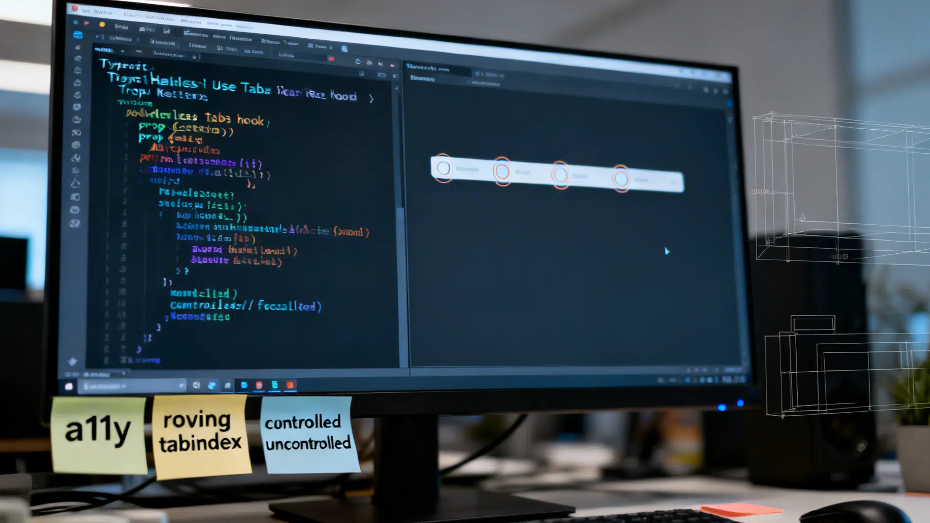
Build a Headless React UI Library: A Practical Tabs Tutorial
Build a headless React UI component library step by step—accessibility, state, TypeScript, testing, and packaging—using a fully featured Tabs example.
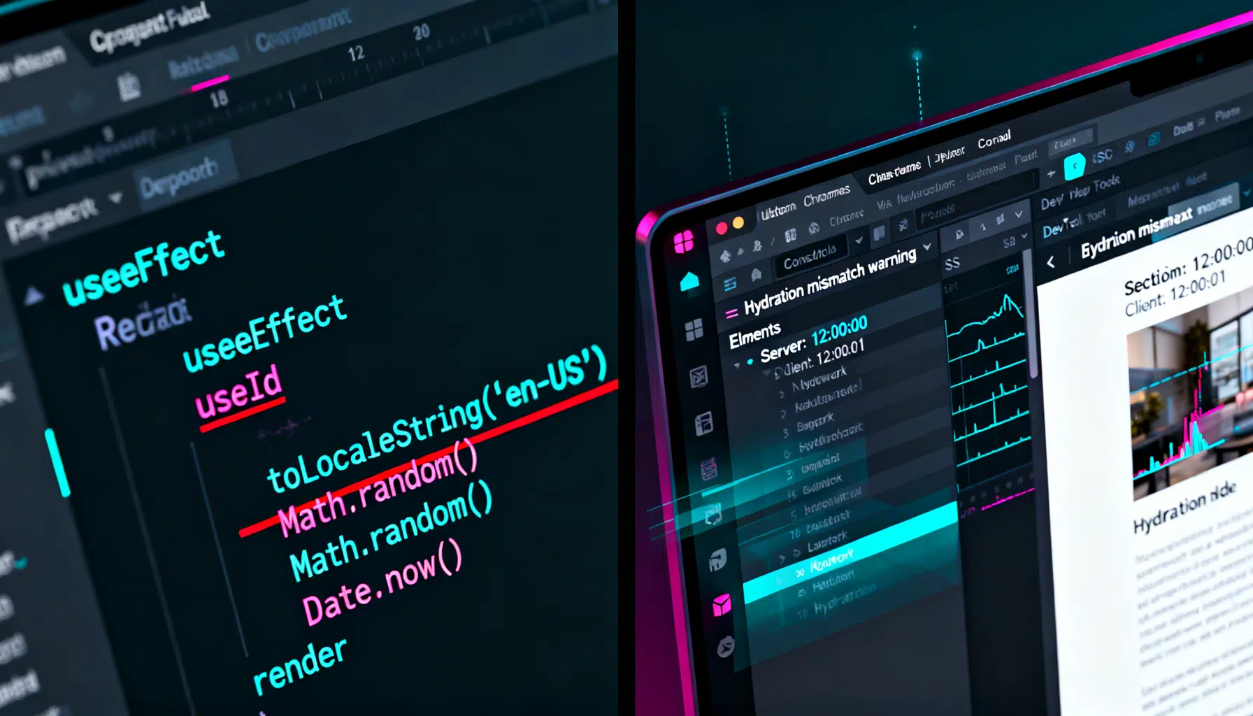
React Hydration Mismatch: A Practical Debugging Guide
Learn how to diagnose and fix React hydration mismatches with step-by-step checks, common causes, and production-safe patterns for SSR and Next.js.

React Compiler Automatic Optimization: A Practical Guide
A practical guide to React’s automatic compiler optimizations: how it works, code patterns that help or hurt, migration steps, and how to measure impact.