Building an Accessible React Portal Modal with TypeScript
Build an accessible React portal modal with TypeScript: focus trap, Escape handling, scroll locking, SSR safety, and tests with RTL.
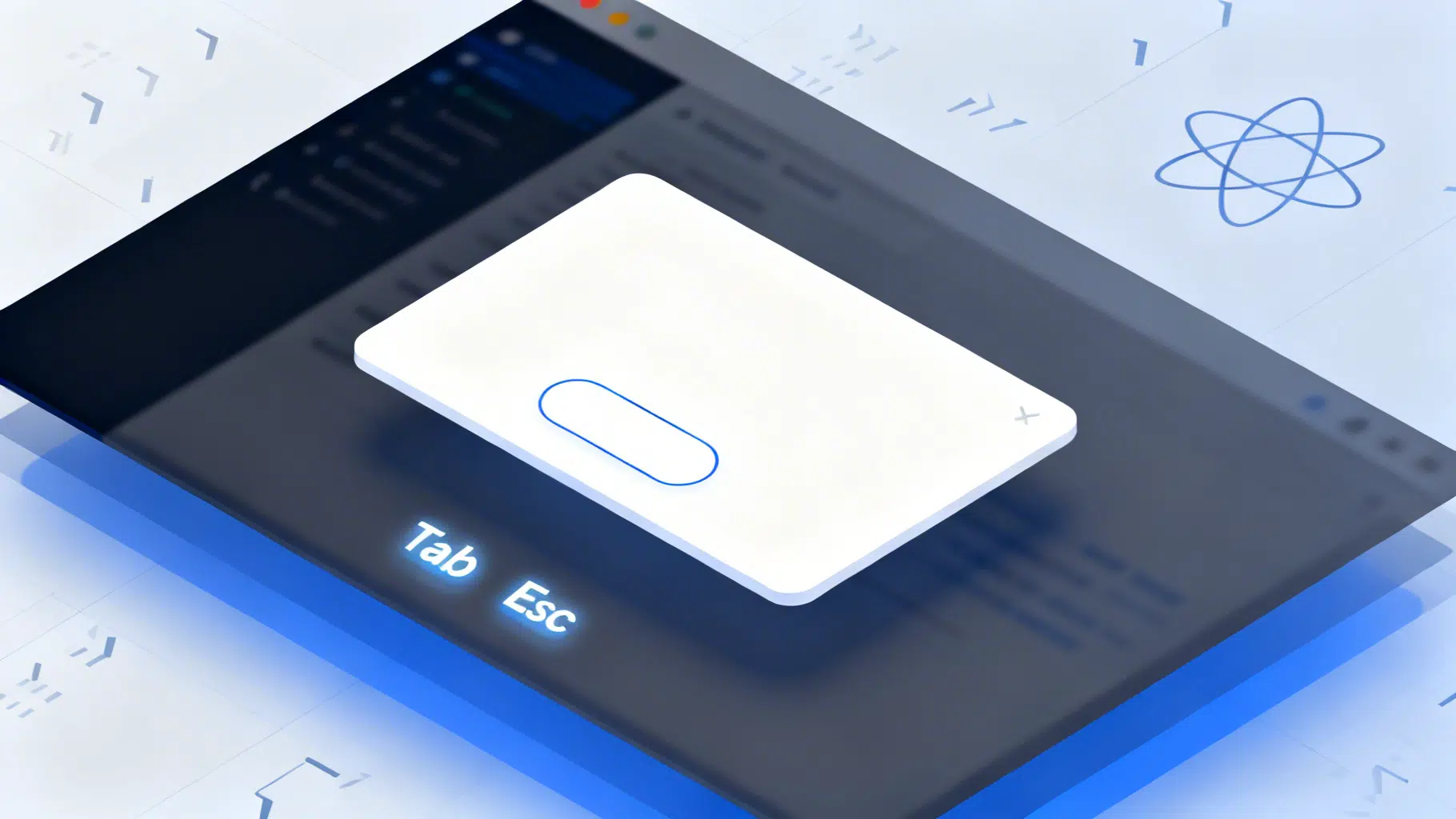
Image used for representation purposes only.
Overview
A portal-backed modal is the most reliable way to present layered UI in React. By rendering outside your app’s normal DOM tree, portals avoid stacking-context traps, simplify z-indexing, and make focus management predictable. In this guide, you’ll build a robust, accessible modal using React portals and TypeScript. You’ll also add scroll locking, keyboard support, animation hooks, SSR safety, and testing.
What you’ll build
- A reusable
component rendered via ReactDOM.createPortal - Full keyboard support: focus trap, Escape to close, Tab cycling, focus restore
- A11y attributes: role=“dialog”, aria-modal, labels/descriptions
- Body scroll locking without layout shift
- Optional overlay click-to-dismiss
- SSR-safe container selection
- Unit tests with React Testing Library
Prerequisites
- React 18+
- TypeScript (optional but recommended)
- Basic CSS knowledge
Step 1: Add a portal root to your HTML
Add a sibling to your main React mount. This eliminates z-index battles and stacking-context issues (e.g., transforms, filters, positioned parents).
<!-- public/index.html or your framework’s HTML shell -->
<div id="root"></div>
<div id="modal-root"></div>
If you can’t edit HTML (e.g., SSR frameworks), you’ll programmatically create this container (covered below).
Step 2: Create a portal container hook (SSR-safe)
Safely locate or create the portal container only on the client.
// usePortalContainer.ts
import * as React from 'react';

export function usePortalContainer(selector = '#modal-root') {
  const [container, setContainer] = React.useState<Element | null>(null);

  React.useEffect(() => {
    if (typeof document === 'undefined') return; // SSR guard

    let el = document.querySelector(selector);
    let created = false;

    if (!el) {
      el = document.createElement('div');
      el.setAttribute('id', selector.replace('#', ''));
      document.body.appendChild(el);
      created = true;
    }

    setContainer(el);

    return () => {
      // If we created it and nothing else depends on it, you could remove it.
      // Leaving it usually simplifies subsequent mounts; keep by default.
      if (created && el && el.childElementCount === 0) {
        // document.body.removeChild(el); // optional cleanup
      }
    };
  }, [selector]);

  return container;
}
Step 3: Lock body scroll without layout shift
When a modal opens, prevent background scroll and compensate for scrollbar width to avoid content “jump.”
// useBodyScrollLock.ts
import * as React from 'react';

export function useBodyScrollLock(isActive: boolean) {
  React.useEffect(() => {
    if (!isActive || typeof document === 'undefined') return;

    const { body, documentElement } = document;
    const originalOverflow = body.style.overflow;
    const originalPaddingRight = body.style.paddingRight;

    const scrollbarWidth = window.innerWidth - documentElement.clientWidth;
    body.style.overflow = 'hidden';
    if (scrollbarWidth > 0) {
      body.style.paddingRight = `${scrollbarWidth}px`;
    }

    return () => {
      body.style.overflow = originalOverflow;
      body.style.paddingRight = originalPaddingRight;
    };
  }, [isActive]);
}
Step 4: Build the Modal component
Focus trapping, Escape handling, and ARIA are the essentials. We’ll implement a minimal trap and recommend a hardened library for production-heavy cases.
// Modal.tsx
import * as React from 'react';
import { createPortal } from 'react-dom';
import { usePortalContainer } from './usePortalContainer';
import { useBodyScrollLock } from './useBodyScrollLock';

export interface ModalProps {
  isOpen: boolean;
  onClose: () => void;
  labelledBy?: string; // id of heading element inside the dialog
  describedBy?: string; // id of description text inside the dialog
  initialFocusRef?: React.RefObject<HTMLElement>;
  closeOnOverlayClick?: boolean;
  closeOnEsc?: boolean;
  container?: Element | null; // custom portal target
  children: React.ReactNode;
}

export function Modal({
  isOpen,
  onClose,
  labelledBy,
  describedBy,
  initialFocusRef,
  closeOnOverlayClick = true,
  closeOnEsc = true,
  container,
  children,
}: ModalProps) {
  const defaultContainer = usePortalContainer('#modal-root');
  const portalTarget = container ?? defaultContainer;

  const overlayRef = React.useRef<HTMLDivElement>(null);
  const dialogRef = React.useRef<HTMLDivElement>(null);
  const lastActiveRef = React.useRef<HTMLElement | null>(null);

  useBodyScrollLock(isOpen);

  // Restore focus on unmount
  React.useEffect(() => {
    if (!isOpen) return;
    lastActiveRef.current = (document.activeElement as HTMLElement) ?? null;
    return () => {
      lastActiveRef.current?.focus?.();
    };
  }, [isOpen]);

  // Move focus into the dialog on open
  React.useEffect(() => {
    if (!isOpen) return;
    const d = dialogRef.current;
    if (!d) return;

    const focusTarget = initialFocusRef?.current ?? getFirstFocusable(d) ?? d;
    if (focusTarget) {
      // Ensure container is focusable if needed
      if (focusTarget === d) d.setAttribute('tabindex', '-1');
      focusTarget.focus();
    }
  }, [isOpen, initialFocusRef]);

  // Key handling: Escape to close, Tab cycle
  const onKeyDown = (e: React.KeyboardEvent) => {
    if (e.key === 'Escape' && closeOnEsc) {
      e.stopPropagation();
      onClose();
      return;
    }
    if (e.key === 'Tab') {
      const d = dialogRef.current;
      if (!d) return;
      const focusables = getFocusableElements(d);
      if (focusables.length === 0) {
        e.preventDefault();
        d.focus();
        return;
      }
      const first = focusables[0];
      const last = focusables[focusables.length - 1];
      if (e.shiftKey) {
        if (document.activeElement === first || !d.contains(document.activeElement)) {
          e.preventDefault();
          last.focus();
        }
      } else {
        if (document.activeElement === last) {
          e.preventDefault();
          first.focus();
        }
      }
    }
  };

  // Close on overlay click (but not on clicks inside the dialog)
  const onOverlayMouseDown = (e: React.MouseEvent) => {
    if (!closeOnOverlayClick) return;
    if (e.target === overlayRef.current) onClose();
  };

  if (!isOpen || !portalTarget) return null;

  return createPortal(
    <div
      ref={overlayRef}
      className="modal-overlay"
      onMouseDown={onOverlayMouseDown}
      aria-hidden={false}
    >
      <div
        ref={dialogRef}
        className="modal-content"
        role="dialog"
        aria-modal="true"
        aria-labelledby={labelledBy}
        aria-describedby={describedBy}
        onKeyDown={onKeyDown}
      >
        {children}
      </div>
    </div>,
    portalTarget
  );
}

// Utilities
function getFocusableElements(root: HTMLElement): HTMLElement[] {
  const selectors = [
    'a[href]', 'button:not([disabled])', 'input:not([disabled]):not([type="hidden"])',
    'select:not([disabled])', 'textarea:not([disabled])', '[tabindex]:not([tabindex="-1"])',
    '[contenteditable="true"]'
  ];
  return Array.from(root.querySelectorAll<HTMLElement>(selectors.join(',')))
    .filter(el => !el.hasAttribute('disabled') && !el.getAttribute('aria-hidden'));
}

function getFirstFocusable(root: HTMLElement) {
  return getFocusableElements(root)[0] ?? null;
}
Step 5: Minimal styling and animation hooks
Keep overlay and content in their own stacking context. Add data-attributes or classes for transitions.
/* modal.css */
.modal-overlay {
  position: fixed;
  inset: 0;
  background: color-mix(in oklab, black 60%, transparent);
  display: grid;
  place-items: center;
  z-index: 1000; /* Above app chrome */
}

.modal-content {
  background: white;
  color: #111;
  border-radius: 12px;
  width: min(560px, 92vw);
  max-height: 85vh;
  overflow: auto;
  box-shadow: 0 10px 40px rgba(0,0,0,0.35);
  transform: translateY(6px) scale(0.98);
  opacity: 0;
  transition: transform 160ms ease, opacity 160ms ease;
}

/* Mount with a class like .is-open to trigger enter; for exit, unmount after transition if you add state */
.modal-overlay .modal-content.is-open {
  transform: translateY(0) scale(1);
  opacity: 1;
}
You can toggle the is-open class via a small state, or integrate an animation library (e.g., CSS keyframes or a motion library) for enter/exit without abrupt unmounting.
Step 6: Use the modal
// App.tsx
import * as React from 'react';
import { Modal } from './Modal';
import './modal.css';

export function App() {
  const [open, setOpen] = React.useState(false);
  const close = () => setOpen(false);
  const saveBtnRef = React.useRef<HTMLButtonElement>(null);

  return (
    <div>
      <button onClick={() => setOpen(true)}>Edit profile</button>

      <Modal
        isOpen={open}
        onClose={close}
        labelledBy="profile-title"
        initialFocusRef={saveBtnRef}
      >
        <div style={{ padding: 20 }}>
          <h2 id="profile-title">Edit profile</h2>
          <p id="profile-desc">Update your display name and bio.</p>
          <form onSubmit={(e) => { e.preventDefault(); close(); }}>
            <label>
              Display name
              <input type="text" defaultValue="Ada" />
            </label>
            <label>
              Bio
              <textarea defaultValue="Engineer and explorer." />
            </label>
            <div style={{ display: 'flex', gap: 8, justifyContent: 'flex-end', marginTop: 16 }}>
              <button type="button" onClick={close}>Cancel</button>
              <button ref={saveBtnRef} type="submit">Save</button>
            </div>
          </form>
        </div>
      </Modal>
    </div>
  );
}
Accessibility checklist
- role=“dialog” and aria-modal=“true”
- aria-labelledby points to a visible heading; aria-describedby to helper text (optional)
- Focus moves into the modal on open and returns to the trigger on close
- Tab cycles within the modal; Escape closes when enabled
- Avoid closing on non-intentional interactions (e.g., typing Enter in a form)
For complex traps (nested iframes, shadow DOM) consider a hardened trap utility. Also consider aria-hidden or inert on app content. If you use inert, ensure robust polyfills for cross-browser support.
Server-side rendering (Next.js, Remix)
- Do not access document/window during render. This guide defers container lookup to useEffect.
- If you need to animate exit without flashing content on SSR, mount a shell with no-op portal on the server and hydrate with a client-only effect.
- In frameworks with streaming SSR, ensure the portal root exists in your HTML template or is created on the client early.
Common pitfalls and how to avoid them
- Stacking contexts: Any ancestor with transform, filter, or position+z-index can trap content behind headers. Portals bypass this by rendering at the document root.
- Scroll bleed on iOS: Locking body may still allow overscroll bounce. Add overscroll-behavior: contain on html, body, and consider using a library that handles iOS nuances if needed.
- Focus loss on re-render: Keep dialogRef stable and avoid conditional wrappers that unmount descendants on every state change.
- Multiple modals: If you may stack dialogs, manage a stack counter in useBodyScrollLock to avoid unlocking prematurely.
Testing with React Testing Library
Portals work in JSDOM as long as the container exists.
// Modal.test.tsx
import * as React from 'react';
import { render, screen, fireEvent } from '@testing-library/react';
import { Modal } from './Modal';

beforeAll(() => {
  const root = document.createElement('div');
  root.id = 'modal-root';
  document.body.appendChild(root);
});

it('renders and is accessible by role/name', () => {
  render(
    <Modal isOpen onClose={() => {}} labelledBy="t">
      <h2 id="t">Edit profile</h2>
      <button>Action</button>
    </Modal>
  );
  expect(screen.getByRole('dialog', { name: /edit profile/i })).toBeInTheDocument();
});

it('closes on Escape and overlay click', () => {
  const onClose = vi.fn();
  render(
    <Modal isOpen onClose={onClose} labelledBy="t">
      <h2 id="t">Edit profile</h2>
      <button>Action</button>
    </Modal>
  );
  fireEvent.keyDown(screen.getByRole('dialog'), { key: 'Escape' });
  expect(onClose).toHaveBeenCalledTimes(1);
});
Assert focus behavior as needed:
it('traps focus inside the dialog', () => {
  render(
    <Modal isOpen onClose={() => {}} labelledBy="t">
      <h2 id="t">Edit profile</h2>
      <button>First</button>
      <button>Last</button>
    </Modal>
  );
  const dialog = screen.getByRole('dialog');
  dialog.focus();
  fireEvent.keyDown(dialog, { key: 'Tab', shiftKey: true });
  // Expect focus to cycle to the last focusable
  expect(screen.getByText('Last')).toHaveFocus();
});
TypeScript tips
- Prefer explicit prop contracts for modal behavior flags (closeOnEsc, closeOnOverlayClick).
- Expose a container?: Element | null for integration in micro-frontends or shadow roots.
- For internal refs, use React.useRef
(null) and avoid reassigning types.
Enhancements you can add
- Animations: Add a mounted state and only unmount after exit transition ends; or use a motion library.
- Reduced motion: Respect prefers-reduced-motion with a media query to disable or shorten animations.
- ARIA controls: Add an explicit close button with aria-label=“Close” and ensure it’s focusable and visible to screen readers.
- Restore scroll position: If modals are triggered from deep scroll, you may want to restore scroll position on close for smoother UX.
Conclusion
With portals, a modal reliably renders above app chrome and outside stacking traps. Add keyboard support, ARIA attributes, focus management, and scroll locking to make it robust and accessible. The patterns above give you a production-ready baseline you can tailor with animations and framework-specific SSR optimizations.
Related Posts
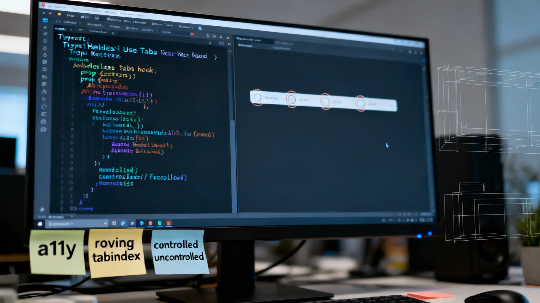
Build a Headless React UI Library: A Practical Tabs Tutorial
Build a headless React UI component library step by step—accessibility, state, TypeScript, testing, and packaging—using a fully featured Tabs example.
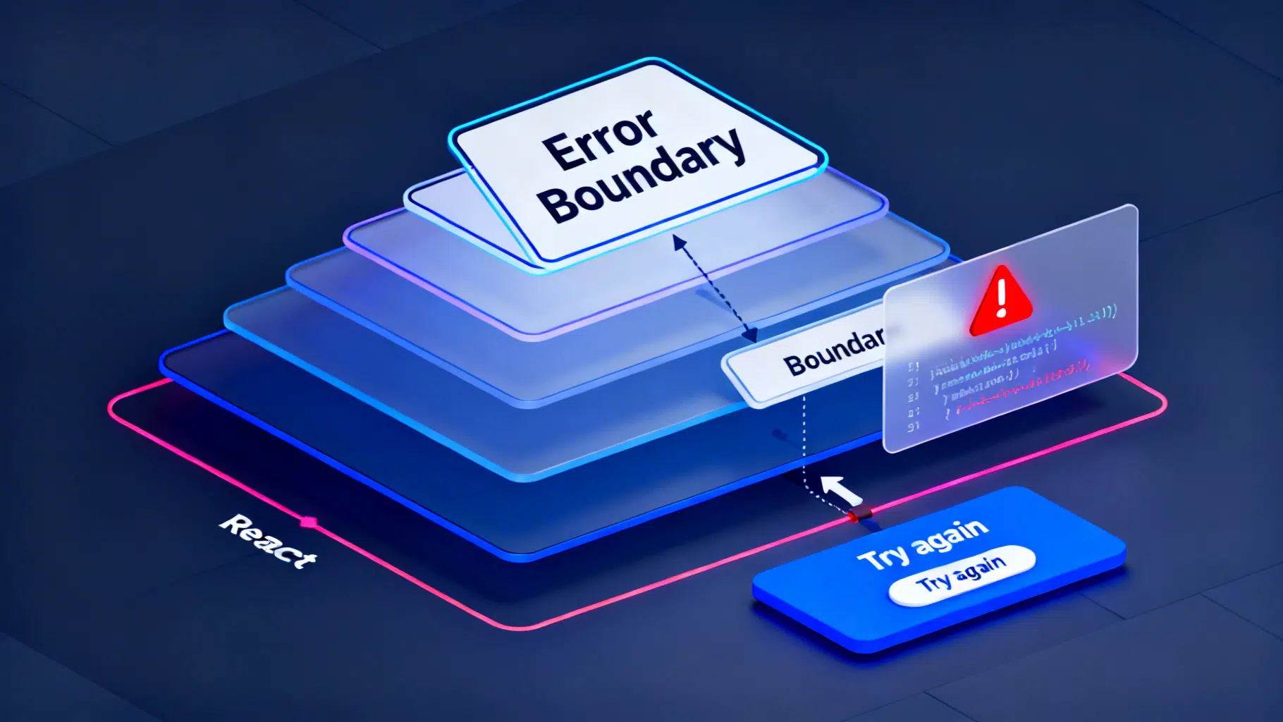
React Error Boundaries: A Complete Implementation Guide
Implement robust React error boundaries with TypeScript examples, reset strategies, logging, Suspense interplay, testing, and accessibility.

React Accessibility: Practical ARIA Best Practices
A practical React guide to ARIA—when to use it, when not to, plus patterns for focus, labels, widgets, and testing.