Building an Accessible, Reusable React Progress Indicator (Linear and Circular)
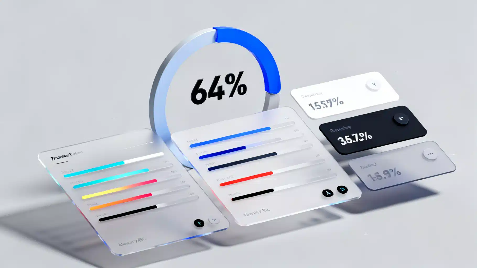
Build an accessible, themeable React progress indicator (linear and circular) with TypeScript, complete code, a11y, performance tips, theming, and tests.
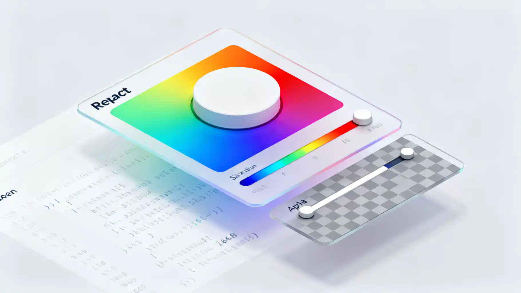
Build a fast, accessible React color picker from scratch: HSV logic, sliders, popover, keyboard/mouse support, CSS variables, tests, and library options.
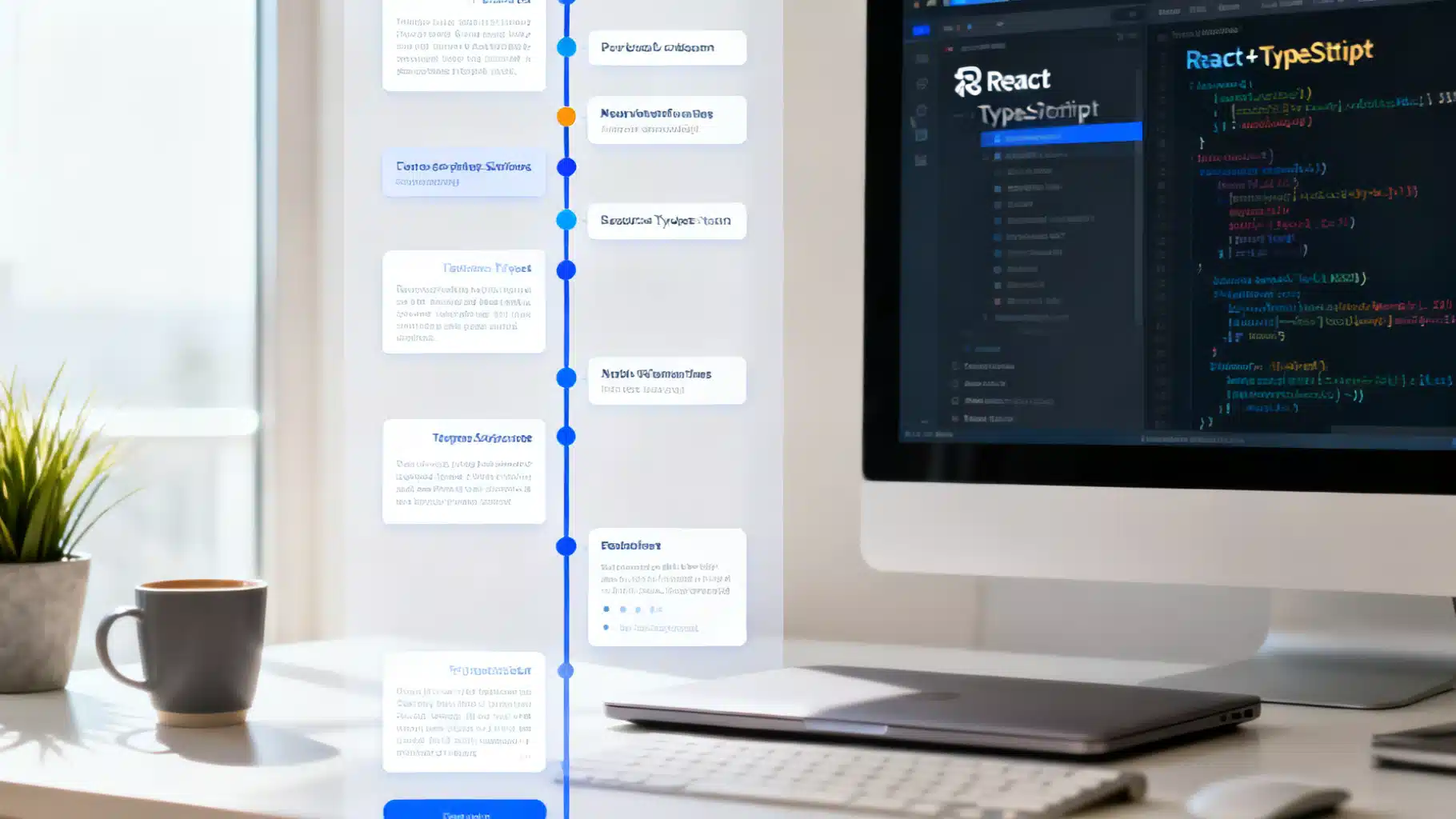
Build a flexible, accessible React timeline component with TypeScript—layout, theming, animation, responsiveness, virtualization, and tests.
Build an accessible, performant React carousel with scroll-snap and transform approaches, including drag, autoplay, and best practices.
Build accessible, performant skeleton loading UIs in React with patterns, Suspense, CSS shimmer, and testing tips.
Tailwind CSS v4.0 brings a new high-performance engine, CSS-first configuration, and simplified developer experience.