Build an Accessible React Color Picker: A Practical Guide
Build a fast, accessible React color picker from scratch: HSV logic, sliders, popover, keyboard/mouse support, CSS variables, tests, and library options.
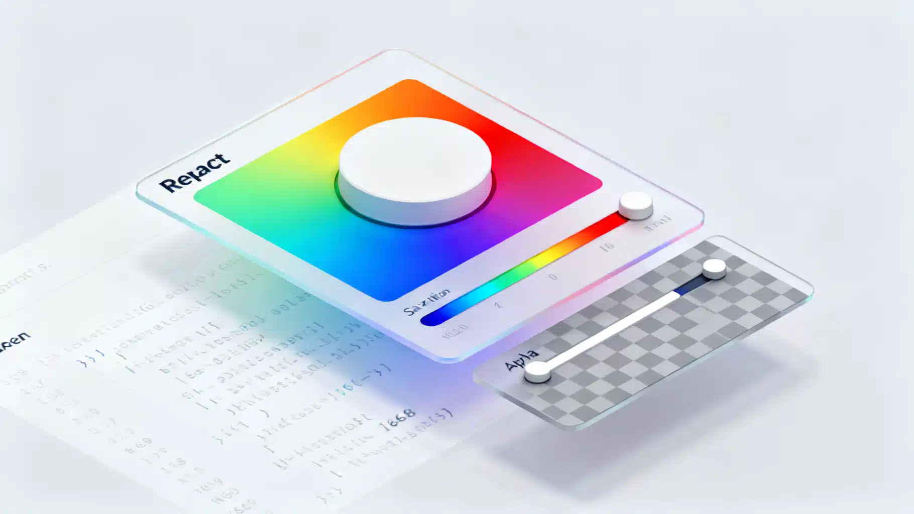
Image used for representation purposes only.
Overview
A good color picker is one of those components that looks simple but hides a lot of nuance: color models, pointer math, accessibility, keyboard support, alpha transparency, controlled state, and performance. In this tutorial you’ll build a fast, accessible React color picker from first principles. You’ll learn the HSV model, write conversion utilities, create a saturation/value panel plus hue and alpha sliders, wire up keyboard and pointer interactions, and expose a clean API for app code.
By the end you’ll have a reusable
Prerequisites
- React 18+
- Familiarity with hooks and basic CSS
- A build setup (Vite, Next.js, or CRA). Examples below assume Vite and plain JavaScript, but TypeScript notes are included.
What we’re building
Features:
- Saturation/Value (SV) 2D panel with a draggable thumb
- Hue slider (0–360°)
- Alpha slider with checkerboard background
- HEX and RGBA input fields
- Keyboard support: arrows, PageUp/PageDown, Home/End
- Controlled/uncontrolled API
Color models 101 (HEX, RGB, HSV)
- RGB represents color by red/green/blue channels in 0–255.
- HEX encodes RGB as a hexadecimal string, commonly used in CSS.
- HSV (Hue, Saturation, Value) separates color (hue) from intensity (value) and purity (saturation). It maps nicely to our UI: one 2D plane for S and V, one 1D slider for Hue.
We’ll keep state in HSVA: { h: 0–360, s: 0–100, v: 0–100, a: 0–1 } and convert to/from RGB/HEX as needed.
Conversion utilities
Create src/color-utils.js:
// src/color-utils.js
export const clamp = (n, min, max) => Math.min(max, Math.max(min, n));

export function hexToRgb(hex) {
  let h = hex.replace(/^#/, '');
  if (h.length === 3) h = h.split('').map(c => c + c).join('');
  const num = parseInt(h, 16);
  return { r: (num >> 16) & 255, g: (num >> 8) & 255, b: num & 255, a: 1 };
}

export function rgbToHex({ r, g, b }) {
  const toHex = x => x.toString(16).padStart(2, '0');
  return `#${toHex(r)}${toHex(g)}${toHex(b)}`;
}

export function hsvToRgb({ h, s, v, a = 1 }) {
  s /= 100; v /= 100;
  const c = v * s;
  const x = c * (1 - Math.abs(((h / 60) % 2) - 1));
  const m = v - c;
  let [r1, g1, b1] = [0, 0, 0];
  if (h >= 0 && h < 60) [r1, g1, b1] = [c, x, 0];
  else if (h < 120) [r1, g1, b1] = [x, c, 0];
  else if (h < 180) [r1, g1, b1] = [0, c, x];
  else if (h < 240) [r1, g1, b1] = [0, x, c];
  else if (h < 300) [r1, g1, b1] = [x, 0, c];
  else [r1, g1, b1] = [c, 0, x];
  return {
    r: Math.round((r1 + m) * 255),
    g: Math.round((g1 + m) * 255),
    b: Math.round((b1 + m) * 255),
    a,
  };
}

export function rgbToHsv({ r, g, b, a = 1 }) {
  let rn = r / 255, gn = g / 255, bn = b / 255;
  const max = Math.max(rn, gn, bn), min = Math.min(rn, gn, bn);
  const d = max - min;
  let h = 0;
  if (d !== 0) {
    if (max === rn) h = ((gn - bn) / d) % 6;
    else if (max === gn) h = (bn - rn) / d + 2;
    else h = (rn - gn) / d + 4;
    h *= 60; if (h < 0) h += 360;
  }
  const s = max === 0 ? 0 : d / max;
  const v = max;
  return { h: Math.round(h), s: Math.round(s * 100), v: Math.round(v * 100), a };
}
Tip: Write unit tests for these functions first; if conversions are wrong, the UI won’t make sense.
Base styles
Add a few reusable CSS variables and utilities in src/color-picker.css:
/* src/color-picker.css */
:root { --cp-size: 220px; --cp-radius: 10px; --cp-gap: 10px; --cp-thumb: 12px; }

.cp { display: grid; grid-template-columns: var(--cp-size) 1fr; gap: var(--cp-gap); align-items: start; font: 14px/1.3 system-ui, sans-serif; }

/* SV panel */
.cp-sv { position: relative; width: var(--cp-size); height: var(--cp-size); border-radius: var(--cp-radius); overflow: hidden; touch-action: none; cursor: crosshair; }
.cp-sv::before { content: ''; position: absolute; inset: 0; background: linear-gradient(to top, #000, rgba(0,0,0,0)); }
.cp-sv::after { content: ''; position: absolute; inset: 0; background: linear-gradient(to right, #fff, rgba(255,255,255,0)); }
.cp-sv-thumb { position: absolute; width: var(--cp-thumb); height: var(--cp-thumb); border: 2px solid #fff; box-shadow: 0 0 0 1px rgba(0,0,0,.5); border-radius: 50%; transform: translate(-50%, -50%); pointer-events: none; }

/* Sliders */
.cp-slider { position: relative; height: 14px; border-radius: 999px; overflow: hidden; touch-action: none; cursor: ew-resize; }
.cp-slider-track { position: absolute; inset: 0; }
.cp-slider-thumb { position: absolute; top: 50%; width: var(--cp-thumb); height: var(--cp-thumb); border: 2px solid #fff; box-shadow: 0 0 0 1px rgba(0,0,0,.5); border-radius: 50%; transform: translate(-50%, -50%); background: currentColor; }

/* Alpha checkerboard */
.cp-checker { background:
  conic-gradient(#eee 25%, #ddd 0 50%, #eee 0 75%, #ddd 0) 0 0/16px 16px;
}

/* Inputs */
.cp-fields { display: grid; grid-template-columns: repeat(4, 1fr); gap: 8px; align-items: center; }
.cp-fields input { width: 100%; padding: 6px 8px; border-radius: 6px; border: 1px solid #d0d0d0; }

/* Swatch & preview */
.cp-preview { width: 44px; height: 44px; border-radius: 8px; box-shadow: inset 0 0 0 1px rgba(0,0,0,.1); }
Building blocks
We’ll create three interactive parts and a wrapper that manages HSVA state.
A. Saturation/Value panel (2D)
// src/SaturationValue.jsx
import * as React from 'react';
import { clamp } from './color-utils.js';

export function SaturationValue({ h, s, v, onChange }) {
  const ref = React.useRef(null);

  const setByPointer = (clientX, clientY) => {
    const rect = ref.current.getBoundingClientRect();
    const x = clamp(clientX - rect.left, 0, rect.width);
    const y = clamp(clientY - rect.top, 0, rect.height);
    const ns = Math.round((x / rect.width) * 100);
    const nv = Math.round(100 - (y / rect.height) * 100);
    onChange({ s: ns, v: nv });
  };

  const onPointerDown = e => {
    e.preventDefault();
    ref.current.setPointerCapture(e.pointerId);
    setByPointer(e.clientX, e.clientY);
  };
  const onPointerMove = e => {
    if (e.buttons !== 1) return;
    setByPointer(e.clientX, e.clientY);
  };

  const left = `${s}%`; // 0..100
  const top = `${100 - v}%`;
  const bg = `hsl(${h} 100% 50%)`;

  return (
    <div
      ref={ref}
      className='cp-sv'
      style={{ backgroundColor: bg }}
      onPointerDown={onPointerDown}
      onPointerMove={onPointerMove}
      role='application'
      aria-label='Saturation and value'
    >
      <div className='cp-sv-thumb' style={{ left, top }} />
    </div>
  );
}
Accessibility note: The 2D area doesn’t map neatly to a native ARIA role. We expose text inputs and sliders that are fully keyboard-accessible, and label the panel as an application region.
B. Generic horizontal slider
// src/Slider.jsx
import * as React from 'react';
import { clamp } from './color-utils.js';

export function Slider({ value, min = 0, max = 100, step = 1, onChange, gradient, ariaLabel }) {
  const ref = React.useRef(null);
  const pct = (value - min) / (max - min);

  const setFromEvent = (clientX) => {
    const rect = ref.current.getBoundingClientRect();
    const x = clamp(clientX - rect.left, 0, rect.width);
    const ratio = x / rect.width;
    const raw = min + ratio * (max - min);
    const snapped = Math.round(raw / step) * step;
    onChange(clamp(snapped, min, max));
  };

  const onPointerDown = e => {
    e.preventDefault();
    ref.current.setPointerCapture(e.pointerId);
    setFromEvent(e.clientX);
  };
  const onPointerMove = e => { if (e.buttons === 1) setFromEvent(e.clientX); };

  const onKeyDown = e => {
    const key = e.key;
    const delta =
      key === 'ArrowRight' ? step :
      key === 'ArrowLeft' ? -step :
      key === 'PageUp' ? step * 10 :
      key === 'PageDown' ? -step * 10 :
      key === 'Home' ? (min - value) :
      key === 'End' ? (max - value) : 0;
    if (delta !== 0) { e.preventDefault(); onChange(clamp(value + delta, min, max)); }
  };

  return (
    <div
      ref={ref}
      className='cp-slider'
      onPointerDown={onPointerDown}
      onPointerMove={onPointerMove}
      role='slider'
      aria-label={ariaLabel}
      aria-valuemin={min}
      aria-valuemax={max}
      aria-valuenow={Math.round(value)}
      tabIndex={0}
    >
      <div className='cp-slider-track' style={{ background: gradient }} />
      <div className='cp-slider-thumb' style={{ left: `${pct * 100}%` }} />
    </div>
  );
}
C. The ColorPicker wrapper
// src/ColorPicker.jsx
import * as React from 'react';
import './color-picker.css';
import { SaturationValue } from './SaturationValue.jsx';
import { Slider } from './Slider.jsx';
import { hexToRgb, rgbToHex, hsvToRgb, rgbToHsv, clamp } from './color-utils.js';

export function ColorPicker({ color = '#4f46e5', onChange }) {
  const [hsva, setHsva] = React.useState(() => rgbToHsv(hexToRgb(color)));

  // Sync external color prop
  React.useEffect(() => { setHsva(rgbToHsv(hexToRgb(color))); }, [color]);

  // Emit value changes upward
  React.useEffect(() => {
    const rgba = hsvToRgb(hsva);
    const hex = rgbToHex(rgba);
    onChange?.({ hsva, rgba, hex });
  }, [hsva, onChange]);

  const { h, s, v, a } = hsva;
  const rgba = hsvToRgb(hsva);
  const cssRgba = `rgba(${rgba.r} ${rgba.g} ${rgba.b} / ${a})`;

  const hueGradient = 'linear-gradient(to right, #f00 0%, #ff0 16.7%, #0f0 33.3%, #0ff 50%, #00f 66.7%, #f0f 83.3%, #f00 100%)';
  const alphaGradient = `linear-gradient(to right, rgba(${rgba.r},${rgba.g},${rgba.b},0), rgba(${rgba.r},${rgba.g},${rgba.b},1))`;

  return (
    <div className='cp'>
      <div>
        <SaturationValue
          h={h}
          s={s}
          v={v}
          onChange={({ s: ns, v: nv }) => setHsva(p => ({ ...p, s: ns, v: nv }))}
        />
        <div style={{ height: 12 }} />
        <Slider
          ariaLabel='Hue'
          value={h}
          min={0}
          max={360}
          step={1}
          onChange={nh => setHsva(p => ({ ...p, h: nh }))}
          gradient={hueGradient}
        />
        <div style={{ height: 8 }} />
        <div className='cp-checker' style={{ borderRadius: 9999 }}>
          <Slider
            ariaLabel='Alpha'
            value={Math.round(a * 100)}
            min={0}
            max={100}
            step={1}
            onChange={na => setHsva(p => ({ ...p, a: clamp(na / 100, 0, 1) }))}
            gradient={alphaGradient}
          />
        </div>
      </div>

      <div style={{ display: 'grid', gap: 10 }}>
        <div style={{ display: 'flex', alignItems: 'center', gap: 10 }}>
          <div className='cp-checker cp-preview' style={{ background: cssRgba }} />
          <strong>{rgbToHex(rgba)}</strong>
        </div>

        <div className='cp-fields'>
          <label htmlFor='hex'>HEX</label>
          <input id='hex' value={rgbToHex(rgba)} onChange={e => {
            try {
              const rgb = hexToRgb(e.target.value.trim());
              setHsva(p => ({ ...rgbToHsv(rgb), a: p.a }));
            } catch {}
          }} />

          <label htmlFor='a'>A</label>
          <input id='a' type='number' min='0' max='1' step='0.01' value={a}
            onChange={e => setHsva(p => ({ ...p, a: clamp(parseFloat(e.target.value) || 0, 0, 1) }))} />

          <label htmlFor='r'>R</label>
          <input id='r' type='number' min='0' max='255' value={rgba.r}
            onChange={e => setHsva(p => rgbToHsv({ r: clamp(+e.target.value||0,0,255), g: rgba.g, b: rgba.b, a: p.a }))} />

          <label htmlFor='g'>G</label>
          <input id='g' type='number' min='0' max='255' value={rgba.g}
            onChange={e => setHsva(p => rgbToHsv({ r: rgba.r, g: clamp(+e.target.value||0,0,255), b: rgba.b, a: p.a }))} />

          <label htmlFor='b'>B</label>
          <input id='b' type='number' min='0' max='255' value={rgba.b}
            onChange={e => setHsva(p => rgbToHsv({ r: rgba.r, g: rgba.g, b: clamp(+e.target.value||0,0,255), a: p.a }))} />
        </div>
      </div>
    </div>
  );
}
Usage example:
// src/App.jsx
import * as React from 'react';
import { ColorPicker } from './ColorPicker.jsx';

export default function App() {
  const [color, setColor] = React.useState('#ff4d4f');
  return (
    <div style={{ padding: 24 }}>
      <h2>Theme color</h2>
      <ColorPicker color={color} onChange={({ hex }) => setColor(hex)} />
      <div style={{ marginTop: 24, color }}>This text reflects your color.</div>
    </div>
  );
}
Controlled vs. uncontrolled
The component above is semi-controlled:
- Incoming color prop is parsed into HSVA.
- Any internal change triggers onChange with hsva, rgba, and hex so parent state can sync.
For a fully controlled picker, keep HSVA state in the parent and pass it down, or accept a CSS color string and always derive HSVA locally as shown.
Keyboard and pointer interactions
- Sliders implement onPointerDown/onPointerMove and keyboard handlers for ArrowLeft/Right, PageUp/PageDown, Home/End.
- The SV panel uses pointer events; for keyboard accessibility, users can adjust precise values through the numeric inputs and hue/alpha sliders. Consider adding optional S and V range inputs for strictly keyboard-only flows.
Accessibility checklist
- Role and labeling: sliders have role=‘slider’ with aria-valuemin/max/now and aria-label.
- Focus: thumbs are not focusable; the whole slider track is, which simplifies keyboard control.
- Contrast: thumbs use white borders plus subtle outer strokes to remain visible over any background.
- Inputs: provide HEX and RGBA fields for screen readers and fine-grained control.
Performance tips
- Keep HSVA as a single object to avoid cascading conversions.
- Derive gradients from memoized rgba where possible.
- Avoid re-renders by lifting expensive computations into useMemo if you later add more features.
Styling the checkerboard and gradients
- The alpha slider uses a conic-based checkerboard, which is crisp and GPU-friendly.
- The SV panel uses layered gradients over an hsl(h 100% 50%) base. This gives clean white and black falloffs without images.
Packaging and API surface
If you plan to reuse the picker across projects, consider:
- Props: value (string or hsva), defaultValue, onChange, disabled, readOnly, className, style.
- Event contract: onChange({ hsva, rgba, hex }).
- i18n: number format and labels.
- Theming: expose CSS variables for sizes and radii.
Testing: what to cover
- Unit tests for hex/rgb/hsv conversions (edge values: 0, 255, black, white, gray).
- Keyboard e2e: arrows move hue by 1°, page keys by 10°.
- Pointer e2e: dragging across SV panel hits expected S/V near edges.
- Accessibility: sliders have correct roles and value attributes; inputs have labels.
When to use a library
If you need advanced features quickly—like color history, swatches, or complex layouts—use a focused library. Popular choices include lightweight pickers that expose HSV and controlled props, offer excellent keyboard support, and ship tree-shakable ESM bundles. For most apps, the DIY version above is enough and remains easy to maintain.
Extensions and ideas
- Add a vertical orientation prop for compact sidebars.
- Add a popover trigger: a swatch button that toggles the picker in a floating layer.
- Persist recent colors in localStorage.
- Expose onChangeStart/onChangeEnd for expensive work (e.g., image filters) and throttle pointer moves.
- Add a color contrast checker against a chosen background.
Summary
You built a production-ready React color picker that:
- Stores color in HSVA and converts to RGB/HEX
- Implements a draggable SV panel plus hue and alpha sliders
- Supports mouse, touch, and keyboard
- Surfaces accessible inputs and ARIA attributes
- Exposes a clean onChange API and is easy to extend
Drop it into your design system, wire onChange to CSS variables, and you’ve got a powerful foundation for theming, visual editors, and more.
Related Posts

Build a Polished React Timeline Component with React and TypeScript
Build a flexible, accessible React timeline component with TypeScript—layout, theming, animation, responsiveness, virtualization, and tests.

Building a Robust React Toast Notification System: Patterns, Code, and UX
Design and implement a fast, accessible React toast system with clean APIs, animations, and promise toasts—complete code, patterns, and pitfalls.
Build a React Carousel Slider: Scroll‑Snap and Custom Hook Approaches
Build an accessible, performant React carousel with scroll-snap and transform approaches, including drag, autoplay, and best practices.