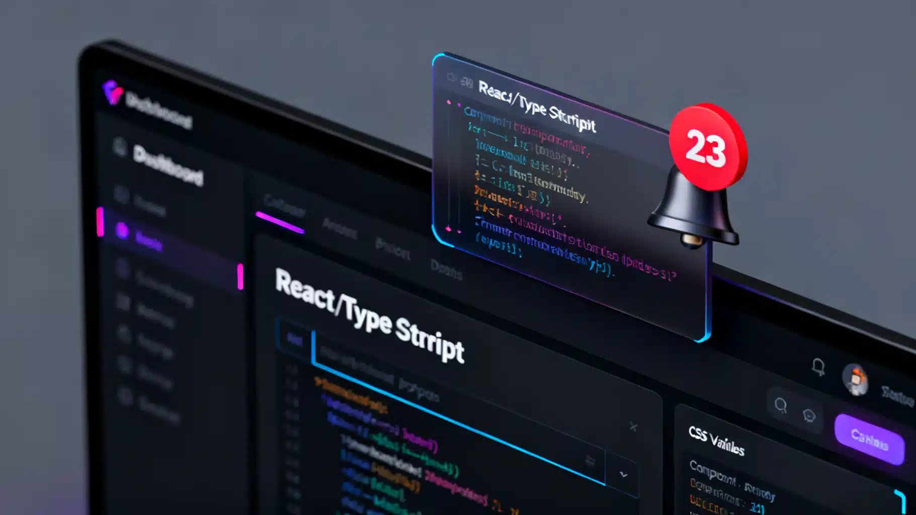
Build an Accessible React Badge Notification Counter (With Real‑Time Updates and Animations)
Build an accessible, themeable React badge notification counter with real-time updates, tasteful animations, and robust a11y—plus tests and tips.
Image used for representation purposes only.
Overview
Notification badges are tiny, high‑signal UI elements that surface counts (unread messages, pending tasks, alerts) without pulling users away from their current context. In React, a badge notification counter should be: accessible, performant, themeable, and easy to drop next to any icon or component. This article walks you through building a production‑grade badge from scratch, wiring it up to real‑time data, animating updates, and testing the result.
UX and accessibility essentials
Before writing code, set the rules for a great badge experience:
- Visibility and contrast: badge background and text should meet contrast guidelines on your chosen theme. Use color and size judiciously.
- Zero behavior: decide whether to hide at 0 or show a neutral state (e.g., a subtle dot). Many apps hide at 0.
- Max cap: large numbers are hard to read; cap at a threshold like 99+.
- Placement: top‑right corner by default; respect RTL with logical positioning.
- Announce changes: screen readers should learn when counts change. Use aria‑live or associate descriptive text via aria‑describedby.
- Hit target: the clickable area is the parent (e.g., the bell button), not the badge. Ensure a large, comfortable tap target.
- Layout stability: prevent layout shifts when the number of digits changes with tabular numbers and min‑width.
Core Badge component (React + TypeScript)
The badge wraps any child (icon, avatar, nav item) and positions a small counter in a corner. It supports dot mode, max capping, theming via CSS variables, and an SR‑only update message for assistive tech.
import React from 'react';

type BadgeProps = {
  count?: number;           // undefined means "no badge"
  max?: number;             // cap, e.g., 99 => "99+"
  showZero?: boolean;       // show when count === 0
  dot?: boolean;            // dot-only indicator
  offset?: { x?: number; y?: number }; // px offset from top-right
  srLabel?: (count: number) => string; // a11y message, e.g., "3 unread notifications"
  color?: string;           // CSS color token for text
  bg?: string;              // CSS color token for background
  className?: string;       // extra classes
  children: React.ReactNode;
};

export const Badge: React.FC<BadgeProps> = ({
  count,
  max = 99,
  showZero = false,
  dot = false,
  offset = { x: 0, y: 0 },
  srLabel,
  color = 'white',
  bg = '#E11D48', // rose-600
  className,
  children,
}) => {
  const shouldShow = (() => {
    if (typeof count === 'number') return showZero ? count >= 0 : count > 0;
    return dot; // if dot is explicitly on with no count
  })();

  const display = React.useMemo(() => {
    if (typeof count !== 'number') return '';
    if (count > max) return `${max}+`;
    return String(count);
  }, [count, max]);

  // Trigger a small pop animation when count changes
  const [animKey, setAnimKey] = React.useState(0);
  React.useEffect(() => { setAnimKey((k) => k + 1); }, [display]);

  // Provide screen-reader updates without duplicating the visual label
  const srText = typeof count === 'number' && shouldShow
    ? (srLabel?.(count) ?? `${display} unread notifications`)
    : '';

  return (
    <span
      className={['rbadg-wrap', className].filter(Boolean).join(' ')}
      style={{ position: 'relative', display: 'inline-inline', display: 'inline-block' }}
    >
      {children}

      {shouldShow && (
        <span
          key={animKey}
          className={dot ? 'rbadg-dot' : 'rbadg-count'}
          aria-hidden="true"
          style={{
            '--rbadg-bg': bg as any,
            '--rbadg-fg': color as any,
            position: 'absolute',
            insetBlockStart: (offset.y ?? 0) - 6,  // logical top
            insetInlineEnd: (offset.x ?? 0) - 6,   // logical right
          } as React.CSSProperties}
        >
          {!dot && display}
        </span>
      )}

      {/* SR-only live region: announce changes politely */}
      <span className="rbadg-sr" role="status" aria-live="polite">
        {srText}
      </span>
    </span>
  );
};
Add the minimal CSS. This uses logical properties for RTL, CSS variables for theming, and tabular numerals to prevent width jumping.
.rbadg-count {
  background: var(--rbadg-bg, #E11D48);
  color: var(--rbadg-fg, white);
  min-width: 1.25rem;            /* space for 1–3 digits */
  height: 1.25rem;
  padding: 0 0.25rem;
  border-radius: 999px;
  display: inline-flex;
  align-items: center;
  justify-content: center;
  font: 600 0.75rem/1 system-ui, -apple-system, Segoe UI, Roboto, sans-serif;
  font-variant-numeric: tabular-nums; /* stable digit widths */
  box-shadow: 0 0 0 2px var(--rbadg-ring, #0B1020);
  transform-origin: center;
  animation: rbadg-pop 160ms ease-out;
}

.rbadg-dot {
  width: 0.5rem;
  height: 0.5rem;
  background: var(--rbadg-bg, #E11D48);
  border-radius: 999px;
  box-shadow: 0 0 0 2px var(--rbadg-ring, #0B1020);
  animation: rbadg-pop 160ms ease-out;
}

@keyframes rbadg-pop {
  0% { transform: scale(0.5); opacity: 0; }
  70% { transform: scale(1.05); opacity: 1; }
  100% { transform: scale(1); }
}

/* Visually hidden but accessible */
.rbadg-sr {
  position: absolute !important;
  height: 1px; width: 1px;
  padding: 0; margin: -1px;
  overflow: hidden; clip: rect(0, 0, 0, 0);
  white-space: nowrap; border: 0;
}
Usage with a bell icon button:
import { Badge } from './Badge';

export function BellWithBadge({ unread }: { unread: number }) {
  return (
    <button
      type="button"
      className="icon-btn"
      aria-label={`Notifications: ${unread} unread`}
    >
      <Badge count={unread} max={99} srLabel={(n) => `${n} unread notifications`}>
        <BellIcon />
      </Badge>
    </button>
  );
}
Tips:
- If you render the badge inside a focusable parent, keep aria-label on the parent so SRs announce intent + count together.
- For a pure presence indicator, set dot to true and omit count.
Real‑time updates: polling, SSE, or WebSocket
Badges shine with live data. Below are two lightweight patterns.
1) React Query polling
import { useQuery } from '@tanstack/react-query';

async function fetchUnread(): Promise<number> {
  const res = await fetch('/api/unread-count');
  const data = await res.json();
  return data.count as number;
}

export function NotificationsNav() {
  const { data: unread = 0 } = useQuery({
    queryKey: ['unread-count'],
    queryFn: fetchUnread,
    refetchInterval: 30_000, // poll every 30s
    staleTime: 15_000,
  });

  return (
    <nav>
      <button aria-label={`Notifications: ${unread} unread`}>
        <Badge count={unread} />
        <BellIcon />
      </button>
    </nav>
  );
}
2) WebSocket push
import React from 'react';

export function useUnreadWS(url: string) {
  const [count, setCount] = React.useState(0);

  React.useEffect(() => {
    const ws = new WebSocket(url);
    ws.addEventListener('message', (e) => {
      try {
        const { type, payload } = JSON.parse(e.data);
        if (type === 'UNREAD_COUNT') setCount(payload.count);
      } catch {}
    });
    return () => ws.close();
  }, [url]);

  return count;
}

export function RealtimeBadge() {
  const unread = useUnreadWS('wss://example.com/notifications');
  return (
    <button aria-label={`Notifications: ${unread} unread`}>
      <Badge count={unread} />
      <BellIcon />
    </button>
  );
}
For server‑sent events (SSE), replace WebSocket with EventSource and update state on message.
Enhancements: transitions and micro‑interactions
A subtle pop is already included. To go further, use Framer Motion to animate count changes and attention‑seeking wiggles on idle.
import { motion, AnimatePresence } from 'framer-motion';

export function FancyBadge({ count = 0 }: { count?: number }) {
  const capped = count > 99 ? '99+' : String(count);
  return (
    <span style={{ position: 'relative', display: 'inline-block' }}>
      <BellIcon />
      <AnimatePresence mode="popLayout">{
        count > 0 && (
          <motion.span
            key={capped}
            initial={{ scale: 0.6, opacity: 0 }}
            animate={{ scale: 1, opacity: 1 }}
            exit={{ scale: 0.6, opacity: 0 }}
            transition={{ type: 'spring', stiffness: 400, damping: 22 }}
            className="rbadg-count"
            aria-hidden
          >
            {capped}
          </motion.span>
        )
      }</AnimatePresence>
    </span>
  );
}
Micro‑interaction ideas:
- Nudge the bell if count increases after a quiet period.
- Pulse the dot for high‑priority alerts only (avoid constant motion).
- Use reduced motion: check prefers-reduced-motion and disable animations when requested by the user.
@media (prefers-reduced-motion: reduce) {
  .rbadg-count, .rbadg-dot { animation: none !important; }
}
Theming, RTL, and layout stability
- Theming with CSS variables: expose –rbadg-bg, –rbadg-fg, and –rbadg-ring to integrate with light/dark themes.
- RTL: the component uses insetInlineEnd/insetBlockStart so top‑right stays correct in right‑to‑left UIs.
- Prevent layout shift: tabular numerals and a min‑width mitigate jumps between 9 and 10, 99 and 100, etc.
- Shape and size: small avatars look better with dots; toolbars often prefer numbers.
Performance and state management tips
- Avoid recomputations: compute displayCount with useMemo.
- Re‑render boundaries: if global unread is used in many places, store it centrally (Zustand, Redux, Jotai, or React Query cache) and subscribe only where needed.
- Avoid heavy rerenders on frequent updates (e.g., chat): batch WebSocket messages or debounce updates to 250–500 ms.
- Memoize icons: BellIcon should be a pure component (React.memo) to skip unnecessary renders.
Testing the badge
Unit test user‑visible behavior and accessibility using Testing Library and jest‑dom.
import { render, screen } from '@testing-library/react';
import '@testing-library/jest-dom';
import { Badge } from './Badge';

it('caps at 99+', () => {
  render(<Badge count={120}><span>child</span></Badge>);
  expect(screen.getByText('99+')).toBeInTheDocument();
});

it('hides at 0 when showZero=false', () => {
  render(<Badge count={0}><span>child</span></Badge>);
  expect(screen.queryByText('0')).not.toBeInTheDocument();
});

it('announces changes to SR users', () => {
  render(<Badge count={5}><span>child</span></Badge>);
  const sr = screen.getByRole('status');
  expect(sr).toHaveTextContent('5 unread notifications');
});
For a11y linting, run axe in tests or as a browser extension to confirm color contrast and ARIA patterns.
Integrating with design systems (quick wins)
If you already use a UI library, you can adopt their badge primitives and still apply the same UX rules.
- Material UI:
- Chakra UI:
wraps text, but use + for positioning, or Chakra’s with . - Radix UI: compose
with your own positioned count for a fully headless approach.
Even with libraries, add a live region or dynamic aria-label on the trigger to announce changes.
Common pitfalls and a checklist
- Badge overlaps the icon: use offset to fine‑tune per icon size.
- Invisible to SR users: ensure aria-label on the parent or provide a role=“status” live region.
- Color only: don’t rely solely on color to communicate priority; consider shape or icon changes.
- Animation overload: too much motion hurts usability; honor prefers-reduced-motion.
- Localization: if you format counts (e.g., 1,200 → 1.2K), use Intl.NumberFormat and language‑aware suffixes.
Quick checklist:
- Capped numbers (e.g., 99+)
- Zero behavior defined (hide or show)
- Announced to screen readers
- RTL‑safe placement
- No layout shift on digit changes
- Reduced‑motion compatible
Putting it all together
A React badge notification counter seems small, but it touches multiple disciplines: interaction design, a11y, layout, performance, theming, and real‑time data. With the component and patterns above, you can:
- Drop a compact, accessible counter next to any icon.
- Update it via polling or push channels.
- Animate changes tastefully without distracting users.
- Validate behavior with automated tests.
Start with the core component, wire in your data source, and finish with polish that respects accessibility and user preferences. Small detail, big impact.
Related Posts
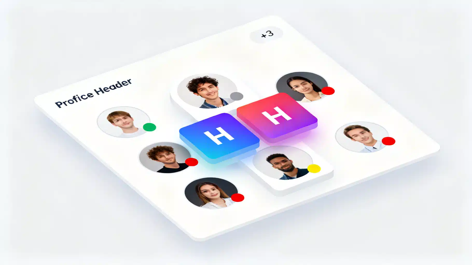
Build a Production‑Ready React Avatar User Profile Component
Build an accessible, flexible React avatar component with initials fallback, status badges, groups, and TypeScript—optimized for performance and a11y.
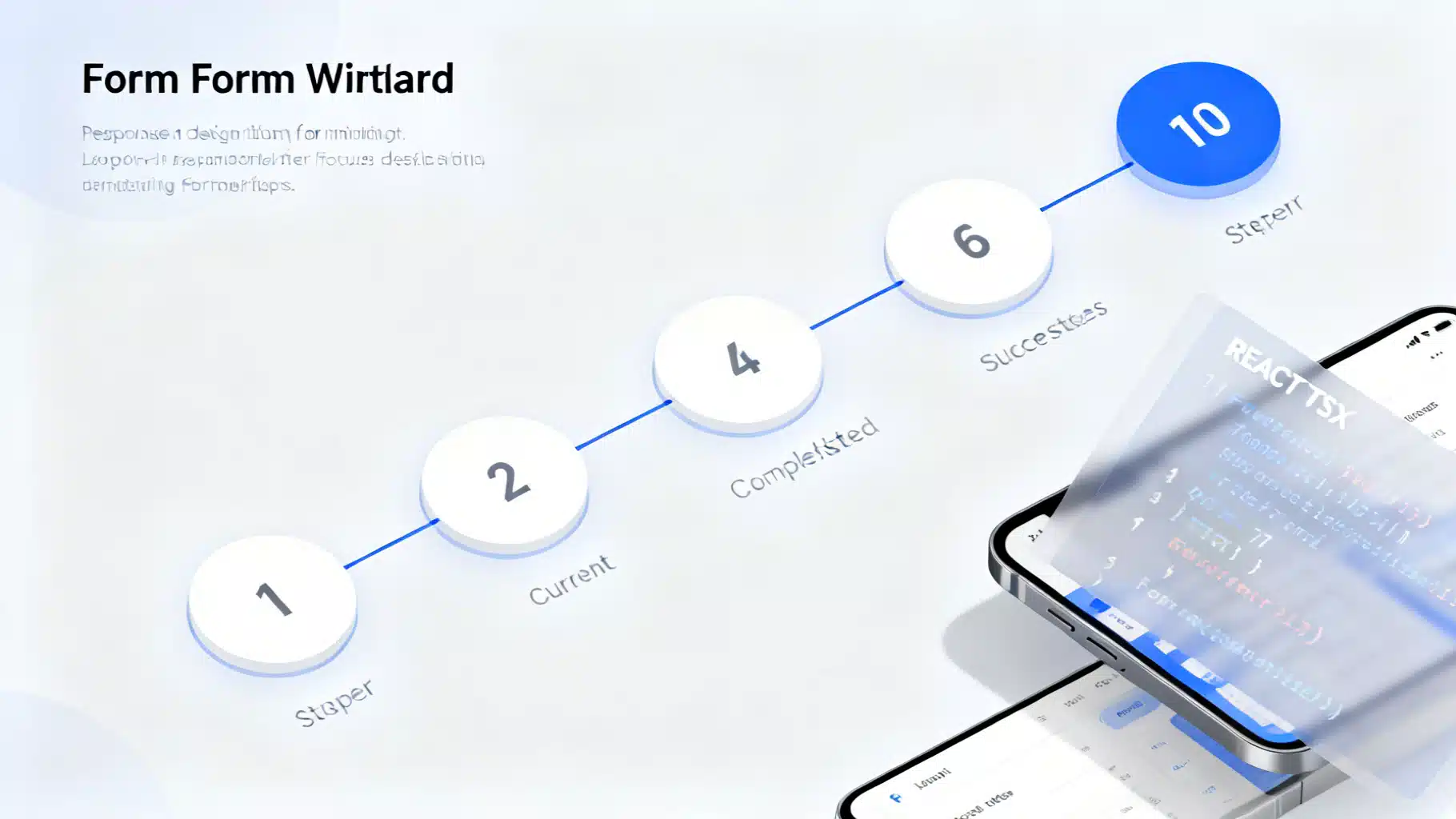
Building a Robust React Stepper Wizard in React: Headless, Accessible, and Validated
Build an accessible, headless React stepper wizard with validation, routing, and React Hook Form integration—complete with code you can reuse.
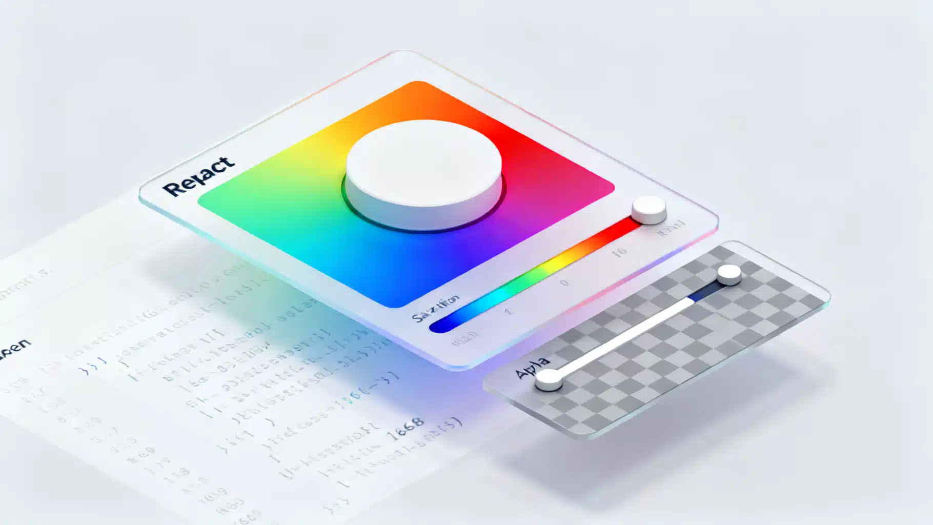
Build an Accessible React Color Picker: A Practical Guide
Build a fast, accessible React color picker from scratch: HSV logic, sliders, popover, keyboard/mouse support, CSS variables, tests, and library options.