Build a Production‑Ready React Avatar User Profile Component
Build an accessible, flexible React avatar component with initials fallback, status badges, groups, and TypeScript—optimized for performance and a11y.
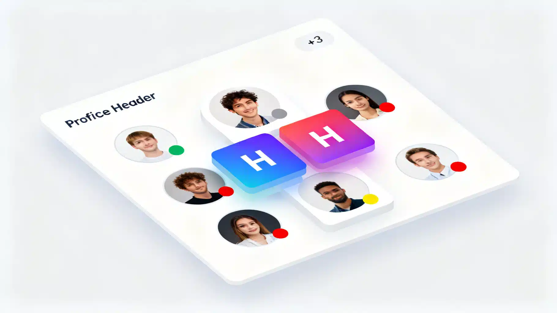
Image used for representation purposes only.
Overview
A reliable avatar component is one of the building blocks of any product that displays user identity—dashboards, chats, comments, or contact lists. In this article, you’ll build a production-grade React avatar user profile component with:
- Image with graceful fallback to initials
- Name‑based color generation
- Configurable sizes and shapes
- Presence/status badges
- Group/stacked avatars with overflow counter
- Accessibility and performance baked in
- TypeScript types and minimal, theme‑friendly CSS
We’ll also cover common pitfalls, testing tips, and integration notes for frameworks like Next.js.
Goals and design principles
- Accessible by default: meaningful alt text, color contrast, and screen reader labels.
- Predictable layout: fixed dimensions prevent layout shift (CLS).
- Flexible API: props for size, shape, status, borders, and className.
- Resilient fallbacks: initials when the image fails to load.
- Theming: light CSS footprint using variables you can wire to your design tokens.
Component API
Props you’ll support:
- src?: string – image URL
- alt?: string – descriptive text for the photo
- name?: string – used for initials and deterministic colors
- size?: ‘xs’ | ‘sm’ | ‘md’ | ’lg’ | ‘xl’ | number – token or px value
- shape?: ‘circle’ | ‘rounded’ | ‘square’
- status?: ‘online’ | ‘offline’ | ‘away’ | ‘busy’
- bordered?: boolean – ring/border around the avatar
- className?: string – additional container classes
- fallback?: React.ReactNode – custom fallback content
Implementation (TypeScript + minimal CSS)
Below is a concise, framework‑agnostic implementation. Adjust styles or tokens to match your system.
// Avatar.tsx
import React, { useMemo, useState } from 'react';

export type AvatarSize = 'xs' | 'sm' | 'md' | 'lg' | 'xl' | number;
export type AvatarShape = 'circle' | 'rounded' | 'square';
export type AvatarStatus = 'online' | 'offline' | 'away' | 'busy';

const SIZE_MAP: Record<Exclude<AvatarSize, number>, number> = {
  xs: 24,
  sm: 32,
  md: 40,
  lg: 56,
  xl: 72,
};

function sizeToPx(size: AvatarSize = 'md') {
  return typeof size === 'number' ? size : SIZE_MAP[size];
}

function initialsFromName(name?: string) {
  if (!name) return '';
  const [a = '', b = ''] = name.trim().split(/\s+/);
  return (a[0] || '').toUpperCase() + (b[0] || '').toUpperCase();
}

function hashStringToHsl(input?: string) {
  if (!input) return 'hsl(210 20% 90%)';
  let h = 0;
  for (let i = 0; i < input.length; i++) h = (h << 5) - h + input.charCodeAt(i);
  const hue = Math.abs(h) % 360;
  return `hsl(${hue} 60% 40%)`;
}

function readableTextColor(bg: string) {
  // crude contrast heuristic: pick white for darker backgrounds
  // You can replace with a proper relative luminance calculation.
  return bg.includes('40%') || bg.includes('30%') ? '#fff' : '#0f172a';
}

export interface AvatarProps {
  src?: string;
  alt?: string;
  name?: string;
  size?: AvatarSize;
  shape?: AvatarShape;
  status?: AvatarStatus;
  bordered?: boolean;
  className?: string;
  fallback?: React.ReactNode;
}

export const Avatar: React.FC<AvatarProps> = ({
  src,
  alt,
  name,
  size = 'md',
  shape = 'circle',
  status,
  bordered,
  className,
  fallback,
}) => {
  const [imgError, setImgError] = useState(false);
  const dimension = sizeToPx(size);
  const showImage = !!src && !imgError;

  const bg = useMemo(() => hashStringToHsl(name), [name]);
  const fg = useMemo(() => readableTextColor(bg), [bg]);
  const initials = useMemo(() => initialsFromName(name), [name]);

  const ariaLabel = alt ?? (name ? `${name} avatar` : 'User avatar');

  return (
    <div
      className={[
        'avatar',
        `avatar--${shape}`,
        bordered ? 'avatar--bordered' : '',
        className || '',
      ].join(' ')}
      role="img"
      aria-label={ariaLabel}
      style={{
        width: dimension,
        height: dimension,
        // Expose size to CSS via a variable for badges/overlap math
        // and allow background on fallback.
        // @ts-ignore - CSS var not in type map
        '--avatar-size': `${dimension}px`,
        background: showImage ? undefined : bg,
        color: showImage ? undefined : fg,
      }}
    >
      {showImage ? (
        <img
          src={src}
          alt={alt ?? name ?? ''}
          width={dimension}
          height={dimension}
          loading="lazy"
          decoding="async"
          fetchPriority="low"
          onError={() => setImgError(true)}
        />
      ) : fallback ? (
        fallback
      ) : (
        <span className="avatar__initials" aria-hidden>
          {initials || '👤'}
        </span>
      )}

      {status && (
        <span className={[
          'avatar__status',
          `avatar__status--${status}`,
        ].join(' ')} aria-hidden />
      )}
    </div>
  );
};
/* avatar.css */
.avatar {
  position: relative;
  display: inline-flex;
  align-items: center;
  justify-content: center;
  overflow: hidden;
  background: hsl(210 20% 90%);
  color: #0f172a;
  font: 500 0.9rem/1 system-ui, -apple-system, Segoe UI, Roboto, Helvetica, Arial;
  user-select: none;
}
.avatar img {
  width: 100%;
  height: 100%;
  object-fit: cover;
  display: block;
}
.avatar--circle { border-radius: 9999px; }
.avatar--rounded { border-radius: 12px; }
.avatar--square  { border-radius: 4px; }

.avatar--bordered { box-shadow: 0 0 0 2px var(--avatar-border, #fff); }

.avatar__initials { letter-spacing: 0.02em; font-size: clamp(10px, calc(var(--avatar-size) * 0.38), 22px); }

.avatar__status {
  position: absolute;
  right: 0; bottom: 0;
  width: calc(var(--avatar-size) * 0.32);
  height: calc(var(--avatar-size) * 0.32);
  min-width: 10px; min-height: 10px;
  border-radius: 9999px;
  box-shadow: 0 0 0 2px var(--avatar-border, #fff);
}
.avatar__status--online { background: #22c55e; }
.avatar__status--offline { background: #94a3b8; }
.avatar__status--away { background: #f59e0b; }
.avatar__status--busy { background: #ef4444; }
Usage examples
import { Avatar } from './Avatar';
import './avatar.css';

export function Example() {
  return (
    <div style={{ display: 'grid', gap: 16, alignItems: 'center' }}>
      <Avatar name="Amelia Earhart" src="/users/amelia.jpg" alt="Amelia Earhart" status="online" />
      <Avatar name="Ada Lovelace" size="lg" shape="rounded" bordered />
      <Avatar name="Mehdi Farouk" size={56} shape="square" status="away" />
      <Avatar size="sm" alt="Service account" fallback={<span>SA</span>} />
    </div>
  );
}
Stacked/group avatars with overflow
Groups are common in conversations, project members, and shared resources. Here’s a lightweight group wrapper that overlaps children and adds a “+N” counter when the group exceeds a limit.
// AvatarGroup.tsx
import React from 'react';

interface AvatarGroupProps {
  children: React.ReactNode;
  max?: number; // max visible avatars
  overlap?: number; // px overlap
  direction?: 'ltr' | 'rtl';
}

export const AvatarGroup: React.FC<AvatarGroupProps> = ({
  children,
  max = 5,
  overlap = 8,
  direction = 'ltr',
}) => {
  const items = React.Children.toArray(children);
  const visible = items.slice(0, max);
  const hiddenCount = Math.max(0, items.length - max);

  return (
    <div className="avatar-group" style={{ direction }}>
      {visible.map((child, i) => (
        <div key={i} className="avatar-group__item" style={{ marginInlineStart: i === 0 ? 0 : -overlap }}>
          {child}
        </div>
      ))}
      {hiddenCount > 0 && (
        <div className="avatar avatar--circle avatar--bordered avatar-group__more" aria-label={`${hiddenCount} more`}>
          +{hiddenCount}
        </div>
      )}
    </div>
  );
};
/* avatar-group.css */
.avatar-group { display: inline-flex; align-items: center; }
.avatar-group__item { position: relative; }
.avatar-group .avatar { box-shadow: 0 0 0 2px var(--group-bg, #fff); }
.avatar-group__more {
  width: var(--avatar-size, 40px);
  height: var(--avatar-size, 40px);
  background: #e2e8f0; color: #0f172a;
  display: inline-flex; align-items: center; justify-content: center;
  font-size: clamp(10px, calc(var(--avatar-size) * 0.35), 18px);
}
Usage:
import { Avatar } from './Avatar';
import { AvatarGroup } from './AvatarGroup';
import './avatar.css';
import './avatar-group.css';

export function Team() {
  return (
    <AvatarGroup max={4} overlap={10}>
      <Avatar name="Ana" src="/u/1.jpg" />
      <Avatar name="Brandon" src="/u/2.jpg" />
      <Avatar name="Chao" />
      <Avatar name="Daria" />
      <Avatar name="Evan" />
      <Avatar name="Farah" />
    </AvatarGroup>
  );
}
Accessibility checklist
- Provide alt whenever you display a real photo. If the avatar is purely decorative (e.g., duplicate of a nearby name), use an empty alt on the img and set aria-hidden on the container.
- Ensure sufficient contrast for initials; the hash‑generated background should pair with a readable text color. Consider WCAG AA for small text.
- Keep status indicators non‑semantic (aria-hidden) and expose presence via text elsewhere for assistive tech users.
- Maintain focus styles if avatars are interactive (e.g., clickable to open a profile). Add role=“button” and keyboard handlers if needed.
Performance and quality tips
- Specify width and height on the
to avoid layout shift and enable browser pre‑allocation.
- Use loading=“lazy”, decoding=“async”, and set fetchPriority appropriately (e.g., “high” for above‑the‑fold user chips, “low” in lists).
- Serve appropriately sized images (e.g., 2x DPR) and WebP/AVIF if available.
- Cache avatars with long max‑age; update when users change photos by fingerprinting URLs.
- Consider a blurred preview if images are large; keep the initials visible until the image onload fires for a quick paint.
Extending the component
- Tooltip/label: show the full user name on hover/focus.
- Upload + preview: integrate file input and display a temporary data URL in src before persisting.
- Skeletons: render a pulsing gray circle while fetching src; then transition to the image.
- Badges: add verified, role, or tenant badges using an additional corner slot.
- Theming: wire CSS vars (e.g., –avatar-border, –group-bg) to your design tokens for light/dark.
Common pitfalls to avoid
- Missing alt text. Always pass meaningful alt for real photos.
- Unstable layout in lists. Fix dimensions and avoid content jumps.
- Excessive box-shadow borders in groups. Use a solid ring (2px) to keep edges crisp on any background.
- Over-reliance on color for status. Also show textual presence nearby.
- Non-deterministic colors. Hash the name to avoid jarring color changes between renders.
Testing the avatar (React Testing Library)
import { render, screen } from '@testing-library/react';
import { Avatar } from './Avatar';

test('renders initials when image fails', () => {
  const { container } = render(<Avatar name="Ada Lovelace" src="/bad.jpg" />);
  const img = container.querySelector('img')!;
  img.dispatchEvent(new Event('error'));
  expect(screen.getByText('AL')).toBeInTheDocument();
});

test('applies alt text for screen readers', () => {
  render(<Avatar name="Grace Hopper" alt="Photo of Grace Hopper" src="/grace.jpg" />);
  expect(screen.getByRole('img', { name: /grace hopper/i })).toBeInTheDocument();
});
Next.js integration notes
- Prefer next/image for automatic optimization. Map the size prop to width/height and set style={{ objectFit: ‘cover’ }}.
- When using next/image, preserve the container’s border radius via className and set the image to fill.
Example snippet:
import Image from 'next/image';

// inside Avatar component, replace <img /> when using Next.js
<Image
  src={src!}
  alt={alt ?? name ?? ''}
  width={dimension}
  height={dimension}
  priority={false}
  style={{ objectFit: 'cover' }}
/>
Wrapping up
The avatar may look simple, yet it touches accessibility, performance, and design consistency across your app. With a handful of props, deterministic styling, and resilient fallbacks, you now have an avatar component ready for real‑world use—and a flexible foundation for groups, presence, and richer profile experiences.
Related Posts

Building an Accessible React Popover and Tooltip Component
Build accessible, high-performance React tooltip and popover components with Floating UI. Includes TypeScript examples, a11y guidance, and testing tips.

Building a Robust React Stepper Wizard in React: Headless, Accessible, and Validated
Build an accessible, headless React stepper wizard with validation, routing, and React Hook Form integration—complete with code you can reuse.
Build an Accessible React Color Picker: A Practical Guide
Build a fast, accessible React color picker from scratch: HSV logic, sliders, popover, keyboard/mouse support, CSS variables, tests, and library options.