Building an Accessible, Reusable React Progress Indicator (Linear and Circular)
Build an accessible, themeable React progress indicator (linear and circular) with TypeScript, complete code, a11y, performance tips, theming, and tests.
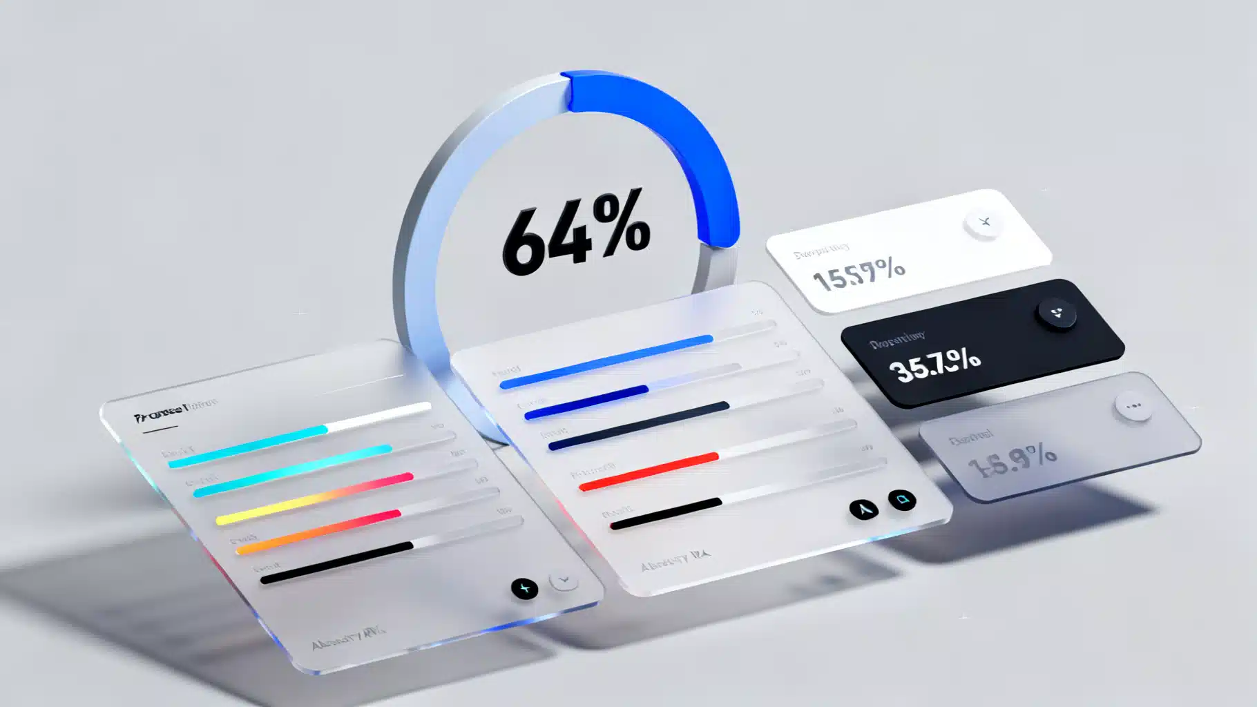
Image used for representation purposes only.
Overview
Progress indicators communicate that the UI is working on something. In React, a well‑designed progress component should be accessible, themeable, and flexible enough to cover both linear (bar) and circular (spinner/arc) patterns, in determinate (known progress) and indeterminate (unknown progress) modes.
This article walks you through designing and implementing a reusable React Progress component with TypeScript, covering accessibility, styling, performance, testing, and real‑world usage.
UX patterns you need to support
- Determinate: The system knows how much work is left (e.g., “64% uploaded”). Visuals should map a value to a filled portion.
- Indeterminate: The duration is unknown (e.g., fetching data). Visuals convey “in progress” without a specific percentage.
- Linear vs. Circular: Linear bars are ideal for lists and forms; circular works well inside buttons, cards, or overlays.
- Labeling: Optional inline text like “64%” or “Uploading file…”. Provide a formatter for localization.
API design
We’ll build a single Progress component that renders either a linear bar or a circular arc based on a variant prop.
Recommended props:
- value?: number — current value (0..max). Omit when indeterminate.
- max?: number — upper bound, default 100.
- indeterminate?: boolean — toggles unknown state.
- variant?: ’linear’ | ‘circular’ — default ’linear’.
- size?: number | string — linear height or circular diameter.
- thickness?: number — stroke width (circular) or bar thickness override.
- color?: string, trackColor?: string — themeable colors.
- rounded?: boolean — pill corners.
- showLabel?: boolean, label?: string — text near the indicator.
- valueLabel?: (value, max) => string — i18n/formatting hook.
- striped?: boolean, animated?: boolean — visual options.
- Standard aria-* and className/style passthrough.
Accessibility checklist
- role=“progressbar” on the root.
- aria-valuemin=“0” and aria-valuemax set to max.
- aria-valuenow only when determinate.
- aria-valuetext or visible label for screen readers (use label or valueLabel).
- aria-busy to signal ongoing work (true when indeterminate or value < max).
- Respect reduced motion with prefers-reduced-motion.
- Ensure color contrast for track vs. fill.
Implementation (TypeScript + CSS variables)
Below is a complete, copy‑pasteable implementation that covers both variants.
// Progress.tsx
import React, { forwardRef } from 'react';

type ProgressVariant = 'linear' | 'circular';

export interface ProgressProps extends React.HTMLAttributes<HTMLDivElement> {
  value?: number;
  max?: number;
  indeterminate?: boolean;
  variant?: ProgressVariant;
  size?: number | string; // linear height or circular diameter
  thickness?: number; // for circular stroke width; optional for linear override
  color?: string;
  trackColor?: string;
  rounded?: boolean;
  showLabel?: boolean;
  label?: string;
  valueLabel?: (value: number, max: number) => string;
  striped?: boolean;
  animated?: boolean;
}

const clamp = (n: number, min: number, max: number) => Math.min(max, Math.max(min, n));

export const Progress = forwardRef<HTMLDivElement, ProgressProps>(function Progress(
  props,
  ref
) {
  const {
    value,
    max = 100,
    indeterminate = false,
    variant = 'linear',
    size = variant === 'circular' ? 48 : 8,
    thickness,
    color = 'var(--accent-9, #3b82f6)', // blue-500 fallback
    trackColor = 'var(--gray-3, #e5e7eb)', // gray-200 fallback
    rounded = true,
    showLabel = false,
    label,
    valueLabel,
    striped = false,
    animated = true,
    style,
    className,
    'aria-label': ariaLabel,
    'aria-labelledby': ariaLabelledby,
    ...rest
  } = props;

  const clamped = typeof value === 'number' ? clamp(value, 0, max) : undefined;
  const pct = typeof clamped === 'number' ? (clamped / max) * 100 : undefined;

  const ariaProps: React.AriaAttributes & React.HTMLAttributes<HTMLDivElement> = {
    role: 'progressbar',
    'aria-valuemin': 0,
    'aria-valuemax': max,
    'aria-busy': indeterminate || (typeof clamped === 'number' ? clamped < max : true),
  };

  if (!indeterminate && typeof clamped === 'number') {
    ariaProps['aria-valuenow'] = Math.round(clamped);
    ariaProps['aria-valuetext'] = label ?? (valueLabel ? valueLabel(clamped, max) : `${Math.round(pct!)}%`);
  }
  if (ariaLabel) ariaProps['aria-label'] = ariaLabel;
  if (ariaLabelledby) ariaProps['aria-labelledby'] = ariaLabelledby;

  const rootStyle: React.CSSProperties = {
    ...style,
    // theme tokens
    ['--pg-color' as any]: color,
    ['--pg-track' as any]: trackColor,
    ['--pg-size' as any]: typeof size === 'number' ? `${size}px` : size,
    ['--pg-thickness' as any]: thickness ? `${thickness}px` : undefined,
    ['--pg-radius' as any]: rounded ? '999px' : '0px',
    ['--pg-value' as any]: pct != null ? `${pct}%` : '0%'
  };

  return (
    <div
      ref={ref}
      className={[
        'progress',
        `progress--${variant}`,
        indeterminate ? 'is-indeterminate' : '',
        className
      ]
        .filter(Boolean)
        .join(' ')}
      style={rootStyle}
      {...ariaProps}
      {...rest}
    >
      {variant === 'linear' && (
        <div className="progress__linear">
          <div className="progress__track" />
          <div
            className={['progress__bar', indeterminate ? 'is-indeterminate' : ''].join(' ')}
            style={{ width: indeterminate ? undefined : 'var(--pg-value)' }}
          />
        </div>
      )}

      {variant === 'circular' && (
        <svg
          className={['progress__svg', indeterminate ? 'is-indeterminate' : ''].join(' ')}
          width="var(--pg-size)"
          height="var(--pg-size)"
          viewBox="0 0 100 100"
          aria-hidden="true"
          focusable="false"
        >
          {/* Track */}
          <circle
            className="progress__circle-track"
            cx="50"
            cy="50"
            r="45"
            pathLength="100"
          />
          {/* Arc */}
          <circle
            className={[
              'progress__circle',
              indeterminate ? 'is-indeterminate' : ''
            ].join(' ')}
            cx="50"
            cy="50"
            r="45"
            pathLength="100"
            strokeDasharray="100"
            strokeDashoffset={indeterminate ? undefined : 100 - (pct ?? 0)}
          />
        </svg>
      )}

      {showLabel && (
        <span className="progress__label">
          {label ?? (indeterminate ? 'Loading…' : `${Math.round(pct ?? 0)}%`)}
        </span>
      )}
    </div>
  );
});

export default Progress;
Add minimal CSS. You can drop this into a global stylesheet or a CSS Module (rename classes if needed).
/* progress.css */
.progress { display: inline-grid; gap: 0.5rem; align-items: center; }
.progress__label { font-size: 0.875rem; color: var(--text-2, #374151); }

/* Linear */
.progress--linear { width: 100%; }
.progress__linear { position: relative; width: 100%; height: var(--pg-size, 8px); }
.progress__track { position: absolute; inset: 0; background: var(--pg-track); border-radius: var(--pg-radius, 0); overflow: hidden; }
.progress__bar { position: absolute; inset: 0 auto 0 0; background: var(--pg-color); border-radius: var(--pg-radius, 0); transition: width 200ms ease; }

/* Indeterminate animation for linear */
.progress__bar.is-indeterminate { width: 30%; animation: pg-indeterminate 1.2s infinite; }
@keyframes pg-indeterminate { from { left: -30%; } to { left: 100%; } }

/* Circular */
.progress__svg { width: var(--pg-size, 48px); height: var(--pg-size, 48px); transform: rotate(-90deg); }
.progress__circle-track { fill: none; stroke: var(--pg-track); stroke-width: var(--pg-thickness, 4px); }
.progress__circle { fill: none; stroke: var(--pg-color); stroke-width: var(--pg-thickness, 4px); stroke-linecap: round; transition: stroke-dashoffset 200ms ease; }

/* Indeterminate animation for circular (dash oscillation) */
.progress__circle.is-indeterminate { animation: pg-dash 1.5s ease-in-out infinite; stroke-dasharray: 60 40; }
@keyframes pg-dash { 0% { stroke-dashoffset: 100; } 50% { stroke-dashoffset: 25; } 100% { stroke-dashoffset: 100; } }

/* Respect reduced motion */
@media (prefers-reduced-motion: reduce) {
  .progress__bar, .progress__circle { transition: none; animation: none !important; }
}
Usage examples:
// 1) Determinate linear
<Progress value={64} aria-label="Upload progress" />

// 2) Indeterminate linear
<Progress indeterminate aria-label="Loading data" />

// 3) Circular with label
<Progress variant="circular" value={32} showLabel size={64} thickness={6} />

// 4) Inside a button
<button disabled={isSubmitting} className="btn">
  {isSubmitting ? (
    <Progress
      variant="circular"
      indeterminate
      size={16}
      thickness={3}
      aria-label="Submitting"
      style={{ verticalAlign: 'middle' }}
    />
  ) : (
    'Submit'
  )}
</button>

// 5) Custom theming per instance
<Progress value={45} color="#10b981" trackColor="#e6f9f2" />

// 6) i18n label formatting
<Progress
  value={73}
  showLabel
  valueLabel={(v, m) => `${Math.round((v / m) * 100)} de 100`}
/>
Theming and design tokens
- CSS variables let you map to a design system: –accent-9 for fill, –gray-3 for track.
- For Tailwind, pass utility‑generated colors into color/trackColor.
- With styled-components or Emotion, wrap Progress and inject theme values via props or a theme provider.
- To use gradients on linear bars, set color to a CSS gradient and add background-clip: padding-box on .progress__bar if needed. For circular gradients you’ll need an SVG
gradient and stroke=url(#id).
Performance tips
- Avoid setting value on every tiny tick; throttle to requestAnimationFrame when streaming progress events.
- Keep animations GPU‑friendly (translate/opacity, not expensive layout operations). The provided CSS does not trigger layout thrash.
- The component is fully controlled and side‑effect free; if you push frequent updates, memoize parents to prevent unrelated re‑renders.
- For very large lists, virtualize rows; progress instances are cheap but DOM count isn’t.
Throttle example when reading upload progress:
function useRafThrottle<T>(value: T) {
  const [v, setV] = React.useState(value);
  const lastRef = React.useRef<number | null>(null);
  React.useEffect(() => {
    const id = requestAnimationFrame(() => setV(value));
    if (lastRef.current != null) cancelAnimationFrame(lastRef.current);
    lastRef.current = id;
    return () => cancelAnimationFrame(id);
  }, [value]);
  return v;
}

const throttled = useRafThrottle(progressValue);
<Progress value={throttled} />;
React 18 integrations
- useTransition: show an indeterminate progress while a low‑priority state update is pending.
const [isPending, startTransition] = React.useTransition();

<button
  onClick={() => startTransition(() => setFilters(next))}
>
  Apply filters
</button>
{isPending && <Progress indeterminate aria-label="Applying filters" />}
- Suspense: use the progress as a fallback.
<Suspense fallback={<Progress indeterminate aria-label="Loading dashboard" showLabel /> }>
  <Dashboard />
</Suspense>
Testing the component
Use React Testing Library to verify ARIA behavior and rendering.
// Progress.test.tsx
import { render, screen } from '@testing-library/react';
import { Progress } from './Progress';

test('announces determinate value', () => {
  render(<Progress value={42} aria-label="Download" />);
  const bar = screen.getByRole('progressbar', { name: /download/i });
  expect(bar).toHaveAttribute('aria-valuenow', '42');
  expect(bar).toHaveAttribute('aria-valuemin', '0');
  expect(bar).toHaveAttribute('aria-valuemax', '100');
});

test('omits aria-valuenow when indeterminate', () => {
  render(<Progress indeterminate aria-label="Loading" />);
  const bar = screen.getByRole('progressbar', { name: /loading/i });
  expect(bar).not.toHaveAttribute('aria-valuenow');
  expect(bar).toHaveAttribute('aria-busy', 'true');
});
Common pitfalls and how to avoid them
- Forgetting aria-valuenow on determinate bars: add it only when value is defined.
- Missing labels: set aria-label or aria-labelledby, or showLabel.
- Percent math drift: clamp value between 0 and max. Round displayed labels to avoid flicker.
- Too much motion: gate animations behind prefers-reduced-motion and an animated prop.
- Low contrast: ensure at least 3:1 contrast for the filled portion against the track.
- SSR hydration warnings from random animation starts: prefer pure CSS animations without JS timers; avoid inline random values.
Extending the component
- Buffer/secondary value: add a secondary track (e.g., for streaming media buffers).
- States: success (green), error (red) variants based on completion or failure.
- Tooltips: show exact bytes transferred using an external tooltip component.
- Composability: expose subcomponents like <Progress.Root>, <Progress.Track>, <Progress.Indicator> if you prefer a headless approach.
Ecosystem notes
If you don’t need full control, mature libraries provide battle‑tested progress indicators: component suites like Material UI, Radix Primitives, or Headless UI pair nicely with a design system. The pattern above remains useful when you need a tiny, dependency‑free, themeable primitive that fits your tokens and accessibility rules.
Wrap‑up
You now have an accessible, themeable Progress component for React that supports both linear and circular variants, determinate and indeterminate states, reduced motion, and rich labeling. Drop it into your app, wire it to real progress signals, and extend as your product needs grow.
Related Posts

Building an Accessible, Animated React Accordion (Headless, Tested, and Themeable)
Build an accessible, animated React accordion: ARIA semantics, keyboard support, headless API, smooth height transitions, tests, and performance tips.
Building a High-Performance React Virtualized Tree View
A practical guide to designing and implementing a fast, accessible React virtualized tree view with lazy loading, keyboard support, and drag‑and‑drop.

Building an Accessible React Combobox in React (Select/Autocomplete) the Right Way
Build a production-ready, accessible React combobox/select with correct ARIA, keyboard support, async data, virtualization, and testing tips.