Flutter Custom Theme System: The Complete, Scalable M3 Guide
Build a scalable custom theme system in Flutter with Material 3: tokens, ColorScheme, extensions, light/dark modes, component overrides, and tests.
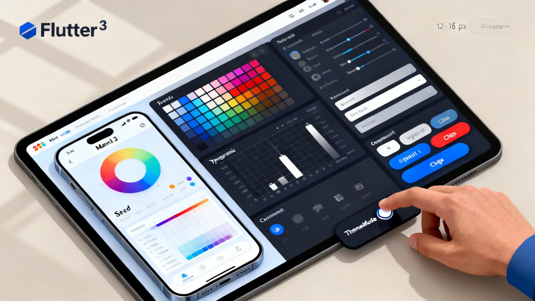
Image used for representation purposes only.
Overview
Flutter makes theme customization easy, but shipping a robust, scalable theme system takes more than flipping a few colors. In this guide, you’ll architect a token‑driven, Material 3–ready theming setup that supports light/dark modes, brand surfaces, component overrides, custom tokens (spacing, radii, shadows), runtime switching, and testability—without turning ThemeData into a 1,000‑line blob.
Goals and principles
- Token first: define brand primitives once, map them into Material’s ColorScheme and TextTheme.
- Single source of truth: centralize ThemeData creation to avoid drift.
- Extensible: use ThemeExtensions for non‑Material tokens (e.g., spacing, elevation, radii).
- Accessible: respect contrast, shape, and motion; test with goldens.
- Maintainable: small, composable files and clear naming.
What makes up a Flutter theme?
- ColorScheme: the canonical set of Material color roles (primary, onPrimary, surface, etc.).
- Typography: TextTheme and font families, sizes, and weights.
- Shape: corner radii and component shapes.
- Component themes: per‑widget defaults (buttons, inputs, chips, app bars, etc.).
- ThemeExtensions: your custom tokens (spacing scale, brand shadows, semantic colors).
Suggested project structure
Create a clear hierarchy under lib/theme/:
lib/
  theme/
    tokens/
      colors.dart         // seed colors, brand palette, semantic roles
      typography.dart     // font families, sizes, weights
      spacing.dart        // spacing scale
    extensions.dart       // ThemeExtensions like Spacing, Radii, Shadows
    schemes.dart          // light/dark ColorScheme factories
    components.dart       // component-level ThemeData overrides
    app_theme.dart        // public factory that builds ThemeData
    theme_controller.dart // runtime toggling of ThemeMode
This split keeps tokens/roles separate from component styling and runtime concerns.
Define design tokens
Start with design primitives that don’t depend on Flutter’s classes. These are stable, brand‑owned values.
// lib/theme/tokens/colors.dart
import 'package:flutter/material.dart';

class BrandColors {
  // Seed colors (Material 3 tonal palettes work well with fromSeed)
  static const Color seed = Color(0xFF4455EE);
  static const Color neutral = Color(0xFF191C1E);

  // Optional semantic roles (non-Material)
  static const Color success = Color(0xFF1DB954);
  static const Color warning = Color(0xFFF59E0B);
  static const Color danger  = Color(0xFFDC2626);
}
// lib/theme/tokens/typography.dart
import 'package:flutter/material.dart';

class BrandTypography {
  static const String displayFont = 'Inter';
  static const String bodyFont = 'Inter';

  static TextTheme textTheme = const TextTheme(
    displayLarge: TextStyle(fontWeight: FontWeight.w700, letterSpacing: -0.5),
    displayMedium: TextStyle(fontWeight: FontWeight.w700, letterSpacing: -0.25),
    titleLarge: TextStyle(fontWeight: FontWeight.w600),
    titleMedium: TextStyle(fontWeight: FontWeight.w600),
    bodyLarge: TextStyle(fontWeight: FontWeight.w400),
    bodyMedium: TextStyle(fontWeight: FontWeight.w400),
    labelLarge: TextStyle(fontWeight: FontWeight.w600),
  ).apply(fontFamily: bodyFont);
}
// lib/theme/tokens/spacing.dart
class SpacingScale {
  // 8pt base scale
  final double xs; // 4
  final double sm; // 8
  final double md; // 12
  final double lg; // 16
  final double xl; // 24
  final double xxl; // 32

  const SpacingScale({
    this.xs = 4,
    this.sm = 8,
    this.md = 12,
    this.lg = 16,
    this.xl = 24,
    this.xxl = 32,
  });
}
ThemeExtensions: carry non‑Material tokens
ThemeExtensions let you attach arbitrary, strongly typed tokens to the theme and access them via Theme.of(context).extension
// lib/theme/extensions.dart
import 'package:flutter/material.dart';
import 'tokens/spacing.dart';

@immutable
class Spacing extends ThemeExtension<Spacing> {
  final SpacingScale scale;
  const Spacing(this.scale);

  @override
  Spacing copyWith({SpacingScale? scale}) => Spacing(scale ?? this.scale);

  @override
  ThemeExtension<Spacing> lerp(ThemeExtension<Spacing>? other, double t) {
    if (other is! Spacing) return this;
    return Spacing(SpacingScale(
      xs: lerpDouble(scale.xs, other.scale.xs, t)!,
      sm: lerpDouble(scale.sm, other.scale.sm, t)!,
      md: lerpDouble(scale.md, other.scale.md, t)!,
      lg: lerpDouble(scale.lg, other.scale.lg, t)!,
      xl: lerpDouble(scale.xl, other.scale.xl, t)!,
      xxl: lerpDouble(scale.xxl, other.scale.xxl, t)!,
    ));
  }
}

double? lerpDouble(num a, num b, double t) => a + (b - a) * t;

@immutable
class Radii extends ThemeExtension<Radii> {
  final double sm; // 8
  final double md; // 12
  final double lg; // 16
  const Radii({this.sm = 8, this.md = 12, this.lg = 16});

  @override
  Radii copyWith({double? sm, double? md, double? lg}) =>
      Radii(sm: sm ?? this.sm, md: md ?? this.md, lg: lg ?? this.lg);

  @override
  ThemeExtension<Radii> lerp(ThemeExtension<Radii>? other, double t) {
    if (other is! Radii) return this;
    return Radii(
      sm: lerpDouble(this.sm, other.sm, t)!,
      md: lerpDouble(this.md, other.md, t)!,
      lg: lerpDouble(this.lg, other.lg, t)!,
    );
  }
}
Usage in widgets:
final spacing = Theme.of(context).extension<Spacing>()!.scale;
SizedBox(height: spacing.lg);
Build ColorSchemes (light and dark)
Use Material 3’s tonal palettes via ColorScheme.fromSeed. It ensures cohesive surfaces, variants, and onX roles.
// lib/theme/schemes.dart
import 'package:flutter/material.dart';
import 'tokens/colors.dart';

class AppSchemes {
  static ColorScheme light = ColorScheme.fromSeed(
    seedColor: BrandColors.seed,
    brightness: Brightness.light,
  );

  static ColorScheme dark = ColorScheme.fromSeed(
    seedColor: BrandColors.seed,
    brightness: Brightness.dark,
  );

  // Optional: tweak for brand specifics (e.g., softer surfaces)
  static ColorScheme softenSurfaces(ColorScheme base) => base.copyWith(
    surface: Color.alphaBlend(base.primary.withOpacity(0.02), base.surface),
    surfaceContainerHighest:
        Color.alphaBlend(base.primary.withOpacity(0.04), base.surface),
  );
}
Tip: prefer using ColorScheme roles throughout your UI (e.g., colorScheme.primary) rather than ad‑hoc colors. This keeps contrast and dark mode consistent.
Compose ThemeData cleanly
Centralize ThemeData creation and apply extensions and component themes.
// lib/theme/components.dart
import 'package:flutter/material.dart';

ThemeData componentThemes(ThemeData base) {
  final cs = base.colorScheme;
  return base.copyWith(
    appBarTheme: AppBarTheme(
      backgroundColor: cs.surface,
      foregroundColor: cs.onSurface,
      elevation: 0,
      centerTitle: false,
      surfaceTintColor: cs.surfaceTint,
    ),
    elevatedButtonTheme: ElevatedButtonThemeData(
      style: ElevatedButton.styleFrom(
        backgroundColor: cs.primary,
        foregroundColor: cs.onPrimary,
        minimumSize: const Size(64, 44),
        shape: RoundedRectangleBorder(
          borderRadius: BorderRadius.circular(12),
        ),
      ),
    ),
    filledButtonTheme: FilledButtonThemeData(
      style: FilledButton.styleFrom(
        backgroundColor: cs.secondaryContainer,
        foregroundColor: cs.onSecondaryContainer,
        shape: RoundedRectangleBorder(borderRadius: BorderRadius.circular(12)),
      ),
    ),
    outlinedButtonTheme: OutlinedButtonThemeData(
      style: OutlinedButton.styleFrom(
        foregroundColor: cs.primary,
        side: BorderSide(color: cs.outline),
        shape: RoundedRectangleBorder(borderRadius: BorderRadius.circular(12)),
      ),
    ),
    inputDecorationTheme: InputDecorationTheme(
      filled: true,
      fillColor: cs.surfaceContainerHighest,
      border: OutlineInputBorder(
        borderRadius: BorderRadius.circular(12),
        borderSide: BorderSide(color: cs.outlineVariant),
      ),
      focusedBorder: OutlineInputBorder(
        borderRadius: BorderRadius.circular(12),
        borderSide: BorderSide(color: cs.primary, width: 2),
      ),
      labelStyle: TextStyle(color: cs.onSurfaceVariant),
    ),
    cardTheme: CardTheme(
      color: cs.surface,
      elevation: 0,
      margin: const EdgeInsets.all(0),
      shape: RoundedRectangleBorder(
        borderRadius: BorderRadius.circular(16),
      ),
    ),
    chipTheme: ChipThemeData(
      backgroundColor: cs.surfaceContainerHighest,
      selectedColor: cs.secondaryContainer,
      padding: const EdgeInsets.symmetric(horizontal: 8, vertical: 4),
      shape: StadiumBorder(side: BorderSide(color: cs.outlineVariant)),
      labelStyle: TextStyle(color: cs.onSurface),
    ),
    bottomSheetTheme: BottomSheetThemeData(
      backgroundColor: cs.surface,
      surfaceTintColor: cs.surfaceTint,
      shape: const RoundedRectangleBorder(
        borderRadius: BorderRadius.vertical(top: Radius.circular(28)),
      ),
    ),
    navigationBarTheme: NavigationBarThemeData(
      backgroundColor: cs.surface,
      indicatorColor: cs.secondaryContainer,
      labelTextStyle: MaterialStatePropertyAll(
        TextStyle(color: cs.onSurfaceVariant),
      ),
    ),
  );
}
// lib/theme/app_theme.dart
import 'package:flutter/material.dart';
import 'tokens/typography.dart';
import 'tokens/spacing.dart';
import 'extensions.dart';
import 'schemes.dart';
import 'components.dart';

class AppTheme {
  static ThemeData light() {
    final scheme = AppSchemes.softenSurfaces(AppSchemes.light);
    final base = ThemeData(
      useMaterial3: true,
      colorScheme: scheme,
      textTheme: BrandTypography.textTheme,
      visualDensity: VisualDensity.adaptivePlatformDensity,
      // Global shape defaults can be set via ThemeData.shapeScheme in newer SDKs
    ).copyWith(
      extensions: const <ThemeExtension<dynamic>>[
        Spacing(SpacingScale()),
        Radii(sm: 8, md: 12, lg: 16),
      ],
    );
    return componentThemes(base);
  }

  static ThemeData dark() {
    final scheme = AppSchemes.softenSurfaces(AppSchemes.dark);
    final base = ThemeData(
      useMaterial3: true,
      colorScheme: scheme,
      textTheme: BrandTypography.textTheme,
      visualDensity: VisualDensity.adaptivePlatformDensity,
    ).copyWith(
      extensions: const <ThemeExtension<dynamic>>[
        Spacing(SpacingScale()),
        Radii(sm: 8, md: 12, lg: 16),
      ],
    );
    return componentThemes(base);
  }
}
Runtime switching with ThemeMode
Provide a controller that stores and toggles ThemeMode. You can wire it to Provider, Riverpod, or a simple ValueListenable.
// lib/theme/theme_controller.dart
import 'package:flutter/material.dart';

class ThemeController extends ChangeNotifier {
  ThemeMode _mode = ThemeMode.system;
  ThemeMode get mode => _mode;

  void set(ThemeMode mode) {
    if (_mode == mode) return;
    _mode = mode;
    notifyListeners();
  }

  void toggle() {
    switch (_mode) {
      case ThemeMode.light: set(ThemeMode.dark); break;
      case ThemeMode.dark: set(ThemeMode.light); break;
      case ThemeMode.system: set(ThemeMode.light); break;
    }
  }
}
Use it in your app:
// main.dart
import 'package:flutter/material.dart';
import 'theme/app_theme.dart';
import 'theme/theme_controller.dart';

void main() => runApp(const MyApp());

class MyApp extends StatefulWidget {
  const MyApp({super.key});
  @override
  State<MyApp> createState() => _MyAppState();
}

class _MyAppState extends State<MyApp> {
  final controller = ThemeController();
  @override
  Widget build(BuildContext context) {
    return AnimatedBuilder(
      animation: controller,
      builder: (context, _) => MaterialApp(
        theme: AppTheme.light(),
        darkTheme: AppTheme.dark(),
        themeMode: controller.mode,
        home: Home(controller: controller),
      ),
    );
  }
}

class Home extends StatelessWidget {
  final ThemeController controller;
  const Home({super.key, required this.controller});
  @override
  Widget build(BuildContext context) {
    final cs = Theme.of(context).colorScheme;
    final spacing = Theme.of(context).extension<Spacing>()!.scale;
    return Scaffold(
      appBar: AppBar(title: const Text('Theming Demo')),
      body: Padding(
        padding: EdgeInsets.all(spacing.lg),
        child: Column(
          crossAxisAlignment: CrossAxisAlignment.start,
          children: [
            Text('Primary', style: Theme.of(context).textTheme.titleLarge),
            SizedBox(height: spacing.md),
            Row(children: [
              _Swatch(cs.primary),
              _Swatch(cs.secondary),
              _Swatch(cs.tertiary),
              _Swatch(cs.error),
            ]),
            SizedBox(height: spacing.xl),
            FilledButton(
              onPressed: controller.toggle,
              child: const Text('Toggle theme'),
            ),
          ],
        ),
      ),
    );
  }
}

class _Swatch extends StatelessWidget {
  final Color color;
  const _Swatch(this.color);
  @override
  Widget build(BuildContext context) {
    return Container(
      width: 40, height: 40, margin: const EdgeInsets.only(right: 8),
      decoration: BoxDecoration(
        color: color, borderRadius: BorderRadius.circular(12),
      ),
    );
  }
}
Dynamic color (Android 12+)
If you want the app to adopt the system’s dynamic colors on supported Android devices, add a small integration layer (e.g., using a dynamic color plugin). Blend the dynamic scheme into your ThemeData while falling back to your seed‑based scheme on unsupported platforms. Keep your component themes unchanged—they will automatically use the active ColorScheme.
Applying tokens in widgets
- Colors: prefer Theme.of(context).colorScheme over Theme.of(context).primaryColor.
- Typography: always use Theme.of(context).textTheme.* roles, not hard‑coded sizes.
- Spacing: Theme.of(context).extension
()!.scale to keep layout consistent. - Radii: Theme.of(context).extension
() to shape custom containers.
Tip: Add convenience getters:
extension BuildContextX on BuildContext {
  ColorScheme get colors => Theme.of(this).colorScheme;
  TextTheme get text => Theme.of(this).textTheme;
  SpacingScale get spacing => Theme.of(this).extension<Spacing>()!.scale;
  Radii get radii => Theme.of(this).extension<Radii>()!;
}
Accessibility and contrast
- Use onX colors for text/icons placed on colored surfaces (e.g., onPrimary on top of primary).
- Favor filled inputs with surfaceContainerHighest for better contrast in dark mode.
- Respect the minimum tap size (44×44) and readable text sizes (≥14sp for body text).
- Test contrast with light and dark backgrounds; avoid low‑alpha text on surfaces.
Testing your theme
Golden tests prevent regression as tokens evolve.
// test/golden/theme_buttons_golden_test.dart
import 'package:flutter_test/flutter_test.dart';
import 'package:golden_toolkit/golden_toolkit.dart';
import 'package:your_app/theme/app_theme.dart';
import 'package:flutter/material.dart';

void main() {
  testGoldens('Buttons look correct in light & dark', (tester) async {
    final builder = GoldenBuilder.column()
      ..addScenario('Elevated', ElevatedButton(onPressed: (){}, child: const Text('Go')))
      ..addScenario('Filled', FilledButton(onPressed: (){}, child: const Text('Go')))
      ..addScenario('Outlined', OutlinedButton(onPressed: (){}, child: const Text('Go')));

    await tester.pumpWidgetBuilder(builder.build(), wrapper: materialAppWrapper(theme: AppTheme.light()));
    await screenMatchesGolden(tester, 'buttons_light');

    await tester.pumpWidgetBuilder(builder.build(), wrapper: materialAppWrapper(theme: AppTheme.dark()));
    await screenMatchesGolden(tester, 'buttons_dark');
  });
}
Migration tips (Material 2 → 3)
- Set useMaterial3: true and migrate to ColorScheme usage; stop using primaryColor/primarySwatch.
- Replace ButtonStyleButton.styleFrom calls with component themes (ElevatedButtonThemeData, FilledButtonThemeData, etc.) when you need global defaults.
- Map legacy colors to ColorScheme roles; do not invent new roles unless unavoidable (then use ThemeExtensions).
Common pitfalls and fixes
- Pitfall: hard‑coded colors in widgets. Fix: use ColorScheme roles.
- Pitfall: component themes scattered across files. Fix: centralize in components.dart.
- Pitfall: spacing magic numbers. Fix: use Spacing extension.
- Pitfall: dark mode washed out. Fix: adjust surfaces via alpha blend (see softenSurfaces).
- Pitfall: inconsistent radii. Fix: define Radii extension and reuse.
Performance notes
- Many const widgets reduce rebuild work; prefer const constructors.
- Theme.of(context) lookups are cheap; avoid passing colors as parameters when not necessary.
- Keep ThemeData immutable during a frame; do not rebuild the entire theme for small tweaks—use ThemeExtensions for gradual evolution.
Checklist
- Tokens defined for color, spacing, typography, radii.
- ColorScheme derived from seed (and optionally dynamic color on Android).
- Component themes cover key widgets.
- ThemeExtensions applied and used in widgets.
- ThemeMode switching wired with a controller.
- Golden tests added for critical components.
- Accessibility checked for contrast and sizes.
Conclusion
A strong theme system speeds up development, improves consistency, and keeps your app accessible as it scales. By grounding your Flutter app in tokens, ColorScheme, and ThemeExtensions—and by centralizing all theme logic—you get a future‑proof foundation that is easy to maintain and straightforward to evolve with new brands, features, or platforms.
Related Posts
Flutter CustomScrollView and Slivers: The Complete Guide with Patterns and Code
Master Flutter’s CustomScrollView and slivers with patterns, code, and performance tips to build fast, flexible, sticky, and collapsible scroll UIs.

Flutter barcode scanning with the camera plugin: a production-ready guide
Build a fast, on‑device Flutter barcode scanner using the camera plugin and ML Kit, with code, overlays, performance tips, and platform setup.

Flutter GetX Dependency Injection: A Practical Tutorial
Master GetX dependency injection in Flutter with Bindings, lifetimes, async setup, testing, and best practices—complete with concise code examples.