Flutter Responsive LayoutBuilder: A Practical Guide with Patterns and Code
Build responsive Flutter UIs with LayoutBuilder: breakpoints, grids, adaptive navigation, orientation, and performance tips with practical code.
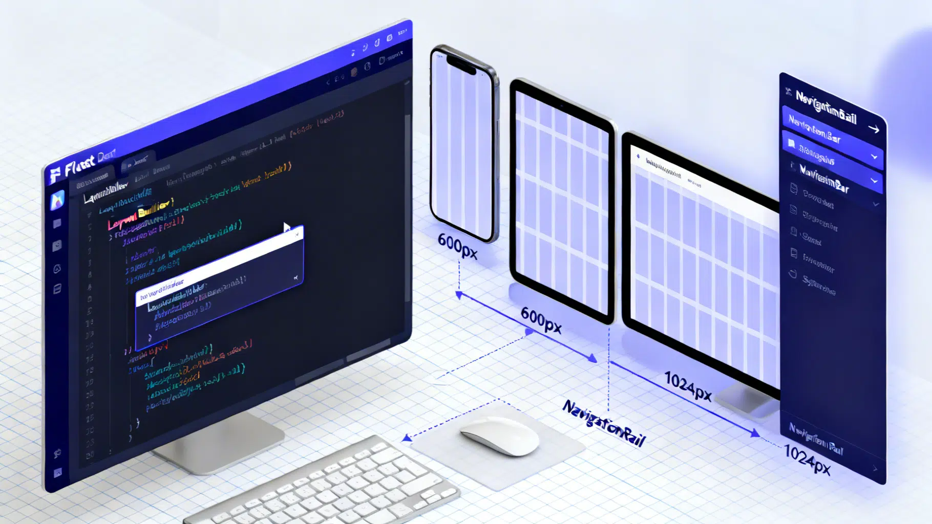
Image used for representation purposes only.
Overview
Designing for phones, tablets, desktops, and the web with one codebase is a core strength of Flutter. The key to making layouts adapt gracefully is understanding constraints and reacting to them at build time. This guide shows how to build robust, responsive UIs with LayoutBuilder, including breakpoints, grids, navigation patterns, orientation handling, and performance tips.
Why LayoutBuilder?
LayoutBuilder gives you the parent’s BoxConstraints for the current widget subtree. That single fact makes it perfect for responsive composition:
- It reacts to the space actually available (not just the full screen size).
- It works inside scrollables, dialogs, side panels, and other nested layouts where MediaQuery might overestimate available width.
In short: use MediaQuery for global context (screen size, padding, text scale), and LayoutBuilder for local, parent-imposed constraints.
Constraints 101 (the mental model)
Flutter’s layout rules:
- Constraints go down: parents tell children how big they can be (min/max width/height).
- Sizes go up: children pick a size that satisfies the constraints.
- Parents set position: the parent decides where to place the child.
LayoutBuilder exposes those constraints via its builder so you can branch your UI cleanly.
Choosing the right tool
- LayoutBuilder: switch UI based on parent width/height.
- MediaQuery: screen size, padding (safe areas), platform brightness, textScaleFactor.
- OrientationBuilder: rotate layouts when orientation changes.
- FittedBox/AspectRatio: scale or preserve ratio for individual elements.
- Flexible/Expanded/FractionallySizedBox: share space in Rows/Columns.
A pragmatic breakpoint strategy
Start with a simple set of width breakpoints and evolve as needed:
- Compact: < 600 px (phones, narrow windows)
- Medium: 600–1023 px (large phones, small tablets, split-screen)
- Expanded: ≥ 1024 px (tablets landscape, desktops, web)
Keep breakpoints in one place so they’re easy to tune.
// breakpoints.dart
const double kCompact = 600;
const double kMedium = 1024;

T responsiveValue<T>({
  required double width,
  required T compact,
  T? medium,
  T? expanded,
}) {
  if (width >= kMedium && expanded != null) return expanded;
  if (width >= kCompact && medium != null) return medium;
  return compact;
}
Example: a responsive scaffold (NavigationBar → NavigationRail → Side panel)
This example swaps navigation patterns and adds a secondary panel on wider screens using LayoutBuilder.
import 'package:flutter/material.dart';
import 'breakpoints.dart';

void main() => runApp(const ResponsiveApp());

class ResponsiveApp extends StatelessWidget {
  const ResponsiveApp({super.key});

  @override
  Widget build(BuildContext context) {
    return MaterialApp(
      debugShowCheckedModeBanner: false,
      theme: ThemeData(useMaterial3: true, colorSchemeSeed: Colors.indigo),
      home: const ResponsiveScaffold(),
    );
  }
}

class ResponsiveScaffold extends StatefulWidget {
  const ResponsiveScaffold({super.key});
  @override
  State<ResponsiveScaffold> createState() => _ResponsiveScaffoldState();
}

class _ResponsiveScaffoldState extends State<ResponsiveScaffold> {
  int _index = 0;

  @override
  Widget build(BuildContext context) {
    return LayoutBuilder(
      builder: (context, constraints) {
        final width = constraints.maxWidth;
        final showRail = width >= kCompact;
        final showSidePanel = width >= kMedium;

        final destinations = const [
          NavigationDestination(icon: Icon(Icons.dashboard_outlined), selectedIcon: Icon(Icons.dashboard), label: 'Overview'),
          NavigationDestination(icon: Icon(Icons.list_alt_outlined), selectedIcon: Icon(Icons.list_alt), label: 'Tasks'),
          NavigationDestination(icon: Icon(Icons.bar_chart_outlined), selectedIcon: Icon(Icons.bar_chart), label: 'Reports'),
        ];

        Widget body = Row(
          children: [
            if (showRail)
              NavigationRail(
                selectedIndex: _index,
                extended: width >= kMedium, // rail extends on larger widths
                labelType: width >= kMedium ? null : NavigationRailLabelType.selected,
                destinations: const [
                  NavigationRailDestination(icon: Icon(Icons.dashboard_outlined), selectedIcon: Icon(Icons.dashboard), label: Text('Overview')),
                  NavigationRailDestination(icon: Icon(Icons.list_alt_outlined), selectedIcon: Icon(Icons.list_alt), label: Text('Tasks')),
                  NavigationRailDestination(icon: Icon(Icons.bar_chart_outlined), selectedIcon: Icon(Icons.bar_chart), label: Text('Reports')),
                ],
                onDestinationSelected: (i) => setState(() => _index = i),
              ),
            Expanded(child: _Body(index: _index)),
            if (showSidePanel)
              SizedBox(
                width: responsiveValue(width: width, compact: 0.0, medium: 280.0, expanded: 360.0),
                child: const _SidePanel(),
              ),
          ],
        );

        return Scaffold(
          appBar: AppBar(title: const Text('Responsive LayoutBuilder Guide')),
          drawer: showRail ? null : Drawer(child: _DrawerList(onSelect: (i) => setState(() => _index = i))),
          body: body,
          bottomNavigationBar: showRail
              ? null
              : NavigationBar(
                  selectedIndex: _index,
                  destinations: destinations,
                  onDestinationSelected: (i) => setState(() => _index = i),
                ),
        );
      },
    );
  }
}

class _Body extends StatelessWidget {
  final int index;
  const _Body({required this.index});

  @override
  Widget build(BuildContext context) {
    return switch (index) {
      0 => const _ResponsiveGrid(),
      1 => const _TasksView(),
      _ => const _ReportsView(),
    };
  }
}

class _DrawerList extends StatelessWidget {
  final ValueChanged<int> onSelect;
  const _DrawerList({required this.onSelect});
  @override
  Widget build(BuildContext context) {
    return ListView(
      children: [
        const DrawerHeader(child: Text('Menu')),
        ListTile(leading: const Icon(Icons.dashboard), title: const Text('Overview'), onTap: () => onSelect(0)),
        ListTile(leading: const Icon(Icons.list_alt), title: const Text('Tasks'), onTap: () => onSelect(1)),
        ListTile(leading: const Icon(Icons.bar_chart), title: const Text('Reports'), onTap: () => onSelect(2)),
      ],
    );
  }
}

class _SidePanel extends StatelessWidget {
  const _SidePanel();
  @override
  Widget build(BuildContext context) {
    return const ColoredBox(
      color: Color(0xFFF5F6FA),
      child: Padding(
        padding: EdgeInsets.all(16),
        child: Text('Contextual panel: filters, details, or chat'),
      ),
    );
  }
}
Responsive grids: fixed count vs max extent
Inside a grid or a scrollable, MediaQuery width can be misleading; use LayoutBuilder or sliver constraints. Prefer SliverGridDelegateWithMaxCrossAxisExtent when you want “as many columns as fit” based on a target tile width.
class _ResponsiveGrid extends StatelessWidget {
  const _ResponsiveGrid();
  @override
  Widget build(BuildContext context) {
    return LayoutBuilder(
      builder: (context, constraints) {
        final width = constraints.maxWidth;
        // Target a comfortable tile width; Flutter will compute the count.
        final itemMaxWidth = width < kCompact ? 220.0 : 260.0;
        return GridView.builder(
          padding: const EdgeInsets.all(16),
          gridDelegate: SliverGridDelegateWithMaxCrossAxisExtent(
            maxCrossAxisExtent: itemMaxWidth,
            mainAxisSpacing: 12,
            crossAxisSpacing: 12,
            childAspectRatio: 3 / 4,
          ),
          itemCount: 40,
          itemBuilder: (context, i) => const _CardTile(),
        );
      },
    );
  }
}

class _CardTile extends StatelessWidget {
  const _CardTile();
  @override
  Widget build(BuildContext context) {
    return Card(
      clipBehavior: Clip.antiAlias,
      child: Column(
        crossAxisAlignment: CrossAxisAlignment.start,
        children: [
          const AspectRatio(
            aspectRatio: 16 / 9,
            child: FlutterLogo(),
          ),
          const Padding(
            padding: EdgeInsets.all(12),
            child: Text('Responsive tile'),
          ),
        ],
      ),
    );
  }
}
If you prefer an explicit count, derive it from constraints:
int columnsForWidth(double width) {
  if (width >= kMedium) return 6;
  if (width >= kCompact) return 4;
  return 2;
}
Orientation-aware layouts
Switch axis or proportions when the device rotates.
class OrientationExample extends StatelessWidget {
  const OrientationExample({super.key});
  @override
  Widget build(BuildContext context) {
    return OrientationBuilder(
      builder: (context, orientation) {
        final isLandscape = orientation == Orientation.landscape;
        return Flex(
          direction: isLandscape ? Axis.horizontal : Axis.vertical,
          children: const [Expanded(child: Placeholder()), Expanded(child: Placeholder())],
        );
      },
    );
  }
}
Typography and spacing that scale nicely
- Drive typography from ThemeData.textTheme; avoid manual font sizes everywhere.
- Use responsive paddings/margins derived from width, but keep steps coarse to avoid jitter.
- Respect user text scaling: MediaQuery.textScaleFactor helps ensure accessibility. If necessary, limit extremes locally and provide alternative layouts instead of hard-capping globally.
EdgeInsets pagePadding(double width) => EdgeInsets.symmetric(
  horizontal: responsiveValue(width: width, compact: 16, medium: 24, expanded: 32),
  vertical: 16,
);
Slivers and very large screens (bonus)
For CustomScrollView, use SliverLayoutBuilder to react to the sliver’s crossAxisExtent (which is the viewport width in vertical scrolling):
class SliverGridAdaptive extends StatelessWidget {
  const SliverGridAdaptive({super.key});
  @override
  Widget build(BuildContext context) {
    return CustomScrollView(
      slivers: [
        SliverPadding(
          padding: const EdgeInsets.all(16),
          sliver: SliverLayoutBuilder(
            builder: (context, constraints) {
              int columns = (constraints.crossAxisExtent / 240).floor().clamp(1, 8);
              return SliverGrid(
                delegate: SliverChildBuilderDelegate((_, i) => const _CardTile(), childCount: 60),
                gridDelegate: SliverGridDelegateWithFixedCrossAxisCount(
                  crossAxisCount: columns,
                  mainAxisSpacing: 12,
                  crossAxisSpacing: 12,
                  childAspectRatio: 3 / 4,
                ),
              );
            },
          ),
        ),
      ],
    );
  }
}
Platform nuances and adaptivity
- Prefer kIsWeb to detect web builds.
- Use Theme.of(context).platform or defaultTargetPlatform for subtle platform differences (gestures, scrolling physics).
- Avoid importing dart:io Platform when targeting web.
import 'package:flutter/foundation.dart' show kIsWeb, defaultTargetPlatform, TargetPlatform;

bool get isDesktop => [TargetPlatform.macOS, TargetPlatform.windows, TargetPlatform.linux].contains(defaultTargetPlatform);
Performance best practices
- Keep LayoutBuilder local: place it around the widget subtrees that need it, not the whole page.
- Avoid heavy rebuilds: extract widgets, use const constructors, cache expensive computations with ValueListenable/InheritedWidgets when appropriate.
- Prefer SliverGridDelegateWithMaxCrossAxisExtent for large, fluid grids; it minimizes relayout churn when resizing.
- Precache images at relevant sizes; keep AspectRatio to prevent layout shifts.
- Use RepaintBoundary for complex, frequently updated subtrees (charts, canvases).
- Test with large text scales and narrow widths to catch overflow early.
Testing responsive layouts
- Run and resize on desktop or web to exercise breakpoints quickly.
- Write golden tests with different surface sizes to lock in structure.
// pseudo-test sketch
// testWidgets('compact layout', (tester) async {
//   tester.binding.window.physicalSizeTestValue = const Size(375, 812);
//   tester.binding.window.devicePixelRatioTestValue = 3.0;
//   await tester.pumpWidget(const ResponsiveApp());
//   expect(find.byType(NavigationBar), findsOneWidget);
// });
Common pitfalls (and fixes)
- Using MediaQuery width deep inside a constrained child: it may report the full screen, causing overflow. Fix: wrap that subtree with LayoutBuilder and use constraints.maxWidth.
- Assuming orientation implies width: on foldables or split-screen, orientation can be landscape with a very narrow width. Always branch on constraints.maxWidth.
- Over-scaling text or icons: prefer stepwise sizes at breakpoints rather than linear scaling.
- Forgetting safe areas: respect MediaQuery.padding or use SafeArea, especially on phones with notches.
A quick checklist
- Breakpoints centralized and named.
- Navigation adapts: Drawer/NavigationBar → Rail → Rail+Side Panel.
- Grids use constraints (max extent or computed counts).
- Typography/spacing scale in coarse steps.
- Tested at compact, medium, expanded sizes and high text scaling.
Conclusion
LayoutBuilder is the linchpin for reliable, responsive Flutter UIs because it reflects the space your widget truly gets. Combine it with simple, well-chosen breakpoints, adaptive navigation, and constraint-driven grids to deliver layouts that feel native on phones, tablets, desktops, and the web—without branching your codebase into oblivion.
Related Posts
Flutter Custom Theme System: The Complete, Scalable M3 Guide
Build a scalable custom theme system in Flutter with Material 3: tokens, ColorScheme, extensions, light/dark modes, component overrides, and tests.

Flutter Web Development Guide: Build, Optimize, and Ship Fast Web Apps
A practical, end-to-end Flutter web development guide: setup, routing, responsive layouts, performance, SEO, PWAs, testing, and deployment tips.
Flutter CustomScrollView and Slivers: The Complete Guide with Patterns and Code
Master Flutter’s CustomScrollView and slivers with patterns, code, and performance tips to build fast, flexible, sticky, and collapsible scroll UIs.