React Dark Mode Theme Toggle: A Modern, Accessible Tutorial
Build a robust React dark mode with CSS variables, system preference, SSR-safe setup, persistence, accessibility, and Tailwind integration.
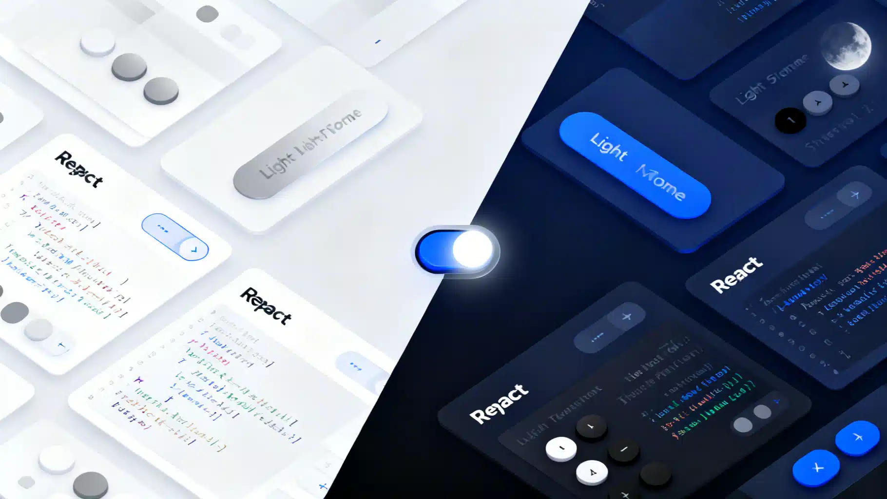
Image used for representation purposes only.
Overview
Dark mode is no longer a nice‑to‑have; users expect it. In this tutorial you’ll build a modern, accessible React dark‑mode toggle that:
- Uses CSS variables for theming (no repainting entire component trees)
- Respects system preference via prefers-color-scheme
- Persists the user’s choice in localStorage
- Avoids hydration mismatches and flash of incorrect theme (FOIT/FOUC)
- Works with plain CSS or Tailwind
- Includes an accessible toggle and robust testing tips
We’ll use TypeScript in examples, with JavaScript notes where relevant.
What you’ll build
- A tokenized theme using CSS variables
- An SSR‑safe initial theme script to prevent flicker
- A ThemeProvider with tri‑state logic: “light” | “dark” | “system”
- A ToggleThemeButton that announces state to assistive tech
- Optional Tailwind integration using the “class” strategy
Architecture in a nutshell
- Source of truth: Keep the effective theme on the root element (html) via data-theme or a dark class. This lets CSS handle colors instantly without re-rendering React trees.
- Tokens: Define colors as CSS variables; switch values between light and dark scopes.
- Persistence: Store explicit user choice (light/dark) in localStorage; omit storage for “system” so the app follows OS changes automatically.
- SSR safety: On first paint, set the root theme synchronously with a tiny inline script before React hydrates.
Step 1: Define design tokens with CSS variables
Create a global stylesheet (e.g., src/styles/theme.css).
/* src/styles/theme.css */
:root {
  /* Advertise that both color schemes are supported to style built-in UI (forms, etc.) */
  color-scheme: light dark;

  /* Light (default) tokens */
  --bg: #ffffff;
  --fg: #111827; /* slate-900 */
  --muted: #6b7280; /* gray-500 */
  --card: #f9fafb; /* gray-50 */
  --border: #e5e7eb; /* gray-200 */
  --primary: #2563eb; /* blue-600 */
  --link: #1d4ed8; /* blue-700 */
}

/* Dark overrides */
:root[data-theme="dark"] {
  --bg: #0b1220; /* deep navy */
  --fg: #e5e7eb; /* gray-200 */
  --muted: #94a3b8; /* slate-400 */
  --card: #0f172a; /* slate-900 */
  --border: #1f2937; /* gray-800 */
  --primary: #60a5fa; /* blue-300 */
  --link: #93c5fd; /* blue-300 */
}

html, body, #root { height: 100%; }
body {
  background: var(--bg);
  color: var(--fg);
  margin: 0;
  font-family: system-ui, -apple-system, Segoe UI, Roboto, Ubuntu, Cantarell, "Helvetica Neue", Arial, "Noto Sans", "Apple Color Emoji", "Segoe UI Emoji";
  transition: background-color 0.2s ease, color 0.2s ease;
}

.card {
  background: var(--card);
  border: 1px solid var(--border);
  border-radius: 12px;
  padding: 1rem;
}

a { color: var(--link); }
button.primary {
  background: var(--primary);
  color: #0b1220;
  border: none;
  padding: 0.5rem 0.875rem;
  border-radius: 8px;
}
Note: We use data-theme on :root for clarity, but a .dark class also works (needed for Tailwind’s class strategy). Pick one approach per app to avoid conflicts.
Step 2: Prevent flicker with an SSR‑safe initial theme
We must set the theme before the first paint. Add this tiny script at the top of your root HTML (e.g., public/index.html for Vite/CRA, or in Next.js _document).
<!-- Place inside <head>, before your bundled scripts -->
<script>
(function () {
  try {
    var stored = localStorage.getItem('theme'); // 'light' | 'dark' | null
    var systemDark = window.matchMedia('(prefers-color-scheme: dark)').matches;
    var resolved = (stored === 'light' || stored === 'dark') ? stored : (systemDark ? 'dark' : 'light');
    var root = document.documentElement;
    root.dataset.theme = resolved;
    root.style.colorScheme = resolved; // Improves built-in form controls
  } catch (_) { /* no-op */ }
})();
</script>
Why this matters:
- Eliminates a flash of the wrong theme before React mounts
- Avoids hydration mismatch by ensuring the DOM matches your initial React render
For Next.js, keep the script inline (not deferred) or use next/script with strategy=“beforeInteractive”. In the App Router, you can also set data-theme on html in layout.tsx when rendering on the server if you can read a cookie; the inline script remains the most robust client-first option when relying on localStorage.
Step 3: Build a ThemeProvider with tri‑state logic
We’ll expose theme, resolvedTheme, setTheme, and toggleTheme. The resolved theme is what’s applied to the DOM; theme is the user’s preference (which might be “system”).
// src/theme/ThemeProvider.tsx
import React, { createContext, useContext, useEffect, useMemo, useState } from 'react';

type Explicit = 'light' | 'dark';
type Theme = Explicit | 'system';

type Ctx = {
  theme: Theme;                // user preference
  resolvedTheme: Explicit;     // actual applied theme
  setTheme: (t: Theme) => void;
  toggleTheme: () => void;
};

const ThemeContext = createContext<Ctx | undefined>(undefined);

function getSystemTheme(): Explicit {
  if (typeof window === 'undefined') return 'light';
  return window.matchMedia('(prefers-color-scheme: dark)').matches ? 'dark' : 'light';
}

function getInitialTheme(): { theme: Theme; resolved: Explicit } {
  // Read what the inline script already set on the root to avoid mismatch.
  if (typeof document !== 'undefined') {
    const data = (document.documentElement.dataset.theme as Explicit | undefined) || 'light';
    // If user had explicit choice, it’s in localStorage; otherwise we assume system.
    try {
      const stored = localStorage.getItem('theme');
      if (stored === 'light' || stored === 'dark') return { theme: stored, resolved: stored };
    } catch {}
    return { theme: 'system', resolved: data };
  }
  return { theme: 'system', resolved: 'light' };
}

export const ThemeProvider: React.FC<React.PropsWithChildren> = ({ children }) => {
  const init = useMemo(getInitialTheme, []);
  const [theme, setTheme] = useState<Theme>(init.theme);
  const [system, setSystem] = useState<Explicit>(init.resolved);

  // Keep system preference in sync
  useEffect(() => {
    const mql = window.matchMedia('(prefers-color-scheme: dark)');
    const onChange = () => setSystem(mql.matches ? 'dark' : 'light');
    // Newer browsers
    mql.addEventListener?.('change', onChange);
    // Fallback
    // @ts-ignore
    mql.addListener?.(onChange);
    return () => {
      mql.removeEventListener?.('change', onChange);
      // @ts-ignore
      mql.removeListener?.(onChange);
    };
  }, []);

  const resolvedTheme: Explicit = theme === 'system' ? system : theme;

  // Apply to DOM and persist explicit choices
  useEffect(() => {
    const root = document.documentElement;
    root.dataset.theme = resolvedTheme;
    root.style.colorScheme = resolvedTheme;
    try {
      if (theme === 'system') localStorage.removeItem('theme');
      else localStorage.setItem('theme', theme);
    } catch {}
  }, [theme, resolvedTheme]);

  const toggleTheme = () => setTheme(resolvedTheme === 'dark' ? 'light' : 'dark');

  const value = useMemo<Ctx>(() => ({ theme, resolvedTheme, setTheme, toggleTheme }), [theme, resolvedTheme]);

  return <ThemeContext.Provider value={value}>{children}</ThemeContext.Provider>;
};

export function useTheme() {
  const ctx = useContext(ThemeContext);
  if (!ctx) throw new Error('useTheme must be used within ThemeProvider');
  return ctx;
}
JavaScript note: Remove types and keep the same logic.
Step 4: Create an accessible toggle button
Use a semantic button with aria-pressed and a clear label. You can swap icons for sun/moon; here we’ll keep it framework‑agnostic.
// src/components/ThemeToggle.tsx
import React from 'react';
import { useTheme } from '../theme/ThemeProvider';

export function ThemeToggle() {
  const { theme, resolvedTheme, setTheme, toggleTheme } = useTheme();
  const isDark = resolvedTheme === 'dark';

  return (
    <div style={{ display: 'inline-flex', gap: 8 }}>
      <button
        type="button"
        aria-label="Toggle dark mode"
        aria-pressed={isDark}
        onClick={toggleTheme}
        className="primary"
        title={isDark ? 'Switch to light mode' : 'Switch to dark mode'}
      >
        {isDark ? '🌙 Dark' : '☀️ Light'}
      </button>

      {/* Optional tri-state selector */}
      <select
        aria-label="Theme"
        value={theme}
        onChange={(e) => setTheme(e.target.value as any)}
      >
        <option value="light">Light</option>
        <option value="dark">Dark</option>
        <option value="system">System</option>
      </select>
    </div>
  );
}
Accessibility notes:
- aria-pressed announces the toggle state to screen readers
- A visible text label or title clarifies the action
- Keep contrast ratios >= 4.5:1 for text; your tokens should enforce this
Step 5: Wire it into your app
Wrap your app with ThemeProvider and import the global CSS.
// src/main.tsx (Vite) or src/index.tsx (CRA)
import React from 'react';
import ReactDOM from 'react-dom/client';
import { ThemeProvider } from './theme/ThemeProvider';
import { App } from './App';
import './styles/theme.css';

ReactDOM.createRoot(document.getElementById('root')!).render(
  <React.StrictMode>
    <ThemeProvider>
      <App />
    </ThemeProvider>
  </React.StrictMode>
);
Use the toggle inside your layout or header.
// src/App.tsx
import React from 'react';
import { ThemeToggle } from './components/ThemeToggle';

export function App() {
  return (
    <main style={{ padding: 24 }}>
      <header style={{ display: 'flex', justifyContent: 'space-between', alignItems: 'center' }}>
        <h1>React Dark Mode</h1>
        <ThemeToggle />
      </header>

      <section className="card" style={{ marginTop: 24 }}>
        <h2>Card</h2>
        <p>This card adapts to light and dark tokens instantly.</p>
        <button className="primary">Primary Action</button>
      </section>
    </main>
  );
}
Optional: Tailwind CSS integration
Tailwind recommends a class strategy: add dark class to html and use dark: variants. If you choose Tailwind, switch from data-theme to class.
- Configure Tailwind:
// tailwind.config.js
module.exports = {
  darkMode: 'class',
  content: ['./index.html', './src/**/*.{ts,tsx,js,jsx}'],
  theme: { extend: {} },
  plugins: [],
};
- Update DOM sync in ThemeProvider to toggle the class instead of data-theme:
// replace inside useEffect that applies theme to DOM
const root = document.documentElement;
root.classList.toggle('dark', resolvedTheme === 'dark');
root.style.colorScheme = resolvedTheme;
- Use Tailwind utilities:
<div className="p-6 rounded-xl border bg-white text-slate-900 dark:bg-slate-900 dark:text-slate-100 dark:border-slate-700">
  Tailwind-styled card
</div>
Note: Do not mix data-theme tokens and Tailwind’s dark class in the same selectors; pick one system to avoid specificity battles.
Handling images and logos
- Provide both light and dark variants of images or SVG logos
- For SVG, swap fill based on currentColor to inherit text color
- Alternatively, render different sources:
<img
  src={resolvedTheme === 'dark' ? '/logo-dark.svg' : '/logo-light.svg'}
  alt="Company logo"
/>
Performance considerations
- Root-level CSS variables avoid rerendering all components—browsers can repaint colors efficiently
- Keep transitions to color/background-color; avoid animating layout-affecting properties
- Debounce expensive operations you might tie to theme changes (rare in practice)
Common pitfalls and how to avoid them
- Flash of wrong theme: Fix with the inline head script shown above
- Hydration mismatch in SSR: Ensure initial DOM theme matches what React expects (read data-theme in getInitialTheme)
- Persisting “system”: Don’t store it; store only explicit light/dark so system changes apply live
- Media query listeners: Clean up event listeners for older and newer browsers
- Third-party components: Prefer libraries that style via CSS variables or expose theme tokens
Testing your dark mode
Unit/Component tests (React Testing Library):
import { render, screen } from '@testing-library/react';
import userEvent from '@testing-library/user-event';
import { ThemeProvider } from '../theme/ThemeProvider';
import { ThemeToggle } from '../components/ThemeToggle';

test('toggles and persists theme', async () => {
  render(
    <ThemeProvider>
      <ThemeToggle />
    </ThemeProvider>
  );
  const btn = screen.getByRole('button', { name: /toggle dark mode/i });
  await userEvent.click(btn);
  expect(document.documentElement.dataset.theme).toBe('dark');
  expect(localStorage.getItem('theme')).toBe('dark');
});
E2E (Playwright): Ensure no flicker and correct initial theme.
import { test, expect } from '@playwright/test';

test('respects stored theme before hydration', async ({ page }) => {
  await page.addInitScript(() => localStorage.setItem('theme', 'dark'));
  await page.goto('/');
  const dataTheme = await page.evaluate(() => document.documentElement.dataset.theme);
  expect(dataTheme).toBe('dark');
});
Extending the system
- Add more tokens (e.g., shadows, focus rings, surface elevations)
- Support high-contrast themes by layering an additional [data-contrast] attribute
- Expose a useToken hook if you need runtime access to computed values (rare; prefer pure CSS)
Production tips
- Prefer system as default; let users opt into explicit light/dark
- Document your tokens in a small theme.md so design and engineering stay in sync
- For Next.js, the next-themes package is a solid alternative if you want a battle‑tested solution—and it uses the same principles outlined here
Summary
You now have a robust dark mode for React:
- Token-driven, CSS-variable theming
- Tri-state logic with live system preference
- SSR-safe initial paint
- Accessible controls and test coverage
Adopt this baseline and you can expand to multiple themes, brand modes, or high-contrast options with minimal friction.
Related Posts

React Testing Library Unit Testing Guide: From Setup to Confident UI Tests
A practical guide to unit testing React with Testing Library—setup, queries, user events, async, MSW, providers, and best practices.

Building an Accessible React Portal Modal with TypeScript
Build an accessible React portal modal with TypeScript: focus trap, Escape handling, scroll locking, SSR safety, and tests with RTL.

Build a Headless React UI Library: A Practical Tabs Tutorial
Build a headless React UI component library step by step—accessibility, state, TypeScript, testing, and packaging—using a fully featured Tabs example.