React Storybook Component Documentation: CSF, MDX, Controls, and Testing
Document React components in Storybook with CSF, MDX, controls, decorators, and testing. Practical patterns, examples, and checklists.
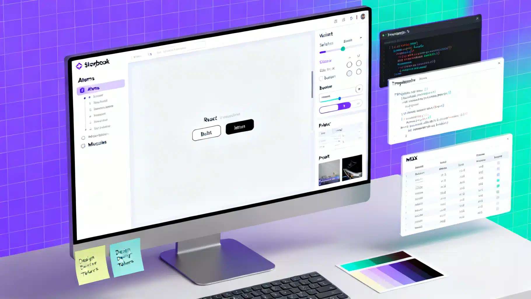
Image used for representation purposes only.
Why Storybook is ideal for React component documentation
Storybook turns your React components into a living, isolated gallery with interactive docs. Instead of static screenshots or out‑of‑date wiki pages, you ship an executable sandbox where consumers can explore props, themes, and edge cases. Stories double as documentation, examples, and test fixtures—reducing drift and increasing confidence.
- Document once, reuse everywhere: design system sites, app teams, QA, and product.
- Isolate UI: develop components without running your full app.
- Encourage consistency: shared templates, controls, and add‑ons.
- Enable testing: visual, interaction, and accessibility.
Quickstart
The fastest path is the guided initializer, which detects your setup and configures bundling, TypeScript, and add‑ons.
# In an existing React project
npx storybook@latest init

# Start the local Storybook
npm run storybook

# Produce a static docs site
npm run build-storybook
After init, you’ll have a .storybook directory (global configuration) and example stories next to components.
Organizing your component docs
A clean structure makes docs easy to find and maintain.
- Co‑locate stories with components:
Button.tsx,Button.stories.tsx, optionalButton.docs.mdx. - Use clear titles mirroring your design system hierarchy:
Atoms/Button,Molecules/Modal. - Prefer TypeScript or JSDoc for props so prop tables and controls are generated automatically.
- Keep stories minimal and focused; use decorators for app‑level context (theme, router, i18n).
Example layout:
src/
  components/
    Button/
      Button.tsx
      Button.stories.tsx
      Button.docs.mdx
.storybook/
  main.ts
  preview.ts
CSF fundamentals (Component Story Format)
CSF uses standard ES modules to describe metadata and named stories. It’s ergonomic, type‑safe with TS, and tree‑shakeable.
// Button.stories.tsx
import type { Meta, StoryObj } from '@storybook/react';
import { Button } from './Button';

const meta: Meta<typeof Button> = {
  title: 'Atoms/Button',
  component: Button,
  tags: ['autodocs'], // enables auto‑generated docs from stories
  parameters: {
    layout: 'centered',
    actions: { argTypesRegex: '^on.*' },
    controls: { expanded: true },
  },
  argTypes: {
    variant: { control: 'select', options: ['primary', 'secondary', 'ghost'] },
    size: { control: 'radio', options: ['sm', 'md', 'lg'] },
  },
};
export default meta;

type Story = StoryObj<typeof Button>;

export const Primary: Story = {
  args: { children: 'Save', variant: 'primary', size: 'md' },
};

export const Disabled: Story = {
  args: { children: 'Save', disabled: true },
};

export const Loading: Story = {
  args: { children: 'Saving…', loading: true },
};
Tips:
- Name stories by state or use case: “Loading”, “Error”, “WithIcon”.
- Prefer
argsto hard‑coding props; controls and docs update automatically. - Coerce events to actions with
argTypesRegexor explicitaction: 'clicked'.
High‑quality stories: what to include
Think of stories as acceptance criteria for a component. Capture the breadth of behavior without duplicating trivial variations.
- Base state with sensible defaults.
- All visual variants (primary/secondary/ghost).
- Size and density options.
- Disabled and loading states.
- Content extremes: very short/very long labels, emoji, RTL text.
- Error or edge conditions (e.g., empty lists, failed images).
- Themed examples (light/dark, high‑contrast).
- Accessibility examples: focus ring, keyboard interaction, ARIA attributes.
Decorators for context and theming
Use decorators to provide global or per‑story context without polluting the component API.
// .storybook/preview.ts
import type { Preview } from '@storybook/react';
import { ThemeProvider } from '../src/theme';

const preview: Preview = {
  decorators: [
    (Story, context) => (
      <ThemeProvider theme={context.globals.theme || 'light'}>
        <Story />
      </ThemeProvider>
    ),
  ],
  globals: { theme: 'light' },
  globalTypes: {
    theme: {
      description: 'Global theme for components',
      defaultValue: 'light',
      toolbar: {
        icon: 'mirror',
        items: [
          { value: 'light', title: 'Light' },
          { value: 'dark', title: 'Dark' },
        ],
      },
    },
  },
};

export default preview;
This adds a theme toggle to the toolbar, automatically wrapping stories with your provider.
Autodocs and narrative MDX
Storybook can generate documentation pages from your CSF stories (“autodocs”), and you can layer narrative content with MDX for richer guides.
- Autodocs: add
tags: ['autodocs']to your meta. Docs will include a description, prop table, and your stories. - MDX: write long‑form docs with headings, prose, and doc blocks that render live stories and prop tables.
---
title: Button
---

import { Meta, Story, ArgsTable, Canvas, Controls } from '@storybook/blocks';
import * as ButtonStories from './Button.stories';

<Meta of={ButtonStories} />

# Button
Use Button for primary actions. Avoid overusing the primary variant—one per view is typical.

## Examples
<Canvas>
  <Story of={ButtonStories.Primary} />
  <Story of={ButtonStories.Disabled} />
</Canvas>

## API
<ArgsTable of={ButtonStories} />

## Playground
<Controls of={ButtonStories.Primary} />
Guidelines:
- Keep component philosophy and usage guidance in MDX; keep state variants in CSF.
- Use
<Story of={...} />to reference existing CSF stories so behavior stays in one place.
Controls and ArgTypes deep dive
Controls make your docs interactive and self‑serve. Define them implicitly from TypeScript or explicitly via argTypes.
- Prefer union types for enums:
type Variant = 'primary' | 'secondary' | 'ghost'. - Document events:
onClickshould show as an action; describe when it fires. - Provide default args on the meta or each story; they appear as initial control values.
// In Button.stories.tsx
const meta = {
  // ...
  args: { size: 'md' },
  argTypes: {
    onClick: { action: 'clicked', description: 'Fires when user presses the button' },
    loading: { control: 'boolean', description: 'Replaces content with a spinner' },
  },
};
Accessibility in docs
Bake a11y into your documentation.
- Keyboard: ensure focus states are visible; add a story showing
:focus-visible. - Color contrast: include dark/light themes; document any contrast caveats.
- Labels: demonstrate accessible names for icon‑only buttons via
aria-label.
export const IconOnly: Story = {
  args: { icon: 'settings', 'aria-label': 'Settings' },
};
Interaction testing with stories
Stories double as test fixtures. Add a play function to simulate user flows, then run them in the browser or headless in CI.
import { within, userEvent } from '@storybook/testing-library';

export const Clickable: Story = {
  args: { children: 'Click me' },
  play: async ({ canvasElement }) => {
    const canvas = within(canvasElement);
    await userEvent.click(await canvas.findByRole('button', { name: /click me/i }));
  },
};
For unit and integration tests, reuse stories with @storybook/testing-react (or the equivalent for your renderer) and Testing Library.
// Button.test.ts
import { render, screen } from '@testing-library/react';
import { composeStories } from '@storybook/testing-react';
import * as stories from './Button.stories';

const { Primary } = composeStories(stories);

test('renders primary button text', () => {
  render(<Primary />);
  expect(screen.getByRole('button', { name: /save/i })).toBeInTheDocument();
});
Benefits:
- No duplicate test fixtures; stories are the source of truth.
- Play functions act as interaction tests; great for critical paths.
Documenting complex components
For components like Modal, DataTable, or Form, combine CSF and MDX:
- CSF: focused stories for open/closed, with/without backdrop, trap focus, long content.
- MDX: usage guidance (do/don’t), accessibility notes (focus management), and composition examples.
Patterns:
- Provide “Recipe” stories that compose smaller atoms (Modal + Button + Form) to show real usage.
- Use loaders to fetch sample data for stories without polluting the component.
export const WithAsyncData: Story = {
  loaders: [async () => ({ users: await fetch('/mock/users').then(r => r.json()) })],
  render: (args, { loaded }) => <UserList users={loaded.users} />,
};
Parameters that improve docs UX
A few global and per‑story parameters make docs more readable:
layout: 'centered' | 'fullscreen' | 'padded'for sensible canvases.backgroundsto preview against brand colors.viewportto demo responsive states.docs.source.state: 'open'to expand code blocks by default.
export const OnDarkBackground: Story = {
  args: { variant: 'ghost' },
  parameters: {
    backgrounds: { default: 'Dark', values: [{ name: 'Dark', value: '#111827' }] },
  },
};
Prop tables from TypeScript and JSDoc
Autogenerated prop tables increase trust, but only if types are clear.
- Prefer explicit exported prop types:
export interface ButtonProps { ... }. - Use descriptive names and default values.
- Annotate with JSDoc for human‑readable descriptions.
/** Primary call‑to‑action button. Prefer one primary per view. */
export interface ButtonProps {
  /** Visual style of the button */
  variant?: 'primary' | 'secondary' | 'ghost';
  /** Size of the button */
  size?: 'sm' | 'md' | 'lg';
  /** Show a loading spinner and disable interaction */
  loading?: boolean;
  /** Button label; required if no icon */
  children?: React.ReactNode;
  onClick?: () => void;
}
Publishing your docs
A static Storybook build is a ready‑to‑host documentation site.
- Build:
npm run build-storybookproduces astorybook-staticdirectory. - Host on your platform of choice (e.g., a static host or behind auth for internal systems).
- Add caching and preview deployments per branch to review changes.
- Version docs alongside your package versions for a design system.
CI, quality gates, and visual coverage
Treat docs like code.
- Run type checks and lint on stories and MDX.
- Validate that all exported components have at least a base story.
- Add accessibility checks to your CI pipeline.
- Add visual regression tests to catch unintended UI changes.
A short style guide for maintainers
- One component per folder with co‑located stories.
- Keep stories deterministic—avoid relying on real network calls.
- Prefer args over custom render functions; create a
Templateonly when composition is non‑trivial. - Name variants by intent, not implementation: “Destructive” beats “RedVariant”.
- Document rationale and trade‑offs in MDX, not in code comments alone.
Common pitfalls and how to avoid them
- Too many trivial stories: focus on meaningful states; use controls for the rest.
- Drifting props and docs: rely on TypeScript/JSDoc so prop tables stay current.
- Context leakage: use decorators to inject providers instead of passing props.
- Unreadable canvases: set
layoutandbackgrounds; add padding in a wrapper if needed. - Flaky interaction tests: avoid timers; wait on roles and labels with Testing Library utilities.
Putting it all together
With CSF for canonical states, MDX for narrative guidance, decorators for context, and play‑function tests for interactions, Storybook becomes your authoritative React component documentation. Start small: document a button, modal, and form field. Establish a folder pattern, a naming convention, and a CI checklist. Your team—and your future self—will thank you.
Related Posts

Building an Accessible React Portal Modal with TypeScript
Build an accessible React portal modal with TypeScript: focus trap, Escape handling, scroll locking, SSR safety, and tests with RTL.

React Error Boundaries: A Complete Implementation Guide
Implement robust React error boundaries with TypeScript examples, reset strategies, logging, Suspense interplay, testing, and accessibility.

Build a Headless React UI Library: A Practical Tabs Tutorial
Build a headless React UI component library step by step—accessibility, state, TypeScript, testing, and packaging—using a fully featured Tabs example.