Accessible Focus Management in React: From Routing to Modals
A practical guide to accessible focus management in React: keyboard navigation, skip links, route changes, modals, roving tabIndex, and testing.
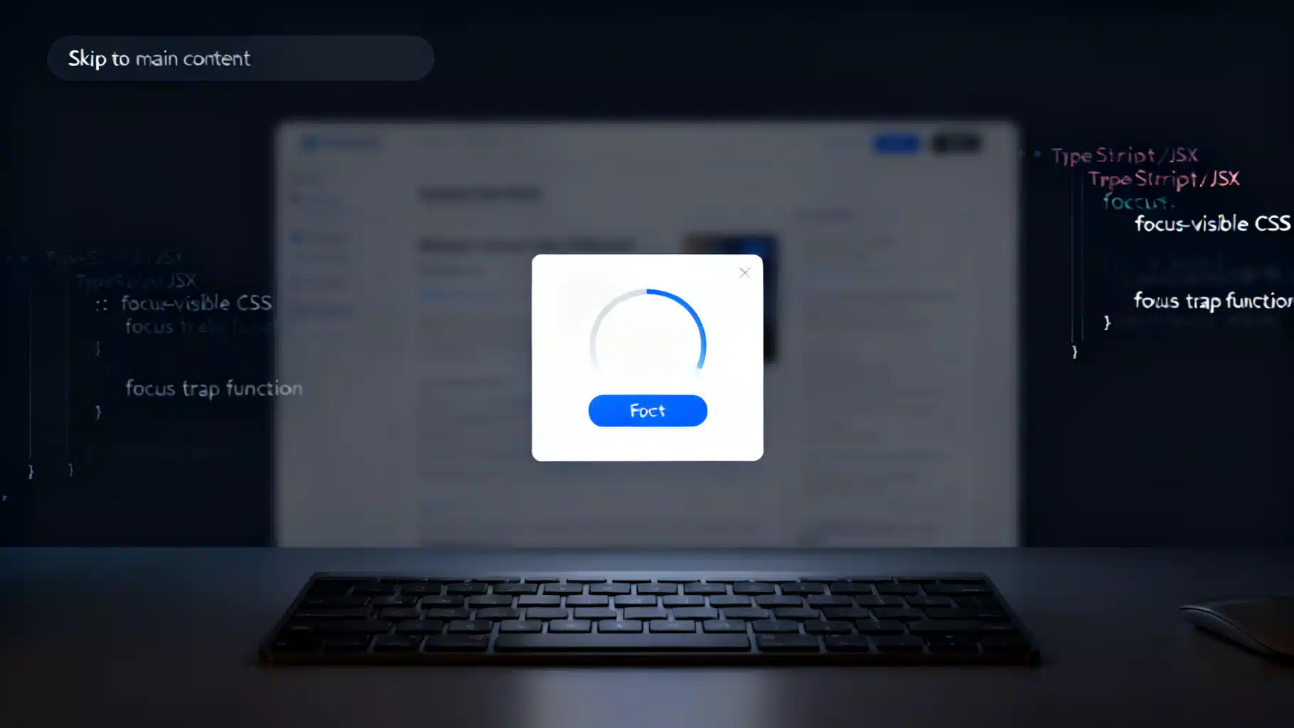
Image used for representation purposes only.
Why Focus Management Matters in React
If users can’t reliably see where focus is or move it with the keyboard, your app becomes frustrating—or unusable—for keyboard and assistive technology (AT) users. React’s rendering model is powerful, but it also means focus can jump, reset, or disappear during rerenders, route changes, and conditional UI. This guide shows practical, framework-agnostic patterns to make focus predictable, visible, and compliant with accessibility best practices in React.
Core Principles of Accessible Focus
- Always visible: Ensure a clear, high-contrast focus indicator. Avoid removing outlines.
- Predictable order: Tabbing should follow the visual/logical order of content.
- Don’t steal focus: Only move focus programmatically when context truly changes (e.g., open dialog, route change, error summary).
- Restore focus: When a temporary surface (dialog, popover) closes, return focus to the element that opened it.
- Respect user settings: Honor prefers-reduced-motion when animating focus or scrolling.
Make Elements Focusable (and in the Right Order)
- Use native interactive elements first: button, a[href], input, select, textarea.
- For custom controls (div/spans), add role, keyboard handlers, and tabIndex=“0”; but prefer native elements whenever possible.
- Avoid positive tabIndex (>0). It creates unexpected tab order. Stick to 0 or -1 for programmatic focus.
Style Focus Clearly
Use the browser’s default outline or improve it, but do not remove it. Prefer :focus-visible so mouse users don’t see unwanted focus rings.
/* Keep or enhance outlines */
:focus-visible {
  outline: 3px solid var(--focus-color, #1a73e8);
  outline-offset: 2px;
}

/* Never do this globally */
/* *:focus { outline: none; } */
Programmatic Focus in React
Access DOM nodes with refs and call focus() at the right time.
import { useEffect, useRef } from 'react';

export function FocusHeading() {
  const h1Ref = useRef<HTMLHeadingElement>(null);

  useEffect(() => {
    h1Ref.current?.focus();
  }, []);

  return (
    <h1 ref={h1Ref} tabIndex={-1}>
      Account settings
    </h1>
  );
}
Notes:
- Use tabIndex={-1} on non-interactive elements to allow programmatic focus without altering tab order.
- Prefer focusing the most relevant landmark or heading when content context changes.
Focus After Route or View Changes
Single-page apps don’t cause a full page load, so browsers won’t auto-move focus to the top. Move it deliberately when navigation completes.
import { useEffect } from 'react';

// Call this component whenever your route/view key changes
export function FocusMainOnChange({ pageKey }: { pageKey: string }) {
  useEffect(() => {
    const main = document.querySelector('main');
    if (main instanceof HTMLElement) {
      // Make sure main can be focused programmatically
      const hadTabIndex = main.hasAttribute('tabindex');
      if (!hadTabIndex) main.setAttribute('tabindex', '-1');
      main.focus();
      if (!hadTabIndex) main.removeAttribute('tabindex');
    }
  }, [pageKey]);
  return null;
}
Also include a skip link so keyboard users can jump past navigation each time.
<a class="skip-link" href="#main">Skip to main content</a>
<header>…</header>
<main id="main">…</main>
.skip-link {
  position: absolute;
  left: -9999px;
}
.skip-link:focus {
  left: 1rem;
  top: 1rem;
  background: #000;
  color: #fff;
  padding: 0.5rem 1rem;
}
Accessible Dialogs and Focus Traps
When opening a modal dialog, move focus into it, trap focus while open, and restore focus on close. Also hide inert background content from AT.
import { useEffect, useRef } from 'react';

function getFocusable(container: HTMLElement): HTMLElement[] {
  const selectors = [
    'a[href]', 'button:not([disabled])', 'textarea:not([disabled])',
    'input:not([disabled])', 'select:not([disabled])', '[tabindex]:not([tabindex="-1"])'
  ];
  return Array.from(container.querySelectorAll<HTMLElement>(selectors.join(',')))
    .filter(el => !el.hasAttribute('disabled') && !el.getAttribute('aria-hidden'));
}

export function Dialog({ open, onClose, labelId, children }: {
  open: boolean;
  onClose: () => void;
  labelId: string;
  children: React.ReactNode;
}) {
  const ref = useRef<HTMLDivElement>(null);
  const lastFocused = useRef<HTMLElement | null>(null);

  useEffect(() => {
    if (!open) return;
    lastFocused.current = document.activeElement as HTMLElement | null;

    const node = ref.current!;

    // Optional: mark background inert via aria-hidden on siblings
    const root = document.body;
    const siblings = Array.from(root.children).filter(c => c !== node.parentElement);
    siblings.forEach(s => s.setAttribute('aria-hidden', 'true'));

    // Move focus to first focusable or container
    const focusables = getFocusable(node);
    (focusables[0] || node).focus();

    // Trap focus
    function onKeyDown(e: KeyboardEvent) {
      if (e.key === 'Escape') {
        e.preventDefault();
        onClose();
      }
      if (e.key === 'Tab') {
        const f = getFocusable(node);
        if (f.length === 0) return;
        const first = f[0];
        const last = f[f.length - 1];
        const active = document.activeElement as HTMLElement | null;
        if (e.shiftKey && active === first) {
          e.preventDefault();
          last.focus();
        } else if (!e.shiftKey && active === last) {
          e.preventDefault();
          first.focus();
        }
      }
    }

    document.addEventListener('keydown', onKeyDown);
    return () => {
      document.removeEventListener('keydown', onKeyDown);
      siblings.forEach(s => s.removeAttribute('aria-hidden'));
      // Restore focus
      lastFocused.current?.focus();
    };
  }, [open, onClose]);

  if (!open) return null;

  return (
    <div role="dialog" aria-modal="true" aria-labelledby={labelId} className="dialog-backdrop">
      <div ref={ref} className="dialog-panel" tabIndex={-1}>
        {children}
        <button onClick={onClose}>Close</button>
      </div>
    </div>
  );
}
Tips:
- Provide role=“dialog” and aria-modal=“true”; label with aria-labelledby or aria-label.
- Don’t forget Escape to close.
- Use a portal to render overlays near the body to avoid z-index and reading-order issues.
Composite Widgets: Roving tabIndex Pattern
Menus, toolbars, grids, and carousels often require arrow-key navigation. Use one tab stop for the whole widget, then move focus inside with arrow keys.
import { useEffect, useRef, useState } from 'react';

export function Menu({ items }: { items: string[] }) {
  const [index, setIndex] = useState(0);
  const refs = useRef(items.map(() => ({ current: null as HTMLButtonElement | null })));

  useEffect(() => {
    refs.current[index].current?.focus();
  }, [index]);

  function onKeyDown(e: React.KeyboardEvent) {
    if (e.key === 'ArrowDown') { e.preventDefault(); setIndex((i) => (i + 1) % items.length); }
    if (e.key === 'ArrowUp')   { e.preventDefault(); setIndex((i) => (i - 1 + items.length) % items.length); }
    if (e.key === 'Home')      { e.preventDefault(); setIndex(0); }
    if (e.key === 'End')       { e.preventDefault(); setIndex(items.length - 1); }
  }

  return (
    <div role="menu" aria-label="Actions" onKeyDown={onKeyDown}>
      {items.map((label, i) => (
        <button
          key={label}
          role="menuitem"
          ref={(el) => (refs.current[i].current = el)}
          tabIndex={i === index ? 0 : -1}
          onMouseMove={() => setIndex(i)}
        >
          {label}
        </button>
      ))}
    </div>
  );
}
Forms and Validation
- On submit errors, move focus to an error summary container or the first invalid field.
- Associate errors with fields using aria-describedby.
- For global summaries, use role=“alert” or aria-live=“assertive” so screen readers announce the problem.
function ErrorSummary({ messages }: { messages: string[] }) {
  const ref = useRef<HTMLDivElement>(null);
  useEffect(() => { if (messages.length) ref.current?.focus(); }, [messages.length]);
  return (
    <div role="alert" tabIndex={-1} ref={ref} className="error-summary">
      <h2>There’s a problem</h2>
      <ul>{messages.map((m) => <li key={m}>{m}</li>)}</ul>
    </div>
  );
}
Content Updates vs. Focus
Changing focus is not the only way to announce updates. For non-disruptive changes (e.g., “item added to cart”), keep focus where it is and use polite live regions.
<div aria-live="polite" aria-atomic="true" id="cart-status">Cart is empty</div>
Update this region’s text when status changes, without stealing focus from the current control.
Timing: When to Call focus()
Because React updates the DOM asynchronously, the element might not exist at the instant you try to focus it.
- Use refs and call focus in useEffect after the element renders.
- For transitions/animations, you may need requestAnimationFrame to wait a frame before calling focus.
- Avoid setTimeout unless necessary; it’s brittle.
useEffect(() => {
  let raf = requestAnimationFrame(() => ref.current?.focus());
  return () => cancelAnimationFrame(raf);
}, []);
Portals, Layers, and Stacking Context
Portals are ideal for overlays and to ensure the dialog sits at the end of the DOM for reading order. Just remember: focus management is still your job—portals don’t move focus automatically. Keep initial focus, trapping, and restore logic within the portal’s content.
Don’t Break Scrolling When You Fix Focus
- Scrolling and focus are related but different. Focusing an element doesn’t guarantee it’s visible if parents have overflow.
- Prefer element.scrollIntoView({ block: ‘center’ }) when focusing content deep in a scroller, but respect prefers-reduced-motion.
if (ref.current) {
  if (window.matchMedia('(prefers-reduced-motion: no-preference)').matches) {
    ref.current.scrollIntoView({ behavior: 'smooth', block: 'center' });
  }
  ref.current.focus();
}
Testing Focus
- Keyboard test: Use Tab/Shift+Tab to ensure a logical order and visible focus ring.
- Screen reader smoke test: Navigate by headings, landmarks, and links.
- Automated checks: Lint for outline removals; run accessibility linters and browser devtools audits.
- Regression-proofing: Add unit/integration tests that assert document.activeElement after route/dialog changes.
Common Pitfalls and Fixes
- Removing outlines globally: Don’t. Instead, style :focus-visible.
- Positive tabIndex: Leads to chaos. Use 0 or -1 only.
- Focusing on every rerender: Guard with flags/effects so you focus only on meaningful changes.
- Forgetting to restore focus after closing a modal: Store the trigger element before opening.
- Invisible focus target: If you focus a heading, give it tabIndex={-1} so it can receive focus.
- Background still readable by AT during modals: Mark siblings aria-hidden or use inert when available.
Quick Checklist
- Clear, consistent focus styles using :focus-visible.
- Skip link to main content; programmatic focus on route changes.
- Dialogs: initial focus, focus trap, Escape to close, restore focus.
- Composite widgets: roving tabIndex and arrow-key navigation.
- Forms: move focus to summary or first error; link errors via aria-describedby.
- Live regions for passive updates; don’t steal focus unnecessarily.
- Tests assert correct document.activeElement at key interactions.
Conclusion
Accessible focus is about respect for user intent. With a handful of small, consistent patterns—clear focus styles, deliberate focus on context changes, traps for modals, restoration on close—you make your React application faster to use for everyone, not just keyboard and screen reader users. Start by adding a skip link, fixing focus after navigation, and auditing your dialogs. The rest will follow naturally as you design components with focus in mind from the start.
Related Posts

Building Effective React Skeleton Loading UIs: Patterns, Code, and A11y Tips
Build accessible, performant skeleton loading UIs in React with patterns, Suspense, CSS shimmer, and testing tips.
React Search Autocomplete: A Fast, Accessible Implementation with Hooks
Build a fast, accessible React search autocomplete with hooks, debouncing, ARIA, caching, and virtualization. Includes complete, production-ready code.
React Dark Mode Theme Toggle: A Modern, Accessible Tutorial
Build a robust React dark mode with CSS variables, system preference, SSR-safe setup, persistence, accessibility, and Tailwind integration.