
The Practical Guide to Flutter’s Widget Catalog: Patterns, Picks, and Proven Recipes
A practical, in-depth guide to Flutter’s widget catalog—organization, selection tips, patterns, recipes, and performance/testing guidance.
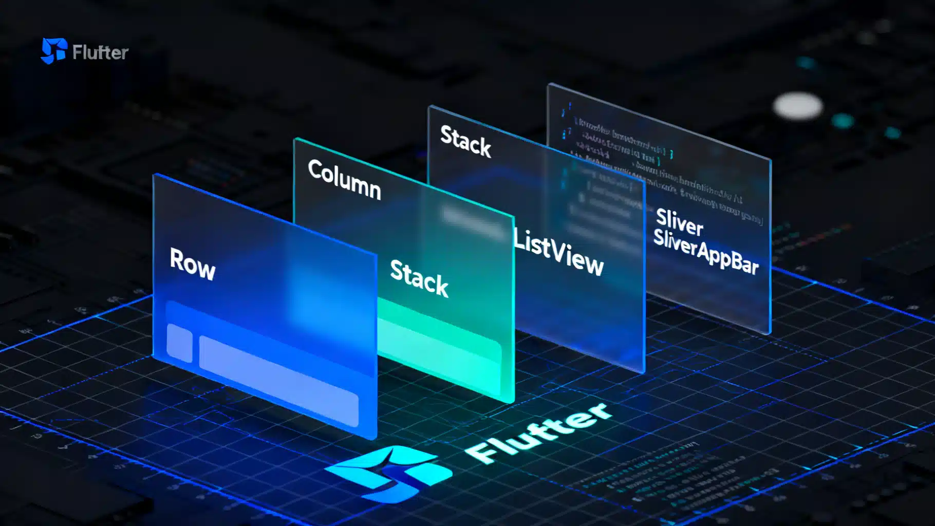
Image used for representation purposes only.
Overview
Flutter’s widget catalog is the foundation for building beautiful, performant cross‑platform UIs. Everything you see on screen—text, images, buttons, layouts, animations—is a widget. This article maps the catalog’s major families, shows how to choose the right widget for a job, and provides practical patterns, recipes, and pitfalls to avoid when composing interfaces.
How Flutter renders your UI (quick mental model)
Before diving into the catalog, keep this model in mind:
- Widgets are immutable configuration objects.
- Elements are the live instances in the widget tree that hold state and connect widgets to rendering.
- RenderObjects perform layout and paint.
When something changes, Flutter rebuilds affected widgets, updates elements, and only repaints what’s necessary. Understanding this helps you pick efficient widgets and avoid unnecessary rebuilds.
The widget catalog at a glance
The catalog groups widgets by intent. The most commonly used families include:
- Basic: Text, Icon, Image, Container, SizedBox, Placeholder.
- Layout: Row, Column, Stack, Expanded, Flexible, Align, Center, Padding, ConstrainedBox, AspectRatio, FittedBox.
- Material: Scaffold, AppBar, FloatingActionButton, ElevatedButton, TextField, Card, ListTile, SnackBar, Dialog.
- Cupertino: CupertinoApp, CupertinoPageScaffold, CupertinoButton, CupertinoTextField, CupertinoSwitch.
- Input & Gestures: GestureDetector, InkWell, Dismissible, Draggable, DragTarget.
- Scrolling: ListView, GridView, PageView, CustomScrollView, SliverList, SliverGrid, SliverAppBar.
- Navigation & Routing: Navigator, Route, WillPopScope; plus Router configuration APIs.
- Animation & Motion: AnimatedContainer, AnimatedOpacity, Hero, TweenAnimationBuilder, AnimationController.
- Styling & Theming: Theme, ThemeData, DefaultTextStyle, MediaQuery.
- Assets, Images, Icons: Image.asset, Image.network, AssetImage, Icon, IconTheme.
- Painting & Effects: DecoratedBox, ClipRRect, Opacity, Transform, ShaderMask.
- Async: FutureBuilder, StreamBuilder.
- Accessibility & Internationalization: Semantics, ExcludeSemantics, Directionality, Localizations.
Choosing the right widget: a quick decision guide
Use this lightweight flow when deciding:
- Need to place children horizontally or vertically? Row/Column. Need to overlap? Stack.
- Child must fill or share extra space? Expanded or Flexible inside Row/Column.
- Uniform padding or alignment? Padding, Align, Center.
- Scrollable list of similar items? ListView.builder; a grid? GridView.builder.
- Complex, flexible, or collapsing scroll effects? CustomScrollView with slivers.
- Platform‑adaptive look? Use Material widgets; for iOS‑style, use Cupertino or platform wrappers.
- Animated property change without manual controllers? Implicit animations (AnimatedContainer, AnimatedOpacity).
- Need fine‑grained control over time and curves? Explicit animations with AnimationController.
- Network or file data that arrives later? FutureBuilder or StreamBuilder.
Layout fundamentals: constraints go down, sizes go up
Flutter’s layout is constraint‑based:
- Parents send constraints to children.
- Children pick a size that satisfies the constraints.
- Parents decide the child’s position.
A few layout staples:
Widget build(BuildContext context) {
  return Padding(
    padding: const EdgeInsets.all(16),
    child: Column(
      crossAxisAlignment: CrossAxisAlignment.stretch,
      children: [
        Text('Header', style: Theme.of(context).textTheme.headlineSmall),
        const SizedBox(height: 12),
        Row(
          children: const [
            Expanded(child: Placeholder(fallbackHeight: 80)),
            SizedBox(width: 12),
            Flexible(flex: 2, child: Placeholder(fallbackHeight: 80)),
          ],
        ),
        const SizedBox(height: 12),
        AspectRatio(
          aspectRatio: 16 / 9,
          child: DecoratedBox(
            decoration: BoxDecoration(color: Color(0xFFE0F7FA), borderRadius: BorderRadius.all(Radius.circular(12))),
          ),
        ),
      ],
    ),
  );
}
Tips:
- Use SizedBox for explicit spacing and quick constraints.
- Prefer Flexible/Expanded over hardcoded widths in Row/Column.
- Use FittedBox or AspectRatio to adapt content responsively.
Material and Cupertino: platform conventions
- Material widgets provide adaptive, cross‑platform defaults aligned with Google’s Material Design. Start with Scaffold to get structure (app bar, body, FAB, drawers, snack bars).
- Cupertino widgets mirror iOS look and feel. Consider mixing Material for structure with Cupertino controls for platform‑specific pages, or use adaptive packages that pick controls per platform.
return Scaffold(
  appBar: AppBar(title: const Text('Catalog Demo')),
  floatingActionButton: FloatingActionButton(
    onPressed: () {},
    child: const Icon(Icons.add),
  ),
  body: const Center(child: Text('Hello, Material!')),
);
Input, gestures, and interactivity
Gestures are layered on widgets with GestureDetector or InkWell (which also provides splash effects inside Material ancestors).
GestureDetector(
  onTap: () => debugPrint('Tapped'),
  onLongPress: () => debugPrint('Long press'),
  child: Container(
    padding: const EdgeInsets.all(20),
    decoration: BoxDecoration(color: Colors.blue, borderRadius: BorderRadius.circular(12)),
    child: const Text('Tap me', style: TextStyle(color: Colors.white)),
  ),
)
Use Focus and Shortcuts/Actions for keyboard navigation on desktop/web.
State: Stateless, Stateful, and inherited context
- StatelessWidget: configuration only; rebuilds when parents change inputs.
- StatefulWidget: holds mutable State; call setState to trigger rebuilds.
- InheritedWidget and InheritedNotifier: propagate data efficiently down the tree; many state libraries (e.g., Provider, Riverpod) build on these.
class Counter extends StatefulWidget {
  const Counter({super.key});
  @override
  State<Counter> createState() => _CounterState();
}

class _CounterState extends State<Counter> {
  int _count = 0;
  @override
  Widget build(BuildContext context) {
    return Row(
      children: [
        Text('$_count'),
        IconButton(icon: const Icon(Icons.add), onPressed: () => setState(() => _count++)),
      ],
    );
  }
}
Best practices:
- Keep widgets small and composable.
- Lift state up to the lowest common ancestor that needs it.
- Use const constructors where possible to reduce rebuild work.
Navigation and routing
For simple apps, Navigator.push and Navigator.pop suffice. For larger apps or deep linking, consider Router configuration APIs.
Navigator.of(context).push(
  MaterialPageRoute(builder: (_) => const DetailsPage()),
);
Tips:
- Wrap routes with PageRouteBuilder to inject custom transitions.
- Use WillPopScope to intercept back navigation.
Scrolling, lists, and slivers
- Use ListView.builder and GridView.builder for large/unknown item counts.
- For advanced effects—collapsing headers, sticky sections—use CustomScrollView with slivers:
CustomScrollView(
  slivers: [
    const SliverAppBar(
      floating: true,
      snap: true,
      expandedHeight: 160,
      flexibleSpace: FlexibleSpaceBar(title: Text('Sliver Catalog')),
    ),
    SliverList(
      delegate: SliverChildBuilderDelegate(
        (context, index) => ListTile(title: Text('Item #$index')),
        childCount: 100,
      ),
    ),
  ],
)
Animation: implicit vs explicit
- Implicit animations (AnimatedContainer, AnimatedOpacity, AnimatedAlign) interpolate property changes automatically—great for small delightful effects.
- Explicit animations (AnimationController, Tween, AnimatedBuilder) provide precise control.
class Pulse extends StatefulWidget {
  const Pulse({super.key});
  @override
  State<Pulse> createState() => _PulseState();
}

class _PulseState extends State<Pulse> with SingleTickerProviderStateMixin {
  late final AnimationController _c = AnimationController(
    vsync: this,
    duration: const Duration(milliseconds: 800),
    lowerBound: 0.9,
    upperBound: 1.1,
  )..repeat(reverse: true);

  @override
  void dispose() { _c.dispose(); super.dispose(); }

  @override
  Widget build(BuildContext context) {
    return ScaleTransition(
      scale: _c,
      child: const FlutterLogo(size: 80),
    );
  }
}
Images, icons, and assets
- Declare assets in pubspec.yaml and load with Image.asset.
- Use Image.network with caching logic when needed; consider cached_network_image for network-heavy UIs.
- Icon and IconTheme unify vector icons; for custom sets, use icon fonts or SVGs (via packages like flutter_svg).
Styling, theming, and responsiveness
- Theme and ThemeData centralize colors, typography, shapes.
- Use MediaQuery and LayoutBuilder for responsive breakpoints.
- Prefer SizedBox.expand, FractionallySizedBox, and Flexible patterns to avoid hardcoded pixel dimensions.
final theme = Theme.of(context);
return Text('Headline', style: theme.textTheme.headlineSmall?.copyWith(color: theme.colorScheme.primary));
Accessibility and internationalization
- Semantics annotates meaning for screen readers. Test with TalkBack/VoiceOver.
- Ensure tap targets are at least 48x48 logical pixels.
- Use Directionality for RTL and Localizations for i18n, pluralization, and formatting.
Performance principles for widget composition
- Favor const constructors where widget configuration is static.
- Minimize work in build; move heavy computations outside or cache with memoization.
- Use Keys wisely: ValueKey for stable item identity, UniqueKey only when you want to force recreation.
- Split big trees: extract subtrees into separate widgets; this reduces rebuild scope.
- For scrollables: prefer ListView.builder/SliverList over ListView(children: …). Consider RepaintBoundary for expensive child renders.
Testing widgets
Widget tests validate layout and behavior without a full device:
import 'package:flutter_test/flutter_test.dart';
import 'package:flutter/material.dart';

void main() {
  testWidgets('increments counter', (tester) async {
    await tester.pumpWidget(const MaterialApp(home: Counter()));
    expect(find.text('0'), findsOneWidget);
    await tester.tap(find.byIcon(Icons.add));
    await tester.pump();
    expect(find.text('1'), findsOneWidget);
  });
}
Golden tests compare rendered widgets to baseline images, catching unintended visual changes. Use pumpWidget, pump, and pumpAndSettle to advance frames.
Writing great documentation for your own widgets
When you create custom widgets, document them so teammates and future‑you can use them confidently.
- Start with a single‑sentence summary that states purpose and constraints.
- Document constructor parameters and default behaviors.
- Show a minimal usage example; link to a full demo if complex.
- Call out performance characteristics and caveats.
/// A pill-shaped button that expands to fill its parent width.
///
/// - Uses [AnimatedContainer] for a subtle hover/tap effect.
/// - Requires a non-null [onPressed].
class PillButton extends StatelessWidget {
  const PillButton({super.key, required this.label, required this.onPressed});
  final String label;
  final VoidCallback onPressed;
  @override
  Widget build(BuildContext context) {
    return SizedBox(
      height: 48,
      width: double.infinity,
      child: ElevatedButton(
        style: ElevatedButton.styleFrom(shape: const StadiumBorder()),
        onPressed: onPressed,
        child: Text(label),
      ),
    );
  }
}
Common recipes from the catalog
- Elevated, full‑width call to action:
SizedBox(
  width: double.infinity,
  child: FilledButton(
    onPressed: () {},
    child: const Text('Continue'),
  ),
)
- Card list with avatars:
ListView.separated(
  itemCount: users.length,
  separatorBuilder: (_, __) => const Divider(height: 0),
  itemBuilder: (_, i) => ListTile(
    leading: CircleAvatar(backgroundImage: NetworkImage(users[i].photoUrl)),
    title: Text(users[i].name),
    subtitle: Text(users[i].role),
    trailing: const Icon(Icons.chevron_right),
  ),
)
- Responsive two‑pane layout (mobile → stacked, tablet → side‑by‑side):
LayoutBuilder(
  builder: (context, constraints) {
    final isWide = constraints.maxWidth >= 600;
    if (isWide) {
      return Row(
        children: const [
          Flexible(flex: 2, child: MasterList()),
          VerticalDivider(width: 1),
          Flexible(flex: 3, child: DetailPane()),
        ],
      );
    }
    return const MasterList();
  },
)
Pitfalls and how to avoid them
- Using Expanded outside Row/Column/Flex: it throws—only use inside flex widgets.
- Unbounded height/width errors: wrap in Expanded, Flexible, or give constraints with SizedBox/ConstrainedBox.
- Excessive rebuilds from setState at high levels: refactor into smaller widgets or use state containers.
- Janky lists with heavy images: use builder constructors, cache images, add placeholders, and defer decoding with image cache controls.
A practical learning path through the catalog
- Master layout: Container, Padding, Align, SizedBox, Row, Column, Stack.
- Build app structure: MaterialApp/Scaffold, AppBar, Drawer, BottomNavigationBar.
- Add interactivity: Buttons, TextField, forms, validators, GestureDetector.
- Scale lists: ListView/GridView → Slivers.
- Polish with motion: Animated* widgets → AnimationController patterns.
- Harden: theming, localization, accessibility, testing, performance tuning.
Conclusion
The Flutter widget catalog is not just a list—it’s a set of composable building blocks guided by a few core rules about layout, state, and rendering. Start with the layout primitives, layer Material or Cupertino structure, then iterate with interactivity, scrolling, and animation. With the patterns and recipes above, you can navigate the catalog confidently and ship production‑ready UIs faster.
Related Posts
Flutter custom page route transitions: clean patterns and reusable code
Build polished, brand-aligned navigation with Flutter custom page route transitions. Examples, reusable code, theming, performance, and testing tips.
Mastering Flutter CustomClipper: Build Custom Shapes and Animated Reveals
Master Flutter’s CustomClipper to build responsive shapes, wavy headers, notched bars, and animated reveals—with clean code and solid performance tips.
Flutter Cupertino Widgets: An iOS-Style UI Guide with Practical Examples
A practical guide to Flutter’s Cupertino iOS-style widgets: app shells, navigation, lists, forms, pickers, theming, and adaptive patterns with code.