
Building an Accessible React Modal Dialog with WAI-ARIA, Focus Management, and Portals
Build an accessible React modal dialog using WAI-ARIA, focus trapping, portals, keyboard support, scroll locking, and robust testing with axe and RTL.
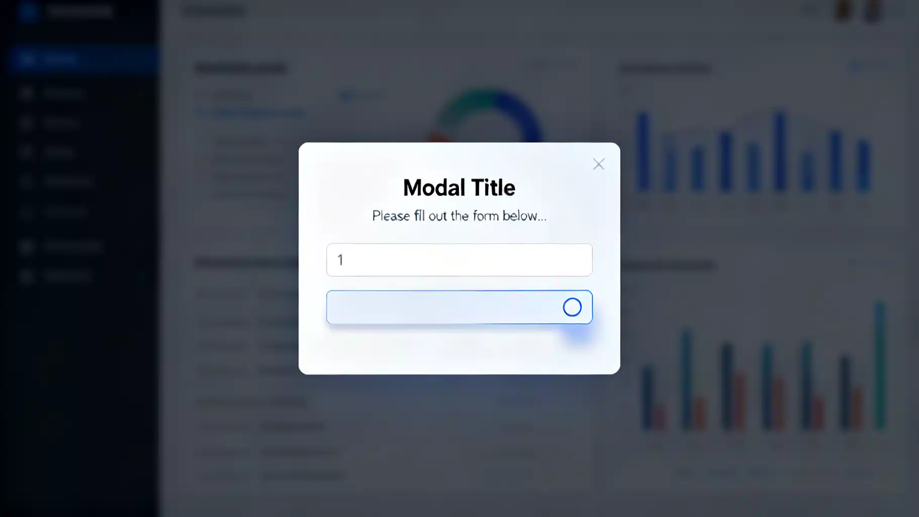
Image used for representation purposes only.
Why accessible modals matter
A modal dialog interrupts the current workflow to request a decision, show critical information, or collect input. Because it takes over keyboard and screen-reader focus, it must be implemented with care. An inaccessible modal can trap users, hide context from assistive tech, or make escape impossible. This guide walks through a robust, production-ready React modal that follows WAI-ARIA Authoring Practices and works with keyboards, screen readers, and touch.
Requirements checklist
Before writing code, align on behavior:
- Semantics
- role=‘dialog’ (or ‘alertdialog’ for urgent, blocking content)
- aria-modal=‘true’
- Accessible name via aria-labelledby or aria-label
- Optional description via aria-describedby
- Focus
- Move focus inside the dialog when it opens
- Trap focus within while open (Tab/Shift+Tab cycle)
- Restore focus to the previously focused element when it closes
- Keyboard
- Esc closes (unless the flow forbids it)
- Tab/Shift+Tab traverse only focusable elements within the dialog
- Visibility
- Hide content outside the dialog from assistive tech
- Prevent background page from scrolling while open
- Pointer
- Optional: click backdrop to close without stealing focus
- Structure
- Render via a portal to document.body to escape CSS stacking and z-index issues
- Performance & resilience
- SSR-friendly, no crashes if document/window are unavailable at import time
Architecture overview
We will build a
- Portals its markup to a container div appended to document.body
- Applies role=‘dialog’ and aria-modal=‘true’
- Accepts labelledBy and describedBy IDs for the dialog title and description
- Traps focus with a small utility
- Locks scrolling using body position locking (no layout jump)
- Hides background from assistive tech with aria-hidden on body siblings
- Restores focus to the element that opened the modal
Implementation (TypeScript + React 18)
The implementation is intentionally dependency-light. You can replace pieces with libraries like focus-trap, react-remove-scroll, or aria-hidden if preferred.
// Modal.tsx
import React, {useEffect, useLayoutEffect, useRef, useId} from 'react';
import {createPortal} from 'react-dom';

type ModalProps = {
  isOpen: boolean;
  onClose: () => void;
  children: React.ReactNode;
  labelledBy?: string; // id of the heading inside the dialog
  describedBy?: string; // id of descriptive text
  initialFocusRef?: React.RefObject<HTMLElement>;
  closeOnEsc?: boolean;
  closeOnBackdrop?: boolean;
};

const FOCUSABLE_SELECTOR = [
  'a[href]',
  'button:not([disabled])',
  'textarea:not([disabled])',
  'input:not([disabled])',
  'select:not([disabled])',
  '[tabindex]:not([tabindex="-1"])'
].join(',');

function useIsomorphicLayoutEffect(cb: React.EffectCallback, deps: React.DependencyList) {
  return typeof window !== 'undefined' ? useLayoutEffect(cb, deps) : useEffect(cb, deps);
}

export function Modal({
  isOpen,
  onClose,
  children,
  labelledBy,
  describedBy,
  initialFocusRef,
  closeOnEsc = true,
  closeOnBackdrop = true
}: ModalProps) {
  const portalElRef = useRef<HTMLElement | null>(null);
  const dialogRef = useRef<HTMLDivElement>(null);
  const previouslyFocusedRef = useRef<HTMLElement | null>(null);

  // Lazily create the portal element
  useIsomorphicLayoutEffect(() => {
    if (!portalElRef.current && typeof document !== 'undefined') {
      const el = document.createElement('div');
      el.setAttribute('data-modal-root', '');
      portalElRef.current = el as HTMLElement;
      document.body.appendChild(el);
    }
    return () => {
      if (portalElRef.current) {
        portalElRef.current.remove();
        portalElRef.current = null;
      }
    };
  }, []);

  // Hide background from assistive tech when open
  useEffect(() => {
    if (!isOpen || typeof document === 'undefined' || !portalElRef.current) return;
    const siblings = Array.from(document.body.children);
    const others = siblings.filter(el => el !== portalElRef.current);
    const prev: Array<{el: Element; ariaHidden: string | null}> = [];
    others.forEach(el => {
      prev.push({el, ariaHidden: el.getAttribute('aria-hidden')});
      el.setAttribute('aria-hidden', 'true');
    });
    return () => {
      prev.forEach(({el, ariaHidden}) => {
        if (ariaHidden === null) el.removeAttribute('aria-hidden');
        else el.setAttribute('aria-hidden', ariaHidden);
      });
    };
  }, [isOpen]);

  // Lock scroll when open (no layout jump)
  useEffect(() => {
    if (!isOpen || typeof document === 'undefined' || typeof window === 'undefined') return;
    const {body} = document;
    const scrollY = window.scrollY;
    const prev = {
      position: body.style.position,
      top: body.style.top,
      width: body.style.width
    };
    body.style.position = 'fixed';
    body.style.top = `-${scrollY}px`;
    body.style.width = '100%';
    return () => {
      body.style.position = prev.position;
      body.style.top = prev.top;
      body.style.width = prev.width;
      window.scrollTo(0, scrollY);
    };
  }, [isOpen]);

  // Manage focus: move in on open, trap while open, restore on close
  useEffect(() => {
    if (!isOpen || typeof document === 'undefined') return;

    previouslyFocusedRef.current = document.activeElement as HTMLElement | null;

    const focusFirst = () => {
      const dialog = dialogRef.current;
      if (!dialog) return;
      const target = initialFocusRef?.current || (dialog.querySelector(FOCUSABLE_SELECTOR) as HTMLElement | null);
      if (target) target.focus();
      else {
        // Make the dialog itself focusable if nothing else is
        dialog.tabIndex = -1;
        dialog.focus();
      }
    };

    // Next tick to ensure portal content is present
    const id = window.setTimeout(focusFirst); // 0ms

    const handleKeyDown = (e: KeyboardEvent) => {
      if (e.key === 'Escape' && closeOnEsc) {
        e.stopPropagation();
        onClose();
        return;
      }
      if (e.key === 'Tab') {
        const dialog = dialogRef.current;
        if (!dialog) return;
        const focusables = Array.from(dialog.querySelectorAll<HTMLElement>(FOCUSABLE_SELECTOR))
          .filter(el => !el.hasAttribute('disabled') && !el.getAttribute('aria-hidden'));
        if (focusables.length === 0) {
          e.preventDefault();
          dialog.focus();
          return;
        }
        const first = focusables[0];
        const last = focusables[focusables.length - 1];
        const active = document.activeElement as HTMLElement | null;
        if (!e.shiftKey && active === last) {
          e.preventDefault();
          first.focus();
        } else if (e.shiftKey && active === first) {
          e.preventDefault();
          last.focus();
        }
      }
    };

    document.addEventListener('keydown', handleKeyDown, true);

    return () => {
      window.clearTimeout(id);
      document.removeEventListener('keydown', handleKeyDown, true);
      // Restore focus
      const prev = previouslyFocusedRef.current;
      if (prev && typeof prev.focus === 'function') prev.focus();
      previouslyFocusedRef.current = null;
    };
  }, [isOpen, closeOnEsc, onClose, initialFocusRef]);

  if (!isOpen || !portalElRef.current) return null;

  const onBackdropClick: React.MouseEventHandler<HTMLDivElement> = (e) => {
    if (!closeOnBackdrop) return;
    if (e.target === e.currentTarget) onClose();
  };

  const content = (
    <div
      role='dialog'
      aria-modal='true'
      aria-labelledby={labelledBy}
      aria-describedby={describedBy}
      className='modal-backdrop'
      onMouseDown={onBackdropClick}
      ref={dialogRef}
    >
      <div className='modal-panel' role='document'>
        {children}
      </div>
    </div>
  );

  return createPortal(content, portalElRef.current);
}
Styles (minimal, theme as needed)
/* Prevent body shift when scrollbar disappears is handled in JS */

.modal-backdrop {
  position: fixed;
  inset: 0;
  background: rgba(0,0,0,0.45);
  display: grid;
  place-items: center;
  padding: 1rem;
  z-index: 1000;
}

.modal-panel {
  max-height: 85vh;
  overflow: auto;
  max-width: 42rem;
  width: 100%;
  background: #fff;
  color: #111;
  border-radius: 0.5rem;
  box-shadow: 0 10px 30px rgba(0,0,0,0.35);
  padding: 1rem 1.25rem;
}

.visually-hidden {
  position: absolute !important;
  height: 1px; width: 1px;
  overflow: hidden;
  clip: rect(1px, 1px, 1px, 1px);
  white-space: nowrap;
}

@media (prefers-reduced-motion: no-preference) {
  .modal-backdrop { animation: fadeIn .12s ease-out; }
  .modal-panel { animation: scaleIn .14s ease-out; transform-origin: 50% 45%; }
  @keyframes fadeIn { from { opacity: 0 } to { opacity: 1 } }
  @keyframes scaleIn { from { transform: scale(.98); opacity: 0 } to { transform: scale(1); opacity: 1 } }
}
Usage example
// App.tsx
import React, {useRef, useState} from 'react';
import {Modal} from './Modal';

export default function App() {
  const [open, setOpen] = useState(false);
  const headingId = 'settings-title';
  const descId = 'settings-desc';
  const firstFieldRef = useRef<HTMLInputElement>(null);

  return (
    <div className='page'>
      <h1>Dashboard</h1>
      <button onClick={() => setOpen(true)}>Open settings</button>

      <Modal
        isOpen={open}
        onClose={() => setOpen(false)}
        labelledBy={headingId}
        describedBy={descId}
        initialFocusRef={firstFieldRef}
      >
        <header style={{display: 'flex', justifyContent: 'space-between', alignItems: 'center'}}>
          <h2 id={headingId}>Settings</h2>
          <button aria-label='Close dialog' onClick={() => setOpen(false)}>×</button>
        </header>
        <p id={descId}>Update your preferences. All fields are optional.</p>
        <form>
          <label>
            Display name
            <input ref={firstFieldRef} type='text' />
          </label>
          <label>
            Email notifications
            <select>
              <option>All</option>
              <option>Important only</option>
              <option>None</option>
            </select>
          </label>
          <div style={{marginTop: '1rem'}}>
            <button type='submit'>Save</button>
            <button type='button' onClick={() => setOpen(false)}>Cancel</button>
          </div>
        </form>
      </Modal>
    </div>
  );
}
Testing accessibility
- Screen readers
- VoiceOver (macOS/iOS), NVDA or JAWS (Windows), TalkBack (Android)
- Verify: focus moves into dialog; title is announced; background is not navigable; Esc closes; focus returns to the trigger
- Keyboard-only
- Tab/Shift+Tab loop inside dialog
- No focus is possible behind the backdrop
- Automated checks
- jest-axe or @axe-core/react for static rules
- @testing-library/react + user-event for keyboard flows
Example test skeleton:
import {render, screen} from '@testing-library/react';
import user from '@testing-library/user-event';
import {Modal} from './Modal';

// …render wrapper that toggles isOpen…

it('traps focus and restores it on close', async () => {
  const userEvent = user.setup();
  // open modal
  // expect focus to be inside
  await userEvent.tab();
  // …
  await userEvent.keyboard('{Escape}');
  // expect focus restored to trigger
});
Common pitfalls and how to avoid them
- Missing accessible name
- Ensure the dialog has an accessible name via aria-labelledby or aria-label. Prefer tying it to a visible heading inside the dialog.
- Forgetting to restore focus
- Always capture document.activeElement before opening and restore it in cleanup.
- Not hiding background from assistive tech
- aria-modal=‘true’ is helpful but does not hide all content for all AT. Proactively set aria-hidden=‘true’ on body siblings (or use the inert attribute with a polyfill if you rely on it).
- Scroll jumps on open/close
- Use body position locking, not just overflow: hidden, to prevent layout jumps on some mobile browsers.
- Overzealous backdrop clicks
- Only close when the backdrop itself is clicked (e.target === e.currentTarget) so clicks inside the panel don’t close the dialog.
- Using display: none to hide open dialogs
- If the dialog is open, it must be in the accessibility tree. When closed, unmount it to remove from tab order and the tree.
- Nesting modals
- Avoid stacking dialogs; it complicates focus and announcements. Use wizard steps or inline expansions instead.
Enhancements and variations
- Alert dialogs
- For urgent confirmation, change role to ‘alertdialog’ and ensure the primary action is focused on open. Keep Esc-to-close consistent with your pattern library.
- Return focus to a specific element
- Allow a prop to pass a focus return target if it differs from previouslyFocusedRef.
- Transitions
- Respect prefers-reduced-motion and keep animations short and subtle. Ensure focus moves immediately; visual transitions should not delay focus.
- Accessibility annotations
- If the dialog contains dynamic status updates, use aria-live regions inside the dialog, not outside it.
Native
The HTML
function NativeDialog({open, onClose, labelledBy, children}: {
  open: boolean; onClose: () => void; labelledBy?: string; children: React.ReactNode;
}) {
  const ref = React.useRef<HTMLDialogElement>(null);
  useEffect(() => {
    const d = ref.current; if (!d) return;
    if (open && !d.open) d.showModal();
    if (!open && d.open) d.close();
  }, [open]);
  useEffect(() => {
    const d = ref.current; if (!d) return;
    const onCancel = (e: Event) => { e.preventDefault(); onClose(); };
    d.addEventListener('cancel', onCancel);
    return () => d.removeEventListener('cancel', onCancel);
  }, [onClose]);
  return (
    <dialog ref={ref} aria-labelledby={labelledBy}>
      {children}
    </dialog>
  );
}
Choose this route if you’re comfortable with its styling quirks and need less custom behavior. Keep the same labeling and testing discipline.
Conclusion
An accessible modal is less about visuals and more about semantics, focus, and predictable behavior. By combining ARIA roles, proper labeling, careful focus management, background hiding, and scroll locking, you create a dialog that works for everyone. Start with the lightweight implementation above, add tests, and grow it into a reusable component in your design system.
Related Posts
Accessible Focus Management in React: From Routing to Modals
A practical guide to accessible focus management in React: keyboard navigation, skip links, route changes, modals, roving tabIndex, and testing.

Building an Accessible React Tooltip and Hover Card in React
Build an accessible React tooltip and hover card with Floating UI and Radix, covering keyboard support, touch, portals, theming, and tests.

Building an Accessible React Floating Action Button (FAB) in React
Build an accessible React Floating Action Button (FAB) with portals, speed dial, theming, keyboard support, and tests—production-ready patterns included.