
Building a Robust React Drawer Navigation Component (Web)
Build an accessible, responsive, high‑performance React drawer navigation component with code, a11y tips, and production checklists.
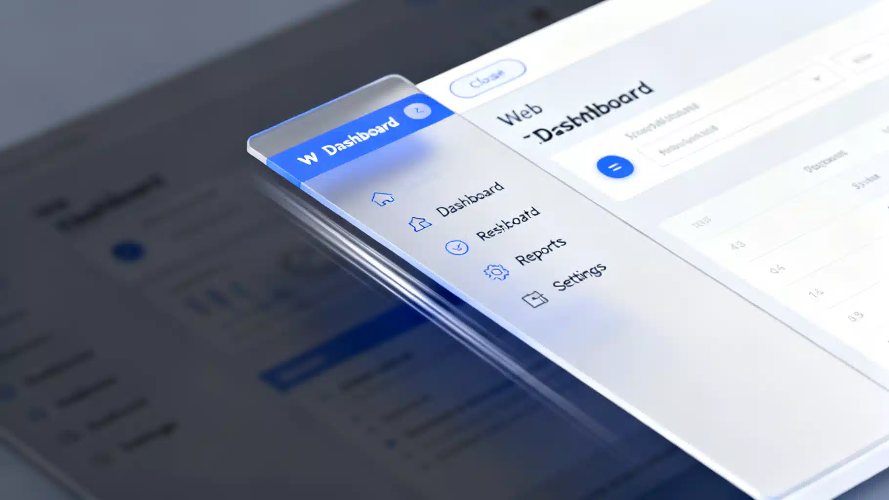
Image used for representation purposes only.
Overview
Drawer navigation is a staple pattern for progressive disclosure: it keeps primary tasks visible while hiding secondary navigation and filters until they’re needed. In React, a well‑built drawer must be accessible, responsive, and performant—without fighting your routing or state management.
This guide walks through UX choices, accessibility requirements, a from‑scratch implementation, and production tips. Examples target React for the web, with notes for React Native at the end.
When (and When Not) To Use a Drawer
Use a drawer when:
- You have more than 5–7 secondary destinations or filters that don’t warrant permanent screen real estate.
- Content benefits from full width, especially on mobile, and navigation can be temporarily hidden.
- You want a progressive path from quick icon access (mini variant) to full navigation labels (expanded).
Avoid a drawer when:
- Primary navigation must always be visible (e.g., mission‑critical dashboards).
- You have very few destinations—tabs or a top bar may be clearer.
- The workflow is linear; a wizard/stepper is a better fit.
Common Drawer Variants
- Temporary (modal/overlay): Slides over content; blocks background. Great on mobile.
- Persistent: Sits beside content on desktop; doesn’t block background.
- Mini variant: Collapsed rail with icons; expands on hover or toggle.
- Responsive hybrid: Temporary under 1024px, persistent above.
Anatomy
- Trigger: Button in the app bar or a hamburger/“Filters” button.
- Panel: The sliding container.
- Scrim/overlay: A backdrop for temporary drawers.
- Content: Navigation list, section labels, optional user/account area.
- Close affordance: Dedicated “Close” button, plus overlay click and Esc key.
- Focus management: Initial focus target; focus trap; return focus on close.
Accessibility Checklist
For a temporary (modal) drawer:
- Role and labeling: role=“dialog” with aria-modal=“true”. Provide aria-labelledby pointing to the drawer title, or aria-label for a concise name.
- Focus: Move focus into the drawer on open; trap focus inside; return focus to the trigger on close.
- Keyboard: Support Esc to close; Tab/Shift+Tab cycle within the drawer.
- Background: Make the page behind inert (use the inert attribute if available) or set aria-hidden and disable pointer events.
- Contrast and targets: Meet WCAG color contrast; 44×44 px targets on touch.
For a persistent (non-modal) drawer:
- Use a semantic region instead of dialog.
- No focus trap; content remains interactive.
Respect reduced motion: Prefer opacity/transform transitions; let users opt out with @media (prefers-reduced-motion: reduce).
From-Scratch React Drawer (Headless)
The snippet below implements a temporary (modal) left drawer with a focus trap, Esc handling, overlay click‑to‑close, and return‑focus behavior. For production, consider a proven focus‑trap utility, but this shows the moving parts clearly.
import React, {useEffect, useRef} from 'react';
import {createPortal} from 'react-dom';

type DrawerProps = {
  open: boolean;
  onOpenChange: (open: boolean) => void;
  title?: string;
  children: React.ReactNode;
};

export function Drawer({ open, onOpenChange, title = 'Navigation', children }: DrawerProps) {
  const overlayRef = useRef<HTMLDivElement | null>(null);
  const panelRef = useRef<HTMLDivElement | null>(null);
  const lastFocused = useRef<HTMLElement | null>(null);

  // Move focus in, trap it, and restore on close
  useEffect(() => {
    const root = document.getElementById('root') || document.body;

    if (open) {
      lastFocused.current = (document.activeElement as HTMLElement) || null;
      // Inert background if supported
      if ('inert' in HTMLElement.prototype) (root as any).inert = true;

      // Focus first focusable element or panel
      const focusable = panelRef.current?.querySelector<HTMLElement>(
        'button, [href], input, select, textarea, [tabindex]:not([tabindex="-1"])'
      );
      (focusable || panelRef.current)?.focus();

      const onKeyDown = (e: KeyboardEvent) => {
        if (e.key === 'Escape') onOpenChange(false);
        if (e.key === 'Tab') {
          // naive focus trap
          const focusables = panelRef.current?.querySelectorAll<HTMLElement>(
            'button, [href], input, select, textarea, [tabindex]:not([tabindex="-1"])'
          );
          if (!focusables || focusables.length === 0) return;
          const first = focusables[0];
          const last = focusables[focusables.length - 1];
          const active = document.activeElement as HTMLElement;
          if (!e.shiftKey && active === last) { e.preventDefault(); first.focus(); }
          if (e.shiftKey && active === first) { e.preventDefault(); last.focus(); }
        }
      };

      document.addEventListener('keydown', onKeyDown);
      return () => {
        document.removeEventListener('keydown', onKeyDown);
      };
    } else {
      // Restore focus and remove inert
      if ('inert' in HTMLElement.prototype) (root as any).inert = false;
      lastFocused.current?.focus?.();
    }
  }, [open, onOpenChange]);

  if (!open) return null;

  return createPortal(
    <div
      ref={overlayRef}
      className="drawer-overlay"
      aria-hidden
      onMouseDown={(e) => {
        // Only close when clicking backdrop, not the panel
        if (e.target === overlayRef.current) onOpenChange(false);
      }}
    >
      <div
        ref={panelRef}
        className="drawer-panel"
        role="dialog"
        aria-modal="true"
        aria-labelledby="drawer-title"
        tabIndex={-1}
      >
        <header className="drawer-header">
          <h2 id="drawer-title">{title}</h2>
          <button aria-label="Close" onClick={() => onOpenChange(false)}>✕</button>
        </header>
        <nav aria-label="Drawer">
          {children}
        </nav>
      </div>
    </div>,
    document.body
  );
}
Basic styles and motion:
.drawer-overlay {
  position: fixed; inset: 0; background: rgba(0,0,0,.5);
  display: grid; grid-template-columns: 1fr; place-items: stretch;
}
.drawer-panel {
  width: min(85vw, 360px);
  height: 100dvh; /* mobile safe viewport */
  background: var(--surface, #fff);
  color: var(--text, #111);
  box-shadow: 0 10px 30px rgba(0,0,0,.2);
  transform: translateX(-100%);
  animation: slide-in .2s ease-out forwards;
}
.drawer-header { display:flex; align-items:center; justify-content:space-between; padding: 1rem; }

@keyframes slide-in { from { transform: translateX(-100%); } to { transform: translateX(0); } }

@media (prefers-reduced-motion: reduce) {
  .drawer-panel { animation: none; transform: none; }
}
Usage:
function App() {
  const [open, setOpen] = React.useState(false);
  return (
    <>
      <button onClick={() => setOpen(true)} aria-haspopup="dialog" aria-controls="drawer">Menu</button>
      <Drawer open={open} onOpenChange={setOpen} title="Main menu">
        <ul>
          <li><a href="/dashboard">Dashboard</a></li>
          <li><a href="/reports">Reports</a></li>
          <li><a href="/settings">Settings</a></li>
        </ul>
      </Drawer>
    </>
  );
}
Notes:
- Prefer a battle‑tested focus trap (e.g., focus-trap) in production.
- Consider portal + z-index layering to avoid stacking-context bugs.
- Add body scroll lock on open (overflow: hidden on html/body or use a library) to prevent background scroll.
Controlled vs. Uncontrolled API
- Controlled:
is predictable, integrates with global state, and plays nicely with routers. - Uncontrolled: Internally tracks open state, simpler to drop in, but harder to synchronize with URL changes. If you must, also expose onOpenChange.
Recommended signature:
- props: open, defaultOpen, onOpenChange, side = “left” | “right”, modal = boolean, closeOnOverlayClick = boolean, closeOnEsc = boolean.
Router Integration
- Close the drawer on route change to avoid stale navigation state.
- In React Router, listen to location changes; in Next.js, subscribe to router.events.
- If the drawer controls filters instead of navigation, consider encoding open state or filter state in the URL for shareability.
Responsive Behavior
- Use a CSS clamp for width and switch variants at breakpoints:
- Under 1024px: temporary/modal.
- 1024px and up: persistent or mini variant.
- Respect safe areas: padding-left: env(safe-area-inset-left) on iOS.
Animation and Feel
- Use transform: translateX for GPU‑friendly motion.
- Keep duration short (150–220ms) with ease-out for open, ease-in for close.
- Stagger nav items subtly for polish, but disable when prefers-reduced-motion is set.
Using a Component Library
If you prefer to skip headless wiring, libraries offer robust drawers out of the box.
Material UI (MUI):
import Drawer from '@mui/material/Drawer';
import List from '@mui/material/List';

function MuiExample({ open, setOpen }: {open: boolean; setOpen: (v:boolean)=>void}) {
  return (
    <Drawer anchor="left" open={open} onClose={() => setOpen(false)} ModalProps={{ keepMounted: true }}>
      <List sx={{ width: 320 }}>
        {/* ListItemButton + ListItemIcon + ListItemText */}
      </List>
    </Drawer>
  );
}
Radix UI (Dialog as a side sheet):
import * as Dialog from '@radix-ui/react-dialog';

export function RadixDrawer() {
  return (
    <Dialog.Root>
      <Dialog.Trigger>Menu</Dialog.Trigger>
      <Dialog.Portal>
        <Dialog.Overlay className="overlay" />
        <Dialog.Content className="sheet-left" aria-label="Navigation">
          <Dialog.Title>Main menu</Dialog.Title>
          {/* Nav items */}
          <Dialog.Close>Close</Dialog.Close>
        </Dialog.Content>
      </Dialog.Portal>
    </Dialog.Root>
  );
}
Other good options: Headless UI’s Dialog, Ark UI/React Aria Components for fully accessible primitives.
Performance Tips
- Keep the drawer mounted (keepMounted) and toggle visibility with CSS for snappy re‑opens.
- Memoize large nav lists; avoid re‑creating arrays/objects on every render.
- Defer heavy content until the drawer opens (lazy load settings, avatars, etc.).
- Use will-change: transform during animations only to avoid long‑lived memory costs.
Testing Strategy
- Unit/integration (React Testing Library):
- Open via trigger; assert role=“dialog” and aria-modal; verify focus is inside.
- Press Esc and expect onOpenChange(false).
- Tab through and ensure focus cycles.
- E2E (Playwright/Cypress):
- Check overlay click closes drawer.
- Validate mobile breakpoint behavior in viewport emulation.
- Accessibility (axe/Storybook a11y):
- No color contrast or ARIA violations.
Common Gotchas
- Body scroll lock on iOS: apply overflow: hidden to body and consider position: fixed on the app shell to prevent rubber‑banding.
- Stacking context: portals avoid z-index fights with transformed parents.
- Focus restoration: store last activeElement before opening, return to it on close.
- Background interactivity: use inert where available; otherwise combine aria-hidden with pointer-events: none.
Production Checklist
- Keyboard: Tab trap, Shift+Tab, Esc.
- Screen reader: role/labeling, focus on open, return focus on close.
- Visual: contrast, large touch targets, reduced motion.
- Performance: keepMounted or lazy load; memoize nav items.
- Responsive: temporary on mobile, persistent on desktop.
- Router: close on navigation.
React Native Note
For React Native, use @react-navigation/drawer for a platform‑appropriate, gesture‑enabled drawer navigator. Many a11y and state principles above still apply, but implementation differs because it’s native UI, not the DOM.
Final Thoughts
A drawer is more than a sliding panel—it’s a carefully orchestrated focus, motion, and state experience. Whether you choose a headless approach or a UI library, following the accessibility and performance practices above will give you a robust, reliable React drawer that feels right on every screen.
Related Posts

Build a Rock-Solid React Scroll Spy Navigation with Hooks and TypeScript
Build a robust React scroll spy navigation with hooks, a11y, smooth scrolling, SSR tips, and TypeScript—plus an optional IntersectionObserver version.

Building Effective React Skeleton Loading UIs: Patterns, Code, and A11y Tips
Build accessible, performant skeleton loading UIs in React with patterns, Suspense, CSS shimmer, and testing tips.
Build a Headless React UI Library: A Practical Tabs Tutorial
Build a headless React UI component library step by step—accessibility, state, TypeScript, testing, and packaging—using a fully featured Tabs example.