Implementing Material 3 in Flutter: A Practical, End‑to‑End Guide
Implement Material 3 in Flutter with ColorScheme.fromSeed, dynamic color, modern components, theming patterns, migration tips, and best practices.
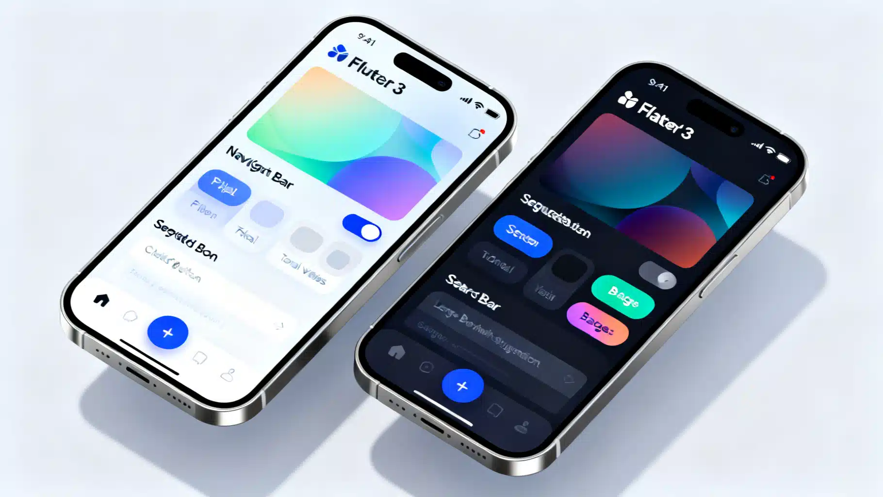
Image used for representation purposes only.
Overview
Material 3 (Material You) is more than a fresh coat of paint for Flutter apps. It rethinks color, elevation, motion, and component behavior so interfaces feel personal, legible, and adaptive across form factors. In Flutter, Material 3 is opt‑in and driven by a ColorScheme-first API, dynamic color on supported platforms, and a modernized component set (NavigationBar, NavigationDrawer, SegmentedButton, SearchBar, Badges, and more).
This guide shows how to enable Material 3, build resilient themes with ColorScheme.fromSeed and dynamic color, adopt new components, and migrate safely from older Material 2 styling.
Quick start: turn on Material 3
Enable Material 3 by setting useMaterial3: true and supplying a ColorScheme. Prefer ColorScheme.fromSeed for consistent tonal palettes.
import 'package:flutter/material.dart';

const _seed = Color(0xFF6750A4); // Your brand seed

void main() => runApp(const MyApp());

class MyApp extends StatelessWidget {
  const MyApp({super.key});

  @override
  Widget build(BuildContext context) {
    final light = ColorScheme.fromSeed(seedColor: _seed, brightness: Brightness.light);
    final dark  = ColorScheme.fromSeed(seedColor: _seed, brightness: Brightness.dark);

    return MaterialApp(
      debugShowCheckedModeBanner: false,
      themeMode: ThemeMode.system,
      theme: ThemeData(useMaterial3: true, colorScheme: light),
      darkTheme: ThemeData(useMaterial3: true, colorScheme: dark),
      home: const HomePage(),
    );
  }
}
Key points:
- ColorScheme is the source of truth for colors. Avoid legacy fields like primaryColor.
- Provide both light and dark schemes. Use ThemeMode.system for automatic switching.
- Enabling useMaterial3 activates updated defaults for typography, shapes, paddings, and newer components.
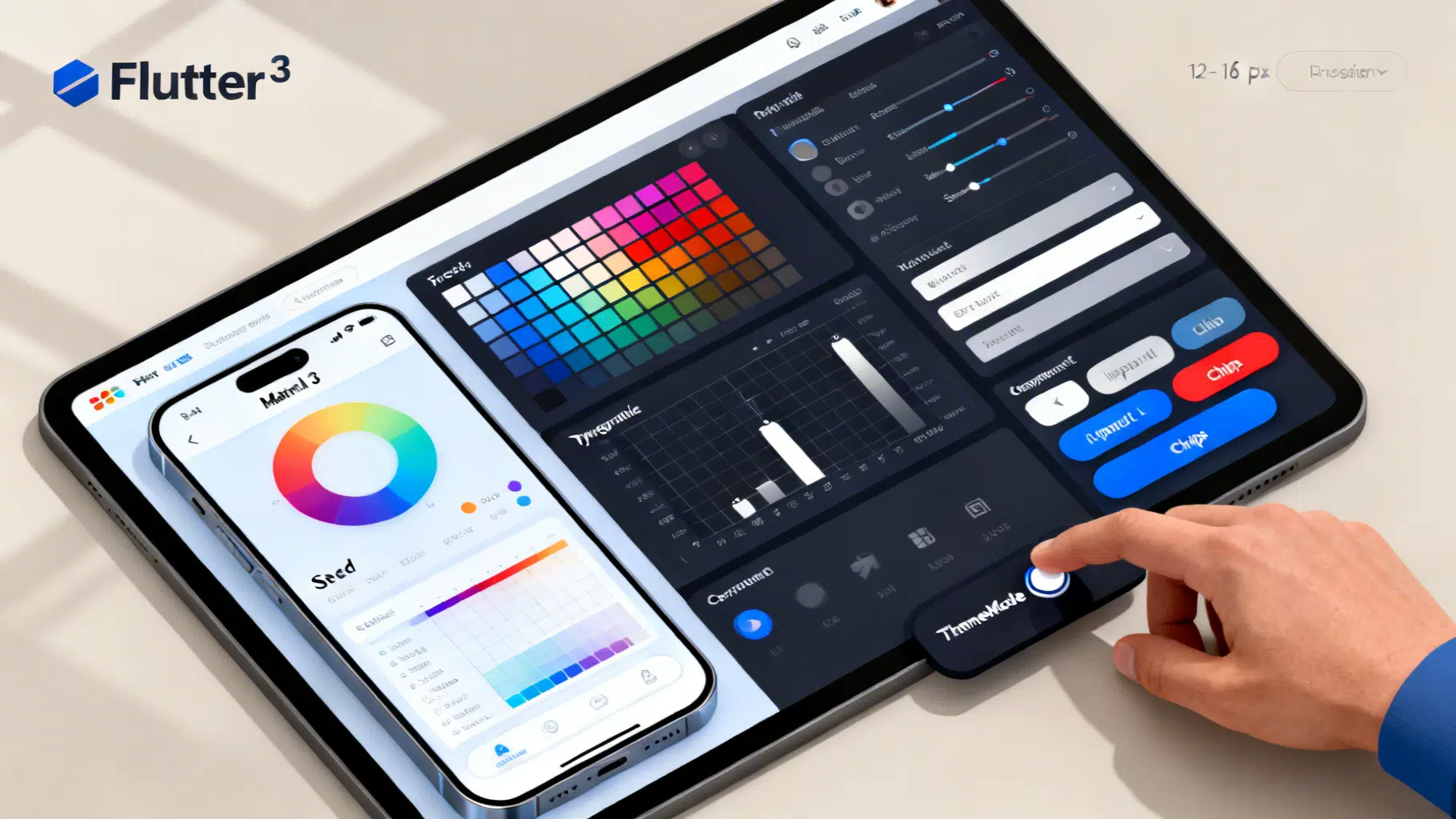
Building a resilient ColorScheme
Material 3 defines a 12-tone palette derived from a single seed. Flutter exposes this via ColorScheme.fromSeed, giving you consistent roles like primary, secondary, tertiary, surface, surfaceContainer variants, error, and their on- colors.
final scheme = ColorScheme.fromSeed(
  seedColor: _seed,
  brightness: Brightness.light,
  // Optional fine-tuning:
  // dynamic shades, surface variants, etc., are derived automatically.
);
Tips:
- Favor ColorScheme roles in your UI (Theme.of(context).colorScheme.primary). Do not hardcode brand colors into widgets.
- Use tertiary for accent/illustrative elements instead of overloading primary.
- Prefer FilledButton.tonal to represent medium-emphasis actions using the tonal palette.
Dynamic color (Material You) on Android 12+
Dynamic color personalizes your app using the user’s wallpaper. On supported Android versions, read the system scheme and fall back to your seed elsewhere. The dynamic_color package is the simplest approach.
import 'package:dynamic_color/dynamic_color.dart';

class MyApp extends StatefulWidget {
  const MyApp({super.key});
  @override State<MyApp> createState() => _MyAppState();
}

class _MyAppState extends State<MyApp> {
  ThemeMode _mode = ThemeMode.system;

  @override
  Widget build(BuildContext context) {
    return DynamicColorBuilder(
      builder: (ColorScheme? lightDynamic, ColorScheme? darkDynamic) {
        final light = lightDynamic ??
            ColorScheme.fromSeed(seedColor: _seed, brightness: Brightness.light);
        final dark = darkDynamic ??
            ColorScheme.fromSeed(seedColor: _seed, brightness: Brightness.dark);

        return MaterialApp(
          themeMode: _mode,
          theme: ThemeData(useMaterial3: true, colorScheme: light),
          darkTheme: ThemeData(useMaterial3: true, colorScheme: dark),
          home: HomePage(onToggleTheme: () {
            setState(() => _mode = _mode == ThemeMode.light ? ThemeMode.dark : ThemeMode.light);
          }),
        );
      },
    );
  }
}
Notes:
- Dynamic color is platform-specific. On iOS, web, desktop, or older Android, you’ll use the seed-derived scheme.
- Keep your brand identity by choosing a seed color aligned with your visual language. The harmonic blending keeps branding intact while adapting to user palettes.
Light, dark, and high contrast
Flutter lets you define theme, darkTheme, and highContrastTheme variants. If your audience includes low-vision users, consider high-contrast overrides that increase contrast while respecting M3 tokens.
MaterialApp(
  theme: ThemeData(useMaterial3: true, colorScheme: light),
  darkTheme: ThemeData(useMaterial3: true, colorScheme: dark),
  highContrastTheme: ThemeData(
    useMaterial3: true,
    colorScheme: light.copyWith(
      primary: light.primary, // keep roles but tune surfaces and outlines as needed
    ),
  ),
);
Typography, shape, and motion defaults
With useMaterial3 true, Flutter adopts the Material 3 typography scale (updated sizes/names within TextTheme) and rounded shape defaults that scale per component (e.g., buttons, cards, text fields). Motion defaults reflect reduced elevation and more subtle transitions.
Practical guidance:
- Use Theme.of(context).textTheme for semantic text (titleLarge for screen titles, bodyMedium for long text). Avoid ad hoc font sizes.
- Customize shapes through component themes (e.g., CardTheme, DialogTheme) or global ThemeData.applyElevationOverlay and component-specific elevation.
- Use IconButton variants (IconButton.filled, .filledTonal, .outlined) to express emphasis via tone rather than only color.
New and updated Material 3 components
Material 3 modernizes the widget set. Here are the most visible pieces and when to use them:
- NavigationBar: Primary bottom navigation with large active indicator; replaces BottomNavigationBar in most apps.
- NavigationDrawer: Side navigation for broader information architectures; pairs well with NavigationRail on larger screens.
- SegmentedButton: Mutually exclusive or multi-select segments for compact filters and switches.
- SearchBar and SearchAnchor: Composable search UX with an anchored suggestions view.
- FilledButton and FilledButton.tonal: Replaces many ElevatedButton use cases with clearer emphasis hierarchy.
- Badges and Chips: Updated styles that match tonal palettes and elevation rules.
- Top app bars: Small, Medium, and Large behaviors via AppBar/SliverAppBar with scrolledUnderElevation to emphasize scroll context.
Elevation, surface tint, and container styles
Material 3 reduces hard shadows and uses surface tinting to convey depth. In Flutter, elevated surfaces apply a subtle overlay (surfaceTint) based on elevation.
Card(
  elevation: 1,
  // Let M3 apply its surface tint automatically, or override explicitly:
  surfaceTintColor: Theme.of(context).colorScheme.surfaceTint,
  child: const ListTile(
    leading: Icon(Icons.palette_outlined),
    title: Text('Surface tint & elevation'),
  ),
);

AppBar(
  title: const Text('Feed'),
  scrolledUnderElevation: 3, // Emphasize once content scrolls under the bar
)
Prefer component defaults unless you have a specific brand reason to customize. Overriding tints broadly can make the UI feel less coherent.
A complete sample screen
The following screen stitches together several M3 components and demonstrates a theme toggle.
class HomePage extends StatefulWidget {
  const HomePage({super.key, this.onToggleTheme});
  final VoidCallback? onToggleTheme;

  @override
  State<HomePage> createState() => _HomePageState();
}

class _HomePageState extends State<HomePage> {
  int _index = 0;
  int _segment = 0;
  final SearchController _searchController = SearchController();

  @override
  Widget build(BuildContext context) {
    return Scaffold(
      appBar: AppBar(
        title: const Text('Material 3 Demo'),
        scrolledUnderElevation: 3,
        actions: [
          IconButton(
            tooltip: 'Toggle theme',
            onPressed: widget.onToggleTheme,
            icon: const Icon(Icons.brightness_6_outlined),
          ),
        ],
      ),
      drawer: const NavigationDrawer(
        children: [
          SizedBox(height: 12),
          NavigationDrawerDestination(
            icon: Icon(Icons.dashboard_outlined),
            label: Text('Dashboard'),
          ),
          NavigationDrawerDestination(
            icon: Icon(Icons.settings_outlined),
            label: Text('Settings'),
          ),
        ],
      ),
      floatingActionButton: FloatingActionButton.extended(
        onPressed: () {},
        icon: const Icon(Icons.add),
        label: const Text('Create'),
      ),
      bottomNavigationBar: NavigationBar(
        selectedIndex: _index,
        onDestinationSelected: (i) => setState(() => _index = i),
        destinations: const [
          NavigationDestination(
            icon: Icon(Icons.home_outlined),
            selectedIcon: Icon(Icons.home),
            label: 'Home',
          ),
          NavigationDestination(
            icon: Icon(Icons.search),
            label: 'Search',
          ),
          NavigationDestination(
            icon: Icon(Icons.person_outline),
            selectedIcon: Icon(Icons.person),
            label: 'Profile',
          ),
        ],
      ),
      body: ListView(
        padding: const EdgeInsets.all(16),
        children: [
          FilledButton(onPressed: () {}, child: const Text('Primary action')),
          const SizedBox(height: 12),
          FilledButton.tonal(onPressed: () {}, child: const Text('Tonal action')),
          const SizedBox(height: 12),
          OutlinedButton(onPressed: () {}, child: const Text('Secondary')),
          const SizedBox(height: 12),
          SegmentedButton<int>(
            segments: const [
              ButtonSegment(value: 0, label: Text('Day'), icon: Icon(Icons.wb_sunny_outlined)),
              ButtonSegment(value: 1, label: Text('Week'), icon: Icon(Icons.calendar_view_week)),
              ButtonSegment(value: 2, label: Text('Month'), icon: Icon(Icons.calendar_today)),
            ],
            selected: {_segment},
            onSelectionChanged: (s) => setState(() => _segment = s.first),
          ),
          const SizedBox(height: 12),
          SearchAnchor(
            searchController: _searchController,
            builder: (context, controller) {
              return SearchBar(
                controller: controller,
                hintText: 'Search',
                leading: const Icon(Icons.search),
                onTap: controller.openView,
                onChanged: (_) => controller.openView(),
              );
            },
            suggestionsBuilder: (context, controller) {
              final q = controller.value.text;
              return List.generate(3, (i) =>
                ListTile(
                  leading: const Icon(Icons.history),
                  title: Text('Result ${i + 1} for "$q"'),
                  onTap: () => controller.closeView(q),
                ));
            },
          ),
          const SizedBox(height: 12),
          const Badge(
            label: Text('3'),
            child: Icon(Icons.notifications_outlined),
          ),
          const SizedBox(height: 12),
          Card(
            elevation: 1,
            child: ListTile(
              leading: const Icon(Icons.palette_outlined),
              title: const Text('Surface tint & elevation'),
              subtitle: Text('Primary: '
                  '${0xFF000000 | Theme.of(context).colorScheme.primary.value}'),
            ),
          ),
        ],
      ),
    );
  }
}
Architecting your theme for scale with ThemeExtension
Add your own design tokens (e.g., success/warning colors) without hardcoding them into widgets.
@immutable
class BrandTokens extends ThemeExtension<BrandTokens> {
  const BrandTokens({required this.success, required this.warning});
  final Color success;
  final Color warning;

  @override
  BrandTokens copyWith({Color? success, Color? warning}) =>
      BrandTokens(success: success ?? this.success, warning: warning ?? this.warning);

  @override
  BrandTokens lerp(ThemeExtension<BrandTokens>? other, double t) {
    if (other is! BrandTokens) return this;
    return BrandTokens(
      success: Color.lerp(success, other.success, t)!,
      warning: Color.lerp(warning, other.warning, t)!,
    );
  }

  static BrandTokens light(ColorScheme s) => BrandTokens(
    success: Colors.green.shade600,
    warning: Colors.orange.shade700,
  );
  static BrandTokens dark(ColorScheme s) => BrandTokens(
    success: Colors.green.shade400,
    warning: Colors.orange.shade300,
  );
}

// Register in your ThemeData
final light = ColorScheme.fromSeed(seedColor: _seed);
final dark  = ColorScheme.fromSeed(seedColor: _seed, brightness: Brightness.dark);

final theme = ThemeData(
  useMaterial3: true,
  colorScheme: light,
  extensions: [BrandTokens.light(light)],
);

// Use in widgets
final tokens = Theme.of(context).extension<BrandTokens>()!;
Container(color: tokens.success);
Migration checklist from Material 2
Moving from M2 to M3? Use this checklist to avoid regressions:
- Turn on useMaterial3 and switch to ColorScheme-based theming. Remove primaryColor, accentColor, and ThemeData.colorSchemeSeed if you already provide a ColorScheme.
- Replace BottomNavigationBar with NavigationBar for primary bottom nav.
- Prefer FilledButton/FilledButton.tonal over ElevatedButton for clearer emphasis. Keep TextButton and OutlinedButton as-is.
- Audit custom shadows; reduce excessive elevations. Rely on surface tints for depth.
- Update AppBar to use scrolledUnderElevation and ensure foreground colors come from colorScheme.
- Review chips, badges, and input decorations. The defaults changed; align any custom paddings/radii with M3.
- Validate dark mode and contrast. Confirm minimum contrast ratios for text and key icons.
- Remove hardcoded colors and opacities that clash with tonal palettes.
Accessibility and quality checks
- Contrast: Verify at least 4.5:1 for body text and 3:1 for large text/icons. M3 tones help, but overrides can break it.
- Touch targets: Ensure 48×48 dp tappable regions. M3 components generally conform by default.
- Motion: Respect platform “reduce motion” preferences when adding custom animations.
- Typography scaling: Test at large accessibility font sizes; M3 text styles scale predictably.
Common pitfalls to avoid
- Mixing legacy colors with M3 roles, producing inconsistent visuals.
- Over-customizing surfaceTintColor globally; it can fight the tonal hierarchy.
- Using NavigationBar and BottomNavigationBar together; standardize on one (prefer NavigationBar).
- Hardcoding button styles; instead, theme per component (FilledButtonTheme, OutlinedButtonTheme) or rely on defaults.
Wrap up
Material 3 in Flutter is a unified system: dynamic color when available, seed-derived schemes everywhere else, and components engineered around tonal contrast rather than raw saturation or heavy shadows. Start by enabling useMaterial3, define a robust ColorScheme (fromSeed + dynamic color), adopt the modern components, and scale your design with ThemeExtension. Your UI will look current, accessible, and adaptable—on mobile, desktop, and web.
Related Posts
Flutter Custom Theme System: The Complete, Scalable M3 Guide
Build a scalable custom theme system in Flutter with Material 3: tokens, ColorScheme, extensions, light/dark modes, component overrides, and tests.
Flutter + Stripe Payment Integration: PaymentSheet, Webhooks, and a Production Checklist
Step-by-step Flutter + Stripe integration using PaymentSheet, with backend setup, webhooks, wallets, testing, and a production checklist.

Flutter SSL Certificate Pinning: A Practical, Battle‑Tested Guide
A practical, code-focused guide to implementing SSL certificate pinning in Flutter, with platform and Dart options, rotation strategy, and testing tips.