React Date Range Picker: Patterns, Libraries, and Production-Ready Examples
A practical guide to building robust React date range pickers with UX tips, code examples, validation, time zones, and testing strategies.
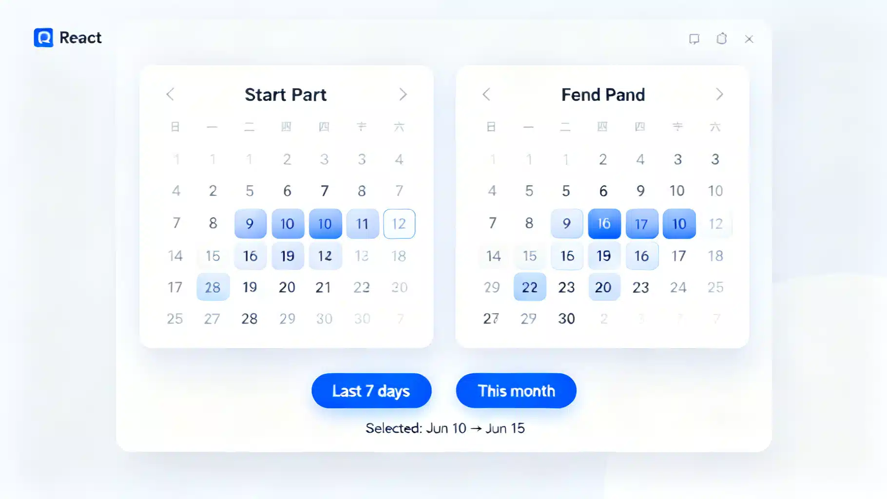
Image used for representation purposes only.
Overview
Date range pickers are a staple of booking flows, analytics dashboards, and reporting tools. In React, you can implement range selection with off‑the‑shelf components or compose your own UX on top of headless calendars. This guide covers UX principles, popular libraries, production caveats (validation, time zones, accessibility), and complete code examples you can drop into an app today.
UX principles for range selection
Well‑designed range pickers do a few things consistently:
- Start and end are visually distinct, with an inclusive highlight between them.
- Hovering a second date previews the tentative range.
- Disabled dates (e.g., before today) are visibly unavailable and non‑interactive.
- Keyboard navigation works with arrow keys and Enter/Space to select.
- Mobile layouts favor a single calendar view; desktop commonly shows two months side by side.
- For analytics, the end date is often inclusive. For bookings/nights, the end is exclusive (checkout day).
Quick wins with a plug‑and‑play component (react-datepicker)
If you want minimal setup and a familiar UI, react-datepicker supports range selection out of the box.
import React from 'react';
import DatePicker from 'react-datepicker';
import 'react-datepicker/dist/react-datepicker.css';

export default function RangeWithReactDatePicker() {
  const [range, setRange] = React.useState<[Date | null, Date | null]>([null, null]);
  const [startDate, endDate] = range;

  return (
    <div>
      <label htmlFor="date-range" style={{ display: 'block', marginBottom: 8 }}>Date range</label>
      <DatePicker
        id="date-range"
        selectsRange
        startDate={startDate}
        endDate={endDate}
        onChange={(update: [Date | null, Date | null]) => setRange(update)}
        isClearable
        monthsShown={2}
        minDate={new Date()}
        placeholderText="Select a start and end date"
      />
      {startDate && endDate && (
        <p style={{ marginTop: 8 }}>
          Selected: {startDate.toDateString()} → {endDate.toDateString()}
        </p>
      )}
    </div>
  );
}
Notes:
- Use minDate/maxDate to constrain ranges.
- monthsShown={2} provides the dual‑calendar desktop pattern.
- The onChange callback returns a tuple [start, end]. You can show a live “N nights” counter by computing the difference once both are set.
Quick presets (Last 7 days, This month)
You can add preset buttons that programmatically set the controlled value:
function addDays(base: Date, days: number) {
  const d = new Date(base);
  d.setDate(d.getDate() + days);
  return d;
}

function startOfMonth(d = new Date()) {
  return new Date(d.getFullYear(), d.getMonth(), 1);
}

function endOfMonth(d = new Date()) {
  return new Date(d.getFullYear(), d.getMonth() + 1, 0);
}

export function RangeWithPresets() {
  const [range, setRange] = React.useState<[Date | null, Date | null]>([null, null]);
  const [start, end] = range;

  return (
    <div>
      <div style={{ display: 'flex', gap: 8, marginBottom: 8 }}>
        <button onClick={() => setRange([addDays(new Date(), -6), new Date()])}>Last 7 days</button>
        <button onClick={() => setRange([startOfMonth(), endOfMonth()])}>This month</button>
        <button onClick={() => setRange([null, null])}>Clear</button>
      </div>
      <DatePicker
        selectsRange
        startDate={start}
        endDate={end}
        onChange={(update: [Date | null, Date | null]) => setRange(update)}
        monthsShown={2}
      />
    </div>
  );
}
Headless/custom approach (react-day-picker)
For maximum control over rendering and behavior, react-day-picker is a great choice. It provides accessible, keyboard‑friendly calendars you can style yourself.
import * as React from 'react';
import { DayPicker, DateRange } from 'react-day-picker';
import 'react-day-picker/dist/style.css';

export default function RangeWithDayPicker() {
  const [range, setRange] = React.useState<DateRange | undefined>();

  return (
    <div>
      <DayPicker
        mode="range"
        selected={range}
        onSelect={setRange}
        numberOfMonths={2}
        disabled={{ before: new Date() }}
        pagedNavigation
      />
      <div style={{ marginTop: 8 }}>
        {range?.from && !range.to && <em>Choose an end date…</em>}
        {range?.from && range?.to && (
          <span>
            {range.from.toDateString()} → {range.to.toDateString()}
          </span>
        )}
      </div>
    </div>
  );
}
Why headless?
- You control the DOM and styles, making it easier to meet brand, a11y, and internationalization requirements.
- You can implement advanced behaviors like multi‑range selection, blackout windows, or custom tooltips for price calendars.
Full‑featured visual picker (react-date-range)
react-date-range provides a polished dual‑calendar with built‑in range previews and well‑documented props.
import * as React from 'react';
import { DateRangePicker } from 'react-date-range';
import 'react-date-range/dist/styles.css';
import 'react-date-range/dist/theme/default.css';

export default function RangeWithReactDateRange() {
  const [selection, setSelection] = React.useState([
    { startDate: new Date(), endDate: null as Date | null, key: 'selection' },
  ]);

  return (
    <DateRangePicker
      ranges={selection}
      onChange={(item: any) => setSelection([item.selection])}
      minDate={new Date()}
      moveRangeOnFirstSelection={false}
      months={2}
      direction="horizontal"
    />
  );
}
Validation and constraints
Regardless of the library, keep these rules close to your state management:
type Range = { start?: Date | null; end?: Date | null };

export function clampRange(r: Range, {
  min = new Date(2000, 0, 1),
  max = new Date(2100, 11, 31),
}: { min?: Date; max?: Date } = {}): Range {
  const start = r.start && r.start < min ? min : r.start ?? null;
  const end = r.end && r.end > max ? max : r.end ?? null;
  // Ensure start <= end when both exist
  if (start && end && start > end) return { start: end, end: start };
  return { start, end };
}
Common constraints:
- Disallow past dates for bookings (minDate = today).
- Blackout maintenance windows or holidays.
- Enforce max span (e.g., 31 days) for analytics queries.
export function isSpanWithin(days: number, start?: Date | null, end?: Date | null) {
  if (!start || !end) return true;
  const ms = Math.abs(end.getTime() - start.getTime());
  return ms <= days * 24 * 60 * 60 * 1000;
}
Time zones and serialization (avoid off‑by‑one errors)
Dates without times can drift when converted to UTC. Practical guidelines:
- Decide whether your domain treats ranges in local time (most UIs) or UTC (server jobs). Be explicit.
- Store date‑only values as ISO strings without a time component (YYYY‑MM‑DD) to avoid implicit zone shifts.
- Convert at the edges: parse/format at boundaries between UI and API.
// Serialize to a date-only string in the user’s local time
export function toLocalDateString(d: Date) {
  const y = d.getFullYear();
  const m = String(d.getMonth() + 1).padStart(2, '0');
  const day = String(d.getDate()).padStart(2, '0');
  return `${y}-${m}-${day}`;
}

// Deserialize from YYYY-MM-DD into a local Date at midnight local time
export function fromLocalDateString(s: string) {
  const [y, m, d] = s.split('-').map(Number);
  return new Date(y, m - 1, d);
}
Inclusive vs exclusive end:
- Analytics: inclusive end. Duration = end − start + 1 day.
- Stays/nights: exclusive end (checkout). Nights = end − start.
export function nightsBetween(checkIn: Date, checkOut: Date) {
  const msPerDay = 24 * 60 * 60 * 1000;
  const start = new Date(checkIn.getFullYear(), checkIn.getMonth(), checkIn.getDate());
  const end = new Date(checkOut.getFullYear(), checkOut.getMonth(), checkOut.getDate());
  return Math.round((end.getTime() - start.getTime()) / msPerDay);
}
Accessibility and internationalization
- Always label inputs (aria-label or a visible
- Ensure contrast for selected/hovered states and size targets for touch.
- Test keyboard navigation end‑to‑end: Tab into input, arrows to move, Enter/Space to select.
- Localize month/day names and date formats. Most libraries accept a locale prop or adapter; ensure you also localize helper text and presets.
Example (react-datepicker) with locale:
import { registerLocale } from 'react-datepicker';
import { fr } from 'date-fns/locale';
registerLocale('fr', fr);

<DatePicker locale="fr" /* ...other props */ />
Working with React Hook Form
Form libraries keep range state predictable and validate at submit time.
import React from 'react';
import { useForm, Controller } from 'react-hook-form';
import DatePicker from 'react-datepicker';
import 'react-datepicker/dist/react-datepicker.css';

type FormValues = {
  range: [Date | null, Date | null];
};

export default function RHFRangeExample() {
  const { control, handleSubmit, formState: { errors } } = useForm<FormValues>({
    defaultValues: { range: [null, null] },
  });

  const onSubmit = (data: FormValues) => {
    const [start, end] = data.range;
    if (start && end) {
      console.log('Submitting', toLocalDateString(start), toLocalDateString(end));
    }
  };

  return (
    <form onSubmit={handleSubmit(onSubmit)}>
      <Controller
        name="range"
        control={control}
        rules={{
          validate: ([s, e]) => (s && e) || 'Please select a start and end date',
        }}
        render={({ field }) => (
          <DatePicker
            selectsRange
            startDate={field.value?.[0]}
            endDate={field.value?.[1]}
            onChange={field.onChange}
            monthsShown={2}
            placeholderText="Select range"
          />
        )}
      />
      {errors.range && <p role="alert">{errors.range.message}</p>}
      <button type="submit" style={{ marginTop: 8 }}>Apply</button>
    </form>
  );
}
Testing range pickers
UI libraries often render days as buttons or grid cells. Use accessible roles and labels for resilient tests.
import { render, screen } from '@testing-library/react';
import userEvent from '@testing-library/user-event';
import RangeWithReactDatePicker from './RangeWithReactDatePicker';

test('selects a range', async () => {
  render(<RangeWithReactDatePicker />);
  const user = userEvent.setup();

  // Open the calendar if your picker uses an input/button trigger
  const input = screen.getByLabelText(/date range/i);
  await user.click(input);

  // Click two distinct days; exact queries depend on the library’s markup
  const day10 = screen.getByRole('button', { name: /10/ });
  const day15 = screen.getByRole('button', { name: /15/ });
  await user.click(day10);
  await user.click(day15);

  // Assert that helper text or input value reflects the selection
  expect(screen.getByText(/selected:/i)).toBeInTheDocument();
});
Tip: Prefer role‑based queries (button, gridcell) and accessible names (aria‑label) over brittle selectors.
Performance tips
- Render two months by default; avoid rendering entire years unless virtualized.
- Memoize heavy day content (e.g., price tooltips) and fetch lazily on month change.
- Defer parsing/formatting to when values change, not on every render.
- In SSR apps (Next.js), ensure the picker renders only on the client if it relies on window or layout effect.
Common pitfalls checklist
- Off‑by‑one day when sending to the API: serialize as YYYY‑MM‑DD, not full ISO with time.
- End before start: clamp or swap automatically for better UX.
- Inclusive vs exclusive end disagreements between UI and backend: document and test.
- Inconsistent locale: ensure calendar, input mask, and printed values share the same locale.
- Accessibility gaps: verify keyboard navigation and screen reader labels.
Choosing the right approach
- Need speed and familiarity: react-datepicker (range mode) is a great default.
- Need fine‑grained control and accessible primitives: react-day-picker.
- Need a polished dual‑calendar with built‑in previews and presets: react-date-range.
No matter which you choose, keep the domain rules (constraints, time zones, inclusive/exclusive semantics) close to your state, and test the full flow from selection to API payload. That’s what turns a nice calendar into a production‑ready range picker.
Related Posts

Building a Robust React Toast Notification System: Patterns, Code, and UX
Design and implement a fast, accessible React toast system with clean APIs, animations, and promise toasts—complete code, patterns, and pitfalls.

Build an Accessible React Color Picker: A Practical Guide
Build a fast, accessible React color picker from scratch: HSV logic, sliders, popover, keyboard/mouse support, CSS variables, tests, and library options.

Build a React Multi-Step Form Wizard with React Hook Form and Zod
Build a robust React multi-step form wizard with React Hook Form and Zod: step-level validation, persistence, and accessibility. Includes full code.