
Build an Accessible React Chip/Tag Component (with Autocomplete)
Build an accessible, headless React chip/tag component with keyboard support, validation, and autocomplete—complete code, UX patterns, and testing tips.
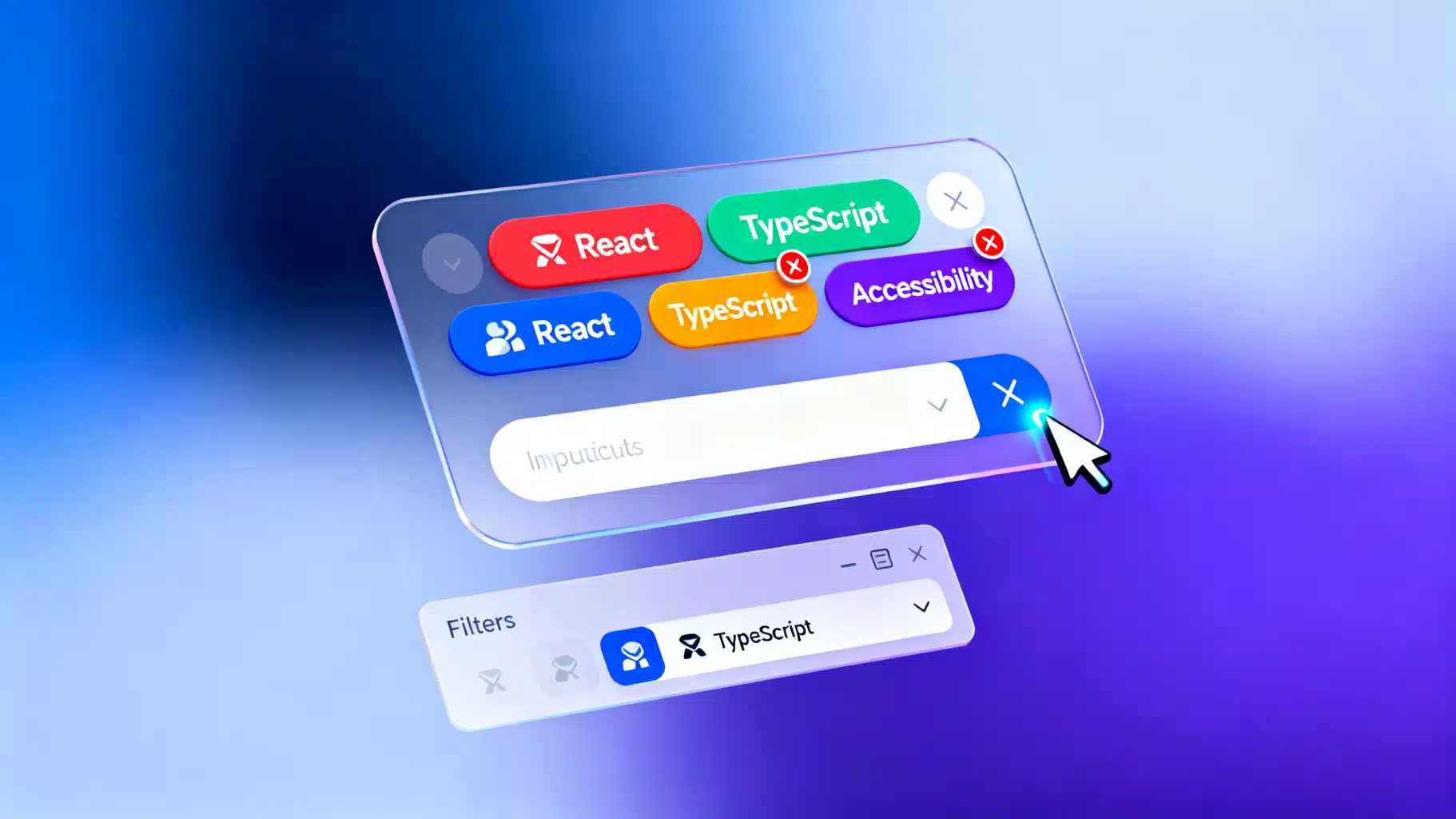
Image used for representation purposes only.
Overview
Chips (also called tags or pills) are compact UI elements that represent an input, attribute, or action. You see them everywhere: selected filters, labeled items, email recipients, and tokenized inputs. In this tutorial, you’ll build a reusable, accessible React Chip/Tag component—plus a TagInput that tokenizes text and offers autocomplete suggestions. We’ll use modern React with TypeScript and a headless approach so you can style it with any system.
What you’ll learn:
- A minimal, reusable Chip component (with remove button and keyboard support)
- A TagInput that adds and deletes chips, handles paste/Enter, and navigates chips with arrow keys
- Accessible patterns with ARIA roles for list, button, and combobox/listbox suggestions
- Styling with plain CSS or utility classes (e.g., Tailwind)
- Controlled vs. uncontrolled APIs and testing strategies
UX and interaction design
Before you code, define behaviors:
- Add a tag when the user presses Enter, comma, or pastes comma-separated values.
- Remove a tag via the close button, Backspace on an empty input, or Delete when a chip has focus.
- Navigate chips with ArrowLeft/ArrowRight; move back to input with ArrowRight on the last chip.
- Provide clear labels and descriptions; announce chip removal via aria-live.
- Optional autocomplete: listbox of suggestions filtered by input; Up/Down to navigate; Enter to commit.
Project setup
Assume React 18+, Vite (or CRA), and TypeScript.
npm create vite@latest react-chips -- --template react-ts
cd react-chips
npm i
npm i nanoid
Create the following files:
- src/components/Chip.tsx
- src/components/TagInput.tsx
- src/components/Suggestions.tsx
- src/styles/chips.css (optional)
Minimal Chip component
A chip renders: a label, an optional leading icon, and a remove button. It must be focusable and announce removal clearly.
// src/components/Chip.tsx
import React from 'react';

export type ChipProps = {
  id: string; // unique identifier
  label: string;
  onRemove?: (id: string) => void;
  disabled?: boolean;
  className?: string;
};

export const Chip = React.forwardRef<HTMLDivElement, ChipProps>(
  ({ id, label, onRemove, disabled, className }, ref) => {
    const handleKeyDown = (e: React.KeyboardEvent) => {
      if (disabled) return;
      if ((e.key === 'Backspace' || e.key === 'Delete') && onRemove) {
        e.preventDefault();
        onRemove(id);
      }
    };

    return (
      <div
        ref={ref}
        role="listitem"
        tabIndex={0}
        aria-disabled={disabled || undefined}
        onKeyDown={handleKeyDown}
        className={
          `chip inline-flex items-center gap-1 rounded-full border px-2 py-1 text-sm ${className ?? ''}`
        }
      >
        <span className="chip__label">{label}</span>
        {onRemove && (
          <button
            type="button"
            className="chip__remove ml-1 inline-flex h-5 w-5 items-center justify-center rounded-full"
            aria-label={`Remove tag ${label}`}
            onClick={() => onRemove(id)}
          >
            ×
          </button>
        )}
      </div>
    );
  }
);
Chip.displayName = 'Chip';
Notes:
- role=“listitem” makes sense when chips live in a list container.
- The div is focusable (tabIndex=0) to support Delete/Backspace.
TagInput: tokens + input
This component manages chips and the text input. It supports adding tokens via Enter/comma, deleting with Backspace on empty input, and keyboard navigation among chips.
// src/components/TagInput.tsx
import React from 'react';
import { nanoid } from 'nanoid';
import { Chip } from './Chip';

export type Tag = { id: string; label: string };

export type TagInputProps = {
  value?: Tag[]; // controlled
  defaultValue?: Tag[]; // uncontrolled
  onChange?: (tags: Tag[]) => void;
  placeholder?: string;
  delimiters?: string[]; // e.g., [',']
  validate?: (label: string, tags: Tag[]) => string | null; // return error
  ariaLabel?: string;
  className?: string;
};

export const TagInput: React.FC<TagInputProps> = ({
  value,
  defaultValue,
  onChange,
  placeholder = 'Add a tag…',
  delimiters = [','],
  validate,
  ariaLabel = 'Tag input',
  className,
}) => {
  const isControlled = value !== undefined;
  const [internal, setInternal] = React.useState<Tag[]>(defaultValue ?? []);
  const tags = isControlled ? value! : internal;
  const [text, setText] = React.useState('');
  const listRef = React.useRef<HTMLDivElement>(null);
  const [error, setError] = React.useState<string | null>(null);
  const liveRef = React.useRef<HTMLDivElement>(null);

  const commit = (raw: string) => {
    const label = raw.trim();
    if (!label) return;
    if (validate) {
      const v = validate(label, tags);
      if (v) {
        setError(v);
        return;
      }
    }
    const next = [...tags, { id: nanoid(6), label }];
    if (isControlled) onChange?.(next); else setInternal(next);
    setText('');
    setError(null);
  };

  const remove = (id: string, announce = true) => {
    const next = tags.filter(t => t.id !== id);
    if (isControlled) onChange?.(next); else setInternal(next);
    if (announce) liveRef.current!.textContent = 'Tag removed';
  };

  const tryCommitFromText = () => commit(text);

  const onKeyDown = (e: React.KeyboardEvent<HTMLInputElement>) => {
    if (e.key === 'Enter') {
      e.preventDefault();
      tryCommitFromText();
      return;
    }
    if (delimiters.includes(e.key)) {
      e.preventDefault();
      tryCommitFromText();
      return;
    }
    if (e.key === 'Backspace' && text === '' && tags.length) {
      // focus last chip for removal/navigation
      e.preventDefault();
      const last = listRef.current?.querySelector<HTMLDivElement>('[data-chip]:last-of-type');
      last?.focus();
    }
  };

  const onPaste = (e: React.ClipboardEvent<HTMLInputElement>) => {
    const data = e.clipboardData.getData('text');
    const items = data.split(/[,\n]/).map(s => s.trim()).filter(Boolean);
    if (items.length > 1) {
      e.preventDefault();
      items.forEach(commit);
    }
  };

  return (
    <div className={`tag-input ${className ?? ''}`}>
      <label className="sr-only">{ariaLabel}</label>
      <div
        ref={listRef}
        role="list"
        aria-label="Selected tags"
        className="tag-input__list flex flex-wrap gap-2"
      >
        {tags.map(t => (
          <Chip
            key={t.id}
            id={t.id}
            label={t.label}
            onRemove={remove}
            className="[&]:data-[chip]"
            // data attribute used to query last chip
            // TSX: add prop manually to DOM
            {...{ 'data-chip': true }}
          />
        ))}
        <input
          aria-label={ariaLabel}
          onKeyDown={onKeyDown}
          onPaste={onPaste}
          value={text}
          onChange={e => setText(e.target.value)}
          placeholder={placeholder}
          className="tag-input__field min-w-[10ch] flex-1 outline-none"
        />
      </div>
      {error && (
        <div role="alert" className="tag-input__error text-red-600 text-sm mt-1">{error}</div>
      )}
      <div className="sr-only" aria-live="polite" ref={liveRef} />
    </div>
  );
};
Key points:
- Chips are rendered inside role=“list” for assistive clarity.
- A visually hidden aria-live region announces removals.
- Backspace on an empty input moves focus to the last chip for seamless deletion.
Optional: autocomplete suggestions (combobox pattern)
To suggest existing tags and avoid duplicates, add a simple headless combobox. We’ll keep it minimal and keyboard-friendly.
// src/components/Suggestions.tsx
import React from 'react';

export type Suggestion = { id: string; label: string };

type Props = {
  inputId: string;
  query: string;
  suggestions: Suggestion[];
  onSelect: (s: Suggestion) => void;
};

export const Suggestions: React.FC<Props> = ({ inputId, query, suggestions, onSelect }) => {
  const [active, setActive] = React.useState(0);
  const listId = `${inputId}-listbox`;

  React.useEffect(() => setActive(0), [query, suggestions.length]);

  if (!query || suggestions.length === 0) return null;

  const onKeyDown = (e: React.KeyboardEvent<HTMLUListElement>) => {
    if (e.key === 'ArrowDown') {
      e.preventDefault();
      setActive(i => Math.min(i + 1, suggestions.length - 1));
    } else if (e.key === 'ArrowUp') {
      e.preventDefault();
      setActive(i => Math.max(i - 1, 0));
    } else if (e.key === 'Enter') {
      e.preventDefault();
      onSelect(suggestions[active]);
    }
  };

  return (
    <ul
      id={listId}
      role="listbox"
      aria-labelledby={inputId}
      className="suggestions mt-1 max-h-56 w-full overflow-auto rounded border bg-white shadow"
      tabIndex={-1}
      onKeyDown={onKeyDown}
    >
      {suggestions.map((s, i) => (
        <li
          key={s.id}
          role="option"
          aria-selected={i === active}
          className={`px-3 py-2 cursor-pointer ${i === active ? 'bg-blue-50' : ''}`}
          onMouseEnter={() => setActive(i)}
          onMouseDown={e => { e.preventDefault(); onSelect(s); }}
        >
          {s.label}
        </li>
      ))}
    </ul>
  );
};
Integrate with TagInput by:
- Filtering suggestions to exclude existing tags
- Wiring aria-expanded, aria-controls on the input for the combobox pattern
// Inside TagInput (trimmed additions)
// props: add optional suggestions prop
export type TagInputProps = {
  // ...previous
  suggestions?: string[];
};

// state
const [isOpen, setIsOpen] = React.useState(false);
const inputId = React.useId();

// filter
const normalized = (s: string) => s.toLowerCase();
const suggestionItems = React.useMemo(() => {
  if (!text || !Array.isArray(suggestions)) return [] as {id:string; label:string}[];
  const existing = new Set(tags.map(t => normalized(t.label)));
  return suggestions
    .filter(s => normalized(s).includes(normalized(text)) && !existing.has(normalized(s)))
    .slice(0, 8)
    .map(s => ({ id: s, label: s }));
}, [text, suggestions, tags]);

// open state
React.useEffect(() => setIsOpen(suggestionItems.length > 0), [suggestionItems.length]);

// in JSX, replace input with combobox attributes
<input
  id={inputId}
  role="combobox"
  aria-expanded={isOpen}
  aria-controls={`${inputId}-listbox`}
  aria-autocomplete="list"
  // ...rest of props
/>
{isOpen && (
  <Suggestions
    inputId={inputId}
    query={text}
    suggestions={suggestionItems}
    onSelect={(s) => {
      commit(s.label);
    }}
  />
)}
Validation and deduplication
Provide a validate function from the parent:
// Usage example
<TagInput
  defaultValue={[{ id: 'js', label: 'JavaScript' }]}
  validate={(label, tags) => {
    const exists = tags.some(t => t.label.toLowerCase() === label.toLowerCase());
    if (exists) return 'Tag already added';
    if (label.length > 24) return 'Keep tags under 24 characters';
    return null;
  }}
  suggestions={[
    'React', 'TypeScript', 'Node.js', 'UI', 'Accessibility', 'Design Systems', 'Jest', 'Playwright'
  ]}
/>
Styling options
You can style with CSS modules, Tailwind, or vanilla CSS. Here’s a small CSS foundation you can adapt:
/* src/styles/chips.css */
.chip { background: #f7fafc; border-color: #e2e8f0; color: #1a202c; }
.chip__remove { color: #4a5568; background: #edf2f7; }
.chip__remove:focus { outline: 2px solid #3182ce; }
.tag-input__list { border: 1px solid #e2e8f0; padding: 0.375rem; border-radius: 0.5rem; }
.tag-input__field { min-width: 8ch; }
.sr-only { position: absolute; width: 1px; height: 1px; overflow: hidden; clip: rect(0 0 0 0); white-space: nowrap; clip-path: inset(50%); }
With Tailwind, much of this is already covered via utility classes in the components.
Controlled vs. uncontrolled
- Uncontrolled: You pass defaultValue and let TagInput manage its own state internally (simpler for most forms).
- Controlled: You pass value and onChange to sync chips with your store (Redux, Zustand) or a form library (React Hook Form). Ensure the parent updates value on every onChange to avoid lagging UI.
Accessibility checklist
- Chips are inside role=“list”; each is role=“listitem” and focusable.
- Remove buttons have descriptive aria-label like “Remove tag React”.
- aria-live region politely announces removals to screen readers.
- Combobox fields use aria-expanded, aria-controls and a listbox with option roles. Ensure keyboard navigation (Up/Down, Enter) works, and close the list on selection or blur.
- Maintain visible focus outlines for all interactive elements.
Performance considerations
- For large tag sets (hundreds):
- Avoid re-creating handlers inline; memoize where beneficial.
- Consider windowing chips with react-window when lists grow large.
- Debounce suggestion filtering.
- Keep ids short (nanoid(6)) to reduce DOM attribute size.
Testing the component
Use React Testing Library to verify behavior.
// src/components/TagInput.test.tsx
import { render, screen } from '@testing-library/react';
import userEvent from '@testing-library/user-event';
import { TagInput } from './TagInput';

test('adds and removes tags', async () => {
  const user = userEvent.setup();
  render(<TagInput defaultValue={[]} />);
  const input = screen.getByRole('combobox', { name: /tag input/i }) || screen.getByRole('textbox');
  await user.type(input, 'React{enter}');
  expect(screen.getByText('React')).toBeInTheDocument();
  // Backspace to focus last chip then Delete
  await user.click(input);
  await user.keyboard('{Backspace}');
  await user.keyboard('{Delete}');
  expect(screen.queryByText('React')).not.toBeInTheDocument();
});
Putting it all together
A typical usage inside a form:
import React from 'react';
import { TagInput, Tag } from './components/TagInput';
import './styles/chips.css';

export default function ArticleEditor() {
  const [tags, setTags] = React.useState<Tag[]>([
    { id: 'react', label: 'React' },
    { id: 'ui', label: 'UI' },
  ]);

  return (
    <form className="max-w-xl space-y-4">
      <div>
        <label htmlFor="title" className="block mb-1 font-medium">Title</label>
        <input id="title" className="w-full rounded border p-2" />
      </div>

      <div>
        <span className="block mb-1 font-medium">Tags</span>
        <TagInput
          value={tags}
          onChange={setTags}
          validate={(label, existing) =>
            existing.some(t => t.label.toLowerCase() === label.toLowerCase())
              ? 'Tag already added' : null
          }
          suggestions={[
            'React', 'TypeScript', 'Testing', 'Accessibility', 'Design Systems', 'UX', 'Hooks', 'State'
          ]}
        />
      </div>

      <button type="submit" className="rounded bg-blue-600 px-4 py-2 text-white">Save</button>
    </form>
  );
}
Troubleshooting tips
- Pressing Enter submits the parent form: preventDefault in onKeyDown when committing tags.
- Screen reader doesn’t announce removals: ensure the live region exists and has aria-live=“polite”.
- Focus gets lost after removing a chip: move focus to the input or the previous chip after removal.
- Duplicates sneak in: normalize case with label.toLowerCase() and check against existing values.
Conclusion
You now have a headless, accessible React chip/tag system with keyboard navigation, validation, paste/Enter tokenization, and optional autocomplete. Because the logic is separate from styles, you can theme it with CSS, Tailwind, or a design system without changing behavior. Extend this further with drag to reorder, server-backed suggestions, or virtualization for very large sets—and drop it into any form with confidence.
Related Posts

Build a Modern, Accessible React Audio Player from Scratch
Build an accessible React audio player with hooks, playlists, Media Session API, HLS streaming, tests, and waveform visualization—step-by-step.

Build a Polished React Animated Counter in React (Hook + Component, A11y-First)
Build an accessible React animated counter with a reusable hook and component—easing, formatting, reduced motion, viewport start, and full control.
Build a Smooth, Accessible React Marquee (Scrolling Text) Component
Build an accessible, performant React marquee with CSS transforms, dynamic speed, pause on hover, gradients, and reduced-motion support. Full code inside.