
Building an Accessible React Range Slider (Single and Two‑Thumb)
Build an accessible React range slider with ARIA, keyboard support, screen reader clarity, and a two‑thumb range implementation with robust form integration.
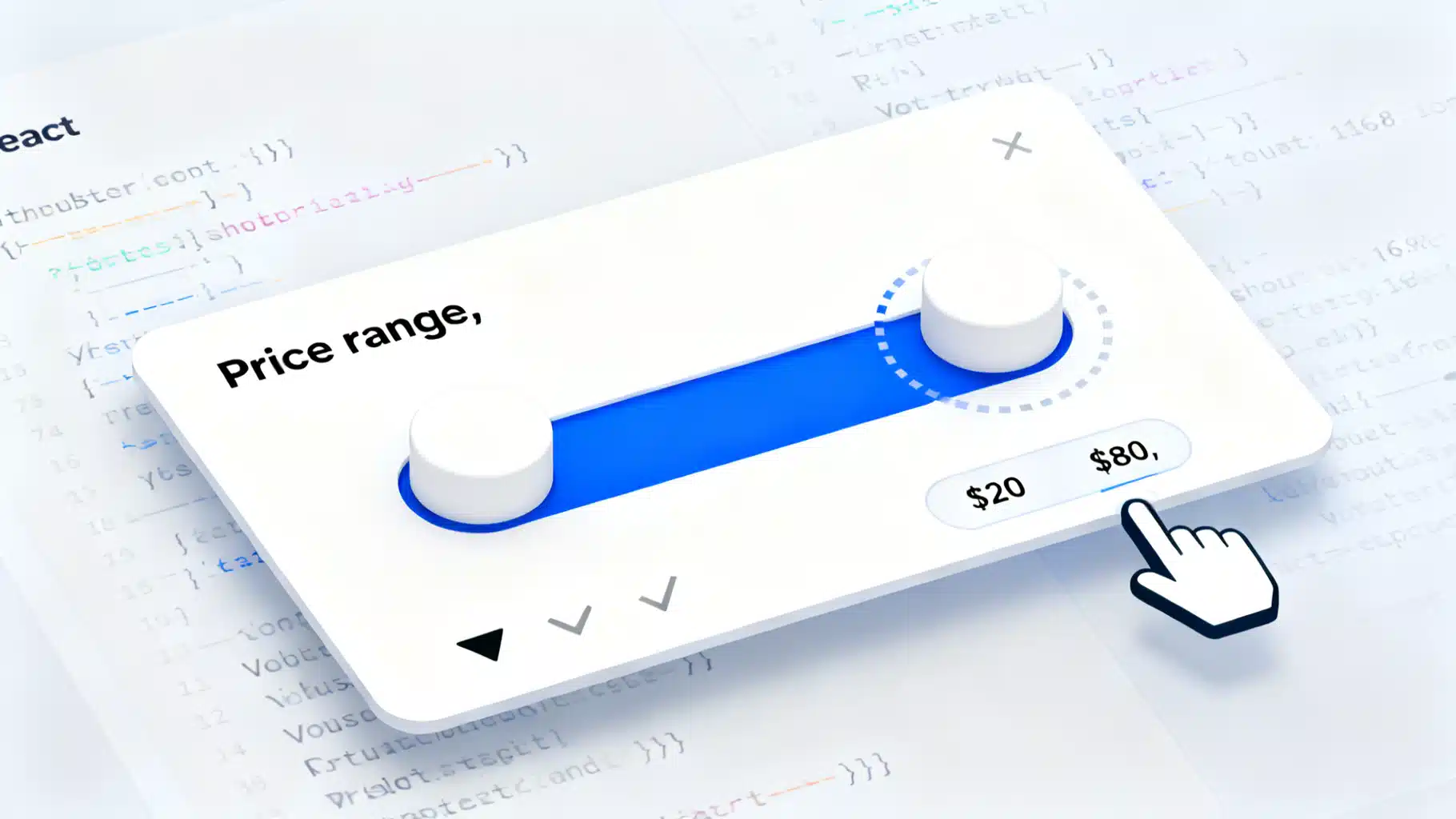
Image used for representation purposes only.
Overview
Sliders look simple, but building one that is truly accessible—keyboard-friendly, screen‑reader clear, touch and mouse usable, and robust in forms—takes care. In this guide you’ll learn:
- What makes a slider accessible (single and two‑thumb “range” variants)
- When to use the native input type=“range”
- How to implement a custom, accessible two‑thumb range slider in React
- Styling, focus, ARIA, and testing checklists
- Production‑ready libraries you can use today
What makes a slider accessible
A slider (and a two‑thumb “range” slider) must satisfy these requirements:
- Name, role, value: Screen readers must announce a clear name, that it’s a slider, and its current value(s).
- Keyboard support: Users can operate it using Arrow keys, PageUp/PageDown, Home/End. Right/Up increase; Left/Down decrease.
- Focus management: Thumbs are focusable, with a visible focus ring and logical tab order.
- Pointer and touch: Dragging works with mouse and touch (Pointer Events recommended).
- ARIA correctness: Use role=“slider” on each thumb when you build custom UI. Provide aria-valuemin, aria-valuemax, aria-valuenow, and optionally aria-valuetext and aria-orientation. Tie to labels with aria-label or aria-labelledby.
- Constraints and stepping: Enforce min/max, step rounding, and a minimum distance between thumbs if needed.
- Visual affordances: 44×44 px hit target recommended; strong focus contrast; clear track and selected range contrast (WCAG 1.4.11 Non‑text contrast).
- Form integration: Values submit with the form or are exposed via controlled React state.
Start with the native range input
If you only need a single value, the native control is accessible by default and integrates perfectly with forms.
import { useId, useState } from 'react';

export default function PriceSlider() {
  const id = useId();
  const [price, setPrice] = useState(50);

  return (
    <div>
      <label htmlFor={id}>Price</label>
      <input
        id={id}
        type="range"
        min={0}
        max={100}
        step={1}
        value={price}
        onChange={(e) => setPrice(Number(e.target.value))}
        aria-describedby={id + '-help'}
      />
      <output id={id + '-out'} htmlFor={id} style={{ marginLeft: 8 }}>
        ${price}
      </output>
      <p id={id + '-help'} className="sr-only">
        Use arrow keys to adjust. Page Up/Down for bigger steps. Home sets to minimum; End sets to maximum.
      </p>
    </div>
  );
}
Notes:
- Associating label + output gives clear announcements in screen readers.
- Styling native range inputs across browsers can be fiddly, but you keep built‑in semantics and keyboard handling for free.
- Native sliders don’t support two thumbs. For a [min, max] selector, you need a custom implementation or a library.
Add this utility class once to your CSS to provide visually hidden but accessible text:
.sr-only {
  position: absolute; width: 1px; height: 1px; padding: 0; margin: -1px;
  overflow: hidden; clip: rect(0, 0, 0, 0); white-space: nowrap; border: 0;
}
When you need a custom two‑thumb “range” slider
A two‑thumb slider exposes a selected interval, e.g., a price range. Because HTML doesn’t provide a native two‑thumb control, you’ll build it with divs and ARIA. Each thumb is an independent slider with shared constraints.
Key decisions:
- Use role=“group” around the slider to connect to a single label.
- Make both thumbs focusable. Each thumb gets role=“slider” and its own aria-* attributes.
- Clicks on the track should move the nearest thumb.
- Update values on pointermove and keydown, clamped to [min, max] and respecting step and minDistance.
Accessible React RangeSlider (two thumbs)
Below is a self‑contained, accessible component using Pointer Events. It supports keyboard control, optional value formatting for aria-valuetext, and hidden inputs for form submission.
import React, { useCallback, useId, useMemo, useRef } from 'react';

function clamp(n, min, max) { return Math.min(max, Math.max(min, n)); }

function roundToStep(value, min, step) {
  const inv = 1 / (step % 1 ? Number(step.toString().split('.')[1]?.length) : 0);
  const precision = isFinite(inv) ? inv : 0; // crude precision calc
  const rounded = Math.round((value - min) / step) * step + min;
  return Number(rounded.toFixed(Math.max(0, precision)));
}

export function RangeSlider({
  min = 0,
  max = 100,
  step = 1,
  value,
  onChange,
  minDistance = 0, // absolute distance, not steps
  orientation = 'horizontal',
  disabled = false,
  format, // (n:number) => string for aria-valuetext
  name, // optional base name for hidden inputs
  label = 'Range'
}) {
  const id = useId();
  const labelId = id + '-label';
  const helpId = id + '-help';
  const outputId = id + '-out';
  const trackRef = useRef(null);
  const activeThumb = useRef(null); // 0 or 1 or null while idle

  const [lo, hi] = value;
  const span = max - min;
  const pct = useMemo(() => ({
    lo: ((lo - min) / span) * 100,
    hi: ((hi - min) / span) * 100,
  }), [lo, hi, min, span]);

  const setValue = useCallback((index, next) => {
    if (disabled) return;
    const other = index === 0 ? hi : lo;
    const raw = clamp(roundToStep(next, min, step), min, max);
    const adjusted = index === 0
      ? Math.min(raw, other - minDistance)
      : Math.max(raw, other + minDistance);
    const clamped = clamp(adjusted, min, max);
    const nextPair = index === 0 ? [clamped, other] : [other, clamped];
    // Ensure ordering and minDistance
    const ordered = [Math.min(...nextPair), Math.max(...nextPair)];
    const [nLo, nHi] = ordered;
    if (nHi - nLo < minDistance) return; // keep invariant
    onChange(ordered);
  }, [disabled, hi, lo, max, min, minDistance, onChange, step]);

  const valueFromPointer = useCallback((clientX, clientY) => {
    const rect = trackRef.current.getBoundingClientRect();
    const pos = orientation === 'horizontal'
      ? (clientX - rect.left) / rect.width
      : 1 - (clientY - rect.top) / rect.height; // top= max for vertical visual; invert if desired
    const raw = min + clamp(pos, 0, 1) * span;
    return roundToStep(raw, min, step);
  }, [min, step, span, orientation]);

  const onTrackPointerDown = useCallback((e) => {
    if (disabled) return;
    e.preventDefault();
    const targetValue = valueFromPointer(e.clientX, e.clientY);
    const distLo = Math.abs(targetValue - lo);
    const distHi = Math.abs(targetValue - hi);
    const index = distLo <= distHi ? 0 : 1;
    activeThumb.current = index;
    e.currentTarget.setPointerCapture?.(e.pointerId);
    setValue(index, targetValue);
  }, [disabled, lo, hi, setValue, valueFromPointer]);

  const onTrackPointerMove = useCallback((e) => {
    if (activeThumb.current == null || disabled) return;
    const next = valueFromPointer(e.clientX, e.clientY);
    setValue(activeThumb.current, next);
  }, [disabled, setValue, valueFromPointer]);

  const onTrackPointerUp = useCallback((e) => {
    activeThumb.current = null;
  }, []);

  const keyStep = 10 * step;

  const onThumbKeyDown = useCallback((index) => (e) => {
    if (disabled) return;
    let handled = true;
    switch (e.key) {
      case 'ArrowRight':
      case 'ArrowUp': setValue(index, (index ? hi : lo) + step); break;
      case 'ArrowLeft':
      case 'ArrowDown': setValue(index, (index ? hi : lo) - step); break;
      case 'PageUp': setValue(index, (index ? hi : lo) + keyStep); break;
      case 'PageDown': setValue(index, (index ? hi : lo) - keyStep); break;
      case 'Home': setValue(index, min); break;
      case 'End': setValue(index, max); break;
      default: handled = false;
    }
    if (handled) e.preventDefault();
  }, [disabled, hi, lo, max, min, setValue, step, keyStep]);

  const commonThumbProps = (index) => ({
    role: 'slider',
    tabIndex: disabled ? -1 : 0,
    'aria-orientation': orientation,
    'aria-valuemin': min,
    'aria-valuemax': max,
    'aria-valuenow': index === 0 ? lo : hi,
    'aria-valuetext': format ? format(index === 0 ? lo : hi) : undefined,
    'aria-labelledby': labelId,
    'aria-controls': outputId,
    'aria-disabled': disabled || undefined,
    onKeyDown: onThumbKeyDown(index),
    className: 'rs-thumb',
    style: {
      left: orientation === 'horizontal' ? `${index === 0 ? pct.lo : pct.hi}%` : undefined,
      bottom: orientation === 'vertical' ? `${index === 0 ? pct.lo : pct.hi}%` : undefined,
    }
  });

  return (
    <div className={`rs ${orientation}`} aria-disabled={disabled}>
      <div className="rs-header">
        <span id={labelId} className="rs-label">{label}</span>
        <output id={outputId} className="rs-output" aria-live="polite">
          {format ? `${format(lo)} – ${format(hi)}` : `${lo} – ${hi}`}
        </output>
      </div>

      <div
        ref={trackRef}
        className="rs-track"
        role="group"
        aria-labelledby={labelId}
        aria-describedby={helpId}
        onPointerDown={onTrackPointerDown}
        onPointerMove={onTrackPointerMove}
        onPointerUp={onTrackPointerUp}
      >
        <div
          className="rs-range"
          style={{
            left: orientation === 'horizontal' ? `${pct.lo}%` : undefined,
            right: orientation === 'horizontal' ? `${100 - pct.hi}%` : undefined,
            bottom: orientation === 'vertical' ? `${pct.lo}%` : undefined,
            top: orientation === 'vertical' ? `${100 - pct.hi}%` : undefined,
          }}
        />
        <div {...commonThumbProps(0)} aria-label="Minimum value" />
        <div {...commonThumbProps(1)} aria-label="Maximum value" />
      </div>

      <p id={helpId} className="sr-only">
        Use arrow keys to adjust each thumb. Page Up/Down for bigger steps. Home jumps to minimum; End to maximum. Click or tap the track to move the nearest thumb.
      </p>

      {name ? (
        <>
          <input type="hidden" name={`${name}_min`} value={lo} />
          <input type="hidden" name={`${name}_max`} value={hi} />
        </>
      ) : null}
    </div>
  );
}
Basic usage:
function Demo() {
  const [range, setRange] = React.useState([20, 80]);
  return (
    <form onSubmit={(e) => { e.preventDefault(); alert(JSON.stringify(Object.fromEntries(new FormData(e.currentTarget)))); }}>
      <RangeSlider
        min={0}
        max={100}
        step={1}
        value={range}
        onChange={setRange}
        minDistance={5}
        label="Price range"
        name="price"
        format={(n) => `$${n}`}
      />
      <button type="submit">Submit</button>
    </form>
  );
}
Minimal CSS to make it usable and beautiful
.rs { --track: #e5e7eb; --range: #2563eb; --thumb: #ffffff; --thumb-border: #1f2937; }
.rs-header { display: flex; justify-content: space-between; align-items: baseline; margin-bottom: .5rem; }
.rs-label { font-weight: 600; }
.rs-output { font-variant-numeric: tabular-nums; color: #111827; }

.rs-track { position: relative; height: 28px; padding: 14px 0; touch-action: none; }
.rs-track::before { content: ""; position: absolute; left: 0; right: 0; top: 50%; height: 6px; transform: translateY(-50%);
  background: var(--track); border-radius: 999px; }

.rs-range { position: absolute; top: 50%; height: 6px; transform: translateY(-50%);
  background: var(--range); border-radius: 999px; }

/* Thumbs: visible 20px, hit area 44x44 */
.rs-thumb { position: absolute; top: 50%; width: 20px; height: 20px; transform: translate(-50%, -50%);
  background: var(--thumb); border: 2px solid var(--thumb-border); border-radius: 50%; box-shadow: 0 1px 2px rgba(0,0,0,.1); }
.rs-thumb::before { content: ""; position: absolute; left: 50%; top: 50%; width: 44px; height: 44px; transform: translate(-50%, -50%); }

/* Focus styles */
.rs-thumb:focus { outline: none; box-shadow: 0 0 0 4px rgba(37, 99, 235, .35); }

/* Disabled state */
.rs[aria-disabled="true"] { opacity: .6; }
.rs[aria-disabled="true"] .rs-thumb { pointer-events: none; }

/* Vertical variant */
.rs.vertical .rs-track { width: 28px; height: 180px; padding: 0 14px; }
.rs.vertical .rs-track::before { left: 50%; top: 0; bottom: 0; right: auto; width: 6px; height: auto; transform: translateX(-50%); }
.rs.vertical .rs-range { left: 50%; width: 6px; transform: translateX(-50%); }
.rs.vertical .rs-thumb { left: 50%; transform: translate(-50%, 50%); }
Implementation notes:
- role=“group” on the track ties both thumbs to one label; each thumb is a slider with its own aria-valuenow/min/max.
- aria-valuetext is optional but useful for units (e.g., currency, percent) or formatted numbers.
- aria-live on the output politely announces changes without being verbose.
- The hit area is expanded via ::before while keeping the visible thumb compact.
- The vertical variant flips positioning—ensure arrow keys still increase/decrease logically.
Pitfalls to avoid
- Missing label: Always provide a programmatic name. If no visible label, set aria-label on the thumbs and/or use role=“group” with aria-labelledby.
- Only one focusable thumb: Both thumbs must be reachable by Tab.
- Crossing thumbs: Enforce ordering and optional minDistance.
- Tiny targets: Keep at least 44×44 px hit areas for touch.
- Low contrast: Selected range and focus ring should be clearly visible in light and dark themes.
- Announcing raw numbers: If units matter, use aria-valuetext to speak “$50” instead of just “50”.
Testing checklist
Test with the same rigor you’d apply to forms:
- Keyboard only
- Tab to each thumb; focus ring visible
- Arrow keys adjust by step
- PageUp/PageDown adjust by larger steps
- Home/End jump to min/max
- Can’t move beyond min/max; thumbs don’t cross (respect minDistance)
- Screen readers
- NVDA + Firefox/Chrome (Windows)
- VoiceOver + Safari/Chrome (macOS, iOS)
- TalkBack + Chrome (Android)
- Ensure each thumb announces: “Price range, slider, Minimum value, 20, to 100” (wording varies by reader)
- Visual checks
- Zoom 200% and 400%
- High contrast/forced colors
- Reduced motion preferences
- Automation
- Run axe (browser extension or @axe-core/react) and ESLint a11y rules
Production‑ready libraries
If you prefer a headless, well‑tested solution, consider:
- Radix UI Slider (@radix-ui/react-slider): Unstyled, accessible primitives you can theme.
- React Aria useSlider (react-aria): Hooks that implement ARIA patterns and interactions.
- Reach UI Slider (reach-ui): A11y‑first components with sensible defaults.
These projects track ARIA patterns and edge cases across browsers and screen readers, saving you time while still letting you customize visuals.
Wrap‑up
- Use the native input type=“range” for single values whenever possible.
- For two‑thumb ranges, model each thumb as a slider with role=“slider” and complete ARIA state.
- Implement robust keyboard support, clear focus, and generous hit targets.
- Announce formatted values and integrate with forms.
- Verify with real assistive tech and automated checks.
With these patterns, your React range sliders will be inclusive, resilient, and pleasant to use—no matter the input method.
Related Posts
How to Build an Accessible React Dropdown Menu (With Code and Testing)
Learn how to build an accessible React dropdown menu: correct ARIA roles, keyboard support, headless component code, testing, and common pitfalls to avoid.

React Accessibility: Practical ARIA Best Practices
A practical React guide to ARIA—when to use it, when not to, plus patterns for focus, labels, widgets, and testing.

Building an Accessible React kbd Shortcut Component
Build an accessible React kbd shortcut component with cross‑platform Mod keys, a useHotkeys hook, and tested, flexible APIs.