
Building an Accessible React kbd Shortcut Component
Build an accessible React kbd shortcut component with cross‑platform Mod keys, a useHotkeys hook, and tested, flexible APIs.
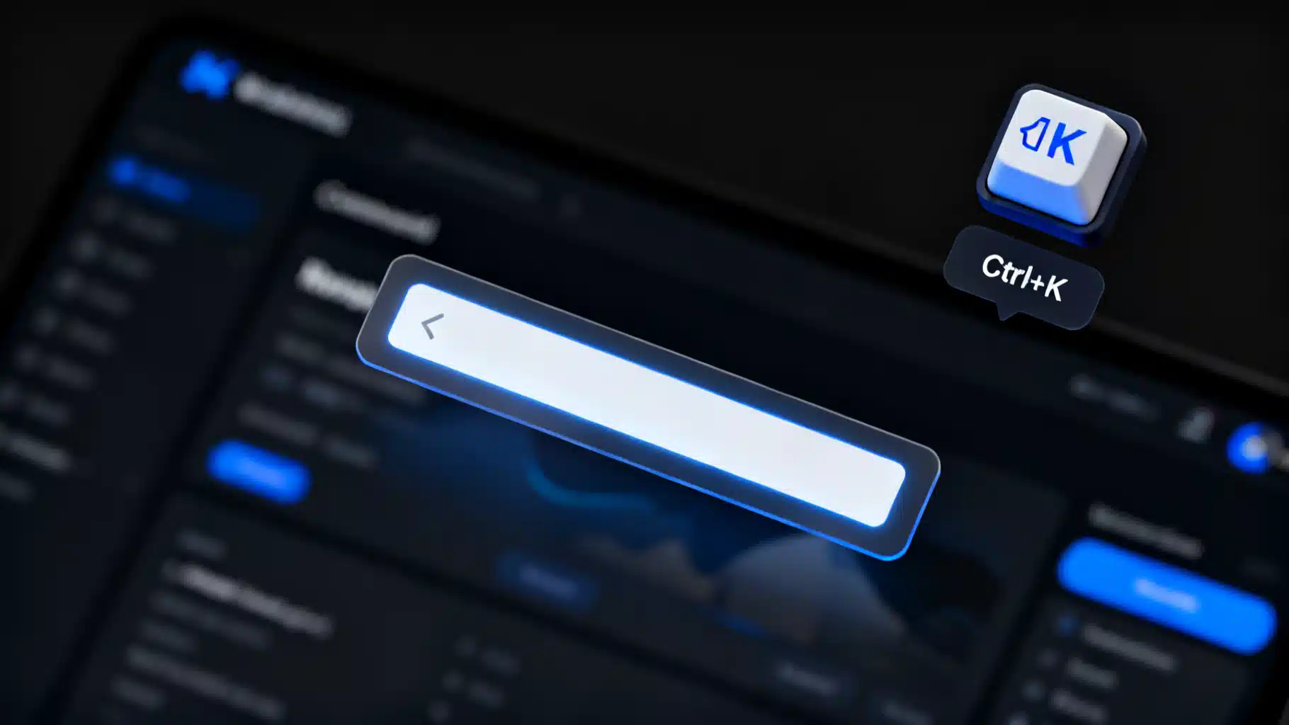
Image used for representation purposes only.
Overview
Keyboard shortcuts make expert users faster and interfaces feel polished. In React, you’ll often want two things:
- Visually render a key combination like ⌘K or Ctrl+Shift+P in a consistent, themeable way.
- Bind that combination to an action with correct scoping, accessibility, and cross‑platform behavior.
This article walks through building a small, accessible “kbd shortcut” component set: a presentational for rendering keycaps, a useHotkeys hook for binding keys, and a
Goals and non-goals
- Goals
- Accessible visual output using semantic elements.
- Predictable, testable key handling with good defaults.
- Cross‑platform support with a single Mod modifier (⌘ on macOS, Ctrl elsewhere).
- Safe interaction with focusable controls, forms, and screen readers.
- Non-goals
- Full global hotkey management for complex apps (you can layer this approach under a command palette or router, but it’s intentionally simple).
Designing the API
We’ll target a minimalist surface area:
- <Kbd keys={[“Mod”, “K”]} /> renders visual keycaps.
- useHotkeys(“Mod+K”, handler, options) binds to keydown.
children renders the UI and binds behavior.
Options include:
- enabled: boolean (default true)
- target: HTMLElement | Document | Window (default document)
- preventDefault, stopPropagation, capture, once: booleans
- allowInInputs: boolean (default false) to avoid hijacking typing
Rendering shortcuts with
Use semantic for each key and group them with separators. Keep it screen‑reader friendly by wrapping the sequence in a span with an accessible label.
// Kbd.tsx
import React from "react";

type KbdProps = {
  keys: string[]; // ["Mod", "K"] or ["Ctrl", "Shift", "P"]
  separator?: string; // default " + "
  ariaLabel?: string; // optional custom label for SRs
  className?: string;
};

export function Kbd({ keys, separator = " + ", ariaLabel, className }: KbdProps) {
  const textLabel = ariaLabel ?? keys.join(" plus ");
  return (
    <span aria-label={textLabel} className={className}>
      {keys.map((k, i) => (
        <React.Fragment key={i}>
          <kbd className="kbd-key">{normalizeKeySymbol(k)}</kbd>
          {i < keys.length - 1 ? <span className="kbd-sep">{separator}</span> : null}
        </React.Fragment>
      ))}
    </span>
  );
}

function isMacLike() {
  if (typeof navigator === "undefined") return false;
  const p = navigator.platform?.toLowerCase() ?? "";
  const uaPlat = (navigator as any).userAgentData?.platform?.toLowerCase?.() ?? "";
  return p.includes("mac") || uaPlat.includes("mac");
}

function normalizeKeySymbol(k: string) {
  const mac = isMacLike();
  if (k.toLowerCase() === "mod") return mac ? "⌘" : "Ctrl";
  if (k.toLowerCase() === "alt") return mac ? "⌥" : "Alt";
  if (k.toLowerCase() === "meta") return mac ? "⌘" : "Win";
  if (k.toLowerCase() === "shift") return mac ? "⇧" : "Shift";
  if (k.toLowerCase() === "enter") return "⏎";
  if (k.toLowerCase() === "escape") return "Esc";
  return k.toUpperCase();
}
Example styles:
/* kbd.css */
.kbd-key {
  font: 12px/1.2 ui-monospace, SFMono-Regular, Menlo, Monaco, Consolas, "Liberation Mono", monospace;
  background: var(--kbd-bg, #f6f7f9);
  border: 1px solid var(--kbd-border, #d0d5dd);
  border-bottom-width: 2px;
  border-radius: 6px;
  padding: 2px 6px;
  box-shadow: inset 0 -1px 0 rgba(0,0,0,0.08);
}
.kbd-sep { margin: 0 4px; color: var(--kbd-sep, #98a2b3); }
Binding keyboard events with useHotkeys
We’ll parse a combo string into modifiers and a main key, then match events. Prefer keydown for shortcuts; it fires before default actions like “type a character”.
// useHotkeys.ts
import { useEffect, useMemo } from "react";

type Options = {
  enabled?: boolean;
  target?: HTMLElement | Document | Window;
  preventDefault?: boolean;
  stopPropagation?: boolean;
  capture?: boolean;
  once?: boolean;
  allowInInputs?: boolean;
  useCode?: boolean; // if true, match event.code for layout-independent combos
};

export function useHotkeys(
  combo: string,
  handler: (ev: KeyboardEvent) => void,
  {
    enabled = true,
    target,
    preventDefault,
    stopPropagation,
    capture,
    once,
    allowInInputs = false,
    useCode = false,
  }: Options = {}
) {
  const parsed = useMemo(() => parseCombo(combo), [combo]);

  useEffect(() => {
    if (!enabled) return;
    const t = target ?? document;

    const onKeyDown = (ev: KeyboardEvent) => {
      if (!allowInInputs && isTypingContext(ev.target as Element)) return;
      if (!matchEvent(ev, parsed, useCode)) return;

      if (preventDefault) ev.preventDefault();
      if (stopPropagation) ev.stopPropagation();
      handler(ev);
    };

    t.addEventListener("keydown", onKeyDown, { capture, once } as AddEventListenerOptions);
    return () => t.removeEventListener("keydown", onKeyDown, capture as boolean | undefined);
  }, [enabled, target, preventDefault, stopPropagation, capture, once, allowInInputs, useCode, parsed, handler]);
}

type Parsed = { ctrl: boolean; meta: boolean; shift: boolean; alt: boolean; key: string | null; code: string | null };

function parseCombo(s: string): Parsed {
  const parts = s.split("+").map(p => p.trim());
  const out: Parsed = { ctrl: false, meta: false, shift: false, alt: false, key: null, code: null };
  for (const p of parts) {
    const low = p.toLowerCase();
    if (low === "mod") { // Mod = Cmd on mac, Ctrl elsewhere
      if (isMacLike()) out.meta = true; else out.ctrl = true;
    } else if (low === "ctrl") out.ctrl = true;
    else if (low === "cmd" || low === "meta") out.meta = true;
    else if (low === "shift") out.shift = true;
    else if (low === "alt" || low === "option") out.alt = true;
    else if (low.startsWith("code:")) out.code = p.slice(5); // e.g., Code:KeyK
    else out.key = normalizeKey(low);
  }
  return out;
}

function normalizeKey(k: string) {
  // Common aliases
  const map: Record<string, string> = {
    enter: "enter",
    return: "enter",
    esc: "escape",
    space: " ",
    spacebar: " ",
    plus: "+",
    comma: ",",
    period: ".",
    backspace: "backspace",
    delete: "delete",
    tab: "tab",
  };
  return map[k] ?? k;
}

function matchEvent(ev: KeyboardEvent, p: Parsed, useCode: boolean) {
  if (ev.repeat) return false; // avoid auto-repeat triggering; make configurable if needed
  const modOk = (!!ev.ctrlKey === p.ctrl) && (!!ev.metaKey === p.meta) && (!!ev.shiftKey === p.shift) && (!!ev.altKey === p.alt);
  if (!modOk) return false;
  if (useCode && p.code) return ev.code.toLowerCase() === p.code.toLowerCase();
  if (p.key === null) return true; // pure-modifier shortcut (rare)
  return (ev.key?.toLowerCase?.() ?? "") === p.key;
}

function isTypingContext(el?: Element | null) {
  if (!el) return false;
  const tag = el.tagName?.toLowerCase();
  const editable = (el as HTMLElement).isContentEditable;
  if (editable) return true;
  if (tag === "input" || tag === "textarea") return true;
  return false;
}
A combined component
This glues visuals and behavior, perfect for buttons, menu items, or command palette rows.
// Shortcut.tsx
import React from "react";
import { useHotkeys } from "./useHotkeys";
import { Kbd } from "./Kbd";

type ShortcutProps = {
  combo: string; // e.g., "Mod+K"
  onMatch: (ev: KeyboardEvent) => void;
  allowInInputs?: boolean;
  children?: React.ReactNode; // label or custom UI
};

export function Shortcut({ combo, onMatch, allowInInputs, children }: ShortcutProps) {
  useHotkeys(combo, onMatch, { allowInInputs, preventDefault: true });
  const keys = combo.split("+").map((s) => s.trim());
  return (
    <span className="shortcut" role="group" aria-label={`Shortcut ${combo}`}>
      {children && <span className="shortcut-label">{children}</span>}
      <Kbd keys={keys} />
    </span>
  );
}
Usage example (toggle a command palette):
// App.tsx
import React, { useState } from "react";
import { Shortcut } from "./Shortcut";

export default function App() {
  const [open, setOpen] = useState(false);
  return (
    <div>
      <button onClick={() => setOpen(o => !o)} aria-haspopup="dialog">
        Open palette <span aria-hidden> </span><Shortcut combo="Mod+K" onMatch={() => setOpen(o => !o)} />
      </button>

      {open && (
        <div role="dialog" aria-modal="true" aria-label="Command Palette">
          <input autoFocus placeholder="Type a command…" />
          {/* palette content */}
        </div>
      )}
    </div>
  );
}
Accessibility and UX considerations
- Use semantic for each key. Screen readers announce them appropriately.
- Provide an overall aria-label on the group so SR users hear “Command K” or “Control K” rather than just visual glyphs.
- Avoid intercepting shortcuts while the user is typing. Default allowInInputs=false helps.
- Respect platform conventions. Map Mod to ⌘ on macOS and Ctrl elsewhere.
- Avoid pure character keys without modifiers (like “K”) for global shortcuts; they conflict with typing.
- Announce state changes. If a shortcut opens a dialog, move focus inside the dialog and manage Escape to close.
Handling platform differences
- Meta vs Ctrl: Using Mod abstracts this away.
- Symbols vs labels: Render ⌘, ⌥, ⇧ on macOS; “Ctrl”, “Alt”, “Shift” on Windows/Linux.
- System-reserved combos: Don’t override Cmd+Q, Cmd+Tab, Alt+F4, etc. The browser/OS will likely ignore your handler anyway, but avoid advertising these.
Scoping and layering
- Document vs element scope: By default we bind on document. For widget‑local shortcuts (e.g., Grid: Arrow keys), pass target as the grid container and set capture as needed.
- Z‑index conflicts: When a modal opens, consider disabling global shortcuts behind it (enabled=false) or change the target to the modal root.
- Propagation: stopPropagation can prevent double‑handling when multiple layers listen for similar combos.
event.key vs event.code
- event.key matches the printed character and changes with keyboard layout. Good for mnemonic shortcuts like Mod+K.
- event.code is the physical key position (KeyK). Useful for gaming or developer tools where physical location matters. Expose useCode and Code:KeyX in combo to opt in.
Preventing default behavior
Call preventDefault for shortcuts that would otherwise type characters or invoke browser actions. Don’t prevent defaults globally; only on a match.
Styling and theming
The styles above are intentionally plain. For design systems:
- Provide CSS variables (–kbd-bg, –kbd-border, –kbd-sep) that adapt to light/dark themes.
- Offer compact and comfortable density variants.
- Support RTL by leaving the separator as text; no mirroring required.
Server‑side rendering (SSR)
- normalizeKeySymbol checks navigator safely, so it won’t crash during SSR.
- On hydration, symbols will update to ⌘/Ctrl as needed. If you render on the server for a different platform than the client (e.g., SSR on Linux, user on macOS), the symbol may shift on hydration. This is acceptable for non‑layout‑critical UI; if it bothers you, render textual “Mod” on the server and upgrade to symbols on the client.
Testing
Example with React Testing Library and user-event:
// Shortcut.test.tsx (pseudo)
import { render } from "@testing-library/react";

it("fires on Mod+K on macOS", async () => {
  const onMatch = vi.fn();
  render(<Shortcut combo="Mod+K" onMatch={onMatch} />);
  const ev = new KeyboardEvent("keydown", { key: "k", metaKey: true });
  document.dispatchEvent(ev);
  expect(onMatch).toHaveBeenCalled();
});

it("does not trigger in inputs by default", () => {
  const onMatch = vi.fn();
  render(<><input data-testid="i" /><Shortcut combo="Mod+K" onMatch={onMatch} /></>);
  const input = screen.getByTestId("i");
  input.focus();
  input.dispatchEvent(new KeyboardEvent("keydown", { key: "k", ctrlKey: true }));
  expect(onMatch).not.toHaveBeenCalled();
});
Performance tips
- Listener count: Prefer a few high‑level listeners to many per‑element listeners. Our useHotkeys defaults to document to keep counts low.
- Memoize handlers: Pass stable handler references (useCallback) when possible to avoid effect re‑subscriptions.
- Avoid keyup unless needed; keydown suffices for most shortcuts and fires earlier.
Common pitfalls and safeguards
- Repeat firing: event.repeat can flood handlers when a key is held. We ignore repeats by default; adapt if you need press‑and‑hold behavior.
- Input method editors (IMEs): Don’t intercept character keys while composing; our input guard helps, but be cautious near text areas.
- Conflicting combos: Use propagation control and scoping to avoid double triggers (e.g., inside modals and global layer).
- Accessibility overrides: Some users remap system shortcuts. Document alternatives or allow remapping in settings when building complex apps.
Extending the pattern
- Command palette: Pair Mod+K with a dialog and list of actions. Add arrow key navigation and typeahead.
- Dynamic registration: Expose a context for feature modules to register shortcuts at runtime and show them in a help screen.
- i18n: Localize aria-labels for key names (e.g., “Control” vs localized strings). The visible symbols can remain universal glyphs.
- Serialization: Store user‑customized combos as strings (e.g., “Shift+Mod+P”) and parse with parseCombo at runtime.
Putting it all together
Here’s a minimal, portable shortcut system:
- for consistent, accessible visuals.
- useHotkeys for reliable key matching with sensible defaults.
to couple the two for buttons, menus, and palettes.
This approach is small enough to live in your codebase, yet flexible enough to cover the majority of keyboard shortcut needs in React apps. Start with Mod+K to open your command palette, document the shortcut in the UI, and your power users will thank you.
Related Posts
Build a Rock-Solid React Scroll Spy Navigation with Hooks and TypeScript
Build a robust React scroll spy navigation with hooks, a11y, smooth scrolling, SSR tips, and TypeScript—plus an optional IntersectionObserver version.
Building an Accessible, Responsive React Collapsible Sidebar Navigation
Build a fast, accessible, responsive React collapsible sidebar with TypeScript, ARIA, keyboard support, and persisted state—no UI library required.
Build a Production‑Ready React Avatar User Profile Component
Build an accessible, flexible React avatar component with initials fallback, status badges, groups, and TypeScript—optimized for performance and a11y.