Building an Accessible, Responsive React Collapsible Sidebar Navigation
Build a fast, accessible, responsive React collapsible sidebar with TypeScript, ARIA, keyboard support, and persisted state—no UI library required.

Image used for representation purposes only.
Overview
A collapsible sidebar is a familiar pattern for apps that balance dense navigation with limited horizontal space. In React, it’s easy to hide and show elements—but the real challenge is doing it accessibly, responsively, and without jank. This guide walks you through designing and implementing a production‑ready collapsible sidebar in React with TypeScript, ARIA, keyboard support, and persisted state.
By the end, you’ll have:
- A headless, reusable Sidebar component
- Smooth, GPU‑accelerated transitions that respect reduced‑motion settings
- Keyboard navigation and screen reader semantics
- Responsive behavior (desktop docked, mobile overlay)
- State that persists across reloads
UX principles to lock in first
Before writing code, decide how the sidebar should behave:
- Modes: docked (desktop) vs. overlay (mobile)
- Collapse width: show icons only; labels are visually hidden but still accessible via tooltips
- Toggle discoverability: a persistent “collapse/expand” button with clear label
- Motion: fast but subtle transitions; support
prefers-reduced-motion - Focus management: do not lose focus on collapse; keep focus on the toggle or focused item
- Persistence: remember collapsed state per user/device, not globally
Architecture options
You have three common approaches:
- UI libraries (e.g., Material UI, Chakra): quick, but less control
- CSS frameworks (Tailwind) + your logic: great balance
- Headless from scratch: maximum control and education (this article)
We’ll build a headless version first, then show a compact Tailwind variant.
Data model
We’ll use a simple tree for navigation items.
export type NavItem = {
  id: string;
  label: string;
  href?: string;
  icon?: React.ReactNode;
  children?: NavItem[]; // one level deep for brevity
};

export const navItems: NavItem[] = [
  {
    id: 'home',
    label: 'Home',
    href: '/',
  },
  {
    id: 'projects',
    label: 'Projects',
    children: [
      { id: 'active', label: 'Active', href: '/projects/active' },
      { id: 'archived', label: 'Archived', href: '/projects/archived' },
    ],
  },
  { id: 'settings', label: 'Settings', href: '/settings' },
];
Utilities: persistence and media queries
import * as React from 'react';

export function useLocalStorage<T>(key: string, initial: T) {
  const [value, setValue] = React.useState<T>(() => {
    if (typeof window === 'undefined') return initial;
    try {
      const raw = window.localStorage.getItem(key);
      return raw ? (JSON.parse(raw) as T) : initial;
    } catch {
      return initial;
    }
  });
  React.useEffect(() => {
    try {
      window.localStorage.setItem(key, JSON.stringify(value));
    } catch {}
  }, [key, value]);
  return [value, setValue] as const;
}

export function useMediaQuery(query: string) {
  const [matches, setMatches] = React.useState(false);
  React.useEffect(() => {
    if (typeof window === 'undefined') return;
    const mql = window.matchMedia(query);
    const handler = () => setMatches(mql.matches);
    handler();
    mql.addEventListener('change', handler);
    return () => mql.removeEventListener('change', handler);
  }, [query]);
  return matches;
}

export function usePrefersReducedMotion() {
  return useMediaQuery('(prefers-reduced-motion: reduce)');
}
Layout shell
A flexible shell keeps concerns clean.
import * as React from 'react';
import { Sidebar } from './Sidebar';
import { navItems } from './navItems';
import { useLocalStorage, useMediaQuery } from './hooks';

export function AppShell() {
  const isMobile = useMediaQuery('(max-width: 1024px)');
  const [collapsed, setCollapsed] = useLocalStorage<boolean>('sidebar:collapsed', false);
  const [mobileOpen, setMobileOpen] = React.useState(false);

  // Auto-close overlay when transitioning to desktop
  React.useEffect(() => {
    if (!isMobile) setMobileOpen(false);
  }, [isMobile]);

  return (
    <div className="app-shell">
      <Sidebar
        items={navItems}
        collapsed={isMobile ? false : collapsed}
        onToggleCollapsed={() => setCollapsed((v) => !v)}
        mobileOpen={mobileOpen}
        onToggleMobile={() => setMobileOpen((v) => !v)}
      />
      <main id="main" className="content" tabIndex={-1}>
        <header className="topbar">
          {isMobile && (
            <button
              className="icon-btn"
              onClick={() => setMobileOpen(true)}
              aria-controls="sidebar"
              aria-expanded={mobileOpen}
            >
              ☰ <span className="sr-only">Open navigation</span>
            </button>
          )}
          <h1>Dashboard</h1>
        </header>
        {/* page content */}
      </main>
    </div>
  );
}
The Sidebar component (accessible and collapsible)
Key points:
- The toggle is a
<button>witharia-expandedandaria-controls. - Use
nav+ul/lisemantics for lists of links. - Submenus are buttons that control their list with
aria-expanded. - Icons are decorative and marked
aria-hidden="true".
import * as React from 'react';
import type { NavItem } from './navItems';
import { usePrefersReducedMotion } from './hooks';

type Props = {
  items: NavItem[];
  collapsed: boolean;
  onToggleCollapsed: () => void;
  mobileOpen: boolean;
  onToggleMobile: () => void;
};

export function Sidebar({ items, collapsed, onToggleCollapsed, mobileOpen, onToggleMobile }: Props) {
  const reduceMotion = usePrefersReducedMotion();
  const [openSubmenus, setOpenSubmenus] = React.useState<Set<string>>(new Set());

  const toggleSubmenu = (id: string) =>
    setOpenSubmenus((prev) => {
      const next = new Set(prev);
      next.has(id) ? next.delete(id) : next.add(id);
      return next;
    });

  return (
    <>
      {/* Backdrop for mobile overlay */}
      <button
        className={`backdrop ${mobileOpen ? 'show' : ''}`}
        aria-hidden={!mobileOpen}
        tabIndex={mobileOpen ? 0 : -1}
        onClick={onToggleMobile}
      />

      <aside
        id="sidebar"
        className={`sidebar ${collapsed ? 'collapsed' : 'expanded'} ${mobileOpen ? 'open' : ''}`}
        aria-label="Primary"
      >
        <div className="sidebar-header">
          <button
            className="toggle"
            onClick={onToggleCollapsed}
            aria-controls="sidebar"
            aria-expanded={!collapsed}
            title={collapsed ? 'Expand sidebar' : 'Collapse sidebar'}
          >
            {collapsed ? '›' : '‹'}
            <span className="sr-only">{collapsed ? 'Expand sidebar' : 'Collapse sidebar'}</span>
          </button>
          <button
            className="close-mobile"
            onClick={onToggleMobile}
            aria-controls="sidebar"
            aria-expanded={mobileOpen}
          >
            ✕<span className="sr-only">Close navigation</span>
          </button>
        </div>

        <nav aria-label="Primary navigation">
          <ul className="nav-root" role="list">
            {items.map((item) => (
              <li key={item.id} className="nav-item">
                {item.children ? (
                  <>
                    <button
                      className="nav-btn"
                      aria-expanded={openSubmenus.has(item.id)}
                      aria-controls={`submenu-${item.id}`}
                      onClick={() => toggleSubmenu(item.id)}
                    >
                      <span aria-hidden="true" className="icon">📁</span>
                      <span className="label">{item.label}</span>
                      <span aria-hidden="true" className="spacer" />
                      <span aria-hidden="true" className={`chev ${openSubmenus.has(item.id) ? 'open' : ''}`}>▾</span>
                    </button>
                    <ul
                      id={`submenu-${item.id}`}
                      className={`submenu ${openSubmenus.has(item.id) ? 'open' : ''}`}
                      role="list"
                      hidden={!openSubmenus.has(item.id)}
                      style={reduceMotion ? { transition: 'none' } : undefined}
                    >
                      {item.children.map((c) => (
                        <li key={c.id} className="nav-subitem">
                          <a className="nav-link" href={c.href}>
                            <span aria-hidden="true" className="icon">-</span>
                            <span className="label">{c.label}</span>
                          </a>
                        </li>
                      ))}
                    </ul>
                  </>
                ) : (
                  <a className="nav-link" href={item.href}>
                    <span aria-hidden="true" className="icon">🏠</span>
                    <span className="label">{item.label}</span>
                  </a>
                )}
              </li>
            ))}
          </ul>
        </nav>
      </aside>
    </>
  );
}
Styles with CSS variables (no framework)
Use CSS custom properties to toggle widths and paddings. Transition transform/opacity for smoother performance.
:root {
  --sidebar-w-expanded: 280px;
  --sidebar-w-collapsed: 64px;
  --duration: 160ms;
  --easing: cubic-bezier(.2,.7,.2,1);
  --bg: #0f172a;      /* slate-900 */
  --bg-2: #111827;    /* darker */
  --text: #e5e7eb;    /* zinc-200 */
  --muted: #9ca3af;   /* gray-400 */
  --ring: #60a5fa;    /* blue-400 */
}

.app-shell { display: grid; grid-template-columns: auto 1fr; min-height: 100dvh; background: #0b1020; }
.content { min-width: 0; }
.topbar { display:flex; align-items:center; gap:.5rem; padding: .75rem 1rem; color: var(--text); }
.icon-btn { background:none; border:0; color:inherit; font-size:1.25rem; }

.sidebar { position: sticky; top: 0; height: 100dvh; background: var(--bg); color: var(--text); overflow: hidden; width: var(--sidebar-w-expanded); transition: width var(--duration) var(--easing); will-change: width; box-shadow: inset -1px 0 0 rgba(255,255,255,.06); }
.sidebar.collapsed { width: var(--sidebar-w-collapsed); }
.sidebar.open { position: fixed; left: 0; z-index: 40; }

.backdrop { position: fixed; inset: 0; background: rgba(2,6,23,.5); opacity: 0; pointer-events: none; transition: opacity var(--duration) var(--easing); }
.backdrop.show { opacity: 1; pointer-events: auto; }

.sidebar-header { display: flex; align-items: center; justify-content: space-between; padding: .5rem; }
.toggle, .close-mobile { background: none; border: 0; color: var(--text); padding: .5rem; border-radius: .375rem; }
.toggle:focus-visible, .close-mobile:focus-visible, .nav-link:focus-visible, .nav-btn:focus-visible { outline: 2px solid var(--ring); outline-offset: 2px; }

.nav-root { margin: .25rem 0 1rem; padding: 0; list-style: none; }
.nav-item { margin: .25rem 0; }

.nav-link, .nav-btn { display: grid; grid-template-columns: 1.5rem 1fr auto; align-items: center; gap: .5rem; width: 100%; padding: .5rem .75rem; color: var(--text); text-decoration: none; border-radius: .5rem; border: 0; background: none; cursor: pointer; }
.nav-link:hover, .nav-btn:hover { background: rgba(255,255,255,.06); }

.icon { width: 1.25rem; text-align: center; opacity: .9; }
.label { white-space: nowrap; }
.spacer { flex: 1 1 auto; }

/* Submenu */
.submenu { margin: .25rem 0 .5rem 0; padding-left: 2.25rem; max-height: 0; overflow: clip; transition: max-height var(--duration) var(--easing), opacity var(--duration) var(--easing); opacity: 0; }
.submenu.open { max-height: 480px; opacity: 1; }
.nav-subitem .nav-link { grid-template-columns: 1rem 1fr; padding-left: .25rem; color: var(--muted); }

/***** Collapsed behavior *****/
.sidebar.collapsed .label { position: absolute; clip: rect(0 0 0 0); clip-path: inset(50%); height: 1px; width: 1px; overflow: hidden; white-space: nowrap; }
.sidebar.collapsed .nav-link, .sidebar.collapsed .nav-btn { grid-template-columns: 1.5rem; justify-content: center; }
.sidebar.collapsed .submenu { display: none; }

/* Reduced motion */
@media (prefers-reduced-motion: reduce) {
  .sidebar, .submenu, .backdrop { transition: none; }
}

/* Mobile overlay */
@media (max-width: 1024px) {
  .app-shell { grid-template-columns: 1fr; }
  .sidebar { transform: translateX(-100%); width: min(86vw, var(--sidebar-w-expanded)); transition: transform var(--duration) var(--easing); }
  .sidebar.open { transform: translateX(0); }
}

/* Screen-reader utility */
.sr-only { position:absolute; width:1px; height:1px; padding:0; margin:-1px; overflow:hidden; clip:rect(0,0,0,0); white-space:nowrap; border:0; }
Why hide labels with clipping in collapsed mode? People using screen readers still need the names, and you may show custom tooltips for sighted users. Clipping keeps the text in the accessibility tree while keeping the visual chrome compact.
Keyboard and ARIA behavior
- Toggle button: Space/Enter toggles collapse;
aria-expandedreflects state - Submenu button: Space/Enter opens/closes;
aria-expandedmirrors visibility; focus remains on the button - Link traversal: Tab/Shift+Tab moves through interactive elements in DOM order
- Mobile overlay: The backdrop closes the menu; consider a focus trap if the overlay is modal for your app
If your app treats the overlay as a modal, add aria-modal="true" and a simple focus trap so Tab stays inside the sidebar until closed.
Tailwind variant (compact)
Prefer utility classes? Here’s the essence of the outer shell; apply the same ARIA and logic as above.
<div className={`fixed lg:sticky top-0 h-dvh bg-slate-900 text-zinc-200 shadow-inner
  transition-[width] duration-150 ease-out
  ${collapsed ? 'w-16' : 'w-72'} ${mobileOpen ? 'translate-x-0' : '-translate-x-full lg:translate-x-0'}`}
  role="complementary"
>
  {/* header, nav, etc. */}
</div>
Performance tips
- Use CSS transforms and opacity for transitions; avoid animating layout-critical properties other than width on the container
- Debounce expensive work during resize
- Memoize large item trees if computing icons/labels dynamically
- Keep DOM shallow; avoid rendering all nested levels if not needed
Testing the critical behaviors
Use React Testing Library for unit tests and Playwright/Cypress for E2E.
import { render, screen } from '@testing-library/react';
import userEvent from '@testing-library/user-event';
import { Sidebar } from './Sidebar';

it('announces expanded state on the collapse toggle', async () => {
  const user = userEvent.setup();
  render(
    <Sidebar
      items={[{ id: 'home', label: 'Home', href: '/' }]}
      collapsed={false}
      onToggleCollapsed={() => {}}
      mobileOpen={false}
      onToggleMobile={() => {}}
    />
  );
  const btn = screen.getByRole('button', { name: /collapse sidebar/i });
  expect(btn).toHaveAttribute('aria-expanded', 'true');
});

it('opens and closes a submenu via keyboard', async () => {
  const user = userEvent.setup();
  render(
    <Sidebar
      items={[{ id: 'p', label: 'Projects', children: [{ id: 'a', label: 'Active', href: '#' }] }]}
      collapsed={false}
      onToggleCollapsed={() => {}}
      mobileOpen={false}
      onToggleMobile={() => {}}
    />
  );
  const projects = screen.getByRole('button', { name: /projects/i });
  await user.keyboard('{Enter}');
  expect(projects).toHaveAttribute('aria-expanded', 'true');
});
Common pitfalls (and how to avoid them)
- Animating height of dynamic lists: Use
max-heightwith a sensible cap or measure withscrollHeight; disable animation whenprefers-reduced-motionis set - Icon-only collapsed state with no labels: Always keep accessible names; add tooltips for sighted users
- Losing focus on collapse: Keep focus on the toggle; do not unmount the button
- Hard-coding desktop assumptions: Implement a true mobile overlay with a backdrop and escape hatch
- Persisting state server-side: Store per-device in
localStorage; guard access during SSR
Enhancement ideas
- Tooltips for collapsed icons using
aria-describedby - Roving tabindex within nav for fine-grained keyboard control
- Deeply nested trees with virtualized lists for very large menus
- Motion with Framer Motion when reduced-motion is not requested
Implementation checklist
- Toggle announces
aria-expanded - Submenus are buttons controlling lists via
aria-controls - Reduced motion respected
- Collapsed labels clipped (still accessible)
- Desktop docked width vs. mobile overlay
- State persisted with
localStorage - Unit tests for ARIA; E2E for overlay lifecycle
Conclusion
A collapsible sidebar is more than a shrinking div—it’s a choreography of layout, state, semantics, and motion. With a clear UX contract, ARIA-first markup, and small utilities for persistence and media queries, you can ship a sidebar that feels fast, reads correctly to assistive tech, and adapts cleanly from 27-inch monitors to phones. Start with the headless version here, then layer on your team’s design system for icons, colors, and motion that match the rest of your app.
Related Posts
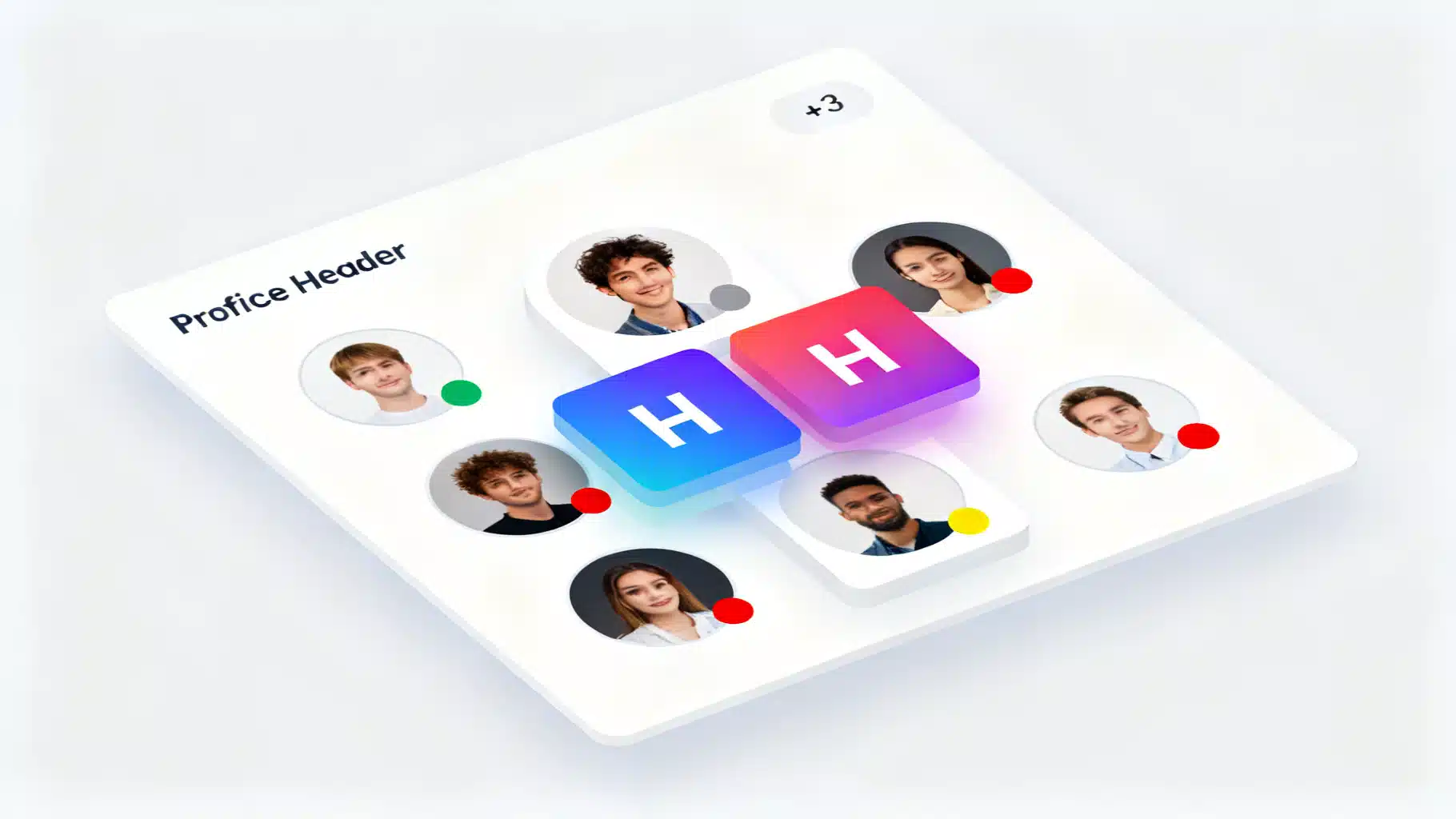
Build a Production‑Ready React Avatar User Profile Component
Build an accessible, flexible React avatar component with initials fallback, status badges, groups, and TypeScript—optimized for performance and a11y.
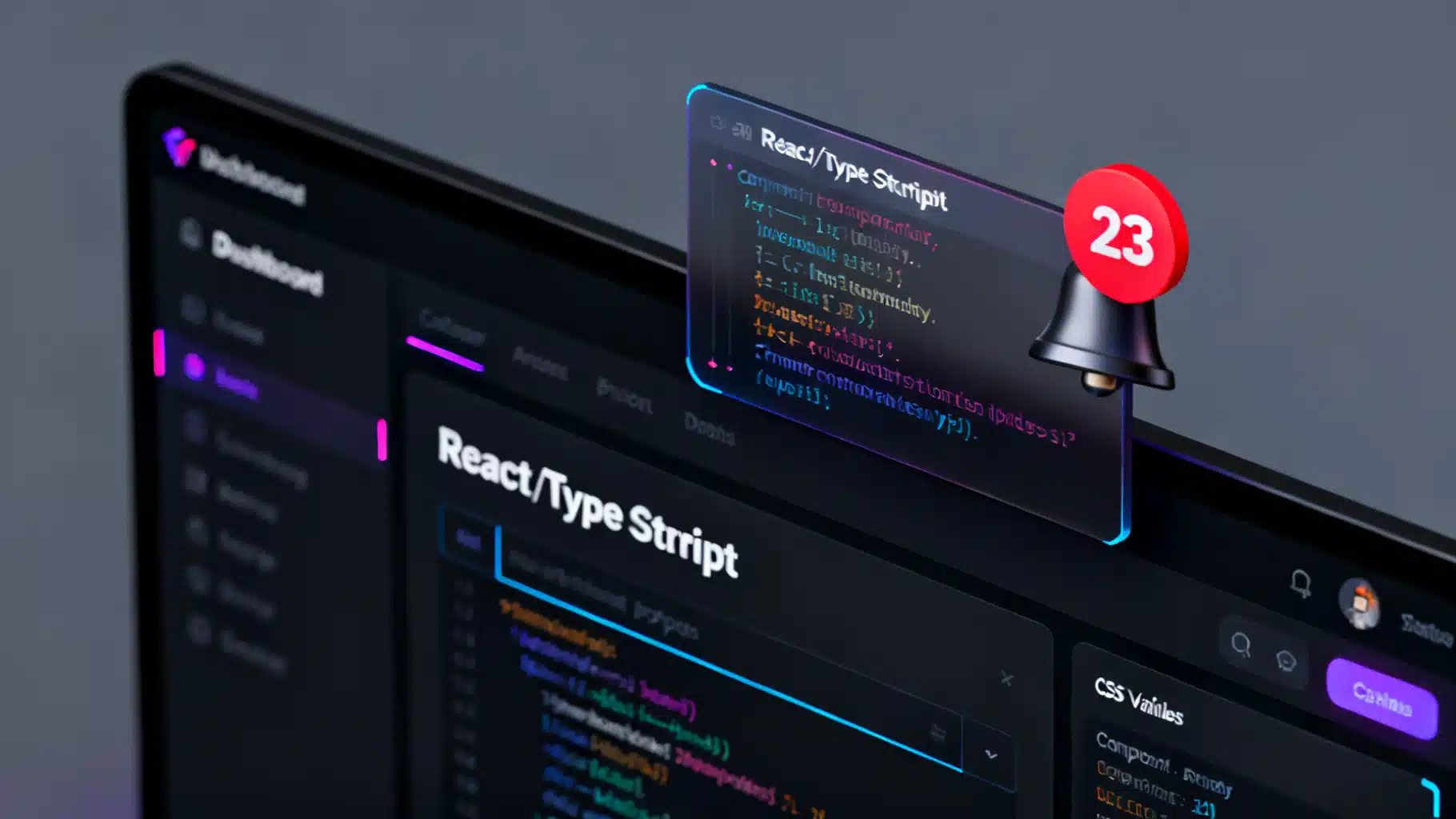
Build an Accessible React Badge Notification Counter (With Real‑Time Updates and Animations)
Build an accessible, themeable React badge notification counter with real-time updates, tasteful animations, and robust a11y—plus tests and tips.

Building an Accessible React Popover and Tooltip Component
Build accessible, high-performance React tooltip and popover components with Floating UI. Includes TypeScript examples, a11y guidance, and testing tips.