
Build a React Emoji Picker Component: A Complete Tutorial
Build a production-grade React emoji picker: search, categories, skin tones, keyboard support, theming, and optional virtualization.
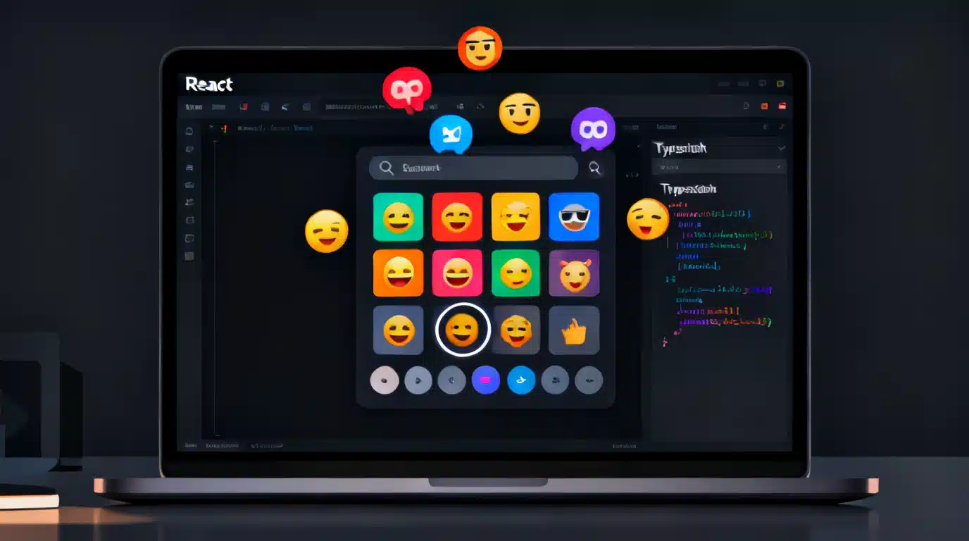
Image used for representation purposes only.
Overview
Building a great emoji picker in React is a perfect exercise in UI composition, accessibility, and performance. In this tutorial, you’ll build a production-grade emoji picker component from scratch—complete with search, categories, keyboard navigation, skin tone variants, “frequently used,” theming, and an optional virtualization pass for large datasets. You’ll also see how to wire it into a text input to insert emoji at the cursor.
By the end, you’ll have a reusable
What we’ll build
- A popover emoji picker that opens from a button
- Search-as-you-type with highlighted matches
- Category tabs and a “Frequently used” section (persisted to localStorage)
- Full keyboard support (arrows, Enter, Esc, Home/End, PgUp/PgDn)
- Skin tone selector for supported emoji
- Optional windowing/virtualization for large data
- Accessible semantics (roles, labels, focus management)
- Theming via CSS variables (light/dark)
We’ll use TypeScript for type safety and Vite for quick setup, but the patterns apply broadly.
Project setup
# 1) Create the app
npm create vite@latest react-emoji-picker -- --template react-ts
cd react-emoji-picker

# 2) Install deps you likely already use
npm i clsx

# 3) Start dev server
npm run dev
Note: This tutorial ships a tiny sample dataset to stay focused on UI. In a real app, you’d load a full emoji dataset (e.g., a JSON file distributed with your app or fetched at runtime) and likely serve sprites or use native emoji.
Data model and sample data
Create src/emoji-data.ts with a minimal set you can expand later:
// src/emoji-data.ts
export type Emoji = {
  id: string;          // stable key like 'thumbs_up'
  emoji: string;       // the native character, e.g., '👍'
  name: string;        // human-friendly name
  keywords: string[];  // for search
  group: string;       // category name
  skinTones?: string[]; // if present, includes base + tone variants
};

export const EMOJI_DATA: Emoji[] = [
  {
    id: 'grinning_face',
    emoji: '😀',
    name: 'Grinning Face',
    keywords: ['smile', 'happy', 'joy'],
    group: 'Smileys & Emotion'
  },
  {
    id: 'thumbs_up',
    emoji: '👍',
    name: 'Thumbs Up',
    keywords: ['like', 'approve', 'ok', 'yes'],
    group: 'People & Body',
    skinTones: ['👍', '👍🏻', '👍🏼', '👍🏽', '👍🏾', '👍🏿']
  },
  {
    id: 'red_heart',
    emoji: '❤️',
    name: 'Red Heart',
    keywords: ['love', 'like', 'affection'],
    group: 'Smileys & Emotion'
  },
  {
    id: 'party_popper',
    emoji: '🎉',
    name: 'Party Popper',
    keywords: ['celebrate', 'congrats', 'tada'],
    group: 'Activities'
  }
];

export const GROUPS = [
  'Frequently Used',
  'Smileys & Emotion',
  'People & Body',
  'Animals & Nature',
  'Food & Drink',
  'Activities',
  'Travel & Places',
  'Objects',
  'Symbols',
  'Flags'
];
Utilities: localStorage and search
// src/emoji-utils.ts
import type { Emoji } from './emoji-data';

const LS_KEY = 'emoji-picker:freq-v1';

export type FreqMap = Record<string, number>;

export function loadFreq(): FreqMap {
  try {
    return JSON.parse(localStorage.getItem(LS_KEY) || '{}');
  } catch {
    return {};
  }
}

export function bumpFreq(map: FreqMap, id: string) {
  map[id] = (map[id] || 0) + 1;
  localStorage.setItem(LS_KEY, JSON.stringify(map));
}

export function rankFrequentlyUsed(emojis: Emoji[], map: FreqMap, limit = 24): Emoji[] {
  return [...emojis]
    .filter(e => map[e.id])
    .sort((a, b) => (map[b.id] || 0) - (map[a.id] || 0))
    .slice(0, limit);
}

export function normalize(s: string) {
  return s.toLowerCase().normalize('NFKD');
}

export function matchesQuery(e: Emoji, q: string) {
  if (!q) return true;
  const n = normalize(q);
  return (
    normalize(e.name).includes(n) ||
    e.keywords.some(k => normalize(k).includes(n))
  );
}
Component API
Our picker exposes a simple interface:
// src/components/EmojiPicker.tsx
export type EmojiPickerProps = {
  open: boolean;
  onClose: () => void;
  onSelect: (emoji: string, meta?: { id: string; name: string }) => void;
  anchorRef: React.RefObject<HTMLElement>; // button/input to position against
  theme?: 'light' | 'dark' | 'auto';
};
Popover and positioning
We’ll implement a minimal popover using fixed positioning relative to the anchor’s bounding rect. In production you might use a library like Floating UI, but this lightweight approach suffices.
// src/components/Popover.tsx
import React, { useLayoutEffect, useRef, useState } from 'react';

type PopoverProps = {
  open: boolean;
  anchorRef: React.RefObject<HTMLElement>;
  onClose: () => void;
  children: React.ReactNode;
};

export function Popover({ open, anchorRef, onClose, children }: PopoverProps) {
  const ref = useRef<HTMLDivElement>(null);
  const [style, setStyle] = useState<React.CSSProperties>({});

  useLayoutEffect(() => {
    if (!open) return;
    const anchor = anchorRef.current;
    if (!anchor) return;
    const rect = anchor.getBoundingClientRect();
    const top = rect.bottom + 8;
    const left = Math.min(
      Math.max(8, rect.left),
      window.innerWidth - 320 - 8
    );
    setStyle({ position: 'fixed', top, left, width: 320, zIndex: 1000 });
  }, [open, anchorRef]);

  React.useEffect(() => {
    if (!open) return;
    const onDocKey = (e: KeyboardEvent) => {
      if (e.key === 'Escape') onClose();
    };
    const onDocClick = (e: MouseEvent) => {
      if (ref.current && !ref.current.contains(e.target as Node) &&
          anchorRef.current && !anchorRef.current.contains(e.target as Node)) {
        onClose();
      }
    };
    document.addEventListener('keydown', onDocKey);
    document.addEventListener('mousedown', onDocClick);
    return () => {
      document.removeEventListener('keydown', onDocKey);
      document.removeEventListener('mousedown', onDocClick);
    };
  }, [open, onClose, anchorRef]);

  if (!open) return null;
  return (
    <div ref={ref} style={style} role="dialog" aria-label="Emoji picker" className="ep-Popover">
      {children}
    </div>
  );
}
The EmojiPicker component
// src/components/EmojiPicker.tsx
import React from 'react';
import { EMOJI_DATA, GROUPS, type Emoji } from '../emoji-data';
import { Popover } from './Popover';
import { bumpFreq, loadFreq, matchesQuery, rankFrequentlyUsed } from '../emoji-utils';
import clsx from 'clsx';

export type EmojiPickerProps = {
  open: boolean;
  onClose: () => void;
  onSelect: (emoji: string, meta?: { id: string; name: string }) => void;
  anchorRef: React.RefObject<HTMLElement>;
  theme?: 'light' | 'dark' | 'auto';
};

export function EmojiPicker({ open, onClose, onSelect, anchorRef, theme = 'auto' }: EmojiPickerProps) {
  const [q, setQ] = React.useState('');
  const [activeGroup, setActiveGroup] = React.useState('Frequently Used');
  const [freq, setFreq] = React.useState(loadFreq());
  const inputRef = React.useRef<HTMLInputElement>(null);
  const gridRef = React.useRef<HTMLDivElement>(null);
  const [focusIndex, setFocusIndex] = React.useState(0);

  // Derive filtered lists
  const filtered = React.useMemo(() => {
    const byQ = EMOJI_DATA.filter(e => matchesQuery(e, q));
    const groups = new Map<string, Emoji[]>();
    for (const g of GROUPS) groups.set(g, []);
    for (const e of byQ) {
      const arr = groups.get(e.group) || groups.get('Symbols')!; // fallback
      arr.push(e);
      groups.set(e.group, arr);
    }
    const frequent = rankFrequentlyUsed(EMOJI_DATA, freq);
    if (frequent.length) groups.set('Frequently Used', frequent);
    return groups;
  }, [q, freq]);

  const currentList = filtered.get(activeGroup) || [];

  React.useEffect(() => {
    if (!open) return;
    // Focus search on open for quick typing
    inputRef.current?.focus({ preventScroll: true });
  }, [open]);

  function handleSelect(e: Emoji, tone?: number) {
    const char = tone && e.skinTones ? e.skinTones[tone] || e.emoji : e.emoji;
    const snapshot = { ...freq };
    bumpFreq(snapshot, e.id);
    setFreq(snapshot);
    onSelect(char, { id: e.id, name: e.name });
  }

  function onKeyDownGrid(ev: React.KeyboardEvent) {
    if (!currentList.length) return;
    const cols = 8; // tweak with CSS grid
    let next = focusIndex;
    switch (ev.key) {
      case 'ArrowRight': next = Math.min(currentList.length - 1, focusIndex + 1); break;
      case 'ArrowLeft':  next = Math.max(0, focusIndex - 1); break;
      case 'ArrowDown':  next = Math.min(currentList.length - 1, focusIndex + cols); break;
      case 'ArrowUp':    next = Math.max(0, focusIndex - cols); break;
      case 'Home':       next = 0; break;
      case 'End':        next = currentList.length - 1; break;
      case 'PageDown':   next = Math.min(currentList.length - 1, focusIndex + cols * 5); break;
      case 'PageUp':     next = Math.max(0, focusIndex - cols * 5); break;
      case 'Enter':
      case ' ': ev.preventDefault(); handleSelect(currentList[focusIndex]); return;
      case 'Escape': onClose(); return;
      default: return;
    }
    ev.preventDefault();
    setFocusIndex(next);
    const el = gridRef.current?.querySelector(`[data-index="${next}"]`) as HTMLElement | null;
    el?.focus({ preventScroll: false });
  }

  return (
    <Popover open={open} onClose={onClose} anchorRef={anchorRef}>
      <div className={clsx('ep-Root', `theme-${theme}`)}>
        <div className="ep-Header">
          <input
            ref={inputRef}
            value={q}
            onChange={e => { setQ(e.target.value); setFocusIndex(0); }}
            placeholder="Search emoji…"
            aria-label="Search emoji"
            className="ep-Search"
          />
          <TonePicker onPick={tone => {/* optional global default; skipped for brevity */}} />
        </div>

        <nav className="ep-Tabs" aria-label="Emoji categories">
          {GROUPS.map(g => (
            <button
              key={g}
              className={clsx('ep-Tab', { active: g === activeGroup })}
              onClick={() => { setActiveGroup(g); setFocusIndex(0); }}
              aria-pressed={g === activeGroup}
            >{g[0]}</button>
          ))}
        </nav>

        <div
          ref={gridRef}
          role="grid"
          aria-label={`${activeGroup} emoji`}
          className="ep-Grid"
          onKeyDown={onKeyDownGrid}
        >
          {currentList.map((e, i) => (
            <EmojiCell
              key={e.id}
              data-index={i}
              emoji={e}
              focused={i === focusIndex}
              onSelect={handleSelect}
            />
          ))}
          {!currentList.length && (
            <div className="ep-Empty" role="note">No results</div>
          )}
        </div>
      </div>
    </Popover>
  );
}

// --- TonePicker (simple demo) ---
function TonePicker({ onPick }: { onPick: (tone: number) => void }) {
  const [open, setOpen] = React.useState(false);
  const tones = ['🏻','🏼','🏽','🏾','🏿'];
  return (
    <div className="ep-TonePicker">
      <button aria-haspopup="menu" aria-expanded={open} onClick={() => setOpen(o => !o)} title="Skin tone">
        ✋
      </button>
      {open && (
        <div role="menu" className="ep-ToneMenu">
          {tones.map((t, i) => (
            <button key={i} role="menuitem" onClick={() => { onPick(i+1); setOpen(false); }}>
              👍{t}
            </button>
          ))}
        </div>
      )}
    </div>
  );
}

// --- EmojiCell ---
function EmojiCell({ emoji, onSelect, focused, ...rest }: {
  emoji: Emoji;
  focused: boolean;
  onSelect: (e: Emoji, tone?: number) => void;
} & React.HTMLAttributes<HTMLButtonElement>) {
  const ref = React.useRef<HTMLButtonElement>(null);
  React.useEffect(() => { if (focused) ref.current?.focus({ preventScroll: true }); }, [focused]);

  return (
    <button
      {...rest}
      ref={ref}
      role="gridcell"
      className="ep-Cell"
      aria-label={emoji.name}
      title={emoji.name}
      onClick={() => onSelect(emoji)}
    >
      <span className="ep-Char" aria-hidden>{emoji.emoji}</span>
    </button>
  );
}
Styling and theming
Add a basic stylesheet with CSS variables you can override per theme.
/* src/emoji.css */
:root {
  --ep-bg: #fff;
  --ep-fg: #111;
  --ep-muted: #888;
  --ep-border: #e5e7eb;
  --ep-accent: #3b82f6;
  --ep-cell-size: 36px;
}
.theme-dark {
  --ep-bg: #111827;
  --ep-fg: #e5e7eb;
  --ep-muted: #9ca3af;
  --ep-border: #1f2937;
  --ep-accent: #60a5fa;
}
.ep-Popover { filter: drop-shadow(0 8px 20px rgba(0,0,0,.15)); }
.ep-Root { background: var(--ep-bg); color: var(--ep-fg); border: 1px solid var(--ep-border); border-radius: 10px; overflow: hidden; }
.ep-Header { display: flex; gap: 8px; padding: 8px; align-items: center; border-bottom: 1px solid var(--ep-border); }
.ep-Search { flex: 1; padding: 8px 10px; border: 1px solid var(--ep-border); border-radius: 8px; background: transparent; color: inherit; }
.ep-Tabs { display: flex; gap: 4px; padding: 6px; border-bottom: 1px solid var(--ep-border); overflow-x: auto; }
.ep-Tab { width: 28px; height: 28px; border-radius: 6px; border: none; background: transparent; color: var(--ep-muted); cursor: pointer; }
.ep-Tab.active { background: var(--ep-border); color: var(--ep-fg); }
.ep-Grid { display: grid; grid-template-columns: repeat(8, var(--ep-cell-size)); gap: 6px; padding: 8px; max-height: 320px; overflow: auto; }
.ep-Cell { display: grid; place-items: center; width: var(--ep-cell-size); height: var(--ep-cell-size); background: transparent; border: none; border-radius: 6px; cursor: pointer; font-size: 22px; }
.ep-Cell:focus, .ep-Cell:hover { outline: 2px solid var(--ep-accent); outline-offset: 0; }
.ep-Empty { color: var(--ep-muted); padding: 24px; text-align: center; }
.ep-TonePicker { position: relative; }
.ep-ToneMenu { position: absolute; top: 100%; right: 0; background: var(--ep-bg); border: 1px solid var(--ep-border); border-radius: 8px; display: grid; grid-auto-flow: column; gap: 4px; padding: 6px; z-index: 1; }
Import the CSS once in src/main.tsx:
import './emoji.css';
Using the picker with an input/textarea
Create a small helper to insert an emoji at the caret.
// src/insertAtCursor.ts
export function insertAtCursor(el: HTMLTextAreaElement | HTMLInputElement, text: string) {
  const start = el.selectionStart ?? el.value.length;
  const end = el.selectionEnd ?? el.value.length;
  const before = el.value.slice(0, start);
  const after = el.value.slice(end);
  el.value = before + text + after;
  const pos = start + text.length;
  el.selectionStart = el.selectionEnd = pos;
  el.dispatchEvent(new Event('input', { bubbles: true }));
}
Wire it in your app:
// src/App.tsx
import React from 'react';
import { EmojiPicker } from './components/EmojiPicker';
import { insertAtCursor } from './insertAtCursor';

export default function App() {
  const [open, setOpen] = React.useState(false);
  const btnRef = React.useRef<HTMLButtonElement>(null);
  const taRef = React.useRef<HTMLTextAreaElement>(null);

  return (
    <div style={{ padding: 24 }}>
      <label>Message</label>
      <div style={{ display: 'flex', gap: 8, alignItems: 'flex-start' }}>
        <textarea ref={taRef} rows={5} style={{ width: 360 }} />
        <button ref={btnRef} onClick={() => setOpen(v => !v)} aria-haspopup="dialog" aria-expanded={open}>
          😊
        </button>
      </div>

      <EmojiPicker
        open={open}
        onClose={() => setOpen(false)}
        anchorRef={btnRef}
        onSelect={(emoji) => {
          const ta = taRef.current;
          if (ta) insertAtCursor(ta, emoji);
          setOpen(false);
        }}
      />
    </div>
  );
}
Accessibility checklist
- Roles: popover uses role=“dialog”; grid uses role=“grid” with gridcell buttons
- Labels: aria-label on dialog and grid; title/aria-label on cells
- Keyboard: arrow keys/Enter/Escape handled in grid; focus visible
- Color contrast: ensure variables meet WCAG AA
- Pointer targets: 36–40 px minimum (we used 36 px)
Optional: simple virtualization
If you load thousands of emoji (including skin variants), windowing prevents the DOM from growing too large. A minimal approach is to render only visible rows based on scroll position. Here’s a small sketch you can adapt:
// src/useVirtual.ts
import React from 'react';
export function useVirtual({ itemCount, rowHeight, viewportRef, overscan = 3 }: {
  itemCount: number; rowHeight: number; viewportRef: React.RefObject<HTMLElement>; overscan?: number;
}) {
  const [range, setRange] = React.useState({ start: 0, end: 0, offset: 0 });
  React.useEffect(() => {
    const el = viewportRef.current!; if (!el) return;
    const onScroll = () => {
      const top = el.scrollTop; const vh = el.clientHeight; const rows = Math.ceil(vh / rowHeight);
      const startRow = Math.max(0, Math.floor(top / rowHeight) - overscan);
      const endRow = startRow + rows + overscan * 2;
      setRange({ start: startRow, end: endRow, offset: startRow * rowHeight });
    };
    onScroll(); el.addEventListener('scroll', onScroll); return () => el.removeEventListener('scroll', onScroll);
  }, [viewportRef, rowHeight, overscan]);
  return range;
}
Integrate it by switching the Grid to a fixed row height, rendering only items within [start,end), and using padding-top to offset. In practice, a library like react-virtual or react-virtualized offers more features.
Enhancements and variations
- Highlight matched substrings in search results
- Per-emoji tone menu (long-press/right-click)
- Recently added/new badges using Unicode version metadata
- Async loading of emoji data chunked by category
- RTL support and i18n for names/keywords
- Sprite sheets or SVGs for consistent cross-platform rendering
Prefer a library?
If you’d rather not build this from scratch, a mature option is to use a dedicated emoji picker library. Look for features like:
- Native vs. image-based rendering
- Full dataset coverage and up-to-date Unicode versions
- Accessibility guarantees and keyboard support
- Virtualization and performance
- Theming and customization hooks
Drop-in libraries can save weeks, but building it yourself—like you did here—gives full control over accessibility, performance, and visual design.
Wrap up
You now have a fully functional, accessible React emoji picker with search, categories, skin tones, and local persistence. Expand the dataset, refine the visuals, and add virtualization when you scale. Because the component is self-contained and typed, you can reuse it across projects and evolve it confidently as your UI grows.
Related Posts
Building a Robust React Chip Input with Autocomplete in React
Build an accessible, high-performance React chip input with autocomplete: patterns, keyboard support, async data, TypeScript code, and production tips.

Build a Fast, Accessible React Filter + Sort List Component (with Hooks)
Build a fast, accessible React filter + sort list with hooks, TypeScript, debouncing, and virtualization. Includes stable sorting and reusable patterns.
Building a Fast, Accessible React Multi‑Select Dropdown: Patterns, Code, and Pitfalls
Build a fast, accessible React multi-select dropdown: API design, ARIA patterns, code, virtualization, async loading, performance, and testing.