Building a Fast, Accessible React Multi‑Select Dropdown: Patterns, Code, and Pitfalls
Build a fast, accessible React multi-select dropdown: API design, ARIA patterns, code, virtualization, async loading, performance, and testing.
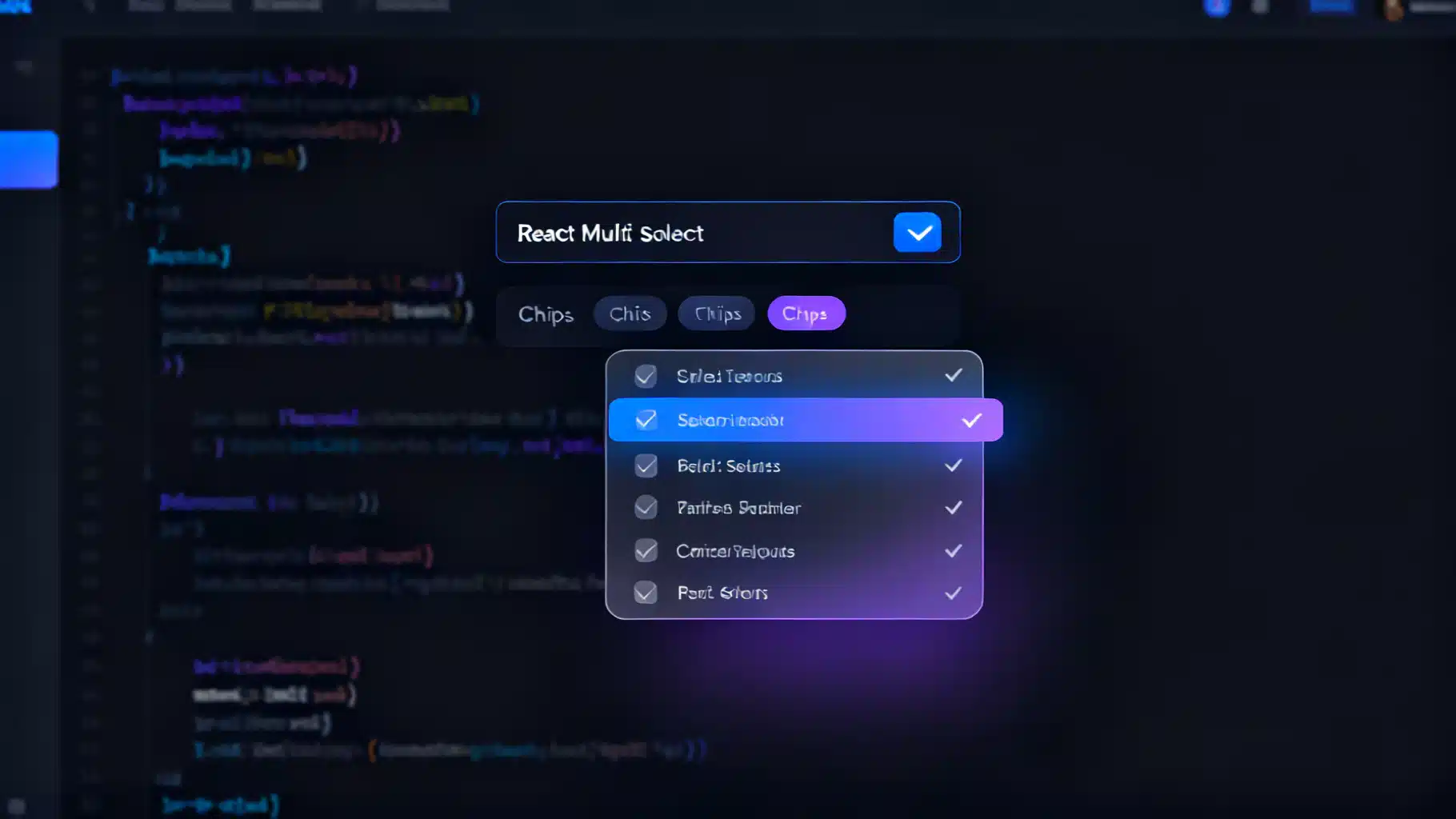
Image used for representation purposes only.
Overview
A multi-select dropdown is a deceptively complex UI. It needs to search, filter, select multiple values, render chips/tags, handle long lists without jank, and work flawlessly with a keyboard and screen readers. In this guide, you’ll learn the essential UX patterns, accessibility requirements, API design, and an implementation approach in React—plus performance tricks, testing strategies, and when to reach for a library.
Core UX requirements
- Search: type-to-filter with highlighted matches.
- Selection model: toggle items, clear-all, and optionally a max selection limit.
- Feedback: show selected items as chips with remove buttons.
- Navigation: arrow keys move focus; Enter/Space toggles; Esc closes.
- Density: support hundreds or thousands of options via virtualization.
- Data: handle async fetching and custom item rendering.
Accessibility and keyboard behaviors
Aim for the ARIA combobox pattern with a listbox popup:
- Container: role=“combobox” with aria-expanded, aria-controls linking to the listbox, and aria-haspopup=“listbox”.
- Input: focus target inside the combobox, labeled via aria-label or aria-labelledby.
- List: role=“listbox” with aria-multiselectable=“true”.
- Option: role=“option” with aria-selected set to true/false.
- Active descendant: manage visual focus with aria-activedescendant pointing from input to the focused option’s id.
- Live region: announce selection changes (e.g., “Added ‘Paris’. 3 selected.”) using aria-live=“polite”.
- Keyboard map:
- ArrowDown/ArrowUp: move active option, open if closed.
- Enter/Space: toggle selection of the active option.
- Esc: close the popup, keep input.
- Backspace: when query is empty, remove last chip.
- Home/End: jump to first/last option.
API design
Expose a headless, controlled component that accepts render props for styling:
- options: Array<{ value: string; label: string; disabled?: boolean }>
- value: string[] (controlled) and onChange(next: string[])
- placeholder?: string
- disabled?: boolean
- maxSelected?: number
- isClearable?: boolean
- filterOptions?(options, query): Option[]
- getOptionLabel?(option): string
- renderOption?(option, state): ReactNode
- renderTag?(option, remove): ReactNode
- loadOptions?(query): Promise<Option[]> (async)
- virtualized?: boolean, itemHeight?: number, height?: number
Implementing a headless multi-select (TypeScript)
Below is a compact, accessible baseline you can style or theme. It uses the combobox + listbox pattern, controlled value, and basic filtering.
import React, {useId, useMemo, useRef, useState, useEffect, useCallback} from 'react';
type Option = { value: string; label: string; disabled?: boolean };
type MultiSelectProps = {
options: Option[];
value: string[];
onChange: (next: string[]) => void;
placeholder?: string;
disabled?: boolean;
maxSelected?: number;
isClearable?: boolean;
filterOptions?: (opts: Option[], q: string) => Option[];
getOptionLabel?: (o: Option) => string;
renderOption?: (o: Option, s: { active: boolean; selected: boolean }) => React.ReactNode;
renderTag?: (o: Option, remove: () => void) => React.ReactNode;
};
export function MultiSelect({
options,
value,
onChange,
placeholder = 'Select…',
disabled,
maxSelected,
isClearable = true,
filterOptions,
getOptionLabel = (o) => o.label,
renderOption,
renderTag,
}: MultiSelectProps) {
const comboId = useId();
const listId = `${comboId}-list`;
const [open, setOpen] = useState(false);
const [query, setQuery] = useState('');
const [activeIndex, setActiveIndex] = useState<number>(-1);
const inputRef = useRef<HTMLInputElement>(null);
const liveRef = useRef<HTMLDivElement>(null);
const filtered = useMemo(() => {
const base = filterOptions
? filterOptions(options, query)
: options.filter(o => getOptionLabel(o).toLowerCase().includes(query.toLowerCase()));
return base;
}, [options, query, filterOptions, getOptionLabel]);
const indexByValue = useMemo(() => new Map(options.map((o, i) => [o.value, i])), [options]);
const isSelected = useCallback((o: Option) => value.includes(o.value), [value]);
const announce = (msg: string) => {
if (liveRef.current) { liveRef.current.textContent = msg; }
};
const commitToggle = (opt: Option) => {
if (opt.disabled) return;
const selected = isSelected(opt);
let next = value;
if (selected) next = value.filter(v => v !== opt.value);
else if (!maxSelected || value.length < maxSelected) next = [...value, opt.value];
onChange(next);
announce(`${selected ? 'Removed' : 'Added'} “${getOptionLabel(opt)}”. ${next.length} selected.`);
};
const moveActive = (dir: 1 | -1) => {
const len = filtered.length;
if (len === 0) return;
let i = activeIndex;
do { i = (i + dir + len) % len; } while (filtered[i]?.disabled && i !== activeIndex);
setActiveIndex(i);
};
const onKeyDown: React.KeyboardEventHandler<HTMLInputElement> = (e) => {
switch (e.key) {
case 'ArrowDown': e.preventDefault(); if (!open) setOpen(true); moveActive(1); break;
case 'ArrowUp': e.preventDefault(); if (!open) setOpen(true); moveActive(-1); break;
case 'Enter':
case ' ': {
if (open && activeIndex >= 0 && activeIndex < filtered.length) {
e.preventDefault(); commitToggle(filtered[activeIndex]);
}
break;
}
case 'Escape': setOpen(false); break;
case 'Backspace':
if (query === '' && value.length) {
const last = options[indexByValue.get(value[value.length - 1])!];
onChange(value.slice(0, -1)); announce(`Removed “${getOptionLabel(last)}”. ${value.length - 1} selected.`);
}
break;
}
};
useEffect(() => { if (open && activeIndex === -1 && filtered.length) setActiveIndex(0); }, [open, filtered, activeIndex]);
return (
<div className="ms-root">
<div
role="combobox"
aria-expanded={open}
aria-haspopup="listbox"
aria-owns={listId}
aria-controls={listId}
aria-disabled={disabled || undefined}
className={`ms-combobox ${disabled ? 'is-disabled' : ''}`}
onClick={() => { if (!disabled) { setOpen(true); inputRef.current?.focus(); }}}
>
<div className="ms-chips">
{value.map(v => {
const opt = options[indexByValue.get(v)!];
const remove = () => onChange(value.filter(x => x !== v));
return (
<span key={v} className="ms-chip">
{renderTag ? renderTag(opt, remove) : <>
<span className="ms-chip-label">{getOptionLabel(opt)}</span>
<button aria-label={`Remove ${getOptionLabel(opt)}`} onClick={(e) => { e.stopPropagation(); remove(); }}>×</button>
</>}
</span>
);
})}
<input
ref={inputRef}
aria-autocomplete="list"
aria-controls={listId}
aria-activedescendant={activeIndex >= 0 ? `${listId}-opt-${activeIndex}` : undefined}
placeholder={value.length ? '' : placeholder}
value={query}
onChange={(e) => { setQuery(e.target.value); setOpen(true); setActiveIndex(-1); }}
onKeyDown={onKeyDown}
disabled={disabled}
className="ms-input"
/>
</div>
{isClearable && value.length > 0 && (
<button
className="ms-clear"
aria-label="Clear all"
onClick={(e) => { e.stopPropagation(); onChange([]); announce('Cleared. 0 selected.'); }}
>
Clear
</button>
)}
</div>
{open && (
<ul id={listId} role="listbox" aria-multiselectable="true" className="ms-list" style={{ maxHeight: 240, overflow: 'auto' }}>
{filtered.length === 0 && <li className="ms-empty">No results</li>}
{filtered.map((opt, i) => {
const selected = isSelected(opt);
const active = i === activeIndex;
const id = `${listId}-opt-${i}`;
return (
<li
id={id}
key={opt.value}
role="option"
aria-selected={selected}
aria-disabled={opt.disabled || undefined}
className={`ms-option ${selected ? 'is-selected' : ''} ${active ? 'is-active' : ''} ${opt.disabled ? 'is-disabled' : ''}`}
onMouseEnter={() => setActiveIndex(i)}
onMouseDown={(e) => e.preventDefault()}
onClick={() => commitToggle(opt)}
>
{renderOption ? renderOption(opt, { active, selected }) : (
<>
<input type="checkbox" tabIndex={-1} readOnly checked={selected} aria-hidden />
<span>{getOptionLabel(opt)}</span>
</>
)}
</li>
);
})}
</ul>
)}
<div aria-live="polite" aria-atomic="true" className="sr-only" ref={liveRef} />
</div>
);
}
Minimal CSS hints: make .ms-root position: relative; style .ms-list as an absolutely positioned popup; use .is-active and .is-selected for states; hide .sr-only visually while keeping it read by screen readers.
Search and filtering
- Default approach: simple case-insensitive substring match on label.
- Advanced: supply filterOptions for fuzzy searching (e.g., Fuse.js) or diacritic-insensitive matching.
- Highlighting: wrap matching substrings in during renderOption to improve scannability.
Async and debounced loading
For remote data, expose loadOptions(query). Debounce user input and show a progress indicator.
function useDebouncedValue<T>(v: T, ms = 250) {
  const [d, setD] = useState(v);
  useEffect(() => { const t = setTimeout(() => setD(v), ms); return () => clearTimeout(t); }, [v, ms]);
  return d;
}

// Inside a wrapper component
const q = useDebouncedValue(query, 250);
useEffect(() => {
  let alive = true;
  setLoading(true);
  loadOptions(q).then(res => { if (alive) setOptions(res); }).finally(() => alive && setLoading(false));
  return () => { alive = false; };
}, [q]);
Avoid refetching on every keystroke by debouncing and cancelling stale promises. When options are server-filtered, pass an empty filterOptions and rely on the server response.
Virtualization for large lists
If options exceed ~500, render with react-window or react-virtual.
import { FixedSizeList as List } from 'react-window';

function VirtualizedOptions({ options, rowHeight = 36, height = 240, renderRow }: {
  options: Option[]; rowHeight?: number; height?: number; renderRow: (o: Option, i: number) => React.ReactNode;
}) {
  return (
    <List height={height} itemCount={options.length} itemSize={rowHeight} width="100%">
      {({ index, style }) => <div style={style}>{renderRow(options[index], index)}</div>}
    </List>
  );
}
When virtualizing, ensure each row still receives role=“option”, aria-selected, and an id so aria-activedescendant keeps working.
Rendering selected items as chips
- Each chip should include a button with aria-label=“Remove X”.
- Keep chip layout scrollable horizontally if selections get long.
- Support maxSelected to prevent overwhelming tags.
Controlled vs uncontrolled
- Controlled (value/onChange) keeps state in the parent and works with forms, validation, and URL syncing.
- If you need uncontrolled, provide defaultValue and internal state, but still expose onChange for traceability.
Form integration
- React Hook Form: register the component by controlling value and invoking setValue inside onChange.
- Native form submission: mirror value to a hidden input with name=“interests[]” for server posts.
<input type="hidden" name="cities" value={JSON.stringify(value)} />
Performance tips
- Memoize derived data: filtered options, maps, and render callbacks with useMemo/useCallback.
- Avoid re-creating option objects on every render—keep options stable.
- Split heavy libraries (fuzzy search, virtualization) with dynamic import.
- Defer non-critical work until the popup opens.
- For very large sets, prefer server-side filtering over client-side.
Testing the component
Use React Testing Library to validate behavior and ARIA contracts.
import { render, screen, fireEvent } from '@testing-library/react';

it('supports keyboard selection and announces changes', () => {
  const opts = [ { value: 'par', label: 'Paris' }, { value: 'lon', label: 'London' } ];
  const onChange = jest.fn();
  render(<MultiSelect options={opts} value={[]} onChange={onChange} />);

  const input = screen.getByRole('combobox');
  fireEvent.keyDown(input, { key: 'ArrowDown' }); // open
  fireEvent.keyDown(input, { key: 'Enter' });     // toggle first
  expect(onChange).toHaveBeenCalledWith(['par']);
  expect(screen.getByRole('listbox')).toBeInTheDocument();
});
Also test:
- aria-selected reflects state
- Backspace removes last chip when query is empty
- Esc closes the listbox
- Disabled options are skipped by keyboard and cannot be toggled
Production hard edges and gotchas
- Focus trapping: don’t trap focus; allow Tab to move on and close the popup.
- IME composition: during East Asian input, ignore Arrow keys while composing (check e.nativeEvent.isComposing).
- Screen reader quirks: JAWS/NVDA might read both checkbox and option text—keep markup minimal and consistent.
- Mobile: consider a native
- Z-index and portals: render the listbox in a portal to avoid clipping inside overflow-hidden containers.
- Announcements: cap verbosity; avoid announcing on every keypress—announce only on selection changes.
When to use a library
If you need production-ready features fast, consider:
- react-select: mature, async, virtualization via react-window, theming, creatable options.
- Downshift: headless utilities for combobox/listbox with complete a11y primitives.
- MUI/Chakra/Radix: accessible building blocks and consistent design tokens.
Choose a library when:
- You have strict accessibility requirements and limited time.
- The option count is huge and you need proven virtualization.
- You need grouped options, creatable tags, and async pagination out of the box.
Checklist
- Roles: combobox + listbox + option, aria-multiselectable, aria-activedescendant.
- Keyboard map implemented and tested.
- Debounced async loading and cancellation.
- Virtualization for large lists.
- Chips with clear remove semantics and labels.
- Controlled API with render hooks for customization.
- Portal + proper z-index; responsive on mobile.
Conclusion
A great React multi-select dropdown balances power and clarity: precise keyboard control, robust ARIA, fast rendering, and a flexible API. Start with a clean, headless core, add search and virtualization as needed, and test the critical paths. With the patterns above, you can ship a component that feels instantaneous for large datasets, remains accessible to all users, and integrates cleanly into any design system.
Related Posts

Building an Accessible, Responsive React Collapsible Sidebar Navigation
Build a fast, accessible, responsive React collapsible sidebar with TypeScript, ARIA, keyboard support, and persisted state—no UI library required.

React Skeleton Screen Shimmer Effect: Accessible and Fast
Build an accessible, high-performance React skeleton screen with a polished shimmer effect, plus Suspense integration, theming, and pro tips.
Build an Accessible React Badge Notification Counter (With Real‑Time Updates and Animations)
Build an accessible, themeable React badge notification counter with real-time updates, tasteful animations, and robust a11y—plus tests and tips.