React Skeleton Screen Shimmer Effect: Accessible and Fast
Build an accessible, high-performance React skeleton screen with a polished shimmer effect, plus Suspense integration, theming, and pro tips.

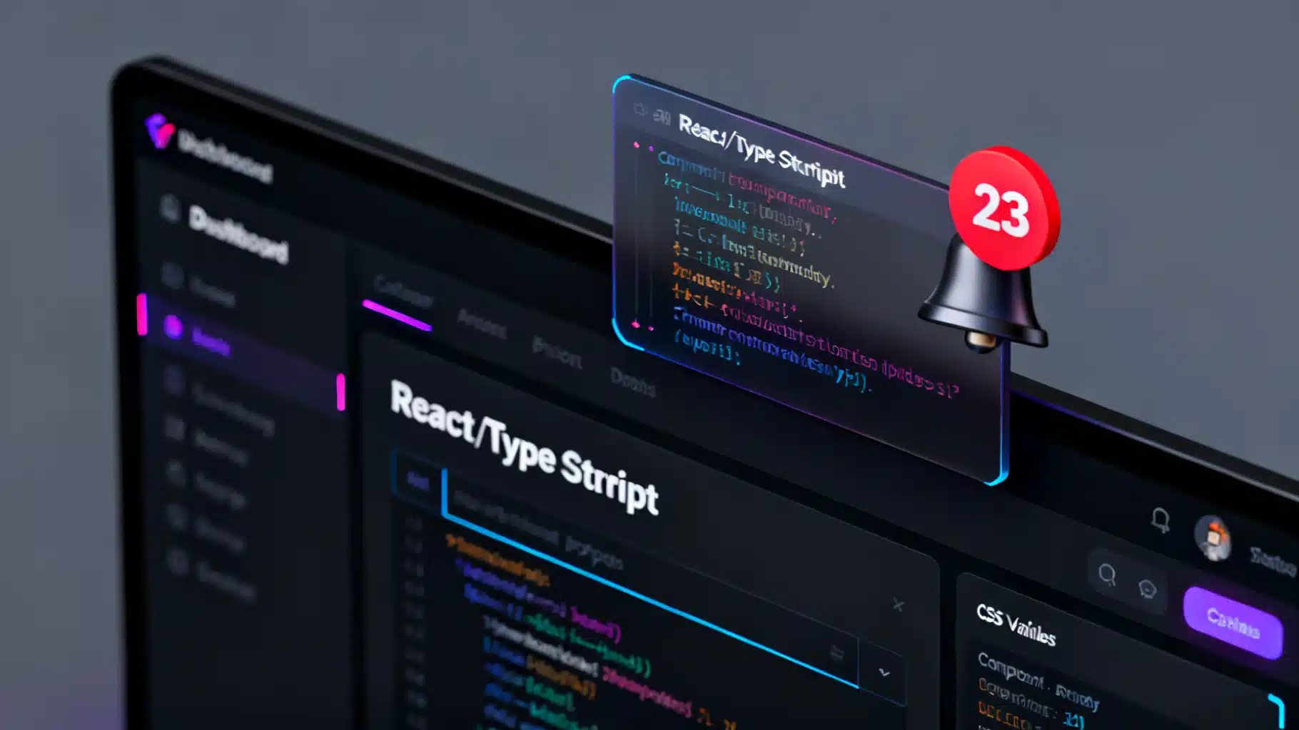
Image used for representation purposes only.
Overview
Skeleton screens keep users engaged while data loads by showing a lightweight preview of the layout. Add a subtle shimmer and the UI feels alive without resorting to spinners that imply indefinite waiting. In this article, you’ll build an accessible, high‑performance shimmer skeleton in React, integrate it with data fetching (including Suspense), and learn production‑grade tuning tips.
When to use skeletons (and when not to)
Use a skeleton when:
- The layout and approximate shapes are known (cards, lists, avatars, text blocks).
- You can closely match final dimensions to minimize layout shift.
- You want to convey progress without distracting users.
Prefer a spinner or progress bar when:
- You can’t predict the final layout or size.
- You’re running short, indeterminate tasks where layout preview adds no value.
- You need to communicate determinate progress (e.g., file upload 0–100%).
The shimmer effect in one minute
The classic shimmer uses a moving, angled gradient over a neutral base color:
- Base: a low‑contrast surface color.
- Highlight: a lighter streak that sweeps left→right (or right→left in RTL locales).
- Motion: a simple translate animation of a pseudo‑element to avoid layout reflow.
This approach:
- Avoids expensive layout/transform cascades by animating only paint/composite.
- Works with any shape (rectangles, rounded rects, circles, text rows).
- Degrades gracefully for users who prefer reduced motion.
Production‑ready CSS for shimmer
Create a single utility class you can apply anywhere. Keep it themable and respectful of accessibility settings.
/* skeleton.css */
:root {
  --skeleton-base: hsl(210 20% 95%);
  --skeleton-radius: 10px;
  --skeleton-duration: 1.1s;
}

@media (prefers-color-scheme: dark) {
  :root {
    --skeleton-base: hsl(220 8% 20%);
  }
}

.skeleton {
  position: relative;
  display: inline-block;
  background: var(--skeleton-base);
  border-radius: var(--r, var(--skeleton-radius));
  overflow: hidden;
  width: var(--w, 100%);
  height: var(--h, 1rem);
}

.skeleton::after {
  content: "";
  position: absolute;
  inset: 0;
  transform: translateX(-100%);
  background: linear-gradient(
    90deg,
    rgba(255,255,255,0) 0%,
    rgba(255,255,255,0.35) 50%,
    rgba(255,255,255,0) 100%
  );
  animation: shimmer var(--skeleton-duration) ease-in-out infinite;
}

@keyframes shimmer { 100% { transform: translateX(100%); } }

@media (prefers-reduced-motion: reduce) { .skeleton::after { animation: none; } }

/* Optional shape helpers */
.skeleton--circle { --r: 999px; }
.skeleton--rounded { --r: 14px; }
.skeleton--text { height: 1em; }
Notes:
- The animation runs on the pseudo‑element only. The base element stays static, avoiding layout or geometry changes.
- Use CSS variables for quick theming and per‑instance sizing (e.g.,
style={{"--w":"200px","--h":"12px"}}).
A reusable React
Encapsulate sizing, shape variants, and ARIA defaults. Skeletons are visual only; hide them from assistive tech and mark the container as busy instead.
// Skeleton.tsx
import React from 'react';
import './skeleton.css';

type Size = number | string; // e.g., 120 or '60%'

type SkeletonProps = {
  width?: Size;
  height?: Size;
  radius?: Size;
  variant?: 'rect' | 'rounded' | 'circle' | 'text';
  className?: string;
  style?: React.CSSProperties;
  inline?: boolean;
};

export const Skeleton: React.FC<SkeletonProps> = ({
  width,
  height,
  radius,
  variant = 'rect',
  className = '',
  style,
  inline = false,
}) => {
  const cssVars: React.CSSProperties = {
    ...(width ? { ['--w' as any]: typeof width === 'number' ? `${width}px` : width } : {}),
    ...(height ? { ['--h' as any]: typeof height === 'number' ? `${height}px` : height } : {}),
    ...(radius ? { ['--r' as any]: typeof radius === 'number' ? `${radius}px` : radius } : {}),
    ...style,
  };

  const variantClass =
    variant === 'circle' ? 'skeleton--circle' :
    variant === 'rounded' ? 'skeleton--rounded' :
    variant === 'text' ? 'skeleton--text' : '';

  return (
    <span
      aria-hidden="true"
      className={`skeleton ${variantClass} ${inline ? '' : 'block'} ${className}`.trim()}
      style={cssVars}
    />
  );
};
Add a small utility for multi‑line text placeholders:
// SkeletonText.tsx
import React from 'react';
import { Skeleton } from './Skeleton';

type SkeletonTextProps = {
  lines?: number; // default 3
  lineHeight?: number; // px, default 14
  gap?: number; // px, default 10
  lastLineWidth?: string | number; // default '60%'
};

export const SkeletonText: React.FC<SkeletonTextProps> = ({
  lines = 3,
  lineHeight = 14,
  gap = 10,
  lastLineWidth = '60%',
}) => {
  return (
    <div style={{ display: 'grid', rowGap: gap }} aria-hidden>
      {Array.from({ length: lines }).map((_, i) => (
        <Skeleton
          key={i}
          variant="text"
          height={lineHeight}
          width={i === lines - 1 ? lastLineWidth : '100%'}
          inline
        />
      ))}
    </div>
  );
};
Building a realistic card skeleton
Mimic your final layout to minimize content jump.
// PostCardSkeleton.tsx
import React from 'react';
import { Skeleton } from './Skeleton';
import { SkeletonText } from './SkeletonText';

export const PostCardSkeleton: React.FC = () => (
  <article className="card" aria-hidden>
    <div className="card__header">
      <Skeleton variant="circle" width={40} height={40} />
      <div style={{ width: '100%', marginLeft: 12 }}>
        <SkeletonText lines={1} lineHeight={14} />
        <Skeleton width={'40%'} height={12} style={{ marginTop: 6 }} />
      </div>
    </div>
    <Skeleton variant="rounded" height={160} style={{ marginTop: 12 }} />
    <SkeletonText lines={3} lineHeight={12} />
  </article>
);
Minimal card styles (optional):
.card { border: 1px solid color-mix(in srgb, #000 8%, transparent); padding: 16px; border-radius: 12px; }
.card__header { display: flex; align-items: center; }
Integrating with data fetching
1) Classic isLoading flag
// Posts.tsx
import React from 'react';
import { PostCardSkeleton } from './PostCardSkeleton';

export function Posts() {
  const [posts, setPosts] = React.useState<any[] | null>(null);

  React.useEffect(() => {
    let cancelled = false;
    (async () => {
      const res = await fetch('/api/posts');
      const data = await res.json();
      if (!cancelled) setPosts(data);
    })();
    return () => { cancelled = true; };
  }, []);

  const loading = posts == null;

  return (
    <section aria-busy={loading} aria-live="polite">
      {loading ? (
        <div className="grid">
          {Array.from({ length: 6 }).map((_, i) => <PostCardSkeleton key={i} />)}
        </div>
      ) : (
        <div className="grid">
          {posts!.map(p => (<PostCard key={p.id} post={p} />))}
        </div>
      )}
    </section>
  );
}
2) React Suspense fallback
If your stack supports data fetching with Suspense (e.g., framework APIs or resource wrappers), use a boundary to stream UI immediately while showing skeletons.
import React, { Suspense } from 'react';
import { PostCardSkeleton } from './PostCardSkeleton';

function PostListContent() {
  const posts = usePosts(); // throws a promise until data resolves
  return (
    <div className="grid">
      {posts.map(p => <PostCard key={p.id} post={p} />)}
    </div>
  );
}

export function PostsWithSuspense() {
  return (
    <Suspense fallback={
      <div className="grid">
        {Array.from({ length: 6 }).map((_, i) => <PostCardSkeleton key={i} />)}
      </div>
    }>
      <PostListContent />
    </Suspense>
  );
}
3) TanStack Query (or SWR) example
import { useQuery } from '@tanstack/react-query';

export function PostsWithQuery() {
  const { data, isLoading } = useQuery({
    queryKey: ['posts'],
    queryFn: () => fetch('/api/posts').then(r => r.json()),
    staleTime: 30_000,
  });

  return (
    <section aria-busy={isLoading} aria-live="polite">
      {isLoading ? (
        <div className="grid">
          {Array.from({ length: 6 }).map((_, i) => <PostCardSkeleton key={i} />)}
        </div>
      ) : (
        <div className="grid">
          {data!.map((p: any) => <PostCard key={p.id} post={p} />)}
        </div>
      )}
    </section>
  );
}
Accessibility checklist
Skeletons are visual hints only. Preserve a good experience for assistive technologies.
- Mark the content region as busy while loading: set
aria-busy={true}on a container. - Hide purely decorative skeletons from screen readers:
aria-hiddenon each skeleton component or wrapper. - Announce when content becomes available using
aria-live="polite"on the container if updates are significant. - Respect motion preferences: stop shimmer under
prefers-reduced-motion: reduce. - Maintain color contrast for surrounding UI; skeletons themselves need not meet text contrast, but avoid ultra‑low contrast in dark themes for visibility.
Performance tips that matter
- Minimize DOM: use simple
<span>s for skeleton blocks; avoid deep trees. - Animate a pseudo‑element: moving a gradient via
transformtriggers only paint/composite. - Avoid
will-changeunless necessary: it can increase memory; measure first. - Keep animation duration between 0.9s–1.4s; faster looks noisy, slower feels unresponsive.
- Batch skeletons in a container that matches final layout to prevent CLS.
- Turn off shimmer after a threshold (e.g., 8–10s) to reduce GPU work on very slow networks.
Example: auto‑disabling shimmer after 8 seconds.
// Optional: stop shimmering after a long wait
export function useShimmerEnabled(timeoutMs = 8000) {
  const [enabled, setEnabled] = React.useState(true);
  React.useEffect(() => {
    const id = setTimeout(() => setEnabled(false), timeoutMs);
    return () => clearTimeout(id);
  }, [timeoutMs]);
  return enabled;
}

// Apply a class that removes the animation
/* .no-shimmer .skeleton::after { animation: none; } */
Theming and dark mode
- Drive colors from CSS variables and your design tokens.
- Provide brand‑tinted skeletons by mixing the base with the surface color.
- Switch tokens with data attributes or color‑scheme media queries.
Example theme override:
/* Brand accent theme */
[data-theme="brand"] {
  --skeleton-base: color-mix(in srgb, var(--brand-600) 10%, #fff 90%);
}

@media (prefers-color-scheme: dark) {
  [data-theme="brand"] {
    --skeleton-base: color-mix(in srgb, var(--brand-400) 12%, #000 88%);
  }
}
Testing your skeletons
- Visual regression: add stories to Storybook for light/dark and reduced‑motion.
- E2E: verify the container toggles
aria-busyand that content replaces skeletons. - Performance: profile with DevTools; ensure animation stays near 60fps on low‑end devices.
- Accessibility: run axe or lighthouse; confirm no unexpected announcements.
Common pitfalls to avoid
- Mismatched sizes: if the skeleton’s height/width differ from the final content, users see jarring jumps.
- Endless shimmer: always stop once content arrives; hide skeletons instantly.
- Over‑detailed placeholders: keep shapes abstract; avoid fake text that could be mistaken for real copy.
- Too‑bright highlights in dark mode: reduce highlight alpha to prevent glare.
Drop‑in snippets
Text line:
<Skeleton variant="text" width="100%" height={14} />
Avatar:
<Skeleton variant="circle" width={40} height={40} />
Rounded media block:
<Skeleton variant="rounded" width="100%" height={180} radius={16} />
Grid of cards while loading:
<div className="grid" aria-busy>
  {Array.from({ length: 8 }).map((_, i) => <PostCardSkeleton key={i} />)}
</div>
Wrap‑up
A good skeleton does three things well: it matches the final layout to prevent layout shift, it respects user preferences and accessibility, and it stays performant under load. With a single utility class and a small <Skeleton/> component, you can ship a polished shimmer effect across your React app—no heavyweight dependencies required.
Related Posts

Building Effective React Skeleton Loading UIs: Patterns, Code, and A11y Tips
Build accessible, performant skeleton loading UIs in React with patterns, Suspense, CSS shimmer, and testing tips.
Build an Accessible React Badge Notification Counter (With Real‑Time Updates and Animations)
Build an accessible, themeable React badge notification counter with real-time updates, tasteful animations, and robust a11y—plus tests and tips.
Build a Production‑Ready React Avatar User Profile Component
Build an accessible, flexible React avatar component with initials fallback, status badges, groups, and TypeScript—optimized for performance and a11y.