
Building a Production‑Ready React Calendar Scheduling Component
Design and build a production-ready React calendar scheduling component with rich UX, timezone safety, recurrence, and accessibility.
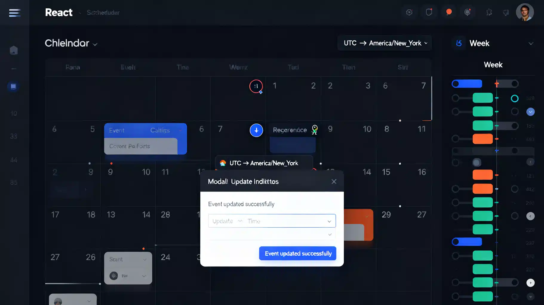
Image used for representation purposes only.
Overview
A calendar scheduling component is a cornerstone of many React applications: CRMs, project trackers, booking tools, healthcare portals, and internal ops dashboards. Building one that feels fast, accessible, and timezone‑aware requires more than date math—it demands careful UX, robust data modeling, and attention to performance and real‑time collaboration.
This guide walks through the architecture and implementation patterns for a production‑ready React calendar scheduler, with code examples, best practices, and trade‑offs when choosing to build vs. buy.
Core UX requirements
- Multiple views: month, week, and day (agenda/timeline)
- Create, move, resize, and edit events (drag‑and‑drop)
- Recurrence rules (e.g., every Monday at 9 AM)
- Time zone correctness and DST safety
- Accessibility: keyboard navigation and screen reader support
- Internationalization and locale‑sensitive formatting
- Real‑time updates and conflict handling (optional but valuable)
Event data model
A clean, extensible event schema prevents downstream pain. TypeScript helps keep constraints explicit.
export interface CalendarEvent {
  id: string;
  title: string;
  start: string | Date;   // ISO string or Date in UTC
  end: string | Date;     // exclusive end recommended
  allDay?: boolean;
  resourceId?: string;    // room, person, or asset
  recurrence?: {
    rrule: string;        // RFC 5545 RRULE string (e.g., FREQ=WEEKLY;BYDAY=MO)
    exceptions?: (string | Date)[]; // dates to exclude
  };
  meta?: Record<string, unknown>; // custom fields
}
Recommendations:
- Store dates in UTC at rest. Render in the user’s local zone.
- Treat
endas exclusive to avoid off‑by‑one rendering bugs. - Keep all‑day events date‑only (no time component) to avoid DST drift.
Choosing date/time utilities
- date‑fns: lightweight, functional, tree‑shakable; great default.
- Luxon: rich time zone handling with
DateTimeandIANAzones; ideal for complex TZ logic. - RRule/rrule.js: generate recurring instances from RRULE strings.
For most apps: use date‑fns for layout math and Luxon for time zone transforms around user input and server boundaries.
Build vs. buy
Libraries accelerate delivery but may limit customization.
- FullCalendar (React wrapper): comprehensive views, DnD, recurrence plugins; larger bundle.
- React Big Calendar: familiar Outlook‑style week/day; relies on localizer (moment/date‑fns/luxon).
- TUI Calendar: feature‑rich, multiple resources; customizable theme.
Build from scratch when:
- You need bespoke layout (e.g., resource timelines) or micro‑bundle size.
- You require strict design system alignment and custom interactions.
Rendering a month grid
A month grid is a 7×5/6 ARIA grid. Compute the visible range from the first visible Sunday (or locale first day) to the last visible Saturday.
import React from 'react';
import {
  startOfMonth, endOfMonth, startOfWeek, endOfWeek,
  eachDayOfInterval, isSameMonth, isToday, format
} from 'date-fns';

interface MonthGridProps {
  value: Date; // focused month
  onSelectDate?: (d: Date) => void;
  locale?: Locale; // date-fns locale
}

export function MonthGrid({ value, onSelectDate, locale }: MonthGridProps) {
  const start = startOfWeek(startOfMonth(value), { locale });
  const end = endOfWeek(endOfMonth(value), { locale });
  const days = eachDayOfInterval({ start, end });

  return (
    <div
      role="grid"
      aria-label={format(value, 'MMMM yyyy', { locale })}
      className="grid grid-cols-7 auto-rows-[minmax(6rem,auto)] border-t border-l"
    >
      {days.map((day) => {
        const muted = !isSameMonth(day, value);
        const today = isToday(day);
        return (
          <button
            key={day.toISOString()}
            role="gridcell"
            aria-selected={today}
            onClick={() => onSelectDate?.(day)}
            className={`relative border-b border-r p-2 text-left focus:outline-none focus:ring-2 focus:ring-indigo-600 ${
              muted ? 'text-gray-400 bg-gray-50' : 'text-gray-900'
            } ${today ? 'ring-1 ring-indigo-500' : ''}`}
          >
            <time dateTime={day.toISOString()} className="text-sm font-medium">
              {format(day, 'd')}
            </time>
            {/* Event chips rendered here (see below) */}
          </button>
        );
      })}
    </div>
  );
}
Basic styles use CSS Grid for a responsive 7‑column layout. Each cell is a focusable button for keyboard reachability.
Rendering events in the month view
Month cells often show up to N compact chips with a “+n more” overflow link.
interface MonthEventsProps {
  day: Date;
  events: CalendarEvent[]; // already filtered by day’s range
  maxVisible?: number;
  onOpenDay?: () => void;
}

function MonthEvents({ day, events, maxVisible = 3, onOpenDay }: MonthEventsProps) {
  const visible = events.slice(0, maxVisible);
  const overflow = events.length - visible.length;

  return (
    <ul className="mt-1 space-y-1">
      {visible.map((ev) => (
        <li key={ev.id} className="truncate text-xs rounded px-1 py-0.5 bg-indigo-100 text-indigo-900">
          {ev.title}
        </li>
      ))}
      {overflow > 0 && (
        <li>
          <button onClick={onOpenDay} className="text-xs text-indigo-700 hover:underline">
            +{overflow} more
          </button>
        </li>
      )}
    </ul>
  );
}
Week/day timeline layout
Week/day views place events on a vertical time axis. Overlaps require collision detection and width assignment.
Algorithm outline:
- Sort events by start time.
- Sweep through the day; maintain an active set of overlapping events.
- Assign each event a column index and total columns for its cluster.
- Render as absolutely positioned blocks within hour rows.
interface PositionedEvent extends CalendarEvent {
  top: number;    // px from top (minutes from midnight * pxPerMinute)
  height: number; // px (duration * pxPerMinute)
  left: number;   // percentage or px
  width: number;  // percentage or px
}
Drag‑and‑drop and resizing
Use a battle‑tested library for pointer interactions.
- dnd‑kit: modern, accessible, sensor‑based; great for custom grids.
- react‑beautiful‑dnd: easier for lists, now community‑maintained.
With dnd‑kit, treat each time slot (or cell) as a droppable and each event as a draggable. On drag end, snap to your desired granularity (e.g., 15 minutes), compute the new start/end, and optimistically update state.
import { DndContext, DragEndEvent } from '@dnd-kit/core';

function Scheduler() {
  const [events, setEvents] = React.useState<CalendarEvent[]>([]);

  function onDragEnd(e: DragEndEvent) {
    const id = e.active.id as string;
    const targetSlot = e.over?.id as string; // encode date/time in id
    if (!targetSlot) return;
    setEvents((prev) => prev.map((ev) => ev.id === id
      ? { ...ev, start: decodeSlotStart(targetSlot), end: shiftEnd(ev, targetSlot) }
      : ev));
  }

  return (
    <DndContext onDragEnd={onDragEnd}>
      {/* timeline grid + draggable events here */}
    </DndContext>
  );
}
Resizing uses a drag handle at the bottom edge; constrain movement to your time grid.
Recurring events with RRULE
Expand recurrences server‑side or in a memoized client utility. Respect exceptions (ex‑dates) and ranges.
import { RRule, RRuleSet, rrulestr } from 'rrule';

export function expandRecurrence(ev: CalendarEvent, rangeStart: Date, rangeEnd: Date): CalendarEvent[] {
  if (!ev.recurrence) return [ev];

  const set = new RRuleSet();
  set.rrule(rrulestr(`DTSTART:${toUTCString(ev.start)}\nRRULE:${ev.recurrence.rrule}`));
  (ev.recurrence.exceptions || []).forEach((ex) => set.exdate(new Date(ex)));

  return set.between(rangeStart, rangeEnd).map((dt, i) => ({
    ...ev,
    id: `${ev.id}:${+dt}`,
    start: dt,
    end: new Date(dt.getTime() + (new Date(ev.end).getTime() - new Date(ev.start).getTime())),
  }));
}
Tip: Avoid expanding the entire series; only expand for the visible range plus a buffer.
Time zones and DST
- Persist UTC on the server. Convert to the user’s IANA zone on display using Luxon’s
DateTime.fromISO(utc, { zone: 'utc' }).setZone(userZone). - Never add hours across DST with native
Datealone; do arithmetic in a zoned library. - All‑day events should be stored as date‑only (e.g., 2026‑11‑06) and rendered midnight‑to‑midnight in the user’s zone.
Accessibility essentials
- Month view: role=“grid”, days as role=“gridcell”, and week rows as role=“row”.
- Keyboard: arrows move day focus; Enter/Space opens create/edit; Esc closes dialogs.
- Screen reader labels:
aria-label="Friday, November 6, 2026. 3 events."on each cell. - Contrast and focus states: visible focus ring, WCAG AA colors.
- Drag alternatives: provide a non‑pointer way to change times (e.g., time pickers in dialogs).
Internationalization
- Use
Intl.DateTimeFormatwith locales and calendars when possible. - Respect first day of week from locale settings.
- Support 12h/24h formats and localized weekday/month names.
- RTL support: flip timeline gutters and arrow key semantics when
dir="rtl".
Server synchronization and real‑time
- Fetch events by range:
/events?start=2026-11-01T00:00:00Z&end=2026-12-01T00:00:00Z. - Apply ETags/If‑None‑Match for caching. Use delta endpoints for large calendars.
- Optimistic UI on create/move/resize; reconcile on success or rollback on 409 Conflict.
- WebSockets or SSE broadcast event changes; debounce view refreshes.
Conflict handling
- Detect overlaps for the same resource (e.g., room clashes).
- On conflict, surface a toast with “view details” and highlight clashing blocks.
Performance tips
- Memoize derived day/week structures with
useMemokeyed by visible range. React.memoevent components; pass stable props and handlers.- Virtualize long all‑day rows or agenda lists (e.g.,
react-virtual). - Prefer CSS transforms for drag previews; avoid layout thrash during pointer moves.
- Batch state updates (
startTransition) when navigating months/weeks.
Security and validation
- Sanitize event titles/descriptions to avoid XSS (never dangerously set inner HTML untrusted).
- Validate server‑side that
end > start, within policy limits, and user has rights to resource. - Rate‑limit bulk changes and ICS imports.
A minimal end‑to‑end example
The snippet shows a simple month view with a dialog to add events and a filtered list per day.
import React from 'react';
import { format, isSameDay, startOfMonth, endOfMonth, startOfWeek, endOfWeek, eachDayOfInterval } from 'date-fns';

type Ev = { id: string; title: string; start: Date; end: Date; allDay?: boolean };

export function CalendarApp() {
  const [current, setCurrent] = React.useState(new Date());
  const [events, setEvents] = React.useState<Ev[]>([]);
  const [draft, setDraft] = React.useState<{ date: Date; title: string } | null>(null);

  const start = startOfWeek(startOfMonth(current));
  const end = endOfWeek(endOfMonth(current));
  const days = eachDayOfInterval({ start, end });

  function addEvent(date: Date, title: string) {
    const start = new Date(date); start.setHours(9, 0, 0, 0);
    const end = new Date(date); end.setHours(10, 0, 0, 0);
    setEvents((prev) => [...prev, { id: crypto.randomUUID(), title, start, end }]);
  }

  return (
    <div className="space-y-4">
      <header className="flex items-center justify-between">
        <h1 className="text-lg font-semibold">{format(current, 'MMMM yyyy')}</h1>
        <div className="space-x-2">
          <button onClick={() => setCurrent(new Date())}>Today</button>
          <button onClick={() => setCurrent(new Date(current.getFullYear(), current.getMonth() - 1, 1))}>Prev</button>
          <button onClick={() => setCurrent(new Date(current.getFullYear(), current.getMonth() + 1, 1))}>Next</button>
        </div>
      </header>

      <div className="grid grid-cols-7 text-xs text-gray-500">
        {["Sun","Mon","Tue","Wed","Thu","Fri","Sat"].map((d) => <div key={d} className="p-2">{d}</div>)}
      </div>

      <div className="grid grid-cols-7 auto-rows-[minmax(7rem,auto)] border-t border-l">
        {days.map((day) => (
          <div key={day.toISOString()} className="border-r border-b p-2">
            <button className="text-sm font-medium" onClick={() => setDraft({ date: day, title: '' })}>
              {format(day, 'd')}
            </button>
            <ul className="mt-2 space-y-1">
              {events.filter((e) => isSameDay(e.start, day)).map((e) => (
                <li key={e.id} className="truncate text-xs rounded px-1 py-0.5 bg-indigo-100 text-indigo-900">{e.title}</li>
              ))}
            </ul>
          </div>
        ))}
      </div>

      {draft && (
        <div role="dialog" aria-modal className="fixed inset-0 grid place-items-center bg-black/30">
          <div className="bg-white p-4 rounded shadow w-80 space-y-3">
            <h2 className="font-medium">Add event on {format(draft.date, 'PP')}</h2>
            <input
              autoFocus
              value={draft.title}
              onChange={(e) => setDraft({ ...draft, title: e.target.value })}
              placeholder="Title"
              className="w-full border px-2 py-1 rounded"
            />
            <div className="flex justify-end gap-2">
              <button onClick={() => setDraft(null)}>Cancel</button>
              <button
                onClick={() => { addEvent(draft.date, draft.title); setDraft(null); }}
                disabled={!draft.title.trim()}
                className="bg-indigo-600 text-white px-3 py-1 rounded disabled:opacity-50"
              >Save</button>
            </div>
          </div>
        </div>
      )}
    </div>
  );
}
This minimal version omits drag‑and‑drop, recurrence, and time zones but provides a scaffold you can extend.
Testing strategy
- Unit test date range calculations and overlap logic (edge cases at DST boundaries).
- Integration tests with Testing Library for keyboard navigation and dialogs.
- Visual regression tests (Storybook + Chromatic) to catch layout shifts.
- E2E tests (Playwright) for create/move/resize flows and conflict toasts.
Deployment checklist
- Range‑based fetching and memoized expansion for recurrences
- Keyboard and screen reader labels verified
- Time zone conversions covered in unit tests
- Drag‑and‑drop with snapping and resize handles
- Optimistic updates with rollback on 409
- Virtualized agenda for large data sets
- Translations + locale first‑day‑of‑week
- Analytics on create/edit/delete funnels
Conclusion
A robust React scheduling component blends careful date math with human‑centered UX. Start with a clean data model, enforce time zone safety, and prioritize accessibility. From there, layer in recurrence, DnD, and real‑time syncing. Whether you integrate a mature library or craft a bespoke solution, the patterns above will help you ship a calendar that users trust and enjoy.
Related Posts

Build a Polished React Animated Counter in React (Hook + Component, A11y-First)
Build an accessible React animated counter with a reusable hook and component—easing, formatting, reduced motion, viewport start, and full control.

Building an Accessible React Split Button Dropdown in React + TypeScript
Build an accessible React split button dropdown with ARIA, keyboard support, and TypeScript—complete code, styling, and testing tips.

Building a Mobile-Perfect React Bottom Sheet in React: UX, A11y, and Performance
Build a mobile‑ready React bottom sheet with gestures, snap points, accessibility, and performance tips—complete with minimal and Framer Motion code.