
Building a Robust React Numeric Input Stepper: Accessibility, Precision, and UX
Build an accessible, locale-aware React numeric input stepper with precise stepping, robust parsing, and a production-ready TypeScript component.
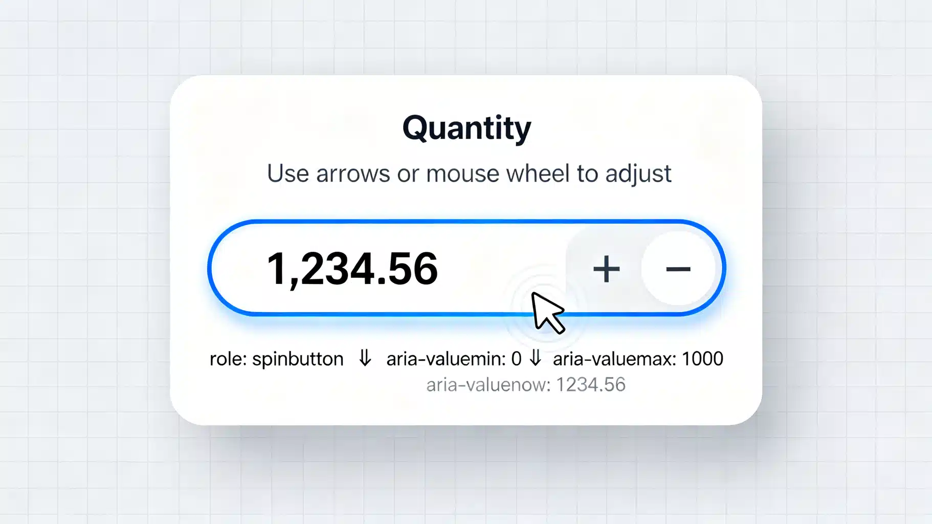
Image used for representation purposes only.
Overview
A numeric input stepper lets users enter numbers with both free typing and precise increments via up/down controls. In React, building a robust stepper is trickier than it looks: you must balance accessibility, keyboard and pointer ergonomics, locale-aware formatting, validation, and floating‑point precision. This guide walks through design choices, implementation patterns, and a production‑ready React component you can adapt.
UX goals
- Fast: Arrow keys, mouse wheel, click-and-hold, and large steps for coarse adjustments.
- Forgiving: Allow partial/invalid text while typing, validate on commit (Enter/blur), and clamp as needed.
- Legible: Optional thousands separators, fixed precision, and clear min/max hints.
- Predictable: No surprising jumps or lost caret position while the user edits.
- Accessible: ARIA spinbutton semantics, labeled controls, and consistent focus order.
API design
A sensible prop surface keeps the component flexible without leaking complexity:
- value: number | null
- onChange(next: number | null): void
- min?: number, max?: number, step?: number (default 1), bigStep?: number (default step*10)
- precision?: number (controls rounding and display)
- allowEmpty?: boolean (default false)
- format?: (n: number) => string
- parse?: (s: string) => number | null
- disabled?: boolean, readOnly?: boolean
- name?: string, id?: string
Key principles:
- Separate display string from numeric value. Preserve the user’s in‑progress text (like ‘-’) without forcing it to parse immediately.
- Emit onChange only with parsed numbers (or null when allowed). Don’t emit on every keystroke if parse fails.
- Defer formatting to blur/Enter to avoid caret jumps; live‑formatting can be optional.
Accessibility essentials
- Use role=‘spinbutton’ on the input when you manage semantics yourself.
- Provide aria-valuemin, aria-valuemax, and aria-valuenow when a valid number is present.
- Associate a visible label via a native label element or aria-label/aria-labelledby.
- Buttons need descriptive aria-labels like ‘Increase value’ and ‘Decrease value’.
- Keyboard interactions:
- ArrowUp/ArrowDown: ±step
- PageUp/PageDown: ±bigStep
- Home/End: jump to min/max when defined
- Enter: commit formatting; Escape: revert to last valid value
Note: input type=‘number’ has built‑in semantics, but often interferes with locale/format and wheel behavior. Many teams prefer type=‘text’ with inputMode=‘numeric’ and explicit ARIA.
Precision and step alignment
Floating‑point math causes 0.1 + 0.2 issues. Strategies:
- Scale to integers using precision, e.g., 2 decimals => factor 100.
- Round to the nearest step multiple relative to a base (commonly min or 0).
- Clamp to [min, max] after rounding.
Locale, parsing, and formatting
- Formatting: Intl.NumberFormat for thousands separators and fixed decimals.
- Parsing: strip grouping separators, normalize decimal separator, allow leading ‘-’, partial input (e.g., ‘-’) while editing.
- Decide when to format:
- On blur/Enter by default (safer caret behavior)
- On change if you can reliably preserve caret and selection
Mouse, touch, and wheel
- Click-and-hold on buttons should repeat steps with acceleration (e.g., 300ms → 100ms → 50ms).
- Support Shift to multiply step (e.g., ×10), Alt for finer control (e.g., ÷10) if it suits your domain.
- Only respond to wheel when input is focused to avoid accidental changes; allow disableWheel prop in sensitive contexts.
Validation lifecycle
- While typing: accept any string; store as inputValue.
- On parse success: update numeric value and optionally format.
- On blur: if invalid and allowEmpty=false, revert to last valid or clamp.
- Always clamp to [min, max] before emitting onChange.
Controlled vs. uncontrolled
- Controlled (value/onChange): single source of truth. Keep a local inputValue mirror string.
- Uncontrolled (defaultValue): maintain internal number state and expose onChange.
Most form libs prefer controlled mode.
Testing checklist
- Keyboard: arrows, page up/down, home/end, enter/escape.
- Mouse: single click, press-and-hold acceleration; disabled/readOnly states.
- Parsing: partial input, negative values, big numbers, exponentials rejected.
- Formatting: thousands separators, precision, locale swaps.
- A11y: screen reader announces role and values; labels connected; tab order.
- Edge cases: min>max (guard), step<=0 (guard), NaN handling.
Reference implementation (TypeScript, controlled)
import React from 'react';

type NumberStepperProps = {
  value: number | null;
  onChange: (v: number | null) => void;
  min?: number;
  max?: number;
  step?: number;
  bigStep?: number;
  precision?: number; // e.g., 2 means keep 2 decimals
  allowEmpty?: boolean;
  disabled?: boolean;
  readOnly?: boolean;
  name?: string;
  id?: string;
  format?: (n: number) => string;
  parse?: (s: string) => number | null;
  ariaLabel?: string;
};

function clamp(n: number, min?: number, max?: number) {
  if (min != null && n < min) return min;
  if (max != null && n > max) return max;
  return n;
}

function scaleFactor(precision = 0) {
  return Math.pow(10, precision);
}

function roundToStep(n: number, step = 1, base = 0, precision = 0) {
  const f = scaleFactor(precision);
  const ni = Math.round((n - base) * f);
  const si = Math.round(step * f);
  const k = Math.round(ni / si);
  return base + (k * si) / f;
}

function addStep(n: number, dir: 1 | -1, step = 1, precision = 0) {
  const f = scaleFactor(precision);
  return Math.round(n * f + dir * step * f) / f;
}

const defaultFormatter = (precision = 0) => (n: number) =>
  new Intl.NumberFormat(undefined, {
    minimumFractionDigits: precision,
    maximumFractionDigits: precision,
  }).format(n);

const defaultParser = (s: string): number | null => {
  const trimmed = s.trim();
  if (trimmed === '' || trimmed === '-' || trimmed === '+') return null;
  // Normalize by removing grouping and normalizing decimal separator.
  const example = 1000.1.toLocaleString();
  const group = example[1]; // likely ',' or ' '
  const decimal = example[5]; // likely '.' or ','
  const reGroup = new RegExp('[' + (group === '.' || group === ',' ? '\\' + group : group) + ']', 'g');
  let normalized = trimmed.replace(reGroup, '');
  if (decimal !== '.') normalized = normalized.replace(decimal, '.');
  // Reject exponentials for safety unless your domain allows.
  if (/e/i.test(normalized)) return null;
  const n = Number(normalized);
  return Number.isFinite(n) ? n : null;
};

export function NumberStepper({
  value,
  onChange,
  min,
  max,
  step = 1,
  bigStep,
  precision = 0,
  allowEmpty = false,
  disabled,
  readOnly,
  name,
  id,
  format,
  parse,
  ariaLabel,
}: NumberStepperProps) {
  const fmt = React.useMemo(() => format ?? defaultFormatter(precision), [format, precision]);
  const prs = React.useMemo(() => parse ?? defaultParser, [parse]);
  const [inputValue, setInputValue] = React.useState<string>(() =>
    value == null ? '' : fmt(value)
  );
  const lastValidRef = React.useRef<number | null>(value ?? null);
  const isFocusedRef = React.useRef(false);
  const repeatRef = React.useRef<number | null>(null);

  React.useEffect(() => {
    // When external value changes (e.g., form reset), update display unless focused and mid-edit.
    if (!isFocusedRef.current) {
      setInputValue(value == null ? '' : fmt(value));
    }
    lastValidRef.current = value ?? null;
  }, [value, fmt]);

  const commit = React.useCallback((s: string) => {
    const parsed = prs(s);
    if (parsed == null) {
      if (allowEmpty) {
        onChange(null);
        setInputValue('');
      } else {
        // Revert to last valid (clamped)
        const lv = lastValidRef.current;
        if (lv == null) {
          const next = min != null ? min : 0;
          onChange(clamp(next, min, max));
          setInputValue(fmt(clamp(next, min, max)));
        } else {
          onChange(clamp(lv, min, max));
          setInputValue(fmt(clamp(lv, min, max)));
        }
      }
      return;
    }
    // Align to step and clamp
    const aligned = roundToStep(parsed, step, min ?? 0, precision);
    const clamped = clamp(aligned, min, max);
    onChange(clamped);
    setInputValue(fmt(clamped));
  }, [allowEmpty, fmt, max, min, onChange, precision, prs, step]);

  const nudge = React.useCallback((dir: 1 | -1, magnitude: 'step' | 'big' = 'step') => {
    const s = magnitude === 'big' ? (bigStep ?? step * 10) : step;
    let base = value;
    if (base == null) base = clamp(0, min, max);
    const next = clamp(addStep(base, dir, s, precision), min, max);
    onChange(next);
    if (!isFocusedRef.current) setInputValue(fmt(next));
  }, [bigStep, fmt, max, min, onChange, precision, step, value]);

  const startRepeat = (dir: 1 | -1) => {
    nudge(dir);
    let delay = 300;
    const tick = () => {
      nudge(dir);
      delay = Math.max(50, Math.floor(delay * 0.7));
      repeatRef.current = window.setTimeout(tick, delay);
    };
    repeatRef.current = window.setTimeout(tick, delay);
  };

  const stopRepeat = () => {
    if (repeatRef.current != null) {
      clearTimeout(repeatRef.current);
      repeatRef.current = null;
    }
  };

  const onKeyDown = (e: React.KeyboardEvent<HTMLInputElement>) => {
    if (disabled || readOnly) return;
    switch (e.key) {
      case 'ArrowUp':
        e.preventDefault();
        nudge(1, e.shiftKey ? 'big' : 'step');
        break;
      case 'ArrowDown':
        e.preventDefault();
        nudge(-1, e.shiftKey ? 'big' : 'step');
        break;
      case 'PageUp':
        e.preventDefault();
        nudge(1, 'big');
        break;
      case 'PageDown':
        e.preventDefault();
        nudge(-1, 'big');
        break;
      case 'Home':
        if (min != null) { e.preventDefault(); onChange(min); setInputValue(fmt(min)); }
        break;
      case 'End':
        if (max != null) { e.preventDefault(); onChange(max); setInputValue(fmt(max)); }
        break;
      case 'Enter':
        commit((e.target as HTMLInputElement).value);
        break;
      case 'Escape': {
        const lv = lastValidRef.current;
        if (lv == null) {
          setInputValue('');
          if (!allowEmpty) {
            const next = clamp(0, min, max);
            onChange(next);
            setInputValue(fmt(next));
          }
        } else {
          setInputValue(fmt(clamp(lv, min, max)));
        }
        break;
      }
    }
  };

  const onWheel = (e: React.WheelEvent<HTMLInputElement>) => {
    if (!isFocusedRef.current || disabled || readOnly) return;
    e.preventDefault();
    const dir = e.deltaY < 0 ? 1 : -1;
    nudge(dir, e.shiftKey ? 'big' : 'step');
  };

  return (
    <div className='number-stepper' data-disabled={disabled || undefined}>
      <button
        type='button'
        className='stepper-btn dec'
        aria-label='Decrease value'
        onMouseDown={() => startRepeat(-1)}
        onMouseUp={stopRepeat}
        onMouseLeave={stopRepeat}
        onTouchStart={() => startRepeat(-1)}
        onTouchEnd={stopRepeat}
        disabled={disabled || readOnly}
      >−</button>

      <input
        id={id}
        name={name}
        type='text'
        inputMode='numeric'
        role='spinbutton'
        aria-label={ariaLabel}
        aria-valuemin={min as number | undefined}
        aria-valuemax={max as number | undefined}
        aria-valuenow={value == null ? undefined : value}
        aria-disabled={disabled || undefined}
        aria-readonly={readOnly || undefined}
        value={inputValue}
        onChange={(e) => {
          setInputValue(e.target.value);
          const parsed = prs(e.target.value);
          if (parsed != null) {
            const aligned = roundToStep(parsed, step, min ?? 0, precision);
            const clamped = clamp(aligned, min, max);
            onChange(clamped);
          }
        }}
        onBlur={(e) => { isFocusedRef.current = false; commit(e.target.value); }}
        onFocus={() => { isFocusedRef.current = true; }}
        onKeyDown={onKeyDown}
        onWheel={onWheel}
        disabled={disabled}
        readOnly={readOnly}
        className='stepper-input'
      />

      <button
        type='button'
        className='stepper-btn inc'
        aria-label='Increase value'
        onMouseDown={() => startRepeat(1)}
        onMouseUp={stopRepeat}
        onMouseLeave={stopRepeat}
        onTouchStart={() => startRepeat(1)}
        onTouchEnd={stopRepeat}
        disabled={disabled || readOnly}
      >+</button>
    </div>
  );
}
Basic usage
export default function QuantityField() {
  const [qty, setQty] = React.useState<number | null>(1);
  return (
    <label style={{ display: 'grid', gap: 8 }}>
      Quantity
      <NumberStepper
        value={qty}
        onChange={setQty}
        min={0}
        max={99}
        step={1}
        precision={0}
        ariaLabel='Quantity'
      />
      <small>In stock: 99</small>
    </label>
  );
}
Styling the control
Keep hit targets at least 32–40px. Outline focus rings clearly; do not remove them.
.number-stepper { display: inline-flex; align-items: stretch; border: 1px solid #c9ccd1; border-radius: 8px; overflow: hidden; }
.stepper-input { width: 6ch; text-align: center; border: 0; outline: none; padding: 8px 10px; font: inherit; }
.stepper-input:focus { box-shadow: inset 0 0 0 2px #2563eb33; }
.stepper-btn { width: 36px; border: 0; background: #f3f4f6; color: #111827; cursor: pointer; display: grid; place-items: center; font-size: 18px; }
.stepper-btn:hover { background: #e5e7eb; }
.stepper-btn:disabled { opacity: .5; cursor: not-allowed; }
Integration with form libraries
- React Hook Form: wrap in Controller to bridge value/onChange and onBlur.
- Formik: map field.value and field.onChange; call setFieldValue inside onChange.
- Zod/Yup: validate numeric range and step alignment on submit; keep UI permissive during edit.
Example with React Hook Form:
import { Controller, useForm } from 'react-hook-form';

type F = { price: number | null };

function PriceField() {
  const { control, handleSubmit } = useForm<F>({ defaultValues: { price: null } });
  return (
    <form onSubmit={handleSubmit(console.log)}>
      <Controller
        control={control}
        name='price'
        render={({ field: { value, onChange } }) => (
          <NumberStepper value={value} onChange={onChange} min={0} step={0.25} precision={2} ariaLabel='Price' />
        )}
      />
      <button type='submit'>Save</button>
    </form>
  );
}
Common pitfalls and fixes
- input type=‘number’ surprises: browser‑specific spinners, wheel changes on scroll, locale constraints. Prefer type=‘text’ + inputMode.
- Caret jumps with live formatting: format on blur, or compute and restore caret by measuring diff.
- Rounding drift: always scale integers by precision when adding steps.
- Losing partial negatives: allow ‘-’ while editing; validate on commit.
- Big numbers and money: consider decimal libraries or integer cents to avoid float errors.
Performance notes
- Use useCallback/useMemo to avoid re-creating handlers/formatters.
- For press-and-hold, use setTimeout acceleration rather than tight setInterval loops.
- Avoid frequent parent re-renders by debouncing expensive onChange side-effects outside the component.
Extending the component
- Prefix/suffix slots for currency symbols or units.
- Tooltip or helper text for min/max and step.
- Read-only display mode that still allows keyboard stepping for accessibility.
- Async validation (e.g., stock constraints) with optimistic UI.
Conclusion
A high-quality React numeric stepper is more than two buttons and an input. By separating display text from the numeric model, aligning to steps with integer math, honoring ARIA spinbutton semantics, and supporting rich interactions (keyboard, wheel, long-press), you’ll ship a control that feels fast, accessible, and trustworthy across locales and devices. Use the reference implementation as a foundation and tailor parsing/formatting and behaviors to your domain.
Related Posts

Build an accessible React password show or hide toggle
Build an accessible React password field with a show or hide toggle, covering UX, a11y, TypeScript, SSR, and integrations with MUI and Chakra.

Building a Production‑Ready React Calendar Scheduling Component
Design and build a production-ready React calendar scheduling component with rich UX, timezone safety, recurrence, and accessibility.

Building an Accessible React Split Button Dropdown in React + TypeScript
Build an accessible React split button dropdown with ARIA, keyboard support, and TypeScript—complete code, styling, and testing tips.