Flutter Dynamic Theming at Runtime: Material 3, System Colors, and ThemeExtensions
Implement dynamic runtime theming in Flutter with ThemeMode, Material 3 seed colors, Android 12 system colors, ThemeExtension, persistence, and tests.
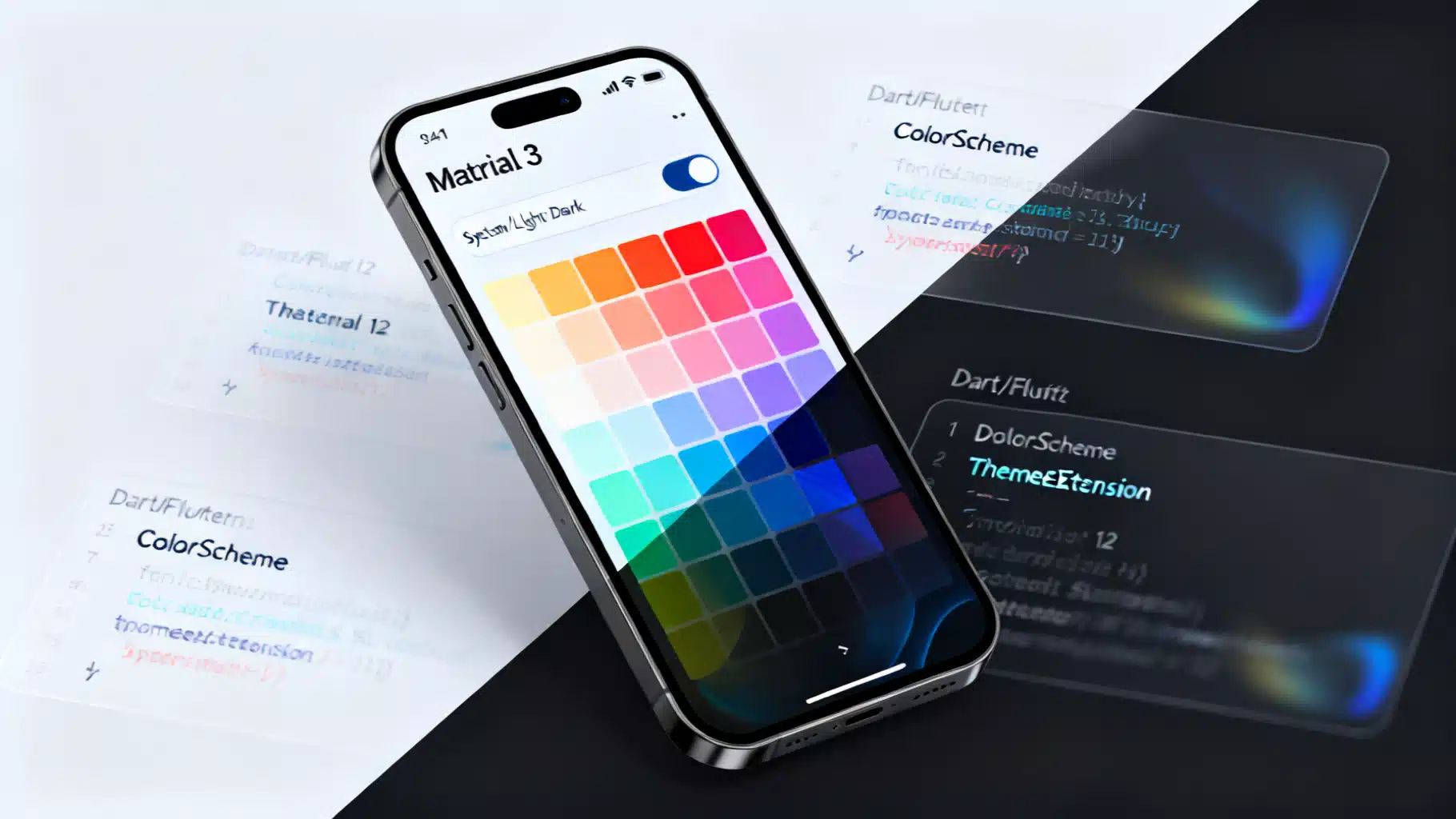
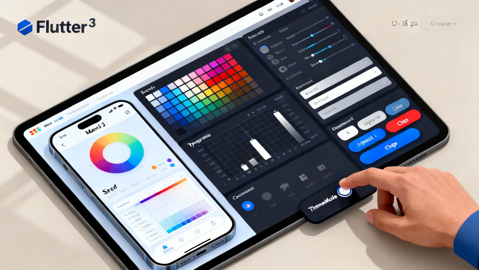
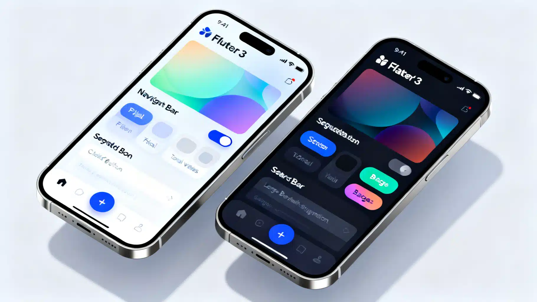
Image used for representation purposes only.
Why dynamic theming matters
Great apps feel personal. Dynamic theming lets users switch between light/dark, follow the system, or even choose an accent color without restarting the app. In Flutter, this can be achieved cleanly with Material 3, ColorScheme, ThemeMode, and ThemeExtension—all updated at runtime.
This guide shows production-ready patterns, from a minimal toggle to full-featured dynamic color with persistence, custom design tokens, animations, and tests.
Core building blocks in Flutter
- ThemeData: The top-level theme object used by MaterialApp.
- ColorScheme: The palette that drives component colors; prefer using it over ad‑hoc colors.
- ThemeMode: Chooses between light, dark, or system.
- ThemeExtension: Add your own tokens (e.g., spacing, brand colors) that animate with the theme.
- State management: ChangeNotifier, Riverpod, BLoC, etc., to hold and update theme state.
Architecture options (pick one)
- Simple apps: ValueNotifier or ChangeNotifier that holds ThemeMode and a seed color.
- Medium/large apps: Riverpod StateNotifier or BLoC/Cubit to keep theme logic testable and modular.
- Cross‑package theming: Expose a ThemeExtension for custom tokens so features can theme themselves.
The key principle: place the theme controller high enough (above MaterialApp) so a single rebuild updates the entire app, while keeping heavy recomputation out of build.
A minimal runtime toggle (ThemeMode)
import 'package:flutter/material.dart';

class ThemeController extends ChangeNotifier {
  ThemeMode _mode = ThemeMode.system;
  ThemeMode get mode => _mode;

  void setMode(ThemeMode value) {
    if (_mode == value) return;
    _mode = value;
    notifyListeners();
  }
}

void main() {
  final controller = ThemeController();
  runApp(MyApp(controller));
}

class MyApp extends StatelessWidget {
  const MyApp(this.controller, {super.key});
  final ThemeController controller;

  @override
  Widget build(BuildContext context) {
    return AnimatedBuilder(
      animation: controller,
      builder: (context, _) {
        return MaterialApp(
          title: 'Dynamic Theme',
          theme: ThemeData(useMaterial3: true, colorSchemeSeed: Colors.indigo),
          darkTheme: ThemeData(
            useMaterial3: true,
            colorSchemeSeed: Colors.indigo,
            brightness: Brightness.dark,
          ),
          themeMode: controller.mode,
          home: Home(controller: controller),
        );
      },
    );
  }
}

class Home extends StatelessWidget {
  const Home({super.key, required this.controller});
  final ThemeController controller;

  @override
  Widget build(BuildContext context) {
    return Scaffold(
      appBar: AppBar(
        title: const Text('Runtime Theming'),
        actions: [
          PopupMenuButton<ThemeMode>(
            onSelected: controller.setMode,
            itemBuilder: (context) => const [
              PopupMenuItem(value: ThemeMode.system, child: Text('System')),
              PopupMenuItem(value: ThemeMode.light, child: Text('Light')),
              PopupMenuItem(value: ThemeMode.dark, child: Text('Dark')),
            ],
          ),
        ],
      ),
      body: const Center(child: Text('Toggle theme from the menu.')),
    );
  }
}
MaterialApp will rebuild when ThemeMode changes. Because it uses an animated theme under the hood, the color transition is smooth.
Adding a user‑selected accent (Material 3 seed colors)
Material 3 encourages generating a full ColorScheme from a single seed.
class ThemeController extends ChangeNotifier {
  ThemeMode _mode = ThemeMode.system;
  Color _seed = const Color(0xFF6750A4); // default brand color

  ThemeMode get mode => _mode;
  Color get seed => _seed;

  void setMode(ThemeMode value) { if (_mode == value) return; _mode = value; notifyListeners(); }
  void setSeed(Color value) { if (_seed == value) return; _seed = value; notifyListeners(); }
}

class MyApp extends StatelessWidget {
  const MyApp(this.controller, {super.key});
  final ThemeController controller;

  @override
  Widget build(BuildContext context) {
    return AnimatedBuilder(
      animation: controller,
      builder: (context, _) {
        final light = ThemeData(
          useMaterial3: true,
          colorSchemeSeed: controller.seed,
        );
        final dark = ThemeData(
          useMaterial3: true,
          colorSchemeSeed: controller.seed,
          brightness: Brightness.dark,
        );
        return MaterialApp(
          theme: light,
          darkTheme: dark,
          themeMode: controller.mode,
          home: Home(controller: controller),
        );
      },
    );
  }
}

class Home extends StatelessWidget {
  const Home({super.key, required this.controller});
  final ThemeController controller;

  @override
  Widget build(BuildContext context) {
    final swatches = [
      Colors.teal, Colors.blue, Colors.indigo, Colors.purple,
      Colors.pink, Colors.red, Colors.orange, Colors.amber,
      Colors.green,
    ];

    return Scaffold(
      appBar: AppBar(title: const Text('Dynamic Seed Color')),
      body: GridView.count(
        crossAxisCount: 6,
        padding: const EdgeInsets.all(16),
        crossAxisSpacing: 12,
        mainAxisSpacing: 12,
        children: [
          for (final c in swatches)
            InkWell(
              onTap: () => controller.setSeed(c),
              borderRadius: BorderRadius.circular(12),
              child: Container(
                decoration: BoxDecoration(
                  color: c,
                  borderRadius: BorderRadius.circular(12),
                  border: Border.all(
                    color: Theme.of(context).colorScheme.onPrimaryContainer,
                    width: controller.seed == c ? 3 : 1,
                  ),
                ),
              ),
            ),
        ],
      ),
    );
  }
}
Persist and restore across launches
Use SharedPreferences (or your data layer) to keep user choices.
import 'package:shared_preferences/shared_preferences.dart';

class ThemeController extends ChangeNotifier {
  static const _kMode = 'theme_mode';
  static const _kSeed = 'theme_seed';

  ThemeMode _mode = ThemeMode.system;
  Color _seed = const Color(0xFF6750A4);

  ThemeMode get mode => _mode;
  Color get seed => _seed;

  Future<void> load() async {
    final p = await SharedPreferences.getInstance();
    _mode = ThemeMode.values[p.getInt(_kMode) ?? ThemeMode.system.index];
    final seedValue = p.getInt(_kSeed);
    if (seedValue != null) _seed = Color(seedValue);
    notifyListeners();
  }

  Future<void> _save() async {
    final p = await SharedPreferences.getInstance();
    await p.setInt(_kMode, _mode.index);
    await p.setInt(_kSeed, _seed.value);
  }

  void setMode(ThemeMode value) { if (_mode == value) return; _mode = value; _save(); notifyListeners(); }
  void setSeed(Color value) { if (_seed == value) return; _seed = value; _save(); notifyListeners(); }
}

void main() async {
  WidgetsFlutterBinding.ensureInitialized();
  final controller = ThemeController();
  await controller.load();
  runApp(MyApp(controller));
}
Opt‑in to Android 12+ system colors (Monet) with dynamic_color
On Android 12 and newer, you can harmonize with the user’s wallpaper colors. Use the dynamic_color package to get OS‑provided ColorSchemes, falling back to your seed on older devices.
import 'package:dynamic_color/dynamic_color.dart';

class MyApp extends StatelessWidget {
  const MyApp(this.controller, {super.key});
  final ThemeController controller;

  @override
  Widget build(BuildContext context) {
    return AnimatedBuilder(
      animation: controller,
      builder: (context, _) {
        return DynamicColorBuilder(
          builder: (ColorScheme? lightDynamic, ColorScheme? darkDynamic) {
            final lightScheme = lightDynamic ??
                ColorScheme.fromSeed(seedColor: controller.seed);
            final darkScheme = darkDynamic ??
                ColorScheme.fromSeed(
                  seedColor: controller.seed,
                  brightness: Brightness.dark,
                );

            return MaterialApp(
              theme: ThemeData(useMaterial3: true, colorScheme: lightScheme),
              darkTheme: ThemeData(useMaterial3: true, colorScheme: darkScheme),
              themeMode: controller.mode,
              home: Home(controller: controller),
            );
          },
        );
      },
    );
  }
}
Behavior summary:
- Android 12+: Uses wallpaper‑derived ColorSchemes by default.
- Other platforms/versions: Falls back to your seed color.
Add your own design tokens with ThemeExtension
Use ThemeExtension to make custom tokens first‑class and animatable.
import 'dart:ui' show lerpDouble;
import 'package:flutter/material.dart';

@immutable
class AppSpacing extends ThemeExtension<AppSpacing> {
  final double xs, sm, md, lg;
  const AppSpacing({required this.xs, required this.sm, required this.md, required this.lg});

  static AppSpacing defaults(Brightness b) => b == Brightness.dark
      ? const AppSpacing(xs: 4, sm: 8, md: 12, lg: 20)
      : const AppSpacing(xs: 4, sm: 8, md: 16, lg: 24);

  @override
  AppSpacing copyWith({double? xs, double? sm, double? md, double? lg}) => AppSpacing(
    xs: xs ?? this.xs,
    sm: sm ?? this.sm,
    md: md ?? this.md,
    lg: lg ?? this.lg,
  );

  @override
  AppSpacing lerp(ThemeExtension<AppSpacing>? other, double t) {
    if (other is! AppSpacing) return this;
    return AppSpacing(
      xs: lerpDouble(xs, other.xs, t)!,
      sm: lerpDouble(sm, other.sm, t)!,
      md: lerpDouble(md, other.md, t)!,
      lg: lerpDouble(lg, other.lg, t)!,
    );
  }
}

ThemeData themedWithExtensions(ColorScheme scheme) => ThemeData(
  useMaterial3: true,
  colorScheme: scheme,
  extensions: <ThemeExtension<dynamic>>[
    AppSpacing.defaults(scheme.brightness),
  ],
);

// Usage in widgets
final spacing = Theme.of(context).extension<AppSpacing>()!;
SizedBox(height: spacing.md);
Benefits:
- Centralized tokens that animate when the theme changes.
- No ad‑hoc constants scattered in the UI.
Reacting to platform brightness changes
If you use ThemeMode.system, Flutter will apply the correct theme automatically when the OS changes. For custom behavior (analytics, logging, or dynamic token tweaks), observe platform brightness.
class SystemThemeObserver with WidgetsBindingObserver {
  SystemThemeObserver(this.onChanged);
  final void Function(Brightness) onChanged;

  @override
  void didChangePlatformBrightness() {
    final b = WidgetsBinding.instance.platformDispatcher.platformBrightness;
    onChanged(b);
  }
}

class SomeStatefulWidgetState extends State<SomeStatefulWidget> with WidgetsBindingObserver {
  late final observer = SystemThemeObserver((b) {
    // Optional: react to brightness change
  });

  @override
  void initState() {
    super.initState();
    WidgetsBinding.instance.addObserver(observer);
  }

  @override
  void dispose() {
    WidgetsBinding.instance.removeObserver(observer);
    super.dispose();
  }
}
Animating theme transitions
Theme changes should feel intentional. You have options:
- Rely on MaterialApp’s built‑in animation (good default).
- Wrap a subtree in AnimatedTheme to customize the duration/curve locally.
AnimatedTheme(
  data: Theme.of(context).copyWith(
    colorScheme: ColorScheme.fromSeed(seedColor: Colors.teal),
  ),
  duration: const Duration(milliseconds: 300),
  curve: Curves.easeInOut,
  child: child,
)
Use short durations (200–400 ms) to avoid jarring transitions.
Performance tips
- Keep theme state at the app root; avoid rebuilding deep feature trees unnecessarily.
- Compute ColorScheme once per change, not on every build of large subtrees.
- Avoid notifyListeners if values did not change.
- Prefer const constructors and StatelessWidgets where possible.
- Use ThemeExtension for derived values to centralize logic and avoid repetitive style construction.
Testing your dynamic themes
- Widget tests: Pump with different ThemeData/ThemeMode values and verify colors via Theme.of(context).colorScheme.
- Golden tests: Capture light/dark and multiple seed colors for visual regressions.
- Integration tests: Toggle the theme via UI to ensure persistence works across app relaunches.
Example widget test snippet:
import 'package:flutter_test/flutter_test.dart';
import 'package:flutter/material.dart';

void main() {
  testWidgets('Button uses primary color from scheme', (tester) async {
    final scheme = ColorScheme.fromSeed(seedColor: Colors.orange);
    await tester.pumpWidget(MaterialApp(theme: ThemeData(colorScheme: scheme), home: const Placeholder()));
    final theme = tester.widget<MaterialApp>(find.byType(MaterialApp)).theme!;
    expect(theme.colorScheme.primary, scheme.primary);
  });
}
Common pitfalls and how to avoid them
- Hardcoding colors: Prefer ColorScheme roles. If you must add brand tokens, wrap them in a ThemeExtension.
- Rebuilding the world: Changing theme state too low in the tree causes many rebuilds. Keep it high (above MaterialApp).
- Ignoring contrast: Seed colors can generate palettes with insufficient contrast on some surfaces; verify with accessibility tooling.
- Forgetting persistence: Users expect their choice to stick across sessions; save ThemeMode and seed.
- Platform assumptions: Dynamic color exists only on Android 12+; always provide a fallback.
Production checklist
- ThemeMode toggle (system, light, dark).
- Material 3 enabled and using ColorScheme throughout.
- Optional dynamic color on Android 12+.
- ThemeExtension for custom tokens.
- Persistence (SharedPreferences/secure storage).
- Smooth animations and accessible contrast.
- Tests for light/dark and multiple seeds.
Wrapping up
With ThemeMode, Material 3’s ColorScheme, ThemeExtension, and a lightweight controller, you can deliver runtime theming that feels native, branded, and accessible—without sacrificing performance or testability. Start with a simple toggle, layer in seed colors, adopt dynamic color where available, and treat your design tokens as first‑class citizens.
Related Posts
Flutter Custom Theme System: The Complete, Scalable M3 Guide
Build a scalable custom theme system in Flutter with Material 3: tokens, ColorScheme, extensions, light/dark modes, component overrides, and tests.
Implementing Material 3 in Flutter: A Practical, End‑to‑End Guide
Implement Material 3 in Flutter with ColorScheme.fromSeed, dynamic color, modern components, theming patterns, migration tips, and best practices.
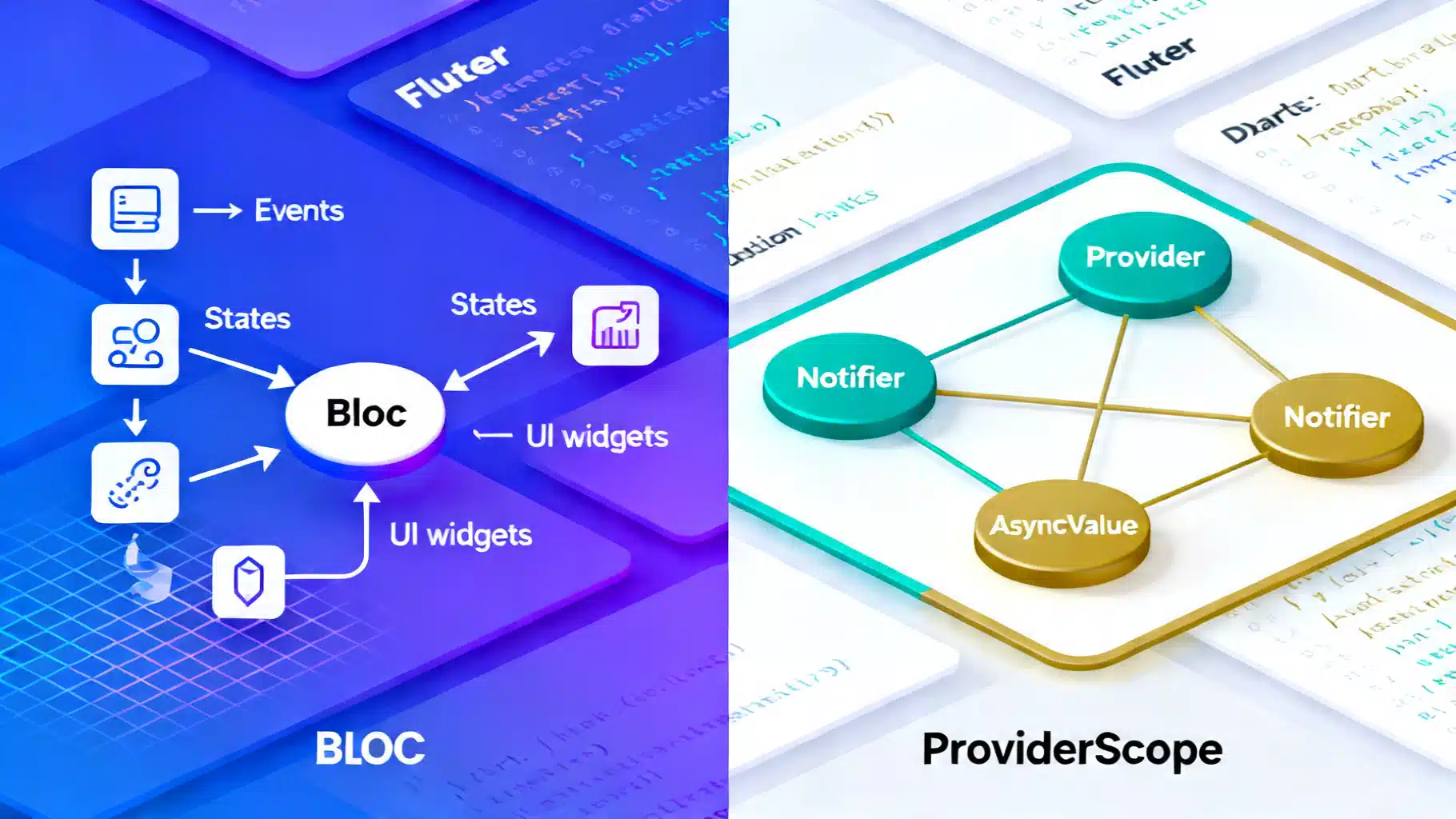
Flutter State Management in 2026: BLoC vs Riverpod (3.x)
Flutter state management in 2026: a concise, practical comparison of BLoC and Riverpod 3.x—APIs, tooling, performance, and when to choose each.