Flutter Custom Keyboard Actions: IME, Shortcuts, and Accessory Bars
Master Flutter custom keyboard actions: IME buttons, focus traversal, desktop shortcuts, accessory bars, and custom keypads with production-ready code.
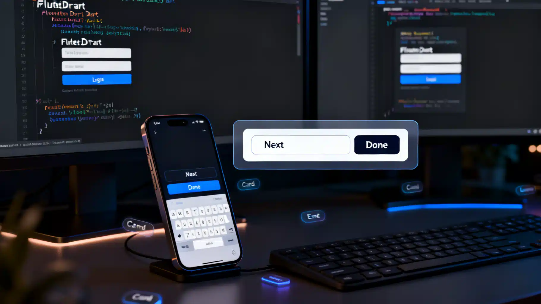
Image used for representation purposes only.
Overview
Mobile and desktop users expect smart, predictable keyboard behavior: a Next button that jumps to the following field, a Search key that triggers a query, or a Cmd/Ctrl+Enter shortcut that submits a form. Flutter gives you multiple layers to implement these interactions—from software (on‑screen) IME actions to hardware keyboard shortcuts and fully custom in‑app keypads. This guide shows practical patterns, pitfalls, and production‑ready snippets for building custom keyboard actions in Flutter.
The building blocks
Before diving into patterns, get familiar with these core APIs:
- TextField / TextFormField: the high‑level input widgets.
- EditableText: the lower‑level engine used by TextField.
- FocusNode / FocusScope: manage focus and traversal between fields.
- TextInputAction: hints the platform IME about which action button to show (done, next, search, send, etc.).
- onSubmitted / onEditingComplete: callbacks triggered by the IME action or enter key.
- Shortcuts, Actions, and Intents: declarative hardware shortcut handling.
- RawKeyboard / HardwareKeyboard: low‑level key events when you need fine‑grained control.
Customizing the software keyboard’s action button (IME)
The fastest way to tailor the on‑screen keyboard is with the textInputAction property. This tells iOS/Android which action to render on the IME (e.g., Next, Done, Search) and how to behave.
class LoginForm extends StatelessWidget {
  LoginForm({super.key});

  final _email = TextEditingController();
  final _password = TextEditingController();
  final _emailFocus = FocusNode();
  final _passwordFocus = FocusNode();

  void _submit(BuildContext context) {
    // validate, call API, etc.
    FocusScope.of(context).unfocus();
  }

  @override
  Widget build(BuildContext context) {
    return Column(
      children: [
        TextField(
          controller: _email,
          focusNode: _emailFocus,
          keyboardType: TextInputType.emailAddress,
          textInputAction: TextInputAction.next,
          onSubmitted: (_) => FocusScope.of(context).requestFocus(_passwordFocus),
          decoration: const InputDecoration(labelText: 'Email'),
        ),
        TextField(
          controller: _password,
          focusNode: _passwordFocus,
          obscureText: true,
          textInputAction: TextInputAction.done,
          onSubmitted: (_) => _submit(context),
          decoration: const InputDecoration(labelText: 'Password'),
        ),
      ],
    );
  }
}
Tips:
- For multi‑line text areas, set maxLines: null and textInputAction: TextInputAction.newline so Return inserts a newline instead of submitting.
- Use onEditingComplete for a form‑agnostic signal that editing finished, while onSubmitted passes the field’s current text.
- On iOS, Next/Done icons follow Cupertino conventions; on Android, you’ll often see labeled actions (NEXT, DONE) or glyphs depending on OEM.
Focus traversal that always “just works”
Coordinating the Next button across forms becomes tedious if every field wires to the next FocusNode. Use an OrderedTraversalPolicy with FocusTraversalGroup to centralize the order.
class ProfileForm extends StatelessWidget {
  ProfileForm({super.key});

  final _nodes = List.generate(4, (_) => FocusNode());

  @override
  Widget build(BuildContext context) {
    return FocusTraversalGroup(
      policy: OrderedTraversalPolicy(),
      child: Column(
        children: List.generate(_nodes.length, (i) {
          return TextField(
            focusNode: _nodes[i],
            textInputAction: i == _nodes.length - 1
                ? TextInputAction.done
                : TextInputAction.next,
            onSubmitted: (_) {
              if (i < _nodes.length - 1) {
                FocusScope.of(context).nextFocus();
              } else {
                FocusScope.of(context).unfocus();
              }
            },
            decoration: InputDecoration(labelText: 'Field ${i + 1}'),
          );
        }),
      ),
    );
  }
}
Now Tab/Shift+Tab and the IME’s Next flow align automatically with your traversal order.
Hardware keyboard shortcuts with Shortcuts/Actions
For desktop, web, and power mobile users on Bluetooth keyboards, map key combos using the Shortcuts/Actions system. This is more robust than ad‑hoc RawKeyboard listeners and plays well with focus.
class SubmitIntent extends Intent {
  const SubmitIntent();
}

class SubmitAction extends Action<SubmitIntent> {
  SubmitAction(this.onSubmit);
  final VoidCallback onSubmit;
  @override
  Object? invoke(SubmitIntent intent) {
    onSubmit();
    return null;
  }
}

Widget build(BuildContext context) {
  void submit() {
    // validate + submit form
  }

  return Shortcuts(
    shortcuts: <LogicalKeySet, Intent>{
      LogicalKeySet(LogicalKeyboardKey.meta, LogicalKeyboardKey.enter): const SubmitIntent(), // Cmd+Enter (macOS)
      LogicalKeySet(LogicalKeyboardKey.control, LogicalKeyboardKey.enter): const SubmitIntent(), // Ctrl+Enter (others)
    },
    child: Actions(
      actions: <Type, Action<Intent>>{ SubmitIntent: SubmitAction(submit) },
      child: Focus(
        autofocus: true,
        child: Builder(
          builder: (_) => ElevatedButton(
            onPressed: submit, child: const Text('Submit'),
          ),
        ),
      ),
    ),
  );
}
Notes:
- Wrap form roots with Focus to ensure the shortcut context is active when any child has focus.
- Use platform checks (defaultTargetPlatform) to tailor key combos (e.g., use Meta on macOS/iOS vs Control on Windows/Linux/Web).
- Built‑in intents like NextFocusIntent, PreviousFocusIntent, and ActivateIntent help you align with platform conventions without custom code.
Intercepting and transforming key events
When you need low‑level control (e.g., remap Escape to clear a field, block Tab in a chat composer), intercept events with a Focus widget’s onKey or by listening to RawKeyboard.
Focus(
  onKey: (node, event) {
    if (event is KeyDownEvent && event.logicalKey == LogicalKeyboardKey.escape) {
      final controller = TextEditingController.of(context);
      controller?.clear();
      return KeyEventResult.handled;
    }
    if (event.logicalKey == LogicalKeyboardKey.tab) {
      // Prevent tabbing out of a chat input
      return KeyEventResult.handled;
    }
    return KeyEventResult.ignored;
  },
  child: TextField(
    maxLines: null,
    textInputAction: TextInputAction.newline,
  ),
)
Prefer onKey over global RawKeyboard listeners so handling is scoped to focused widgets and composes well with other handlers.
Adding a custom action bar above the system keyboard
Want an accessory row with formatting buttons, clear, or emoji toggles while keeping the native IME? Compose your own bar and position it just above the keyboard using viewInsets.
class AccessoryScaffold extends StatelessWidget {
  const AccessoryScaffold({super.key});

  @override
  Widget build(BuildContext context) {
    return Scaffold(
      resizeToAvoidBottomInset: true,
      body: Stack(
        children: [
          const Padding(
            padding: EdgeInsets.all(16),
            child: TextField(
              maxLines: null,
              decoration: InputDecoration(hintText: 'Type…'),
            ),
          ),
          // Accessory bar pinned above the keyboard
          Align(
            alignment: Alignment.bottomCenter,
            child: AnimatedPadding(
              duration: const Duration(milliseconds: 200),
              padding: EdgeInsets.only(
                bottom: MediaQuery.viewInsetsOf(context).bottom,
              ),
              child: SafeArea(
                top: false,
                child: Material(
                  elevation: 8,
                  color: Theme.of(context).colorScheme.surface,
                  child: SizedBox(
                    height: 48,
                    child: Row(
                      children: [
                        IconButton(
                          tooltip: 'Bold',
                          icon: const Icon(Icons.format_bold),
                          onPressed: () {/* toggle bold */},
                        ),
                        IconButton(
                          tooltip: 'Clear',
                          icon: const Icon(Icons.clear),
                          onPressed: () {/* clear text */},
                        ),
                        const Spacer(),
                        TextButton(
                          onPressed: () {/* submit */},
                          child: const Text('Send'),
                        ),
                      ],
                    ),
                  ),
                ),
              ),
            ),
          ),
        ],
      ),
    );
  }
}
This works on iOS and Android without private APIs. The AnimatedPadding responds to the keyboard height via MediaQuery.viewInsets.bottom, keeping your action bar neatly attached to the IME.
Building a fully custom in‑app keyboard (e.g., PIN pad)
Sometimes you want to hide the system keyboard and drive input with your own keypad: think POS terminals, PIN code entries, or constrained numeral inputs. The simplest strategy is to keep a regular TextField in readOnly mode and update its controller from your keypad.
class PinKeyboardField extends StatefulWidget {
  const PinKeyboardField({super.key});
  @override
  State<PinKeyboardField> createState() => _PinKeyboardFieldState();
}

class _PinKeyboardFieldState extends State<PinKeyboardField> {
  final _controller = TextEditingController();
  final _focus = FocusNode();

  void _press(String digit) {
    if (_controller.text.length >= 6) return;
    _controller.text += digit;
    _controller.selection = TextSelection.fromPosition(
      TextPosition(offset: _controller.text.length),
    );
  }

  void _backspace() {
    final t = _controller.text;
    if (t.isEmpty) return;
    _controller.text = t.substring(0, t.length - 1);
    _controller.selection = TextSelection.fromPosition(
      TextPosition(offset: _controller.text.length),
    );
  }

  @override
  void dispose() {
    _controller.dispose();
    _focus.dispose();
    super.dispose();
  }

  @override
  Widget build(BuildContext context) {
    return Column(
      mainAxisSize: MainAxisSize.min,
      children: [
        TextField(
          controller: _controller,
          focusNode: _focus,
          readOnly: true, // suppresses the system keyboard
          showCursor: true,
          enableInteractiveSelection: false,
          textAlign: TextAlign.center,
          decoration: const InputDecoration(hintText: '••••••'),
        ),
        const SizedBox(height: 12),
        _PinPad(
          onDigit: _press,
          onBackspace: _backspace,
          onSubmit: () {/* validate _controller.text */},
        ),
      ],
    );
  }
}

class _PinPad extends StatelessWidget {
  const _PinPad({required this.onDigit, required this.onBackspace, required this.onSubmit});
  final ValueChanged<String> onDigit;
  final VoidCallback onBackspace;
  final VoidCallback onSubmit;

  @override
  Widget build(BuildContext context) {
    final keys = ['1','2','3','4','5','6','7','8','9','←','0','✓'];
    return GridView.builder(
      shrinkWrap: true,
      physics: const NeverScrollableScrollPhysics(),
      gridDelegate: const SliverGridDelegateWithFixedCrossAxisCount(
        crossAxisCount: 3,
        childAspectRatio: 1.6,
        crossAxisSpacing: 8,
        mainAxisSpacing: 8,
      ),
      itemCount: keys.length,
      itemBuilder: (_, i) {
        final k = keys[i];
        return ElevatedButton(
          onPressed: () {
            if (k == '←') return onBackspace();
            if (k == '✓') return onSubmit();
            onDigit(k);
          },
          child: Text(k, style: const TextStyle(fontSize: 18)),
        );
      },
    );
  }
}
Guidelines for custom keypads:
- Keep semantics: wrap buttons with Semantics and give labels (“Backspace”, “Submit”) for screen readers.
- Respect haptics: use HapticFeedback.lightImpact() for tactile confirmation.
- Provide an alternative path for hardware keyboards so accessibility users can still type digits.
Search, send, and chat composer patterns
For a search bar, set textInputAction: TextInputAction.search and respond in onSubmitted. For chat, prefer newline to insert a line break, but add a Send shortcut.
class ChatComposer extends StatelessWidget {
  ChatComposer({super.key});
  final _controller = TextEditingController();

  void _send() {
    final text = _controller.text.trim();
    if (text.isEmpty) return;
    // send message
    _controller.clear();
  }

  @override
  Widget build(BuildContext context) {
    return Shortcuts(
      shortcuts: {
        LogicalKeySet(LogicalKeyboardKey.enter): const ActivateIntent(),
        LogicalKeySet(LogicalKeyboardKey.shift, LogicalKeyboardKey.enter): const DoNothingAndStopPropagationIntent(),
      },
      child: Actions(
        actions: {
          ActivateIntent: CallbackAction<ActivateIntent>(onInvoke: (_) {
            // Enter sends if no Shift
            _send();
            return null;
          })
        },
        child: Row(
          children: [
            Expanded(
              child: TextField(
                controller: _controller,
                maxLines: null,
                textInputAction: TextInputAction.newline,
                onSubmitted: (_) => _send(), // mobile IME send
                decoration: const InputDecoration(hintText: 'Message…'),
              ),
            ),
            IconButton(icon: const Icon(Icons.send), onPressed: _send),
          ],
        ),
      ),
    );
  }
}
This design lets Return submit on mobile (IME action), while Shift+Enter inserts a newline on hardware keyboards.
Validation, error states, and form integration
- Use TextFormField with a Form and GlobalKey for integrated validation. Call FormState.validate() inside your submit action.
- If you intercept Enter/Cmd+Enter, always run the same submit logic as your main button so behavior is consistent.
- When auto‑advancing after a digit (e.g., 1‑time code), debounce your controller listener to avoid jumpy focus moves.
Platform nuances to remember
- iOS vs Android action labels: textInputAction is a hint. If the platform can’t show a specific label, it may fall back to a generic Return or glyph.
- Multiline fields: if maxLines > 1 and you set TextInputAction.done, some keyboards still insert a newline on Return; capture onSubmitted to ensure your handler runs.
- Web: Some browsers block certain key combos. Rely on Shortcuts/Actions for portability, and test in Chrome/Safari/Firefox.
- macOS & iPad hardware: users expect Cmd shortcuts; mirror Ctrl shortcuts with Meta.
Accessibility and internationalization
- Screen readers: verify your actions are reachable via TalkBack/VoiceOver rotor. If you add a custom accessory bar, provide clear tooltips and semanticsLabel.
- Logical direction: use Directionality.of(context) when handling arrow keys to respect RTL layouts.
- IME composition: during East Asian input, Enter may commit composition rather than submit. Guard by checking composing range on TextEditingValue; avoid acting mid‑composition.
final value = controller.value;
final isComposing = value.composing.isValid && !value.composing.isCollapsed;
if (!isComposing) submit();
Testing keyboard behavior
Automated tests prevent regressions when tweaking focus and shortcuts.
import 'package:flutter_test/flutter_test.dart';
import 'package:flutter/services.dart';

void main() {
  testWidgets('Ctrl+Enter submits', (tester) async {
    bool submitted = false;
    await tester.pumpWidget(MyApp(onSubmit: () => submitted = true));

    await tester.sendKeyDownEvent(LogicalKeyboardKey.control);
    await tester.sendKeyEvent(LogicalKeyboardKey.enter);
    await tester.sendKeyUpEvent(LogicalKeyboardKey.control);

    expect(submitted, isTrue);
  });

  testWidgets('Next focuses second field', (tester) async {
    await tester.pumpWidget(LoginFormApp());
    await tester.tap(find.byType(TextField).first);
    await tester.pumpAndSettle();
    await tester.testTextInput.receiveAction(TextInputAction.next);
    await tester.pump();
    // assert focus moved
  });
}
Troubleshooting checklist
- IME action not showing as expected? Confirm textInputAction, keyboardType, and platform—some OEM keyboards ignore certain hints.
- Focus not moving? Ensure your TextField has a FocusNode and that there is a FocusScope ancestor. Check that you return KeyEventResult.handled only when necessary.
- Hardware shortcuts conflict? Place your Shortcuts higher in the tree, or use modal routes to isolate contexts.
- Custom keypad double input? Make sure TextField.readOnly is true and you aren’t also attaching a TextInputConnection.
Putting it together: a robust form shell
The snippet below combines IME actions, Next/Done traversal, and a universal submit shortcut.
class AccountForm extends StatelessWidget {
  AccountForm({super.key});

  final _name = TextEditingController();
  final _user = TextEditingController();
  final _pass = TextEditingController();
  final _nodes = List.generate(3, (_) => FocusNode());

  void _submit(BuildContext context) {
    // validate and submit
    FocusScope.of(context).unfocus();
    ScaffoldMessenger.of(context).showSnackBar(
      const SnackBar(content: Text('Submitted')),
    );
  }

  @override
  Widget build(BuildContext context) {
    return Shortcuts(
      shortcuts: {
        LogicalKeySet(LogicalKeyboardKey.meta, LogicalKeyboardKey.enter): const ActivateIntent(),
        LogicalKeySet(LogicalKeyboardKey.control, LogicalKeyboardKey.enter): const ActivateIntent(),
      },
      child: Actions(
        actions: {
          ActivateIntent: CallbackAction<ActivateIntent>(onInvoke: (_) {
            _submit(context);
            return null;
          })
        },
        child: FocusTraversalGroup(
          policy: OrderedTraversalPolicy(),
          child: Column(
            children: [
              TextField(
                controller: _name,
                focusNode: _nodes[0],
                textInputAction: TextInputAction.next,
                onSubmitted: (_) => FocusScope.of(context).nextFocus(),
                decoration: const InputDecoration(labelText: 'Full name'),
              ),
              TextField(
                controller: _user,
                focusNode: _nodes[1],
                textInputAction: TextInputAction.next,
                onSubmitted: (_) => FocusScope.of(context).nextFocus(),
                decoration: const InputDecoration(labelText: 'Username'),
              ),
              TextField(
                controller: _pass,
                focusNode: _nodes[2],
                obscureText: true,
                textInputAction: TextInputAction.done,
                onSubmitted: (_) => _submit(context),
                decoration: const InputDecoration(labelText: 'Password'),
              ),
              const SizedBox(height: 16),
              FilledButton(
                onPressed: () => _submit(context),
                child: const Text('Create account'),
              ),
            ],
          ),
        ),
      ),
    );
  }
}
Conclusion
Great keyboard interactions feel invisible: the right IME action appears, Next flows through fields, Enter submits when it should—and everything still works with a hardware keyboard or screen reader. In Flutter, combine IME hints (textInputAction), Focus traversal, Shortcuts/Actions, and, when needed, a custom accessory bar or keypad to deliver a polished, cross‑platform experience. Start with the high‑level APIs, add targeted intercepts for edge cases, and back it all with tests. Your users will notice—by not noticing a thing.
Related Posts
Building a Robust React Stepper Wizard in React: Headless, Accessible, and Validated
Build an accessible, headless React stepper wizard with validation, routing, and React Hook Form integration—complete with code you can reuse.

Flutter Secure Storage: Encrypting Data the Right Way
A practical guide to encrypting data in Flutter with secure storage, biometrics, and envelope encryption—complete with code, pitfalls, and best practices.
Flutter Dynamic Theming at Runtime: Material 3, System Colors, and ThemeExtensions
Implement dynamic runtime theming in Flutter with ThemeMode, Material 3 seed colors, Android 12 system colors, ThemeExtension, persistence, and tests.