Building an Accessible React Toggle Switch (The Right Way)
Build an accessible React toggle switch: semantics-first component with native checkbox, keyboard support, forms, RTL, reduced motion, and tests.
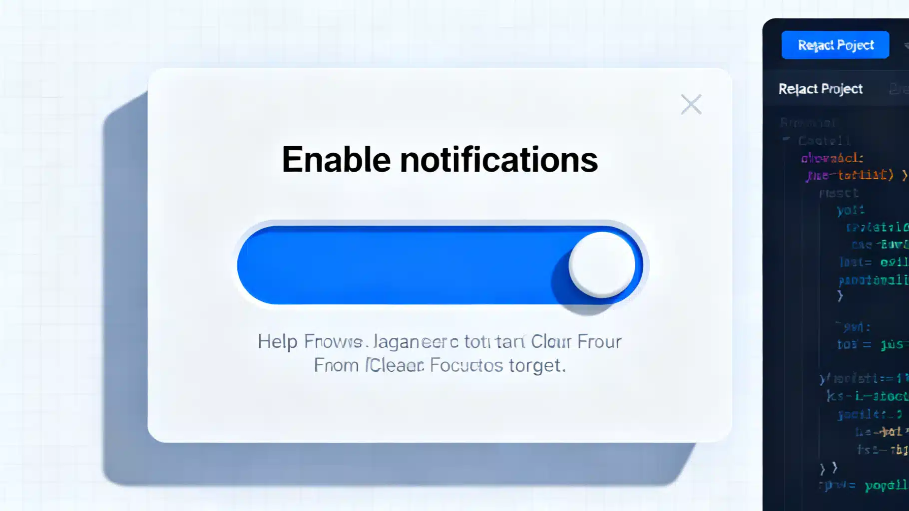
Image used for representation purposes only.
Why build a “switch” the accessible way?
A toggle switch is a compact control for an on/off state—think “Enable notifications” or “Dark mode.” While it often looks like a mobile-style slider, users still need standard keyboard support, clear labeling, and reliable announcements in screen readers. The simplest, most robust way to achieve this in React is to start with native HTML semantics (a checkbox) and layer styling and ergonomics on top.
This article walks through a production-ready, accessible React switch component: semantics-first, keyboard-friendly, form-compatible, RTL-aware, and testable.
Accessibility foundations (the essentials)
- Prefer native semantics: Use an input type=“checkbox”. It already supports keyboard interaction (Space to toggle), is tabbable, and integrates with forms.
- Provide an accessible name: Associate a visible label using the label element and htmlFor.
- Don’t rely on color alone: The thumb position plus color conveys state to a wider range of users.
- Keep the focus outline: Replace it with a custom outline if you must, but never remove focus indication.
- Announce extra context: Use aria-describedby to connect help text to the control.
- Consider reduced motion and forced-colors/high-contrast modes.
Note: You’ll sometimes see role=“switch” with aria-checked on a custom element. That’s valid when you can’t use a checkbox, but it requires recreating native keyboard behavior and state management. A styled checkbox is simpler and harder to break.
Component API design
A clean API makes the component predictable and form-friendly.
- checked, defaultChecked: Controlled or uncontrolled usage
- onCheckedChange(checked: boolean): Change handler
- disabled, required: Standard form constraints
- name, value: Form integration
- id: Optional; auto-generated when omitted
- label: Visible label content (string or node)
- description: Optional help text connected via aria-describedby
- className, style, size: Presentation escape hatches
Implementation (React + TypeScript)
Below is a compact, accessible implementation that supports controlled and uncontrolled usage and integrates with forms.
import React, { forwardRef, useId, useState, useEffect } from 'react';

type SwitchProps = {
  id?: string;
  name?: string;
  value?: string;
  checked?: boolean; // controlled
  defaultChecked?: boolean; // uncontrolled
  onCheckedChange?: (checked: boolean) => void;
  disabled?: boolean;
  required?: boolean;
  label: React.ReactNode; // visible label
  description?: React.ReactNode; // optional help text
  className?: string;
  style?: React.CSSProperties;
};

export const Switch = forwardRef<HTMLInputElement, SwitchProps>(
  (
    {
      id,
      name,
      value,
      checked,
      defaultChecked,
      onCheckedChange,
      disabled,
      required,
      label,
      description,
      className,
      style,
    },
    ref
  ) => {
    const autoId = useId();
    const inputId = id ?? `switch-${autoId}`;
    const descId = description ? `desc-${inputId}` : undefined;

    const isControlled = typeof checked === 'boolean';
    const [uncontrolledChecked, setUncontrolledChecked] = useState(
      defaultChecked ?? false
    );

    const isOn = isControlled ? checked! : uncontrolledChecked;

    const handleChange = (e: React.ChangeEvent<HTMLInputElement>) => {
      const next = e.target.checked;
      if (!isControlled) setUncontrolledChecked(next);
      onCheckedChange?.(next);
    };

    return (
      <div className={`switch-root ${className ?? ''}`} style={style}>
        <input
          ref={ref}
          id={inputId}
          name={name}
          value={value}
          type="checkbox"
          className="switch-input sr-only"
          checked={isOn}
          onChange={handleChange}
          disabled={disabled}
          required={required}
          aria-describedby={descId}
        />

        <label htmlFor={inputId} className={`switch-label ${disabled ? 'is-disabled' : ''}`}>
          <span className="switch-control" aria-hidden="true">
            <span className="switch-thumb" />
          </span>
          <span className="switch-text">
            <span className="switch-title">{label}</span>
            {description ? (
              <span id={descId} className="switch-description">{description}</span>
            ) : null}
          </span>
        </label>
      </div>
    );
  }
);
Switch.displayName = 'Switch';
Why hide the input visually?
We hide the native checkbox and style a custom track+thumb while keeping the label and input semantically connected. The input remains focusable and operable; users get native keyboard behavior and form submission “for free.”
Styling the switch (CSS)
This CSS focuses on:
- Thumb/track styling
- Focus-visible outline
- Disabled state
- Reduced motion
- High-contrast/forced-colors support
- RTL awareness
/* 1) Visually hidden but still accessible */
.sr-only {
  position: absolute;
  width: 1px;
  height: 1px;
  padding: 0;
  margin: -1px;
  overflow: hidden;
  clip: rect(0, 0, 0, 0);
  white-space: nowrap;
  border: 0;
}

/* 2) Layout */
.switch-root { display: block; }
.switch-label {
  display: inline-flex;
  align-items: center;
  gap: 0.75rem;
  cursor: pointer;
  user-select: none;
}
.switch-label.is-disabled { cursor: not-allowed; opacity: 0.6; }

.switch-text { display: grid; }
.switch-title { font: 600 0.95rem/1.2 system-ui, sans-serif; }
.switch-description { color: #555; font-size: 0.85rem; }

/* 3) Track + Thumb */
.switch-control {
  --w: 44px; /* width */
  --h: 24px; /* height */
  --p: 2px;  /* padding */
  width: var(--w);
  height: var(--h);
  background: #c7c7c7;
  border-radius: var(--h);
  position: relative;
  transition: background 160ms ease;
  box-shadow: inset 0 0 0 1px rgba(0,0,0,0.08);
}
.switch-thumb {
  position: absolute;
  top: var(--p);
  left: var(--p);
  width: calc(var(--h) - (var(--p) * 2));
  height: calc(var(--h) - (var(--p) * 2));
  background: white;
  border-radius: 50%;
  box-shadow: 0 1px 2px rgba(0,0,0,0.25);
  transition: transform 160ms ease;
}

/* 4) Checked state via sibling selector */
.switch-input:checked + .switch-label .switch-control {
  background: #2563eb; /* blue-600 */
}
.switch-input:checked + .switch-label .switch-thumb {
  transform: translateX(calc(var(--w) - var(--h)));
}

/* 5) Focus-visible outline on the custom control */
.switch-input:focus-visible + .switch-label .switch-control {
  outline: 3px solid #93c5fd; /* blue-300 */
  outline-offset: 2px;
}

/* 6) Disabled styling already handled via .is-disabled */

/* 7) Reduced motion */
@media (prefers-reduced-motion: reduce) {
  .switch-control, .switch-thumb { transition: none; }
}

/* 8) High contrast / forced colors */
@media (forced-colors: active) {
  .switch-control { background: CanvasText; }
  .switch-input:checked + .switch-label .switch-control {
    background: Highlight; /* system color */
  }
  .switch-thumb { background: Canvas; }
}

/* 9) RTL: move thumb the other way when checked */
[dir="rtl"] .switch-input:checked + .switch-label .switch-thumb {
  transform: translateX(calc(-1 * (var(--w) - var(--h))));
}
Usage examples
Controlled
function NotificationsSetting() {
  const [enabled, setEnabled] = React.useState(false);
  return (
    <Switch
      name="notifications"
      value="on"
      checked={enabled}
      onCheckedChange={setEnabled}
      label="Enable notifications"
      description="Receive product updates by email."
    />
  );
}
Uncontrolled
<Switch
  name="beta_access"
  defaultChecked
  label="Join beta program"
  description="You can opt out anytime."
/>
Inside a form (submission-ready)
function ProfileForm() {
  return (
    <form onSubmit={(e) => { e.preventDefault(); const fd = new FormData(e.currentTarget); console.log(Object.fromEntries(fd.entries())); }}>
      <Switch name="dark_mode" label="Dark mode" />
      <button type="submit">Save</button>
    </form>
  );
}
Keyboard, pointer, and touch behavior
- Tabbing moves focus to the input; Space toggles it.
- Clicking or tapping the label toggles the input, enlarging the hit area.
- The custom focus outline appears on the track to help sighted keyboard users.
Tip: Keep the thumb at least 20–24px for a comfortable target and ensure the combined label + control meets a ~44px minimum height for touch.
Validation, required, and disabled
- required: Works like any other checkbox; browsers will block submission until checked.
- disabled: Disables the input and visually dims the label.
- aria-describedby: Attach inline errors or help text to the control for announcement.
<Switch
  name="terms"
  required
  label="I agree to the terms"
  description={<span className="error">You must agree before continuing.</span>}
/>
Server rendering and IDs
React 18’s useId produces stable IDs across server and client, preventing hydration mismatches. You can still supply your own id prop when integrating with form libraries.
Internationalization and RTL
- Use the document dir attribute to enable RTL-aware transforms (see CSS above).
- Keep labels concise and avoid state words like “on/off” in the label itself; the control’s state communicates that. If you must include state text, update it dynamically and ensure it’s reflected visually and programmatically.
Theming and color contrast
- Check color contrast for both states against adjacent surfaces. Aim for at least 3:1 for UI components against their immediate surroundings.
- Use both position and color to communicate state. Users with color-vision deficiencies should still understand “on” vs “off.”
Testing accessibility
Use automated checks plus behavior tests. Example with React Testing Library and jest-dom:
import { render, screen } from '@testing-library/react';
import userEvent from '@testing-library/user-event';
import { Switch } from './Switch';

test('has an accessible name and toggles with space', async () => {
  render(<Switch label="Enable notifications" name="n" />);
  const checkbox = screen.getByRole('checkbox', { name: /enable notifications/i });
  expect(checkbox).not.toBeChecked();
  await userEvent.keyboard('{Tab}{Space}');
  expect(checkbox).toBeChecked();
});

test('controlled usage calls onCheckedChange', async () => {
  const onChange = vi.fn();
  render(<Switch label="Airplane mode" checked={false} onCheckedChange={onChange} />);
  await userEvent.click(screen.getByText(/airplane mode/i));
  expect(onChange).toHaveBeenCalledWith(true);
});
Add an a11y linter (eslint-plugin-jsx-a11y) and consider running @axe-core/react in development to catch common issues.
Common pitfalls to avoid
- Using a div with role=“switch” but forgetting keyboard handlers or aria-checked.
- Hiding the input with display: none (it removes it from the accessibility tree and prevents focus). Use the sr-only technique instead.
- Removing focus styles entirely.
- Not associating a label; screen reader users then hear a nameless control.
- Relying only on color to convey state.
When to reach for a library
If you prefer headless primitives or need broader cross-browser testing, consider a reputable headless UI library that provides a Switch built on correct semantics. You can still keep your brand styling while delegating tricky accessibility edge cases.
Wrap-up
An accessible React switch is mostly about restraint: lean on the native checkbox for semantics, use a real label for the name, and enhance with careful styling and testing. The result is a compact, elegant control that works for everyone—keyboard users, screen reader users, and touch users alike.
Related Posts

Building an Accessible, Reusable React Progress Indicator (Linear and Circular)
Build an accessible, themeable React progress indicator (linear and circular) with TypeScript, complete code, a11y, performance tips, theming, and tests.

Building an Accessible React Combobox in React (Select/Autocomplete) the Right Way
Build a production-ready, accessible React combobox/select with correct ARIA, keyboard support, async data, virtualization, and testing tips.

Build a Robust React Clipboard Copy/Paste Component (Hooks, A11y, Fallbacks)
Build a production-ready React clipboard copy/paste component with hooks, fallbacks, accessibility, sanitization, and tests.