React split panes done right: resizable, accessible, and fast
Build robust React split-pane layouts: DIY implementation, libraries, accessibility, performance, and persistence, with practical code examples.
Image used for representation purposes only.
Overview
Split panes let users resize sections of an interface to fit their task: larger editor, smaller sidebar; wide results, narrow filters; or stacked logs under a console. In React, a good split-pane layout is smooth, accessible, and resilient across devices and window sizes. This guide shows how to build one from scratch, when to reach for a library, and how to handle details like keyboard resizing, persistence, and nested panes.
When to use a split pane
Use a resizable split when:
- Two or three regions must remain visible simultaneously.
- The relative importance of regions changes frequently (code vs. preview, list vs. details).
- Users benefit from quick, continuous adjustments instead of presets.
Avoid a split if a single region should dominate most of the time, or when toggling layouts is simpler and clearer.
Design principles
- Predictable: The divider should never create overlapping content or push controls off-screen.
- Constrained: Enforce sensible min and max sizes for each pane.
- Accessible: The separator must be reachable by keyboard and announced by assistive tech.
- Performant: Resize at 60 fps under continuous drag; avoid expensive reflows.
- Persistent: Remember user choices between visits.
Building a split pane without a library
The simplest robust approach uses CSS Grid for layout and Pointer Events for drag handling. Grid gives you clean columns or rows; JS adjusts a single CSS custom property to set the pane size.
Markup and styles
import React from 'react';

export function SplitPane({
  initial = 360,        // starting left pane width in px
  minLeft = 200,        // left pane cannot be smaller
  minRight = 260,       // right pane cannot be smaller
  gutter = 8,           // separator thickness in px
  onChange,             // optional callback(sizePx)
  children,             // [left, right]
}) {
  const containerRef = React.useRef(null);
  const [leftPx, setLeftPx] = React.useState(initial);
  const frameRef = React.useRef(0);

  // Keep leftPx within container bounds on mount and on resize
  React.useLayoutEffect(() => {
    const el = containerRef.current;
    if (!el) return;

    const clamp = () => {
      const total = el.clientWidth;
      const maxLeft = Math.max(minLeft, total - gutter - minRight);
      setLeftPx(v => Math.min(Math.max(v, minLeft), maxLeft));
    };

    const ro = new ResizeObserver(clamp);
    ro.observe(el);
    clamp();
    return () => ro.disconnect();
  }, [minLeft, minRight, gutter]);

  const startRef = React.useRef({ startX: 0, startLeft: 0 });

  const onPointerDown = (e: React.PointerEvent) => {
    const el = containerRef.current;
    if (!el) return;
    (e.target as Element).setPointerCapture(e.pointerId);
    startRef.current = { startX: e.clientX, startLeft: leftPx };

    const onMove = (clientX: number) => {
      const total = el.clientWidth;
      const maxLeft = Math.max(minLeft, total - gutter - minRight);
      const next = startRef.current.startLeft + (clientX - startRef.current.startX);
      const clamped = Math.min(Math.max(next, minLeft), maxLeft);
      // rAF to avoid layout thrash
      cancelAnimationFrame(frameRef.current);
      frameRef.current = requestAnimationFrame(() => {
        setLeftPx(clamped);
        onChange?.(clamped);
      });
    };

    const onPointerMove = (ev: PointerEvent) => onMove(ev.clientX);
    const onPointerUp = (ev: PointerEvent) => {
      (e.target as Element).releasePointerCapture(e.pointerId);
      window.removeEventListener('pointermove', onPointerMove);
      window.removeEventListener('pointerup', onPointerUp);
    };

    window.addEventListener('pointermove', onPointerMove);
    window.addEventListener('pointerup', onPointerUp, { once: true });
  };

  // Keyboard support on the separator
  const onKeyDown = (e: React.KeyboardEvent) => {
    const step = e.shiftKey ? 32 : 8; // larger jump with Shift
    if (e.key === 'ArrowLeft' || e.key === 'ArrowRight') {
      e.preventDefault();
      const dir = e.key === 'ArrowLeft' ? -1 : 1;
      const el = containerRef.current!;
      const total = el.clientWidth;
      const maxLeft = Math.max(minLeft, total - gutter - minRight);
      const next = Math.min(Math.max(leftPx + dir * step, minLeft), maxLeft);
      setLeftPx(next);
      onChange?.(next);
    }
  };

  return (
    <div
      ref={containerRef}
      className='split-row'
      style={{ ['--left' as any]: `${leftPx}px`, ['--gutter' as any]: `${gutter}px` }}
    >
      <div className='pane pane-left'>{Array.isArray(children) ? children[0] : children}</div>
      <div
        className='separator'
        role='separator'
        aria-orientation='vertical'
        aria-label='Resize'
        aria-valuemin={minLeft}
        aria-valuemax={(() => {
          const el = containerRef.current; if (!el) return undefined;
          return Math.max(minLeft, el.clientWidth - gutter - minRight);
        })()}
        aria-valuenow={leftPx}
        tabIndex={0}
        onPointerDown={onPointerDown}
        onKeyDown={onKeyDown}
      />
      <div className='pane pane-right'>{Array.isArray(children) ? children[1] : null}</div>
    </div>
  );
}
.split-row {
  /* 3 columns: left, gutter, right */
  display: grid;
  grid-template-columns: var(--left, 360px) var(--gutter, 8px) 1fr;
  min-height: 0; /* allow children to shrink */
}
.pane {
  min-width: 0; /* critical: text can shrink without overflow */
  overflow: auto;
}
.separator {
  cursor: col-resize;
  touch-action: none; /* allow horizontal drag on touch */
  background: transparent; /* invisible hit area */
  position: relative;
}
.separator::after {
  /* visible handle */
  content: '';
  position: absolute;
  left: 50%;
  top: 0;
  width: 2px;
  height: 100%;
  transform: translateX(-50%);
  background: color-mix(in oklab, CanvasText 20%, transparent);
}
.separator:focus-visible::after {
  background: Highlight;
}
Notes:
- The layout avoids inline width updates on child panes, changing only a single CSS custom property.
- touch-action: none on the separator enables predictable drag on touch devices.
- min-width: 0 prevents grid children from overflowing when space is tight.
Persisting a user-chosen size
function usePersistedNumber(key: string, initial: number) {
  const [value, setValue] = React.useState(() => {
    const raw = localStorage.getItem(key);
    return raw == null ? initial : Number(raw);
  });
  React.useEffect(() => {
    localStorage.setItem(key, String(value));
  }, [key, value]);
  return [value, setValue] as const;
}

export function SidebarLayout() {
  const [left, setLeft] = usePersistedNumber('sidebar.width', 320);
  return (
    <SplitPane initial={left} onChange={setLeft} minLeft={220} minRight={300}>
      <Sidebar />
      <MainArea />
    </SplitPane>
  );
}
Vertical orientation
For a top and bottom split, swap grid-template-columns with grid-template-rows, track height instead of width, and use row-resize cursor with aria-orientation set to horizontal.
.split-col {
  display: grid;
  grid-template-rows: var(--top, 280px) var(--gutter, 8px) 1fr;
}
.separator.y { cursor: row-resize; }
Accessibility details
- role=separator informs assistive tech that the element resizes content.
- aria-orientation: vertical for left/right, horizontal for top/bottom.
- aria-valuemin, aria-valuemax, aria-valuenow communicate the current pixel size. Update as the container resizes.
- Keyboard: support ArrowLeft and ArrowRight (or ArrowUp and ArrowDown) with small and large steps (Shift). Ensure the separator is focusable via tabIndex.
- Focus styles: provide a clear visible focus indication.
Performance and UX tips
- Throttle with requestAnimationFrame, not setState on every raw pointermove.
- Prefer CSS transforms or custom properties over repeatedly mutating style.width on panes.
- Disable expensive work during drag; for example, defer chart reflows until pointerup.
- Make the hit target at least 8 px wide; visually you can render a 2 px hairline inside it.
- Use ResizeObserver to keep constraints valid when the container changes size.
Using a library
Libraries give you polished behavior, nested panes, and edge-case handling with less code. Two popular choices are shown below.
react-split-pane example
import SplitPane from 'react-split-pane';

export function App() {
  const [size, setSize] = React.useState(() => {
    const raw = localStorage.getItem('left');
    return raw ? Number(raw) : 340;
  });
  return (
    <SplitPane
      split='vertical'          // or 'horizontal'
      minSize={220}
      maxSize={-300}            // negative means from the far edge
      size={size}               // controlled
      onChange={(v: number) => { setSize(v); localStorage.setItem('left', String(v)); }}
      allowResize
      paneStyle={{ overflow: 'auto' }}
    >
      <Sidebar />
      <Main />
    </SplitPane>
  );
}
Highlights:
- Negative maxSize caps the opposite pane, which is handy for responsive UIs.
- Controlled mode makes persistence straightforward.
react-split (Split.js wrapper)
import Split from 'react-split';

export function TwoPane() {
  const [sizes, setSizes] = React.useState(() => {
    const raw = localStorage.getItem('sizes');
    return raw ? JSON.parse(raw) : [35, 65]; // percentages
  });

  return (
    <Split
      className='split-row'
      sizes={sizes}
      minSize={[220, 280]}
      gutterSize={8}
      onDragEnd={(next) => { setSizes(next); localStorage.setItem('sizes', JSON.stringify(next)); }}
      direction='horizontal'
      snapOffset={12}
    >
      <div className='pane'>A</div>
      <div className='pane'>B</div>
    </Split>
  );
}
This approach uses percentages by default, which adapt well to window resizes.
Advanced patterns
Nested panes
Compose panes for tri-pane layouts. Each SplitPane manages its own size and constraints; ensure inner panes have min-width: 0 to avoid overflow.
<SplitPane initial={280} minLeft={220} minRight={260}>
  <Navigation />
  <SplitPane initial={520} minLeft={360} minRight={260}>
    <Editor />
    <Preview />
  </SplitPane>
</SplitPane>
Collapsible and snap points
Add a double-click to toggle a collapsed state, and snap widths near useful breakpoints.
const snaps = [240, 320, 480];
const snapTo = (px: number, tolerance = 12) => {
  for (const s of snaps) if (Math.abs(px - s) <= tolerance) return s;
  return px;
};

// In onMove/onKeyDown, after clamping:
const snapped = snapTo(clamped);
setLeftPx(snapped);
Controlled vs. uncontrolled
- Controlled: parent owns size; easy persistence; more re-renders but predictable.
- Uncontrolled: component stores internal state; simpler wiring; lift state only when needed.
Responsive behavior
- Switch orientation at breakpoints: horizontal above 1024 px, vertical below.
- Replace split with a tabbed layout on small screens.
- Use negative max constraints (in libraries) or recompute clamps on resize (DIY) so the reading pane never shrinks below its minimum.
Server rendering and hydration
If you SSR, avoid reading container sizes during the first render. Use layout effects to measure after hydration, and render a reasonable default to prevent layout shift.
Virtualized content
Heavy lists inside panes should use virtualization. Keep the pane container with overflow: auto to ensure the virtualizer controls the scroll region.
Testing checklist
- Mouse, touch, and trackpad drag behave smoothly.
- Keyboard resizing works and is announced to screen readers.
- Min and max constraints hold during window resizes.
- Persistence restores correctly across reloads and route changes.
- Nested panes do not overflow; content remains focusable.
- Performance under drag stays smooth on low-power devices.
Common pitfalls
- Missing min-width: 0 on grid children causes unexpected overflow and broken layouts.
- Using inline width on panes instead of a grid variable complicates constraints and nesting.
- Forgetting touch-action: none prevents reliable dragging on touch devices.
- Recomputing expensive layouts on every pointermove leads to jank; throttle with rAF.
- Not exposing role=separator and keyboard handlers excludes keyboard-only users.
Putting it all together
Start with CSS Grid and a single custom property to represent the adjustable size. Add a separator with role=separator, pointer and keyboard handlers, and a ResizeObserver to keep constraints accurate. If you need percentages, snap points, nested layouts, or vertical splits with little ceremony, a small library can save time. Whichever route you take, lock down min and max sizes, keep the UI smooth during drag, and persist what users choose.
With these patterns in place, you can ship split panes that feel native, respect accessibility, and stay robust as your app grows.
Related Posts
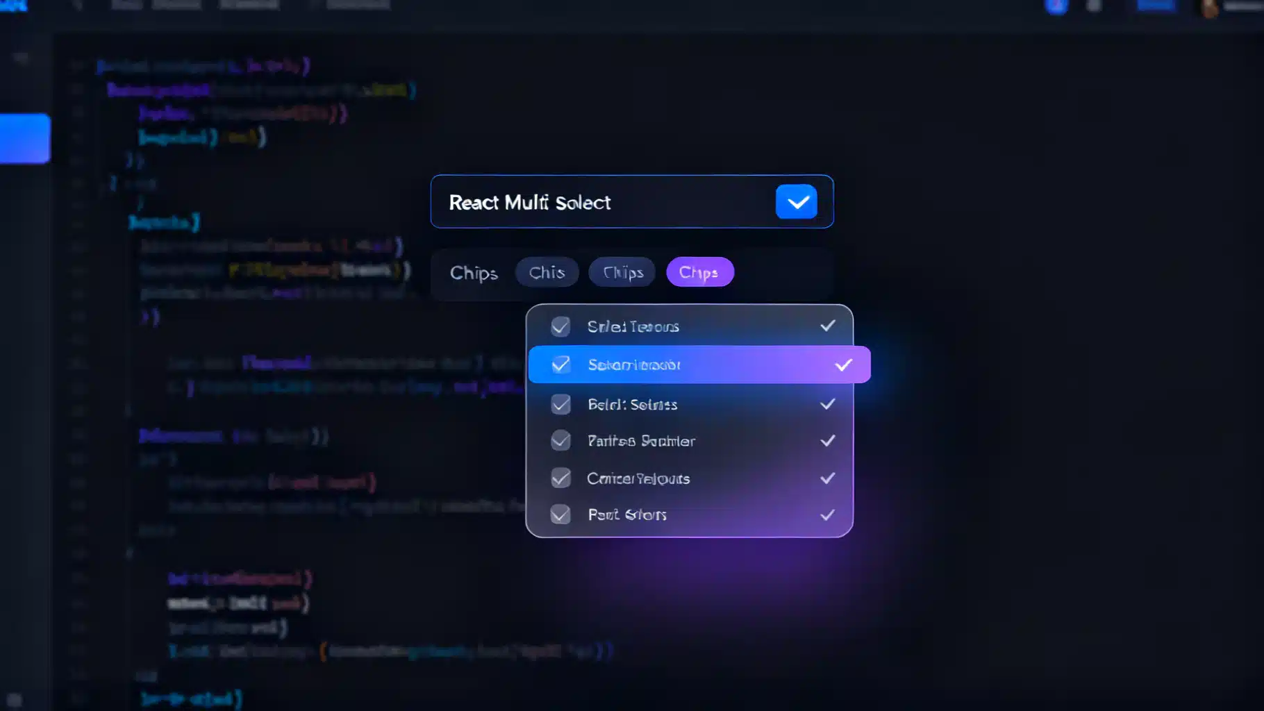
Building a Fast, Accessible React Multi‑Select Dropdown: Patterns, Code, and Pitfalls
Build a fast, accessible React multi-select dropdown: API design, ARIA patterns, code, virtualization, async loading, performance, and testing.

React Skeleton Screen Shimmer Effect: Accessible and Fast
Build an accessible, high-performance React skeleton screen with a polished shimmer effect, plus Suspense integration, theming, and pro tips.

Building a Robust React Toast Notification System: Patterns, Code, and UX
Design and implement a fast, accessible React toast system with clean APIs, animations, and promise toasts—complete code, patterns, and pitfalls.