Flutter Custom App Bar Design Patterns: From Large Titles to Immersive Headers
A practical guide to Flutter custom app bar design patterns with code: large titles, immersive media, search-first bars, contextual actions, and more.
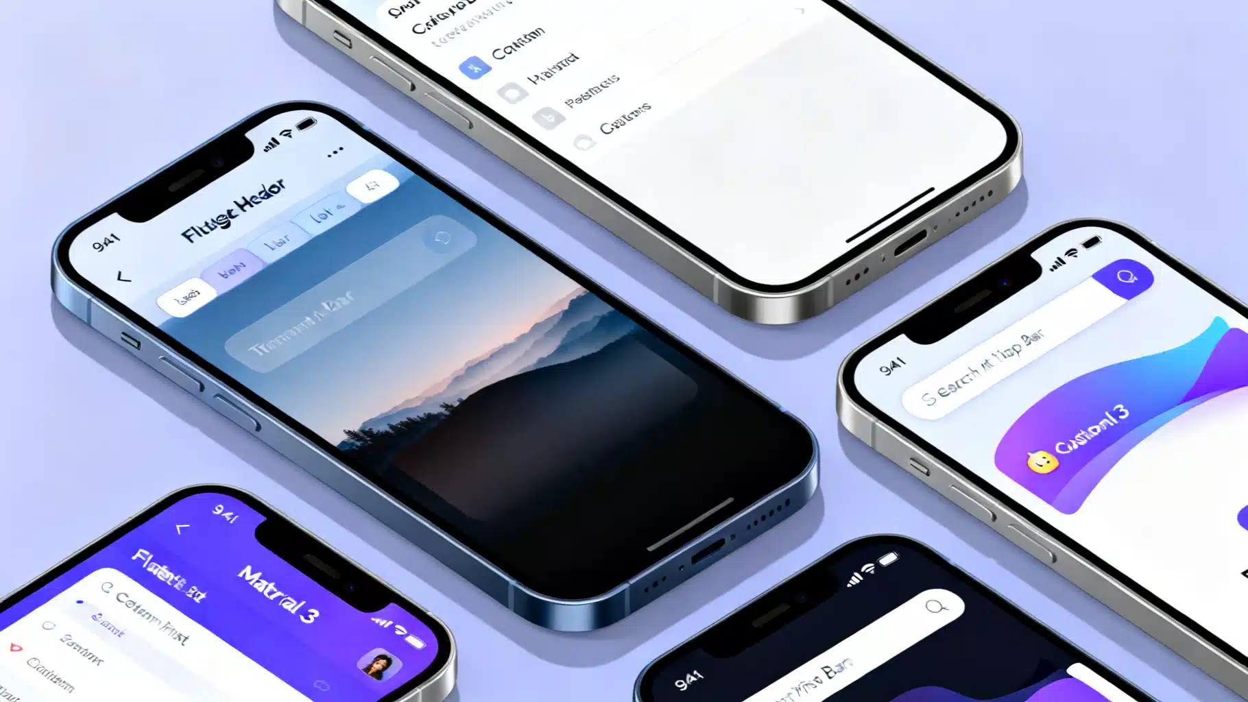
Image used for representation purposes only.
Overview
A well-designed app bar anchors navigation, search, and key actions while reinforcing your brand. In Flutter, the built-in AppBar and SliverAppBar cover common needs, but real apps often require custom behavior: collapsing large titles, immersive media headers, contextual toolbars, or search-first layouts. This guide distills proven design patterns for building custom app bars that look sharp, adapt to content, and perform smoothly on both Android and iOS.
Anatomy of an App Bar in Flutter
Before customizing, understand the key pieces you can tune:
- Leading: back button, menu icon, avatar, or brand mark.
- Title: text, logo, or a search field; can be centered or aligned per platform.
- Actions: icon buttons, overflow menus, or badges.
- Flexible space: content behind the toolbar (e.g., imagery, gradients, large titles).
- Bottom: typically a TabBar or a custom PreferredSizeWidget.
- Behavior: elevation when scrolled under, pinned/floating/snap for slivers, and system UI overlays for status bar icons.
Pattern 1: Themed Small App Bar (Material 3-first)
Start with consistent theming so your app bars look right everywhere.
theme: ThemeData(
  useMaterial3: true,
  colorScheme: ColorScheme.fromSeed(seedColor: const Color(0xFF3366FF)),
  appBarTheme: const AppBarTheme(
    elevation: 0,
    scrolledUnderElevation: 3, // adds depth only when content scrolls under
    centerTitle: false,        // Material: left-aligned; consider true for smaller titles
    backgroundColor: Colors.transparent, // allow surface tint to show
    surfaceTintColor: Colors.transparent,
    systemOverlayStyle: SystemUiOverlayStyle.dark, // status bar icons
  ),
)
Then use it:
class HomeScreen extends StatelessWidget {
  const HomeScreen({super.key});

  @override
  Widget build(BuildContext context) {
    return Scaffold(
      appBar: AppBar(
        title: const Text('Home'),
        leading: IconButton(
          icon: const Icon(Icons.menu),
          onPressed: () {/* open drawer */},
          tooltip: 'Open navigation menu',
        ),
        actions: const [
          _NotificationsAction(),
        ],
      ),
      body: const _ContentList(),
    );
  }
}

class _NotificationsAction extends StatelessWidget {
  const _NotificationsAction();
  @override
  Widget build(BuildContext context) {
    return Badge(
      label: const Text('2'),
      child: IconButton(
        icon: const Icon(Icons.notifications),
        onPressed: () {},
        tooltip: 'Notifications',
      ),
    );
  }
}
Tips
- Prefer textScaleFactor-aware titles (no hard-coded widths).
- Use tooltips on actions for accessibility.
Pattern 2: Collapsing Large Titles with Tabs (SliverAppBar.large)
For information-dense screens like libraries or catalogs, combine a large title that collapses into a compact toolbar and a TabBar.
class LibraryScreen extends StatelessWidget {
  const LibraryScreen({super.key});

  @override
  Widget build(BuildContext context) {
    return DefaultTabController(
      length: 3,
      child: Scaffold(
        body: NestedScrollView(
          headerSliverBuilder: (context, innerBoxIsScrolled) => [
            SliverAppBar.large(
              title: const Text('Library'),
              pinned: true,
              forceElevated: innerBoxIsScrolled,
              bottom: const TabBar(
                isScrollable: true,
                tabs: [
                  Tab(text: 'All'),
                  Tab(text: 'Favorites'),
                  Tab(text: 'Downloads'),
                ],
              ),
            ),
          ],
          body: const TabBarView(
            children: [
              _List(tab: 'All'),
              _List(tab: 'Favorites'),
              _List(tab: 'Downloads'),
            ],
          ),
        ),
      ),
    );
  }
}
Notes
- Use forceElevated with innerBoxIsScrolled to avoid visual jumps.
- If you have multiple slivers above the TabBarView, add SliverOverlapAbsorber/Injector to fix overlap.
Pattern 3: Immersive, Transparent App Bar Over Media
Hero images, maps, or video often look best edge-to-edge. Make the app bar transparent and let content show through, while keeping status bar icons legible.
class DestinationScreen extends StatelessWidget {
  const DestinationScreen({super.key});
  @override
  Widget build(BuildContext context) {
    return Scaffold(
      extendBodyBehindAppBar: true,
      appBar: AppBar(
        backgroundColor: Colors.transparent,
        elevation: 0,
        systemOverlayStyle: SystemUiOverlayStyle.light, // light icons over dark media
        title: const Text('Santorini'),
      ),
      body: Stack(
        children: [
          Positioned.fill(
            child: Image.asset('assets/santorini.jpg', fit: BoxFit.cover),
          ),
          // Add a top gradient for text legibility
          Positioned(
            top: 0,
            left: 0,
            right: 0,
            height: 160,
            child: IgnorePointer(
              child: DecoratedBox(
                decoration: BoxDecoration(
                  gradient: LinearGradient(
                    begin: Alignment.topCenter,
                    end: Alignment.bottomCenter,
                    colors: [Colors.black54, Colors.transparent],
                  ),
                ),
              ),
            ),
          ),
          // Content below
          ListView(
            padding: const EdgeInsets.only(top: kToolbarHeight + 32),
            children: const [
              ListTile(title: Text('Overview')),
              ListTile(title: Text('Itinerary')),
              ListTile(title: Text('Reviews')),
            ],
          )
        ],
      ),
    );
  }
}
Tips
- Pair extendBodyBehindAppBar with a legibility gradient.
- Switch systemOverlayStyle to dark if the media is light; consider a scroll listener to toggle dynamically.
Pattern 4: Custom Shape or Gradient App Bar (PreferredSizeWidget)
When branding demands non-rectangular shapes or layered gradients, compose your own PreferredSizeWidget.
class CurvedAppBar extends StatelessWidget implements PreferredSizeWidget {
  const CurvedAppBar({super.key, required this.title, this.actions});
  final Widget title;
  final List<Widget>? actions;

  @override
  Size get preferredSize => const Size.fromHeight(kToolbarHeight + 24);

  @override
  Widget build(BuildContext context) {
    final cs = Theme.of(context).colorScheme;
    return Material(
      color: Colors.transparent,
      child: Stack(children: [
        // Background with curve
        ClipPath(
          clipper: _BottomCurveClipper(),
          child: Container(
            height: preferredSize.height,
            decoration: BoxDecoration(
              gradient: LinearGradient(colors: [cs.primary, cs.tertiary]),
            ),
          ),
        ),
        SafeArea(
          bottom: false,
          child: SizedBox(
            height: kToolbarHeight,
            child: Row(
              children: [
                const BackButton(color: Colors.white),
                const SizedBox(width: 8),
                Expanded(child: DefaultTextStyle.merge(
                  style: const TextStyle(color: Colors.white, fontWeight: FontWeight.w600),
                  child: title,
                )),
                ...?actions,
                const SizedBox(width: 8),
              ],
            ),
          ),
        ),
      ]),
    );
  }
}

class _BottomCurveClipper extends CustomClipper<Path> {
  @override
  Path getClip(Size size) {
    final path = Path()
      ..lineTo(0, size.height - 24)
      ..quadraticBezierTo(size.width / 2, size.height, size.width, size.height - 24)
      ..lineTo(size.width, 0)
      ..close();
    return path;
  }
  @override
  bool shouldReclip(covariant CustomClipper<Path> oldClipper) => false;
}
Use it:
Scaffold(
  appBar: CurvedAppBar(
    title: const Text('Brand Story'),
    actions: [
      IconButton(icon: const Icon(Icons.share, color: Colors.white), onPressed: () {}),
    ],
  ),
  body: ...,
)
Pattern 5: Search-First Top Bar with SearchAnchor
Material 3’s SearchAnchor makes a search-dominant top bar simple without resorting to custom overlays.
class SearchScreen extends StatefulWidget {
  const SearchScreen({super.key});
  @override
  State<SearchScreen> createState() => _SearchScreenState();
}

class _SearchScreenState extends State<SearchScreen> {
  final SearchController _controller = SearchController();

  @override
  Widget build(BuildContext context) {
    return Scaffold(
      appBar: AppBar(
        title: SearchAnchor.bar(
          searchController: _controller,
          barHintText: 'Search products',
          barLeading: const Icon(Icons.search),
          barTrailing: [
            IconButton(icon: const Icon(Icons.tune), onPressed: () {}),
          ],
          suggestionsBuilder: (context, controller) {
            final q = controller.text;
            final items = q.isEmpty ? const <String>[] : ['Shoes', 'Shirts', 'Shorts']
              .where((e) => e.toLowerCase().startsWith(q.toLowerCase()))
              .toList();
            return items.map((e) => ListTile(
              leading: const Icon(Icons.search),
              title: Text(e),
              onTap: () => controller.closeView(e),
            ));
          },
        ),
      ),
      body: const Placeholder(),
    );
  }
}
Pattern 6: Contextual Action Bar (Selection Mode)
Swap the normal app bar with a high-contrast contextual bar when users select items.
class PhotosScreen extends StatefulWidget {
  const PhotosScreen({super.key});
  @override
  State<PhotosScreen> createState() => _PhotosScreenState();
}

class _PhotosScreenState extends State<PhotosScreen> {
  final Set<int> selected = {};
  bool get selectionMode => selected.isNotEmpty;

  @override
  Widget build(BuildContext context) {
    final cs = Theme.of(context).colorScheme;
    final contextual = AppBar(
      backgroundColor: cs.inverseSurface,
      foregroundColor: cs.onInverseSurface,
      leading: IconButton(icon: const Icon(Icons.close), onPressed: () => setState(selected.clear)),
      title: Text('${selected.length} selected'),
      actions: [
        IconButton(icon: const Icon(Icons.select_all), onPressed: () {/* select all */}),
        IconButton(icon: const Icon(Icons.delete), onPressed: () {/* delete */}),
      ],
    );

    final normal = AppBar(
      title: const Text('Photos'),
      actions: [IconButton(icon: const Icon(Icons.search), onPressed: () {})],
    );

    return Scaffold(
      appBar: PreferredSize(
        preferredSize: const Size.fromHeight(kToolbarHeight),
        child: AnimatedSwitcher(
          duration: const Duration(milliseconds: 200),
          switchInCurve: Curves.easeOut,
          switchOutCurve: Curves.easeIn,
          child: selectionMode ? contextual : normal,
        ),
      ),
      body: GridView.builder(
        padding: const EdgeInsets.all(8),
        gridDelegate: const SliverGridDelegateWithFixedCrossAxisCount(crossAxisCount: 3),
        itemCount: 60,
        itemBuilder: (_, i) => GestureDetector(
          onLongPress: () => setState(() => selected.add(i)),
          onTap: () => setState(() => selected.contains(i) ? selected.remove(i) : selected.add(i)),
          child: Stack(children: [
            Positioned.fill(child: Container(color: Colors.grey[(i % 9 + 1) * 100])),
            if (selected.contains(i)) const Align(
              alignment: Alignment.topRight,
              child: Padding(
                padding: EdgeInsets.all(6),
                child: Icon(Icons.check_circle, color: Colors.lightBlue),
              ),
            ),
          ]),
        ),
      ),
    );
  }
}
Pattern 7: SliverAppBar with Stretch, Snap, and Floating
Make toolbars feel responsive to fast scrolling with floating and snap, and add pull-to-stretch effects.
CustomScrollView(
  slivers: [
    SliverAppBar(
      floating: true,
      snap: true,        // requires floating
      stretch: true,
      expandedHeight: 160,
      flexibleSpace: FlexibleSpaceBar(
        title: const Text('Discover'),
        stretchModes: const [
          StretchMode.zoomBackground,
          StretchMode.fadeTitle,
        ],
        background: Image.asset('assets/header.jpg', fit: BoxFit.cover),
      ),
    ),
    SliverList(
      delegate: SliverChildBuilderDelegate(
        (context, i) => ListTile(title: Text('Item $i')),
        childCount: 50,
      ),
    ),
  ],
)
Pattern 8: Platform-Adaptive Navigation Bars
Users expect native conventions. On iOS, prefer large titles with a collapsing Cupertino nav bar.
class AdaptivePage extends StatelessWidget {
  const AdaptivePage({super.key});

  @override
  Widget build(BuildContext context) {
    final isCupertino = Theme.of(context).platform == TargetPlatform.iOS ||
        Theme.of(context).platform == TargetPlatform.macOS;

    if (isCupertino) {
      return CupertinoPageScaffold(
        navigationBar: const CupertinoNavigationBar(
          middle: Text('Settings'),
          // Automatically handles back swipe and translucency
        ),
        child: const SafeArea(child: SettingsList()),
      );
    }

    return Scaffold(
      appBar: AppBar(title: const Text('Settings')),
      body: const SettingsList(),
    );
  }
}
If you need sliver-based large titles on iOS, use CupertinoSliverNavigationBar inside a CustomScrollView.
Pattern 9: Bottom App Bar + FAB Cutout
For apps where primary actions dominate, move key actions to a BottomAppBar and keep the top bar minimal.
Scaffold(
  appBar: AppBar(title: const Text('Compose')),
  floatingActionButtonLocation: FloatingActionButtonLocation.centerDocked,
  floatingActionButton: FloatingActionButton(
    onPressed: () {},
    child: const Icon(Icons.add),
  ),
  bottomNavigationBar: BottomAppBar(
    shape: const CircularNotchedRectangle(),
    notchMargin: 8,
    child: Row(
      children: [
        IconButton(icon: const Icon(Icons.archive), onPressed: () {}),
        IconButton(icon: const Icon(Icons.mail), onPressed: () {}),
        const Spacer(),
        IconButton(icon: const Icon(Icons.attach_file), onPressed: () {}),
        IconButton(icon: const Icon(Icons.more_vert), onPressed: () {}),
      ],
    ),
  ),
)
Accessibility, Layout, and Localization Checklist
- Touch targets: 48×48 logical pixels minimum for leading/actions.
- Semantics: add semanticLabel and tooltips for icons; ensure badges announce changes.
- Contrast: check title and icons over images/gradients; add overlays if needed.
- Text scaling: test at 200% textScaleFactor; prefer Flexible widgets for titles.
- RTL: respect Directionality; avoid hard-coded paddings that flip poorly.
- Overflow: use softWrap: false and overflow: TextOverflow.ellipsis for long titles.
Performance Tips and Gotchas
- Keep app bars as const where possible; avoid rebuilding icons on scroll.
- For images in FlexibleSpaceBar, cache and downscale to device size to reduce jank.
- scrolledUnderElevation only appears when the content beneath can scroll under; verify with NestedScrollView/CustomScrollView.
- With NestedScrollView + TabBarView, prefer isScrollable tabs for many categories and test overscroll behavior.
- Don’t block the system back gesture with full-width drag areas in the app bar.
Reusable Builder: One Place for Variants
Centralize your app bar rules so screens stay consistent.
class AppBars {
  static PreferredSizeWidget small({
    required String title,
    List<Widget>? actions,
    Widget? leading,
  }) => AppBar(
        title: Text(title),
        leading: leading,
        actions: actions,
      );

  static SliverAppBar large({
    required String title,
    PreferredSizeWidget? bottom,
    bool pinned = true,
  }) => SliverAppBar.large(
        title: Text(title),
        pinned: pinned,
        bottom: bottom,
      );

  static PreferredSizeWidget contextual({
    required String title,
    required VoidCallback onClose,
    List<Widget>? actions,
    required ColorScheme cs,
  }) => AppBar(
        backgroundColor: cs.inverseSurface,
        foregroundColor: cs.onInverseSurface,
        leading: IconButton(icon: const Icon(Icons.close), onPressed: onClose),
        title: Text(title),
        actions: actions,
      );
}
Testing and QA
- Golden tests: capture app bar states (normal, scrolled, selection mode) to prevent regressions.
- Device matrix: validate on small phones, large phones, and tablets in both orientations.
- Theming: verify light/dark and high-contrast schemes; test systemOverlayStyle legibility.
Putting It All Together
Choose the smallest pattern that meets the need:
- Content-first views: Immersive transparent app bar with overlay gradient.
- Category hubs: SliverAppBar.large with tabs.
- Power-user tasks: Contextual bars that appear only when needed.
- Search-centric flows: SearchAnchor.bar.
- Strong branding: PreferredSizeWidget with custom shapes/gradients.
- Cross-platform polish: Material on Android, Cupertino on iOS.
By treating the app bar as a composable system—theme, behavior, layout, and platform—you’ll ship toolbars that feel native, scale with content, and showcase your brand without sacrificing usability or performance.
Related Posts
The Practical Guide to Flutter’s Widget Catalog: Patterns, Picks, and Proven Recipes
A practical, in-depth guide to Flutter’s widget catalog—organization, selection tips, patterns, recipes, and performance/testing guidance.
Flutter Home Widget Creation Guide: Cross‑Platform Widgets for Android and iOS
Step-by-step Flutter guide to build home screen widgets for Android and iOS using native WidgetKit/AppWidget with Dart-driven updates.
Flutter custom page route transitions: clean patterns and reusable code
Build polished, brand-aligned navigation with Flutter custom page route transitions. Examples, reusable code, theming, performance, and testing tips.