Build an Accessible, Production‑Ready React OTP/PIN Input
Build an accessible, secure, paste-aware React OTP/PIN input with Web OTP, mobile keypad, and full keyboard support.
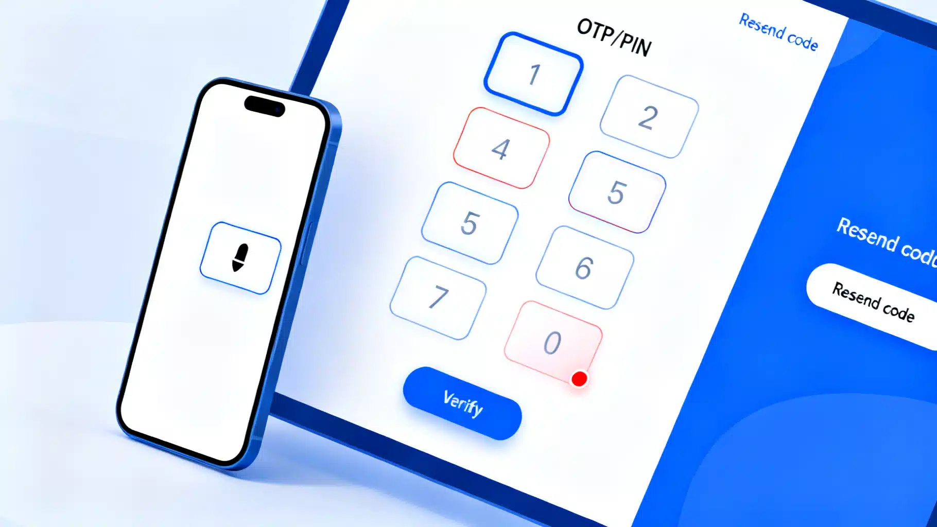
Image used for representation purposes only.
Overview
A great OTP/PIN input does more than render a row of boxes. It must be accessible, keyboard- and screen reader-friendly, mobile-optimized, paste-aware, resilient to edge cases, and secure by default. In this guide, you’ll build a production-ready React OTP component from first principles, then layer on UX polish, accessibility, Web OTP autofill, testing, and security considerations.
What “good” looks like
Before writing code, set your acceptance criteria:
- Usability
- Auto-advance on input and auto-backspace to previous box when deleting
- Paste a full code into any box and distribute across fields
- Works with mouse, touch, and keyboard only
- Selects the character on focus for quick overwrite
- Accessibility
- Screen reader labels for each box and the group
- Proper error semantics (aria-invalid, descriptions)
- Logical tab order and arrow-key navigation
- Mobile
- Numeric keypad where appropriate (inputMode=“numeric”; avoid type=“number”)
- One-time-code autofill hints (autocomplete=“one-time-code”)
- Optional Web OTP API integration on supported browsers
- Internationalization & RTL
- Respect dir attributes for arrow navigation
- Security & DX
- Optional masking
- onComplete callback when the code is filled
- No reliance on timers or brittle focus hacks
Component API design
We’ll build a controlled/uncontrolled hybrid for flexibility:
export type PinType = 'number' | 'alphanumeric';

export interface PinInputProps {
  length?: number;            // default 6
  value?: string;             // controlled value
  onChange?: (value: string) => void;
  onComplete?: (value: string) => void; // fires when fully filled
  type?: PinType;             // input character set
  mask?: boolean;             // show bullets
  autoFocus?: boolean;        // focus first cell on mount
  disabled?: boolean;
  error?: boolean;            // aria-invalid
  name?: string;              // form integration (hidden input)
  ariaLabel?: string;         // group label
  dir?: 'ltr' | 'rtl' | 'auto';
  inputProps?: React.InputHTMLAttributes<HTMLInputElement>; // spread onto each input
  className?: string;         // container class
}
Implementation (React + TypeScript)
Below is a self-contained, modern implementation that covers the behaviors above.
import React, { useCallback, useEffect, useMemo, useRef, useState } from 'react';

export type PinType = 'number' | 'alphanumeric';

export interface PinInputProps {
  length?: number;
  value?: string;
  onChange?: (value: string) => void;
  onComplete?: (value: string) => void;
  type?: PinType;
  mask?: boolean;
  autoFocus?: boolean;
  disabled?: boolean;
  error?: boolean;
  name?: string;
  ariaLabel?: string;
  dir?: 'ltr' | 'rtl' | 'auto';
  inputProps?: React.InputHTMLAttributes<HTMLInputElement>;
  className?: string;
}

function sanitize(input: string, type: PinType): string {
  if (!input) return '';
  const normalized = input.replace(/\s+/g, '');
  return type === 'number'
    ? normalized.replace(/\D/g, '')
    : normalized.replace(/[^0-9a-z]/gi, '').toUpperCase();
}

export const PinInput: React.FC<PinInputProps> = ({
  length = 6,
  value,
  onChange,
  onComplete,
  type = 'number',
  mask = false,
  autoFocus = false,
  disabled = false,
  error = false,
  name,
  ariaLabel = 'One-time code',
  dir = 'ltr',
  inputProps,
  className,
}) => {
  const [internal, setInternal] = useState('');
  // clamp to length while keeping existing chars
  const val = (value ?? internal).slice(0, length);
  const chars = useMemo(() => Array.from({ length }, (_, i) => val[i] ?? ''), [val, length]);
  const inputsRef = useRef<Array<HTMLInputElement | null>>([]);

  const setAll = useCallback(
    (next: string) => {
      const nextClean = sanitize(next, type).slice(0, length);
      if (value === undefined) setInternal(nextClean);
      onChange?.(nextClean);
      if (nextClean.length === length) onComplete?.(nextClean);
    },
    [length, onChange, onComplete, type, value]
  );

  useEffect(() => {
    // adjust internal length if prop changes in uncontrolled mode
    if (value === undefined && internal.length > length) {
      setInternal((s) => s.slice(0, length));
    }
  }, [length, value, internal.length]);

  useEffect(() => {
    if (!autoFocus) return;
    inputsRef.current[0]?.focus();
  }, [autoFocus]);

  const focusIndex = (i: number) => {
    const el = inputsRef.current[i];
    el?.focus();
    el?.select?.();
  };

  const handleChange = (i: number, raw: string) => {
    const s = sanitize(raw, type);
    if (!s) return; // ignore empty changes here; backspace handled in keydown

    const current = chars.join('');
    // If user pasted/typed multiple chars into one box, distribute
    const nextArr = current.split('');
    let idx = i;
    for (const ch of s) {
      if (idx >= length) break;
      nextArr[idx] = ch;
      idx++;
    }
    const next = nextArr.join('');
    setAll(next);
    if (idx < length) focusIndex(idx);
    else focusIndex(length - 1);
  };

  const handleKeyDown: React.KeyboardEventHandler<HTMLInputElement> = (e) => {
    const target = e.currentTarget;
    const i = Number(target.dataset.index);
    if (Number.isNaN(i)) return;

    const isRTL = (dir ?? 'ltr') === 'rtl';
    const leftKey = isRTL ? 'ArrowRight' : 'ArrowLeft';
    const rightKey = isRTL ? 'ArrowLeft' : 'ArrowRight';

    switch (e.key) {
      case leftKey:
        e.preventDefault();
        focusIndex(Math.max(0, i - 1));
        break;
      case rightKey:
        e.preventDefault();
        focusIndex(Math.min(length - 1, i + 1));
        break;
      case 'Backspace': {
        e.preventDefault();
        const current = chars.join('');
        const arr = current.split('');
        if (arr[i]) {
          arr[i] = '';
          setAll(arr.join(''));
          focusIndex(i);
        } else if (i > 0) {
          arr[i - 1] = '';
          setAll(arr.join(''));
          focusIndex(i - 1);
        }
        break;
      }
      case 'Delete': {
        e.preventDefault();
        const arr = chars.slice();
        arr[i] = '';
        setAll(arr.join(''));
        break;
      }
      default:
        break;
    }
  };

  const handlePaste: React.ClipboardEventHandler<HTMLDivElement> = (e) => {
    const text = e.clipboardData.getData('text');
    if (!text) return;
    e.preventDefault();
    const focused = document.activeElement as HTMLInputElement | null;
    const startIndex = Number(focused?.dataset.index ?? 0);
    const s = sanitize(text, type).slice(0, length);
    const arr = chars.slice();
    let idx = Math.max(0, Math.min(length - 1, startIndex));
    for (const ch of s) {
      if (idx >= length) break;
      arr[idx++] = ch;
    }
    const next = arr.join('');
    setAll(next);
    focusIndex(Math.min(idx, length - 1));
  };

  // Optional: Web OTP API (Chrome/Android). Secure context only.
  useEffect(() => {
    // eslint-disable-next-line @typescript-eslint/no-explicit-any
    const anyNav = navigator as any;
    if (!('OTPCredential' in window) || !anyNav.credentials) return;
    const ac = new AbortController();
    (async () => {
      try {
        const cred = await anyNav.credentials.get({
          otp: { transport: ['sms'] },
          signal: ac.signal,
        });
        if (cred && 'code' in cred && typeof cred.code === 'string') {
          setAll(String(cred.code).slice(0, length));
        }
      } catch {
        // Ignore: user denied, not available, or timed out
      }
    })();
    return () => ac.abort();
  }, [length, setAll]);

  // Hidden form field support
  const joined = chars.join('');

  return (
    <div
      role="group"
      aria-label={ariaLabel}
      aria-disabled={disabled || undefined}
      onPaste={handlePaste}
      dir={dir}
      className={className}
    >
      {Array.from({ length }).map((_, i) => (
        <input
          key={i}
          ref={(el) => (inputsRef.current[i] = el)}
          data-index={i}
          value={chars[i]}
          inputMode={type === 'number' ? 'numeric' : 'text'}
          autoComplete="one-time-code"
          pattern={type === 'number' ? '[0-9]*' : undefined}
          type={mask ? 'password' : 'text'}
          maxLength={1}
          aria-label={`Character ${i + 1} of ${length}`}
          aria-invalid={error || undefined}
          disabled={disabled}
          onChange={(e) => handleChange(i, e.currentTarget.value)}
          onKeyDown={handleKeyDown}
          onFocus={(e) => e.currentTarget.select()}
          {...inputProps}
        />
      ))}
      {name && <input type="hidden" name={name} value={joined} />}
    </div>
  );
};
Minimal styling
You can style the inputs as a compact grid with focus-visible rings and error states.
.pin {
  display: grid;
  grid-auto-flow: column;
  gap: 0.5rem;
}
.pin input {
  width: 2.5rem;
  height: 2.5rem;
  text-align: center;
  font: 600 1.125rem/1 system-ui, sans-serif;
  border: 1px solid #c9c9cf;
  border-radius: 0.5rem;
}
.pin input:focus-visible {
  outline: 3px solid #2563eb33; /* subtle ring */
  border-color: #2563eb;
}
.pin[aria-disabled="true"] input {
  background: #f6f6f8;
  color: #9aa0a6;
}
.error .pin input {
  border-color: #dc2626;
}
Usage example:
export default function Example() {
  const [code, setCode] = React.useState('');
  return (
    <form
      onSubmit={(e) => {
        e.preventDefault();
        alert(`Submitting code: ${code}`);
      }}
      className={code.length === 6 ? 'ready' : ''}
    >
      <label className="block mb-2">Enter the 6‑digit code</label>
      <div className={`pin ${false ? 'error' : ''}`}>
        <PinInput
          length={6}
          value={code}
          onChange={setCode}
          onComplete={(v) => console.log('Filled:', v)}
          type="number"
          mask={false}
          autoFocus
          ariaLabel="Verification code"
          inputProps={{ 'aria-describedby': 'hint', placeholder: '•' }}
        />
      </div>
      <div id="hint" className="text-sm text-gray-600 mt-2">
        We sent a code via SMS. Autocomplete may appear automatically.
      </div>
      <button type="submit" disabled={code.length !== 6}>Verify</button>
    </form>
  );
}
Accessibility notes
- Group semantics: Wrap inputs in a role=“group” container with a clear aria-label (e.g., “One-time code”).
- Per-field labels: Use aria-label like “Character 1 of 6” to give context. If an error occurs, set aria-invalid and point inputs to a shared helper text with aria-describedby.
- Keyboard navigation: Support ArrowLeft/ArrowRight for moving between boxes; Backspace/Delete should clear and move logically. Respect RTL by swapping arrow behavior or honoring the container’s dir attribute.
- Screen reader fallback: If your audience is heavily AT-driven, consider a single-input design (one text field) that visually segments digits via CSS; this often yields simpler SR behavior.
Mobile autofill and Web OTP
- Hint the OS and password managers with autocomplete=“one-time-code” on each input (or at least the first).
- Prefer inputMode=“numeric” over type=“number” to avoid steppers and preserve leading zeros.
- Optional: Integrate the Web OTP API for seamless SMS retrieval on capable browsers (secure contexts only). The hook in the component demonstrates this with graceful fallback.
Validation, security, and backend notes
- Treat OTPs as secrets: never log them client- or server-side. Avoid storing codes in analytics or error reports.
- Limit attempts and throttle: implement server-side rate limits and short expirations (e.g., 2–5 minutes).
- Constant-time comparison: compare submitted codes using constant-time equality checks server-side to reduce timing attack surface.
- Masking: Shoulder-surfing risk is real on mobile; offer optional masking, but keep usability: many teams show the last typed character briefly.
- UX recovery: Provide a clear “Resend code” with cooldown and status updates (aria-live=“polite”).
Internationalization and RTL
- If you support right-to-left languages, set dir=“rtl” on the container or inherit from the page. The component above flips arrow behavior based on dir.
- For alphanumeric codes, normalize to uppercase for visual consistency, but validate server-side case-insensitively.
Testing the component
Use React Testing Library for behavior and accessibility smoke tests.
import { render, screen } from '@testing-library/react';
import userEvent from '@testing-library/user-event';

test('pastes and distributes digits, then calls onComplete', async () => {
  const user = userEvent.setup();
  const onComplete = vi.fn();
  render(<PinInput length={6} onComplete={onComplete} ariaLabel="Code" />);
  const first = screen.getByLabelText('Character 1 of 6') as HTMLInputElement;
  await user.click(first);
  await user.paste('123456');
  expect(onComplete).toHaveBeenCalledWith('123456');
});

test('backspace moves to previous when current empty', async () => {
  const user = userEvent.setup();
  render(<PinInput length={4} ariaLabel="Code" />);
  const inputs = [1,2,3,4].map(i => screen.getByLabelText(`Character ${i} of 4`));
  await user.type(inputs[0], '1');
  await user.type(inputs[1], '2');
  await user.click(inputs[1]);
  await user.keyboard('{Backspace}{Backspace}');
  expect((inputs[0] as HTMLInputElement).value).toBe('');
});
When to use a library
If you’d rather not maintain this logic yourself, consider a mature component from your design system or a well-supported package. Evaluate on:
- Accessibility guarantees (docs and audits)
- Paste behavior and Web OTP support
- Themability and styling approach
- TypeScript types and test coverage
Common sources include design-system components (e.g., Chakra UI’s PinInput) or popular community packages. Always verify maintenance cadence and issue responsiveness.
Production checklist
- Numeric keypad appears on mobile (inputMode=“numeric”)
- Paste distributes characters from any cell
- Arrow keys and backspace behave logically; works with RTL
- Screen reader labels and error messaging are present
- onComplete fires exactly once when filled
- Web OTP is best-effort with safe fallback
- No secrets in logs; server-side rate limiting and constant-time compare
Wrap-up
A polished OTP/PIN input is a small component with a lot of nuance. By focusing on accessibility, robust input handling, and mobile ergonomics—plus optional Web OTP—you’ll ship a frictionless verification step that works for everyone and stands up in production.
Related Posts

Build an Accessible, Dynamic React Breadcrumb Component (React Router v6 + Next.js)
Build an accessible, responsive React breadcrumb with dynamic routes, a11y, SEO, and examples for React Router v6 and Next.js.
Building a Fast, Accessible React Multi‑Select Dropdown: Patterns, Code, and Pitfalls
Build a fast, accessible React multi-select dropdown: API design, ARIA patterns, code, virtualization, async loading, performance, and testing.

Building an Accessible React Tooltip and Hover Card in React
Build an accessible React tooltip and hover card with Floating UI and Radix, covering keyboard support, touch, portals, theming, and tests.