React Loading Spinner Variants Collection: Accessible, Themeable Patterns
A curated, accessible collection of React loading spinner variants with code, theming, performance tips, and patterns for buttons, overlays, and Suspense.
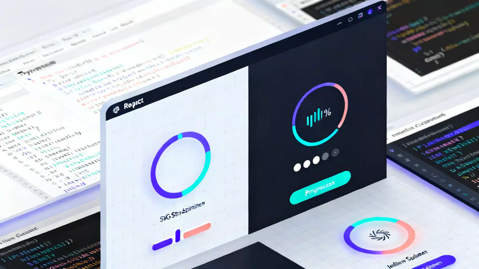
Image used for representation purposes only.
Why a Spinner Collection Still Matters
Loading indicators are tiny, but they set the tone for perceived performance and polish. In React apps—where routing, data fetching, and code-splitting are routine—having a cohesive, accessible set of spinners saves time and keeps UX consistent. This article curates a practical collection of React loading spinner variants, with production-minded patterns for accessibility, theming, performance, and integration with Suspense and transitions.
What you’ll get:
- 10+ drop-in spinner variants (CSS and SVG)
- An accessible API you can standardize across your app
- Patterns for buttons, full-screen overlays, determinate progress, and skeletons
- Reduced-motion fallbacks and performance tips
Principles for a Solid Loader System
- Accessibility first: expose meaningful labels, roles, and states; support screen readers.
- Minimal CPU/GPU cost: prefer CSS/SVG animations; avoid timers in JS loops.
- Themeable by design: accept size, color, and speed as props or CSS variables.
- Motion-respectful: honor prefers-reduced-motion.
- Consistent semantics: use role=“status” for indeterminate, role=“progressbar” for determinate.
A Small, Consistent API
Use a shared interface so all variants are swappable:
// types.ts
export type SpinnerProps = {
  size?: number | string; // px, rem, etc.
  color?: string;         // CSS color or var(--token)
  speed?: string;         // e.g. '0.8s'
  label?: string;         // accessible text, e.g. 'Loading…'
  className?: string;
};
Defaults can live in CSS variables so variants stay lightweight:
/* spinner.css */
:root {
  --spinner-size: 24px;
  --spinner-color: currentColor;
  --spinner-speed: 0.8s;
}
Variant 1: Classic CSS Border Ring (Indeterminate)
Lightweight, no SVG needed.
// Ring.tsx
import React from 'react';
import './spinner.css';
import styles from './ring.module.css';
import { SpinnerProps } from './types';

export function Ring({ size, color, speed, label = 'Loading…', className }: SpinnerProps) {
  const style: React.CSSProperties = {
    width: size ?? 'var(--spinner-size)',
    height: size ?? 'var(--spinner-size)',
    color: color ?? 'var(--spinner-color)',
    ['--sp-speed' as any]: speed ?? 'var(--spinner-speed)'
  };
  return (
    <span
      role="status"
      aria-live="polite"
      aria-label={label}
      className={[styles.ring, className].filter(Boolean).join(' ')}
      style={style}
    />
  );
}
/* ring.module.css */
.ring {
  display: inline-block;
  border-radius: 50%;
  border: calc(var(--spinner-size) / 8) solid var(--spinner-color/ / fallback);
  border: calc(var(--spinner-size) / 8) solid color-mix(in srgb, currentColor 20%, transparent);
  border-top-color: currentColor;
  animation: spin var(--sp-speed) linear infinite;
}
@keyframes spin { to { transform: rotate(360deg); } }
Note: color-mix gives a subtle two-tone. Fall back to a translucent border if not supported.
Variant 2: SVG Stroke Spinner (Indeterminate, Smooth)
SVG enables crisp strokes and advanced easing.
// SvgSpinner.tsx
import React from 'react';
import { SpinnerProps } from './types';
import './spinner.css';

export function SvgSpinner({ size, color, speed, label = 'Loading…', className }: SpinnerProps) {
  const s = size ?? 'var(--spinner-size)';
  const style: React.CSSProperties = {
    color: color ?? 'var(--spinner-color)',
    ['--sp-speed' as any]: speed ?? 'var(--spinner-speed)'
  };
  return (
    <span role="status" aria-label={label} className={className} style={style}>
      <svg width={s} height={s} viewBox="0 0 50 50" fill="none">
        <circle
          cx="25" cy="25" r="20"
          stroke="currentColor" strokeWidth="4"
          strokeLinecap="round"
          strokeDasharray="80 200"
          strokeDashoffset="0"
        >
          <animateTransform attributeName="transform" type="rotate" from="0 25 25" to="360 25 25" dur={String(speed ?? '0.8s')} repeatCount="indefinite"/>
          <animate attributeName="stroke-dashoffset" values="0; -140" dur={String(speed ?? '0.8s')} repeatCount="indefinite"/>
        </circle>
      </svg>
    </span>
  );
}
Variant 3: Dots Ellipsis (Chat-style)
Great for short waits or typing indicators.
// Dots.tsx
import React from 'react';
import styles from './dots.module.css';
import { SpinnerProps } from './types';

export function Dots({ size, color, speed, label = 'Loading…', className }: SpinnerProps) {
  const style: React.CSSProperties = {
    fontSize: typeof size === 'number' ? `${size}px` : size ?? 'calc(var(--spinner-size) * 0.8)',
    color: color ?? 'var(--spinner-color)',
    ['--sp-speed' as any]: speed ?? '0.9s'
  };
  return (
    <span role="status" aria-label={label} className={[styles.dots, className].join(' ')} style={style}>
      <span/> <span/> <span/>
    </span>
  );
}
/* dots.module.css */
.dots { display: inline-flex; gap: 0.25em; align-items: center; }
.dots > span { width: 0.3em; height: 0.3em; background: currentColor; border-radius: 50%; opacity: 0.3; }
.dots > span:nth-child(1) { animation: bounce var(--sp-speed) infinite; }
.dots > span:nth-child(2) { animation: bounce var(--sp-speed) 0.15s infinite; }
.dots > span:nth-child(3) { animation: bounce var(--sp-speed) 0.3s infinite; }
@keyframes bounce { 0%, 80%, 100% { transform: translateY(0); opacity: .3; } 40% { transform: translateY(-30%); opacity: 1; } }
Variant 4: Bars/Wave
Space-efficient, nice in narrow columns.
// Bars.tsx
import React from 'react';
import styles from './bars.module.css';
import { SpinnerProps } from './types';

export function Bars({ size, color, speed, label = 'Loading…', className }: SpinnerProps) {
  const style: React.CSSProperties = {
    width: size ?? 'calc(var(--spinner-size) * 1.6)',
    height: size ?? 'var(--spinner-size)',
    color: color ?? 'var(--spinner-color)',
    ['--sp-speed' as any]: speed ?? '1s'
  };
  return (
    <span role="status" aria-label={label} className={[styles.box, className].join(' ')} style={style}>
      <i/><i/><i/><i/><i/>
    </span>
  );
}
/* bars.module.css */
.box { display: inline-grid; grid-auto-flow: column; align-items: end; gap: 0.2em; color: currentColor; }
.box i { display: block; width: 0.18em; height: 40%; background: currentColor; border-radius: 0.1em; animation: wave var(--sp-speed) ease-in-out infinite; }
.box i:nth-child(2){animation-delay:.1s} .box i:nth-child(3){animation-delay:.2s} .box i:nth-child(4){animation-delay:.3s} .box i:nth-child(5){animation-delay:.4s}
@keyframes wave { 0%,100%{ height: 40% } 50%{ height: 90% } }
Variant 5: Pulse (Reduced-Motion Friendly)
Simple, soft attention without rotation.
// Pulse.tsx
import React from 'react';
import { SpinnerProps } from './types';

export function Pulse({ size, color, speed, label = 'Loading…', className }: SpinnerProps) {
  const style: React.CSSProperties = {
    width: size ?? 'var(--spinner-size)',
    height: size ?? 'var(--spinner-size)',
    background: color ?? 'var(--spinner-color)'
  };
  return (
    <span role="status" aria-label={label} className={className} style={{ display: 'inline-grid', placeItems: 'center' }}>
      <i style={{...style, borderRadius: '50%', opacity:.35, animation:'pulse '+(speed??'1.2s')+' ease-in-out infinite'}} />
      <style>{`@keyframes pulse { 0%,100%{opacity:.35; transform:scale(1)} 50%{opacity:1; transform:scale(1.15)} }
      @media (prefers-reduced-motion: reduce){ i{animation:none} }`}</style>
    </span>
  );
}
Variant 6: Determinate Progress Ring
When you know progress, tell users. Provide ARIA attributes.
// ProgressRing.tsx
import React from 'react';

type ProgressProps = {
  value: number; // 0..100
  size?: number | string;
  stroke?: number;
  color?: string;
  label?: string;
  className?: string;
};

export function ProgressRing({ value, size = 40, stroke = 4, color = 'currentColor', label = 'Loading…', className }: ProgressProps) {
  const r = 20; // radius in viewBox
  const C = 2 * Math.PI * r;
  const clamped = Math.max(0, Math.min(100, value));
  const offset = C * (1 - clamped / 100);
  return (
    <div role="progressbar" aria-label={label} aria-valuemin={0} aria-valuemax={100} aria-valuenow={Math.round(clamped)} className={className}>
      <svg width={size} height={size} viewBox="0 0 50 50">
        <circle cx="25" cy="25" r={r} stroke={color} opacity="0.15" strokeWidth={stroke} fill="none"/>
        <circle cx="25" cy="25" r={r} stroke={color} strokeWidth={stroke} fill="none" strokeLinecap="round" strokeDasharray={C} strokeDashoffset={offset} style={{ transition: 'stroke-dashoffset .2s ease' }}/>
      </svg>
    </div>
  );
}
Variant 7: Skeleton Block
Use skeletons when layout is known; spinners for unknown duration.
// Skeleton.tsx
import React from 'react';

type SkeletonProps = { width?: string | number; height?: string | number; radius?: number; className?: string; };

export function Skeleton({ width = '100%', height = 16, radius = 8, className }: SkeletonProps) {
  const style: React.CSSProperties = { width, height, borderRadius: radius, background: 'linear-gradient(90deg, #eee 25%, #f5f5f5 37%, #eee 63%)', backgroundSize: '400% 100%', animation: 'shimmer 1.4s ease infinite' };
  return <div role="status" aria-label="Loading…" className={className} style={style}/>;
}
@keyframes shimmer { 0% { background-position: 100% 0; } 100% { background-position: -100% 0; } }
@media (prefers-reduced-motion: reduce){ .skeleton{ animation: none; } }
Variant 8: Inline Button Spinner
Avoid layout shift; reserve space for the spinner.
// LoadingButton.tsx
import React from 'react';
import { Ring } from './Ring';

type ButtonProps = React.ButtonHTMLAttributes<HTMLButtonElement> & { loading?: boolean };

export function LoadingButton({ loading, disabled, children, ...rest }: ButtonProps) {
  return (
    <button {...rest} aria-busy={loading || undefined} disabled={disabled || loading} style={{ position:'relative', display:'inline-flex', alignItems:'center', gap:8 }}>
      {loading && <Ring size={16} aria-hidden="true" label="" />}
      <span>{children}</span>
    </button>
  );
}
Variant 9: Full-screen Overlay
Use for blocking operations; prefer to keep sessions unblocked where possible.
// Overlay.tsx
import React from 'react';
import { SvgSpinner } from './SvgSpinner';

export function Overlay({ open }: { open: boolean }) {
  if (!open) return null;
  return (
    <div role="dialog" aria-modal="true" aria-label="Loading" style={{position:'fixed', inset:0, background:'rgba(0,0,0,.35)', display:'grid', placeItems:'center', zIndex:9999}}>
      <SvgSpinner size={56} color="#fff" label="Loading content" />
    </div>
  );
}
Variant 10: Suspense Fallback + Minimum Delay
Avoid flicker by deferring the spinner for very short loads.
// useMinDelay.ts
import { useEffect, useState } from 'react';
export function useMinDelay(trigger: any, ms = 200) {
  const [show, setShow] = useState(false);
  useEffect(() => {
    if (!trigger) { setShow(false); return; }
    const t = setTimeout(() => setShow(true), ms);
    return () => clearTimeout(t);
  }, [trigger, ms]);
  return show;
}
// SuspenseExample.tsx
import React, { Suspense } from 'react';
import { Ring } from './Ring';
import { useMinDelay } from './useMinDelay';
const Product = React.lazy(() => import('./Product'));

export function ProductsPage() {
  const loading = true; // mimic route/data loading state
  const showSpinner = useMinDelay(loading, 200);
  return (
    <Suspense fallback={showSpinner ? <Ring size={28} /> : null}>
      <Product/>
    </Suspense>
  );
}
Variant 11: useTransition Micro-spinner
Show a small inline spinner during state transitions (filters, sorts).
// TransitionExample.tsx
import React, { useMemo, useState, useTransition } from 'react';
import { Dots } from './Dots';

export function FilterBox({ data }: { data: string[] }) {
  const [q, setQ] = useState('');
  const [isPending, startTransition] = useTransition();

  const filtered = useMemo(() => data.filter(x => x.toLowerCase().includes(q.toLowerCase())), [data, q]);

  return (
    <div>
      <label>
        Search
        <input value={q} onChange={e => startTransition(() => setQ(e.target.value))} />
      </label>
      {isPending && <Dots size={14} label="Filtering results" />}
      <ul>{filtered.map((x) => <li key={x}>{x}</li>)}</ul>
    </div>
  );
}
Variant 12: Themed with CSS Variables
Expose a theme layer once; all variants inherit it.
/* theme.css */
:root { --brand-500: #635bff; }
.light { --spinner-color: var(--brand-500); }
.dark  { --spinner-color: #fff; }
.large { --spinner-size: 40px; }
.fast  { --spinner-speed: .6s; }
// Usage
<div className="dark large">
  <Ring/>
  <SvgSpinner/>
  <Bars/>
</div>
Accessibility Checklist
- Provide aria-label on indeterminate spinners; avoid verbose live regions.
- For determinate progress, use role=“progressbar” with aria-valuenow/min/max.
- Hide purely decorative spinners with aria-hidden=“true” and ensure a textual label elsewhere.
- Don’t trap keyboard focus inside overlays; keep tab order intact.
- Respect prefers-reduced-motion: disable or tone down animation.
Performance Notes
- Favor CSS or SVG animations over JS loops; they leverage the compositor.
- Keep DOM minimal: a spinner should be a few elements only.
- Reduce paint area: small inline spinners beat full-width shimmering bars.
- Debounce display with a minimum delay to prevent flash on fast operations.
- Bundle-split heavy pages so the spinner appears while needed assets stream in.
When to Use Each Variant
- Small inline waits (button click, micro-interaction): Ring, Dots, Pulse.
- List/table filter or search: Dots or Bars; optionally with useTransition.
- Page or route loads: SVG spinner or skeletons for predictable layout.
- Uploads/downloads: Determinate ProgressRing.
- Blocking operations: Full-screen Overlay—use sparingly.
Drop-in Recipe: One Index, Many Variants
Create a single export so teams can swap variants without changing imports.
// index.ts
export { Ring } from './Ring';
export { SvgSpinner } from './SvgSpinner';
export { Dots } from './Dots';
export { Bars } from './Bars';
export { Pulse } from './Pulse';
export { ProgressRing } from './ProgressRing';
export { Skeleton } from './Skeleton';
export { LoadingButton } from './LoadingButton';
export { Overlay } from './Overlay';
Testing and QA Tips
- Visual regression: snapshot keyframes at 0%, 50%, 100% to detect CSS drift.
- A11y tests: verify roles/labels with tooling (e.g., axe). Ensure no infinite live region spam.
- Cross-theme checks: validate contrast in light/dark and brand variants.
- Motion audit: emulate prefers-reduced-motion and verify fallbacks.
Conclusion
A spinner system is more than a single GIF. By standardizing props, respecting accessibility, and offering a versatile collection (ring, SVG, dots, bars, pulse, determinate, skeletons, overlays), your React app communicates progress clearly without distracting users—or your CPU. Start with the shared SpinnerProps, wire in CSS variables for theming, and adopt the variants above as your default, swappable toolkit.
Related Posts

React Skeleton Screen Shimmer Effect: Accessible and Fast
Build an accessible, high-performance React skeleton screen with a polished shimmer effect, plus Suspense integration, theming, and pro tips.

Building Effective React Skeleton Loading UIs: Patterns, Code, and A11y Tips
Build accessible, performant skeleton loading UIs in React with patterns, Suspense, CSS shimmer, and testing tips.
Build an Accessible, Production‑Ready React OTP/PIN Input
Build an accessible, secure, paste-aware React OTP/PIN input with Web OTP, mobile keypad, and full keyboard support.