
Building an Accessible React Stepper Form Progress Component
Build an accessible React stepper form progress component with validation, keyboard support, and persistence. Includes TypeScript code and best practices.
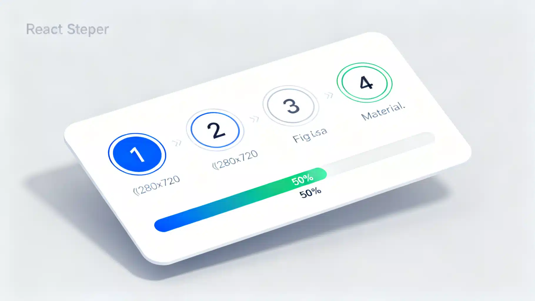
Image used for representation purposes only.
Overview
Multi‑step (“stepper”) forms break complex data entry into digestible screens and show users exactly where they are, what’s next, and how to finish. In this article you’ll build a reusable, accessible React stepper with a visible progress bar, keyboard support, and per‑step validation. You’ll also see how to persist progress and test the UX.
What you’ll learn:
- A clean component model for Stepper, StepPanels, and form controls
- How to calculate and display progress
- Accessibility with roles, labels, and keyboard navigation
- Validation per step (framework‑agnostic and with React Hook Form)
- Persisting and restoring state
- Styling and theming with simple CSS variables
When (and when not) to use a stepper
Use a stepper when:
- The form requires multiple logical sections (e.g., Account → Profile → Confirm)
- You need to enforce an order or validate prerequisites
- Users benefit from a visible sense of completion
Avoid a stepper when:
- The form is short enough to fit on a single screen
- Steps are independent and don’t require sequential flow (tabs might be better)
Component design
We’ll keep the API headless and styling‑friendly:
- Stepper: renders a progress bar and the clickable step headers (tabs)
- StepPanels: renders the content region and only shows the active panel
- Parent form container: owns state, validation, and navigation controls
State kept in the parent:
- active: index of the current step
- completed: Set
for finished steps (drives progress) - form data: your fields, any shape you like
Core components (TypeScript)
Create a small, dependency‑free Stepper with proper ARIA semantics. The step headers act like a tablist (role=‘tablist’), each step is a ’tab’, and each panel is a ’tabpanel’ linked via aria-controls and aria-labelledby.
import * as React from 'react'

type StepDef = { id: string; label: string; optional?: boolean }

type StepperProps = {
  steps: StepDef[]
  active: number
  onChange: (index: number) => void
  completed?: Set<number>
}

export function Stepper({ steps, active, onChange, completed = new Set() }: StepperProps) {
  const progress = Math.round((completed.size / steps.length) * 100)

  function onKeyDown(e: React.KeyboardEvent<HTMLDivElement>) {
    if (e.key === 'ArrowRight' || e.key === 'ArrowDown') {
      e.preventDefault()
      onChange(Math.min(active + 1, steps.length - 1))
    } else if (e.key === 'ArrowLeft' || e.key === 'ArrowUp') {
      e.preventDefault()
      onChange(Math.max(active - 1, 0))
    } else if (e.key === 'Home') {
      onChange(0)
    } else if (e.key === 'End') {
      onChange(steps.length - 1)
    }
  }

  return (
    <div className='stepper' aria-label='Form progress'>
      <div className='progress' role='progressbar' aria-valuemin={0} aria-valuemax={100} aria-valuenow={progress} aria-label='Completion'>
        <div className='bar' style={{ width: `${progress}%` }} />
      </div>

      <div role='tablist' aria-label='Steps' className='tabs' onKeyDown={onKeyDown}>
        {steps.map((s, i) => {
          const selected = i === active
          const isDone = completed.has(i)
          const disabled = i > active + 1 // naive lock-ahead
          return (
            <button
              key={s.id}
              role='tab'
              id={`step-tab-${s.id}`}
              aria-selected={selected}
              aria-controls={`step-panel-${s.id}`}
              aria-disabled={disabled}
              className={`tab ${selected ? 'active' : ''} ${isDone ? 'done' : ''}`}
              onClick={() => !disabled && onChange(i)}
              tabIndex={selected ? 0 : -1}
              type='button'
            >
              <span className='index'>{i + 1}</span>
              <span className='label'>{s.label}{s.optional ? ' (optional)' : ''}</span>
            </button>
          )
        })}
      </div>
    </div>
  )
}
Panels render the content; only the active one is visible and focusable.
type StepPanelsProps = {
  steps: StepDef[]
  active: number
  children: React.ReactNode[]
}

export function StepPanels({ steps, active, children }: StepPanelsProps) {
  return (
    <div className='panels'>
      {steps.map((s, i) => (
        <section
          key={s.id}
          role='tabpanel'
          id={`step-panel-${s.id}`}
          aria-labelledby={`step-tab-${s.id}`}
          hidden={i !== active}
        >
          {i === active ? children[i] : null}
        </section>
      ))}
    </div>
  )
}
Putting it together: a 3‑step form
The parent container owns the business logic: validation per step, next/back/submit, and the completed set.
export function StepperForm() {
  const steps: StepDef[] = [
    { id: 'account', label: 'Account' },
    { id: 'profile', label: 'Profile' },
    { id: 'confirm', label: 'Confirm' }
  ]

  const [active, setActive] = React.useState(0)
  const [completed, setCompleted] = React.useState<Set<number>>(new Set())

  const [form, setForm] = React.useState({
    email: '',
    password: '',
    name: '',
    agree: false
  })

  const validators: Record<string, () => boolean> = {
    account: () => /\S+@\S+\.\S+/.test(form.email) && form.password.length >= 8,
    profile: () => form.name.trim().length > 1,
    confirm: () => form.agree
  }

  function markComplete(i: number) {
    setCompleted(prev => new Set(prev).add(i))
  }

  function next() {
    const id = steps[active].id
    if (!validators[id] || validators[id]()) {
      markComplete(active)
      setActive(a => Math.min(a + 1, steps.length - 1))
    }
  }

  function back() {
    setActive(a => Math.max(a - 1, 0))
  }

  function submit(e: React.FormEvent) {
    e.preventDefault()
    if (validators.confirm()) {
      alert('Submitted! ' + JSON.stringify(form, null, 2))
    }
  }

  return (
    <form onSubmit={submit} className='stepper-form'>
      <Stepper steps={steps} active={active} onChange={setActive} completed={completed} />

      <StepPanels steps={steps} active={active}>
        {/* Account */}
        <div className='grid'>
          <label>
            Email
            <input type='email' value={form.email} onChange={e => setForm({ ...form, email: e.target.value })} required />
          </label>
          <label>
            Password
            <input type='password' value={form.password} onChange={e => setForm({ ...form, password: e.target.value })} required minLength={8} />
          </label>
        </div>

        {/* Profile */}
        <div className='grid'>
          <label>
            Full name
            <input type='text' value={form.name} onChange={e => setForm({ ...form, name: e.target.value })} />
          </label>
        </div>

        {/* Confirm */}
        <div>
          <pre className='summary'>{JSON.stringify(form, null, 2)}</pre>
          <label className='checkbox'>
            <input type='checkbox' checked={form.agree} onChange={e => setForm({ ...form, agree: e.target.checked })} />
            I confirm the information above is correct
          </label>
        </div>
      </StepPanels>

      <div className='controls'>
        <button type='button' onClick={back} disabled={active === 0}>Back</button>
        {active < steps.length - 1 ? (
          <button type='button' onClick={next}>Next</button>
        ) : (
          <button type='submit' disabled={!validators.confirm()}>Submit</button>
        )}
      </div>
    </form>
  )
}
Styling and theming
Minimal CSS with variables for quick theming. Replace with your design tokens as needed.
.stepper { --c-primary: #3b82f6; --c-muted: #e5e7eb; --c-done: #10b981; }
.progress { height: 6px; background: var(--c-muted); border-radius: 999px; overflow: hidden; margin-bottom: 12px; }
.progress .bar { height: 100%; background: linear-gradient(90deg, var(--c-primary), var(--c-done)); transition: width .3s ease; }
.tabs { display: grid; grid-template-columns: repeat(auto-fit, minmax(160px, 1fr)); gap: 8px; margin-bottom: 16px; }
.tab { display: flex; align-items: center; gap: 8px; padding: 10px 12px; border-radius: 10px; border: 1px solid var(--c-muted); background: white; cursor: pointer; }
.tab.active { border-color: var(--c-primary); box-shadow: 0 0 0 2px color-mix(in srgb, var(--c-primary) 20%, transparent); }
.tab.done .index { background: var(--c-done); color: white; }
.tab[aria-disabled='true'] { opacity: .6; pointer-events: none; }
.index { width: 28px; height: 28px; display: grid; place-items: center; border-radius: 50%; background: var(--c-muted); font-weight: 600; }
.label { white-space: nowrap; overflow: hidden; text-overflow: ellipsis; }
.panels section { animation: fade .2s ease; }
@keyframes fade { from { opacity: 0 } to { opacity: 1 } }
.stepper-form .grid { display: grid; gap: 12px; }
.controls { display: flex; justify-content: space-between; margin-top: 16px; }
.summary { background: #0b1020; color: #cbd5e1; padding: 12px; border-radius: 8px; overflow: auto; }
Accessibility checklist
- Roles: tablist → tab → tabpanel correctly wired via aria-controls/aria-labelledby
- Progress: role=‘progressbar’ with aria-valuenow/min/max; include a text label
- Keyboard: Left/Right/Up/Down to move, Home/End to jump, Tab to enter fields
- Focus: Keep tabIndex at 0 only for the active tab; -1 for others
- Disabled steps: set aria-disabled and ensure they are not focusable/clickable
- Visible labels: Display step indexes and names; indicate optional steps
Tip: When you programmatically advance to the next step, move focus to the next panel’s first focusable element to aid screen reader users.
Validation strategies
- Synchronous per‑step rules (as above) to gate the Next button
- Asynchronous validation (e.g., check username availability) before marking a step complete
- Partial completion: allow jumping back to edit without losing ‘completed’ state; recompute progress if a step becomes invalidated
With React Hook Form (optional)
If you use React Hook Form, trigger validation for only the current step’s fields:
import { useForm, FormProvider } from 'react-hook-form'

type FormData = { email: string; password: string; name: string; agree: boolean }

export function RHFStepper() {
  const steps: StepDef[] = [
    { id: 'account', label: 'Account' },
    { id: 'profile', label: 'Profile' },
    { id: 'confirm', label: 'Confirm' }
  ]

  const methods = useForm<FormData>({ mode: 'onChange' })
  const [active, setActive] = React.useState(0)
  const [completed, setCompleted] = React.useState<Set<number>>(new Set())

  async function next() {
    const fieldsByStep: Record<number, (keyof FormData)[]> = {
      0: ['email', 'password'],
      1: ['name'],
      2: ['agree']
    }
    const ok = await methods.trigger(fieldsByStep[active])
    if (ok) {
      setCompleted(s => new Set(s).add(active))
      setActive(a => a + 1)
    }
  }

  return (
    <FormProvider {...methods}>
      {/* render Stepper + StepPanels; use methods.register for inputs */}
      {/* call next() on Next button; methods.handleSubmit on final Submit */}
    </FormProvider>
  )
}
Persisting progress and deep linking
Persist the active step so reloading the page resumes where the user left off. Also consider encoding the step in the URL query.
// Persist active step
React.useEffect(() => {
  localStorage.setItem('signup.activeStep', String(active))
}, [active])

// Restore on mount
React.useEffect(() => {
  const saved = Number(localStorage.getItem('signup.activeStep') ?? '0')
  if (!Number.isNaN(saved)) setActive(Math.min(Math.max(saved, 0), steps.length - 1))
}, [])
For deep linking, read and write ?step=profile in the URL and map it to your step index.
Testing the UX
Use Testing Library to validate the keyboard and progress behavior.
import { render, screen } from '@testing-library/react'
import userEvent from '@testing-library/user-event'
import { StepperForm } from './StepperForm'

test('progress updates as steps complete', async () => {
  const user = userEvent.setup()
  render(<StepperForm />)

  await user.click(screen.getByRole('button', { name: /next/i }))

  const bar = screen.getByRole('progressbar')
  expect(bar).toHaveAttribute('aria-valuenow', '33') // 1 of 3 steps ≈ 33%
})
Also test keyboard navigation (ArrowRight/Left) and that disabled steps can’t be focused.
Performance tips
- Split steps into memoized components; pass only the data needed for that step
- Use lazy validation for heavy checks; prefetch data when entering a step
- Avoid re‑creating arrays/objects each render (memoize steps and handlers where practical)
Common pitfalls
- Hiding panels with CSS only (visibility) but not aria-hidden/hidden → screen readers may read multiple panels; use the hidden attribute
- Missing labeling on the progress bar → low accessibility
- Allowing users to jump ahead without guarding prerequisites → incomplete or invalid submissions
- Forgetting mobile: ensure large tap targets and horizontal steps wrap or scroll gracefully
Wrap‑up
You now have a headless, accessible React stepper with progress that you can drop into any design system. Start with the minimal version, then layer in your stack’s form library, async checks, and analytics. Most importantly, keep navigation predictable, keyboard‑friendly, and transparent about what comes next. That’s how steppers earn user trust and drive higher completion rates.
Related Posts
Build an Accessible React Badge Notification Counter (With Real‑Time Updates and Animations)
Build an accessible, themeable React badge notification counter with real-time updates, tasteful animations, and robust a11y—plus tests and tips.
Building a Robust React Stepper Wizard in React: Headless, Accessible, and Validated
Build an accessible, headless React stepper wizard with validation, routing, and React Hook Form integration—complete with code you can reuse.
Building a Fast, Accessible React Multi‑Select Dropdown: Patterns, Code, and Pitfalls
Build a fast, accessible React multi-select dropdown: API design, ARIA patterns, code, virtualization, async loading, performance, and testing.