
Flutter Material You Dynamic Colors: A Practical Guide with Fallbacks and Harmonization
Learn how to implement Material You dynamic colors in Flutter with platform support, harmonization, fallbacks, and production-ready code patterns.
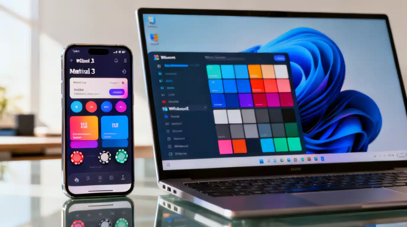
Image used for representation purposes only.
Overview
Material You’s dynamic color system adapts your app’s palette to the user’s device theme, producing interfaces that feel personal, brand‑aware, and accessible by default. In Flutter, you can opt into Material 3 and read platform palettes (Monet on Android 12+, Windows 11 accent colors) to build a ColorScheme that automatically harmonizes your UI. When dynamic color isn’t available, you fall back to a seeded scheme that retains your brand identity.
This guide explains how dynamic color works, which platforms support it, and how to implement it cleanly in Flutter with robust fallbacks, testing tips, and common pitfalls to avoid.
How Material You dynamic color works
Material You starts from a “source” color (typically derived from the user’s wallpaper or system accent), generates tonal palettes, then maps those tones to semantic roles in a ColorScheme—primary, secondary, tertiary, surface, error, and a family of surface container roles. Components pull from these roles, so your app’s look updates cohesively without one‑off color tweaks.
Flutter exposes this through Material 3 and ColorScheme. When dynamic color is available, you build ThemeData from the platform‑provided schemes. Otherwise, you create a scheme from a seed color, ensuring consistent, on‑brand theming everywhere.
Platform support at a glance
- Android: Dynamic color is available on Android 12 (API 31) and newer via Monet. On older versions, use a seeded fallback.
- Windows: Windows 11 provides an accent color you can read for a dynamic scheme. Older Windows versions fall back to seeded.
- iOS, macOS, Linux, Web: No system wallpaper‑driven palette. Use seeded schemes or app‑level preferences. You can still let users pick a seed or extract colors from an image.
Design considerations before you code
- Embrace semantic roles: Style components by role (e.g., colorScheme.primary) rather than hardcoded colors.
- Plan dark mode: Generate both light and dark schemes. Let ThemeMode.system switch between them.
- Harmonize brand elements: Adjust brand colors so they “live” in the same tonal universe as the dynamic palette instead of clashing.
- Accessibility: Dynamic color aims for contrast targets, but verify critical screens with high‑contrast and large text settings.
Project setup
Add Material 3 and the dynamic color package. Material 3 is baked into Flutter’s Material library; the dynamic color package provides platform palettes and helpful harmonization utilities.
# pubspec.yaml
dependencies:
  flutter:
    sdk: flutter
  dynamic_color: ^1.0.0 # use the latest compatible version
The minimal implementation
This pattern reads the platform’s light/dark schemes when available and falls back to a seeded brand color when not. It also harmonizes both schemes so custom brand accents blend with the system palette.
import 'package:flutter/material.dart';
import 'package:dynamic_color/dynamic_color.dart';

void main() => runApp(const MyApp());

class MyApp extends StatelessWidget {
  const MyApp({super.key});

  static const Color brandSeed = Color(0xFF6750A4); // Your brand seed

  @override
  Widget build(BuildContext context) {
    return DynamicColorBuilder(
      builder: (ColorScheme? lightDynamic, ColorScheme? darkDynamic) {
        final ColorScheme lightScheme = (lightDynamic?.harmonized())
            ?? ColorScheme.fromSeed(seedColor: brandSeed, brightness: Brightness.light);

        final ColorScheme darkScheme = (darkDynamic?.harmonized())
            ?? ColorScheme.fromSeed(seedColor: brandSeed, brightness: Brightness.dark);

        return MaterialApp(
          title: 'Material You + Flutter',
          themeMode: ThemeMode.system,
          theme: ThemeData(
            useMaterial3: true,
            colorScheme: lightScheme,
            appBarTheme: const AppBarTheme(centerTitle: true),
          ),
          darkTheme: ThemeData(
            useMaterial3: true,
            colorScheme: darkScheme,
            appBarTheme: const AppBarTheme(centerTitle: true),
          ),
          home: const HomePage(),
        );
      },
    );
  }
}

class HomePage extends StatelessWidget {
  const HomePage({super.key});
  @override
  Widget build(BuildContext context) {
    final cs = Theme.of(context).colorScheme;
    return Scaffold(
      appBar: AppBar(title: const Text('Dynamic colors in action')),
      body: Padding(
        padding: const EdgeInsets.all(16),
        child: Column(
          crossAxisAlignment: CrossAxisAlignment.start,
          children: [
            Text('Primary', style: Theme.of(context).textTheme.titleLarge),
            const SizedBox(height: 8),
            Row(children: [
              _Swatch(cs.primary, 'primary'),
              _Swatch(cs.onPrimary, 'onPrimary'),
              _Swatch(cs.primaryContainer, 'primaryContainer'),
              _Swatch(cs.onPrimaryContainer, 'onPrimaryContainer'),
            ]),
            const SizedBox(height: 16),
            FilledButton(
              onPressed: () {},
              child: const Text('Material 3 Button'),
            ),
            const SizedBox(height: 8),
            OutlinedButton(onPressed: () {}, child: const Text('Outlined')),
            const SizedBox(height: 8),
            ElevatedButton(onPressed: () {}, child: const Text('Elevated')),
          ],
        ),
      ),
    );
  }
}

class _Swatch extends StatelessWidget {
  const _Swatch(this.color, this.label);
  final Color color; final String label;
  @override
  Widget build(BuildContext context) {
    return Container(
      width: 64, height: 64, margin: const EdgeInsets.only(right: 8),
      decoration: BoxDecoration(color: color, borderRadius: BorderRadius.circular(12)),
      alignment: Alignment.center,
      child: Text(label, textAlign: TextAlign.center,
          style: Theme.of(context).textTheme.labelSmall?.copyWith(
            color: ThemeData.estimateBrightnessForColor(color) == Brightness.dark
                ? Colors.white : Colors.black,
          )),
    );
  }
}
Harmonizing brand colors with the system palette
Sometimes you keep a signature color (e.g., for a logo or chip). Harmonization shifts your brand hue slightly so it fits the dynamic scheme’s tonal context.
// Example: harmonize a brand accent for a custom widget
const brandAccent = Color(0xFF1E88E5);

Widget harmonizedChip(BuildContext context) {
  final cs = Theme.of(context).colorScheme;

  // Align brand accent with the current scheme’s primary tone
  final Color harmonizedAccent = brandAccent.harmonizeWith(cs.primary);

  return Chip(
    label: const Text('Harmonized'),
    backgroundColor: harmonizedAccent.withOpacity(0.24),
    side: BorderSide(color: harmonizedAccent),
    labelStyle: Theme.of(context).textTheme.labelLarge?.copyWith(
      color: Color.alphaBlend(harmonizedAccent, cs.onSurface),
    ),
  );
}
Tip: If you maintain multiple brand colors, consider deriving a full ColorScheme.fromSeed from your primary brand color, then use harmonizeWith selectively for accents that sit on top of dynamic surfaces.
Providing a user toggle and persistent preference
Let users override dynamic color (some prefer stable branding across devices). Persist the choice with your state solution of choice (e.g., shared_preferences) and rebuild ThemeData accordingly.
class ThemeController extends ChangeNotifier {
  bool useDynamic = true; // default to dynamic when supported
  void toggleDynamic(bool value) { useDynamic = value; notifyListeners(); }
}

// In your app builder:
final canUseDynamic = lightDynamic != null && darkDynamic != null;
final effectiveLight = (controller.useDynamic && canUseDynamic)
    ? lightDynamic!.harmonized()
    : ColorScheme.fromSeed(seedColor: brandSeed, brightness: Brightness.light);
When dynamic color isn’t available: smart fallbacks
- Seeded schemes: Use ColorScheme.fromSeed for both light and dark. This produces a complete, well‑balanced palette from a single brand color.
- Image‑derived seeds: To mimic “wallpaper‑aware” UI on platforms without system palettes, you can compute a seed from a user‑selected image and feed it to ColorScheme.fromSeed or ColorScheme.fromImageProvider.
final image = const AssetImage('assets/sample.jpg');
final lightFromImage = await ColorScheme.fromImageProvider(
  provider: image,
  brightness: Brightness.light,
);
Testing and debugging dynamic colors
- Android Emulator (API 31+): Change wallpaper to see different palettes. Relaunch your app to apply newly derived colors consistently.
- Windows 11: Change the system accent color and relaunch your app.
- Golden tests: Inject a fixed ColorScheme into ThemeData to lock visuals for snapshot tests.
- Accessibility: Enable large text and high‑contrast modes. Verify text and icon legibility on primary/secondary containers.
Common pitfalls and how to avoid them
- Mixing legacy fields with Material 3: Prefer ColorScheme roles over primaryColor, accentColor, and ThemeData’s deprecated properties.
- Hardcoding component colors: Let components pull from ColorScheme unless you have a specific reason not to. If you must override, reference scheme roles.
- Ignoring dark mode: Always provide both light and dark schemes. Test with ThemeMode.dark and ThemeMode.system.
- Over‑branding: Use harmonization to keep your brand present but not overpowering; avoid vivid, non‑harmonized accents on dynamic surfaces.
- Assuming live updates: Platform palettes are typically read at launch. Provide an in‑app refresh or rely on app restarts after system changes.
Advanced tips
- Surface containers: Material 3 adds roles like surfaceContainer, surfaceContainerHigh/Low. Use them for layered surfaces (cards, sheets) instead of reusing plain surface/background.
- Content tones: For custom drawing or charts, derive tones from your scheme to maintain rhythm across elevations and states.
- State layers: Respect pressed/hovered/disabled opacity guidelines; many widgets handle this, but custom components should align with the scheme’s alpha patterns.
Performance notes
Dynamic color resolution is inexpensive and typically happens once at startup. Subsequent rebuilds reuse the resolved ColorScheme. Avoid recomputing schemes on every frame; create them during app/bootstrap or in a ChangeNotifier/Bloc and provide via InheritedWidget or Provider.
Implementation checklist
- useMaterial3: true on both light and dark ThemeData
- Read platform dynamic colors (when available) via dynamic_color
- Provide seeded fallbacks for all platforms
- Harmonize brand accents with the active scheme
- Support ThemeMode.system and test dark/light explicitly
- Verify accessibility contrast on key screens
- Offer a user toggle to disable dynamic color if appropriate
Conclusion
Flutter makes Material You dynamic color straightforward: fetch platform palettes on Android 12+ and Windows 11, harmonize your brand accents, and provide robust seeded fallbacks elsewhere. By structuring your theming around ColorScheme and Material 3 roles, your app stays adaptable, accessible, and unmistakably yours—no matter the user’s device or wallpaper.
Related Posts
Implementing Material 3 in Flutter: A Practical, End‑to‑End Guide
Implement Material 3 in Flutter with ColorScheme.fromSeed, dynamic color, modern components, theming patterns, migration tips, and best practices.
Flutter Dynamic Theming at Runtime: Material 3, System Colors, and ThemeExtensions
Implement dynamic runtime theming in Flutter with ThemeMode, Material 3 seed colors, Android 12 system colors, ThemeExtension, persistence, and tests.
Flutter Custom Theme System: The Complete, Scalable M3 Guide
Build a scalable custom theme system in Flutter with Material 3: tokens, ColorScheme, extensions, light/dark modes, component overrides, and tests.