
Build a Fast, Accessible React Notification Bell Dropdown (with Real‑Time Updates)
Build an accessible, real-time React notification bell dropdown with unread badges, keyboard support, virtualization, and robust data handling.
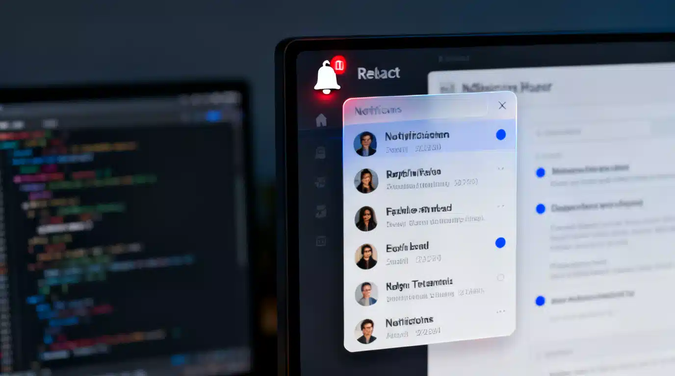
Image used for representation purposes only.
Overview
A notification bell dropdown is a compact pattern that surfaces time‑sensitive updates without pulling users out of context. In React, getting this right requires more than a badge and a popover. You need accessible markup, reliable state management, efficient data loading, real‑time updates, and careful rendering so the list feels instant even with hundreds of items.
This guide walks through the design, data, and code decisions behind a fast, accessible React notification bell dropdown. You will see TypeScript examples, performance tips (virtualization, pagination), real‑time strategies (WebSocket, polling, GraphQL subscriptions), and production‑grade concerns like security, offline behavior, and testing.
UX anatomy and behaviors
A solid bell dropdown usually includes:
- Bell button: toggleable, keyboard‑operable, focusable, with an unread count badge.
- Dropdown panel: a popover aligned to the bell containing a scannable list.
- Items: compact title, optional body, time, icon/avatar, and a target link.
- Controls: mark all read, view all, clear, and pagination or infinite scroll.
- States: loading (skeleton), empty, error, and offline.
Key interactions:
- Click or Enter/Space toggles the menu; Escape closes it.
- Arrow keys move between items; Tab respects standard focus order.
- Clicking outside closes the dropdown.
- Reading an item updates counts optimistically.
Data model and API shape
Keep items small and normalized. A typical shape:
- id: string
- title: string
- body?: string (plain text; sanitize if HTML)
- href?: string
- iconUrl?: string
- createdAt: ISO string
- read: boolean
Server endpoints you will likely need:
- GET /notifications?cursor=… for paginated fetch.
- POST /notifications/:id/read to mark a single item.
- POST /notifications/read-all for bulk.
- A real‑time channel that emits created or updated events.
Accessibility first
Make the bell a real button. Add:
- aria-label: ‘Notifications’
- aria-expanded: stateful true/false
- aria-controls: id of the dropdown panel
- aria-live=‘polite’ on the count badge so screen readers announce changes politely
- role=‘menu’ on the dropdown and role=‘menuitem’ on items
- Keyboard: Enter/Space to open, ArrowUp/ArrowDown to move focus, Home/End to jump, Escape to close
Ensure focus is managed: when the menu opens, move focus to the first item; when it closes, return focus to the bell.
Baseline implementation (TypeScript + React Query)
Below is a minimal, headless implementation that you can style with Tailwind, CSS Modules, or your system of choice. It includes: data fetching via React Query, optimistic read, outside‑click handling, and basic keyboard support. Swap the fake API with your real endpoints and wire up WebSocket invalidation later.
import React, {useEffect, useId, useRef, useState} from 'react'
import {useMutation, useQuery, useQueryClient} from '@tanstack/react-query'

type Notification = {
  id: string
  title: string
  body?: string
  href?: string
  iconUrl?: string
  createdAt: string
  read: boolean
}

type Page = { items: Notification[]; nextCursor?: string | null }

async function fetchNotifications(cursor?: string): Promise<Page> {
  const url = cursor ? `/api/notifications?cursor=${cursor}` : '/api/notifications'
  const res = await fetch(url, { credentials: 'include' })
  if (!res.ok) throw new Error('Failed to load')
  return res.json()
}

async function markRead(id: string): Promise<{ id: string }> {
  const res = await fetch(`/api/notifications/${id}/read`, { method: 'POST', credentials: 'include' })
  if (!res.ok) throw new Error('Failed to mark read')
  return res.json()
}

export function useNotifications() {
  // Cursor-based pagination; keep the list small in memory
  const query = useQuery({
    queryKey: ['notifications', 'page-1'],
    queryFn: () => fetchNotifications(),
    staleTime: 30_000,
    refetchOnWindowFocus: false,
  })
  return query
}

export function NotificationBell() {
  const { data, isLoading, isError, refetch } = useNotifications()
  const qc = useQueryClient()
  const [open, setOpen] = useState(false)
  const btnRef = useRef<HTMLButtonElement | null>(null)
  const panelRef = useRef<HTMLDivElement | null>(null)
  const menuId = useId()

  const items = data?.items ?? []
  const unreadCount = items.reduce((acc, it) => acc + (it.read ? 0 : 1), 0)

  // Close on outside click
  useEffect(() => {
    if (!open) return
    const onDown = (e: MouseEvent) => {
      if (!panelRef.current || !btnRef.current) return
      const target = e.target as Node
      if (!panelRef.current.contains(target) && !btnRef.current.contains(target)) {
        setOpen(false)
        btnRef.current?.focus()
      }
    }
    document.addEventListener('mousedown', onDown)
    return () => document.removeEventListener('mousedown', onDown)
  }, [open])

  // Keyboard handling on the button
  const onButtonKeyDown = (e: React.KeyboardEvent) => {
    if (e.key === 'ArrowDown' || e.key === 'Enter' || e.key === ' ') {
      e.preventDefault(); setOpen(true)
      requestAnimationFrame(() => {
        const first = panelRef.current?.querySelector<HTMLElement>('[role="menuitem"]')
        first?.focus()
      })
    }
  }

  // Optimistic mark-as-read
  const readMutation = useMutation({
    mutationFn: (id: string) => markRead(id),
    onMutate: async (id: string) => {
      await qc.cancelQueries({ queryKey: ['notifications', 'page-1'] })
      const prev = qc.getQueryData<Page>(['notifications', 'page-1'])
      if (prev) {
        const next: Page = { ...prev, items: prev.items.map(it => it.id === id ? { ...it, read: true } : it) }
        qc.setQueryData(['notifications', 'page-1'], next)
      }
      return { prev }
    },
    onError: (_err, _id, ctx) => {
      if (ctx?.prev) qc.setQueryData(['notifications', 'page-1'], ctx.prev)
    },
    onSettled: () => qc.invalidateQueries({ queryKey: ['notifications', 'page-1'] })
  })

  const onItemActivate = (id: string, href?: string) => {
    readMutation.mutate(id)
    if (href) window.location.assign(href)
  }

  return (
    <div className='relative'>
      <button
        ref={btnRef}
        aria-label='Notifications'
        aria-expanded={open}
        aria-controls={menuId}
        className='relative inline-flex items-center justify-center h-10 w-10 rounded-full hover:bg-neutral-100 dark:hover:bg-neutral-800'
        onClick={() => setOpen(v => !v)}
        onKeyDown={onButtonKeyDown}
      >
        {/* Bell icon placeholder */}
        <svg aria-hidden='true' viewBox='0 0 24 24' className='h-6 w-6 text-neutral-700 dark:text-neutral-200'>
          <path d='M12 22a2 2 0 0 0 2-2H10a2 2 0 0 0 2 2Zm6-6v-5a6 6 0 1 0-12 0v5l-2 2v1h16v-1l-2-2Z' fill='currentColor' />
        </svg>
        {unreadCount > 0 && (
          <span aria-live='polite' className='absolute -top-1 -right-1 min-w-5 h-5 px-1 rounded-full bg-red-600 text-white text-xs grid place-items-center'>
            {unreadCount > 99 ? '99+' : unreadCount}
          </span>
        )}
      </button>

      {open && (
        <div
          ref={panelRef}
          id={menuId}
          role='menu'
          aria-label='Notifications list'
          className='absolute right-0 mt-2 w-[380px] max-h-[60vh] overflow-auto rounded-lg border border-neutral-200 dark:border-neutral-700 bg-white dark:bg-neutral-900 shadow-xl'
        >
          <header className='sticky top-0 z-10 bg-white/80 dark:bg-neutral-900/80 backdrop-blur px-3 py-2 flex items-center justify-between border-b border-neutral-100 dark:border-neutral-800'>
            <div className='font-medium'>Notifications</div>
            <button className='text-sm text-blue-600 hover:underline disabled:opacity-50' disabled={!unreadCount}>Mark all read</button>
          </header>

          {isLoading && (
            <ul className='p-2 space-y-2'>
              {Array.from({ length: 5 }).map((_, i) => (
                <li key={i} className='animate-pulse h-14 rounded-md bg-neutral-100 dark:bg-neutral-800' />
              ))}
            </ul>
          )}

          {isError && (
            <div className='p-4 text-sm'>Failed to load. <button className='text-blue-600 underline' onClick={() => refetch()}>Retry</button></div>
          )}

          {!isLoading && items.length === 0 && (
            <div className='p-6 text-sm text-neutral-600 dark:text-neutral-400'>You are all caught up.</div>
          )}

          <ul className='p-2'>
            {items.map((n, idx) => (
              <li key={n.id} role='menuitem' tabIndex={0}
                  onKeyDown={(e) => {
                    if (e.key === 'Enter' || e.key === ' ') { e.preventDefault(); onItemActivate(n.id, n.href) }
                    if (e.key === 'Escape') { setOpen(false); btnRef.current?.focus() }
                    if (e.key === 'ArrowDown') { (e.currentTarget.nextElementSibling as HTMLElement | null)?.focus() }
                    if (e.key === 'ArrowUp') { (e.currentTarget.previousElementSibling as HTMLElement | null)?.focus() }
                  }}
                  onClick={() => onItemActivate(n.id, n.href)}
                  className={'group flex gap-3 p-3 rounded-md cursor-pointer hover:bg-neutral-50 dark:hover:bg-neutral-800 ' + (n.read ? '' : 'bg-blue-50/40 dark:bg-blue-900/10')}
              >
                {n.iconUrl ? (
                  <img alt='' src={n.iconUrl} className='h-8 w-8 rounded' />
                ) : (
                  <div className='h-8 w-8 rounded bg-neutral-200 dark:bg-neutral-700' />
                )}
                <div className='min-w-0'>
                  <div className='truncate font-medium'>{n.title}</div>
                  {n.body && <div className='truncate text-sm text-neutral-600 dark:text-neutral-400'>{n.body}</div>}
                  <time className='text-xs text-neutral-500'>{new Date(n.createdAt).toLocaleString()}</time>
                </div>
                {!n.read && <span className='ml-auto mt-2 h-2 w-2 rounded-full bg-blue-600' />}
              </li>
            ))}
          </ul>

          <footer className='px-3 py-2 border-t border-neutral-100 dark:border-neutral-800 text-sm'>
            <button className='text-blue-600 hover:underline' onClick={() => window.location.assign('/notifications')}>View all</button>
          </footer>
        </div>
      )}
    </div>
  )
}
Notes:
- Replace styling classes with your own system (Vanilla CSS, MUI, Chakra UI).
- For complex menus, consider Headless UI, Radix UI, or Reach UI for robust keyboard and focus management.
Real‑time updates
Choose one path based on your stack and constraints:
- Polling: simplest. Use React Query refetchInterval for 15–60s. Works everywhere; more server load.
- WebSocket or SSE: push updates to the client for immediate feedback and reduced polling.
- GraphQL subscriptions: if you already use GraphQL, subscriptions integrate cleanly with normalized caches.
Implementation sketch with WebSocket:
- Open a socket on mount.
- On notification: either unshift the item into cache or invalidate the query to refetch.
- Debounce invalidations to avoid stampedes when many events arrive together.
Performance: keep it snappy
- Pagination and virtualization: never render hundreds of DOM nodes. Use windowing libraries such as @tanstack/react-virtual or react-window.
- Memoize list items: pass stable props; avoid anonymous inline functions in huge lists where possible.
- Image optimization: lazy‑load icons/avatars; use width/height to prevent layout shift.
- Batched updates: group mark‑as‑read mutations; update cache once.
Styling, theming, and animation
- Align the dropdown with Popper, Floating UI, or CSS anchor positioning.
- Animate open/close with CSS transitions or Framer Motion for springy feels; respect reduced‑motion preferences.
- Support dark mode with CSS color variables or Tailwind class strategy.
- Keep badges legible: high contrast, minimum 16px touch target.
SSR, RSC, and Next.js
- SSR vs CSR: SSR gives a ready‑to‑paint bell with initial unread count (good for perceived speed). Hydrate and then connect real‑time.
- React Server Components: fetch the initial list on the server and stream; keep the live connection on the client component.
- Server Actions: provide mark‑as‑read endpoints that handle auth server‑side; still optimistically update on the client.
- Caching: stale‑while‑revalidate for the list; short TTL for the count.
Offline and push
- Offline: cache the initial list with a service worker; show an offline banner and queue mutations for background sync.
- Web Push: pair a service worker with Push API or use providers like Firebase Cloud Messaging. Use push to update the count and enqueue a refetch when the tab becomes active.
Security considerations
- Never render untrusted HTML inside notifications. If you must, sanitize with a reputable library and disallow script, style, on* attributes, and iframes.
- Link safety: for external targets, add rel=‘noopener noreferrer’ to prevent tab‑nabbing.
- Validate IDs and auth on mark‑as‑read endpoints; avoid leaking data in counts for unauthorized users.
Testing checklist
- Unit: reducer logic for unread counts; cache updates; mark‑as‑read optimistic path and rollback.
- Accessibility: aria attributes, tab order, roving focus, Escape to close, focus return.
- Integration: outside click; viewport collisions; virtualization window correctness.
- E2E: unread badge updates after receiving a pushed item; links navigate properly; retry flow on network errors.
Optional enhancements
- Sections: group by channel (mentions, system, billing) with tabs inside the panel.
- Snooze or Do Not Disturb: temporarily mute badges while keeping a quiet tray.
- Smart truncation: clamp titles to one line and bodies to two lines with CSS line‑clamp.
- Time formatting: relative times for recent items (5m ago), absolute after 24h; localize with Intl.RelativeTimeFormat.
When to use a popover vs a full page
- Popover (dropdown): quick triage; scanning the last 10–20 updates.
- Full page: bulk actions, search, filtering, and historical browsing. Link to it from the dropdown footer.
Plain JavaScript variant (no TypeScript)
If you prefer JS, remove types and keep the same structure. For example, change type annotations and TSX generics to plain JS, and ensure your build supports JSX.
Wrap‑up
A high‑quality React notification bell dropdown blends accessibility, real‑time responsiveness, and careful performance work. Start with a clean, a11y‑correct headless component; add React Query for cache and mutations; integrate real‑time with WebSocket or subscriptions; and window the list for speed. Secure the surface, test the flows, and you will have a bell that feels instant and trustworthy even at scale.
Related Posts
Building a Fast, Accessible React Data Table with Pagination
Build a fast, accessible React data table with robust pagination—client and server examples, TypeScript components, a11y, and performance tips.
Build a Fast, Accessible React Command Palette
Build a fast, accessible React command palette with fuzzy search, keyboard UX, and TypeScript—complete with code, ARIA, and performance tips.
Build an Accessible React Color Picker: A Practical Guide
Build a fast, accessible React color picker from scratch: HSV logic, sliders, popover, keyboard/mouse support, CSS variables, tests, and library options.