
Build a Fast, Accessible React Command Palette
Build a fast, accessible React command palette with fuzzy search, keyboard UX, and TypeScript—complete with code, ARIA, and performance tips.
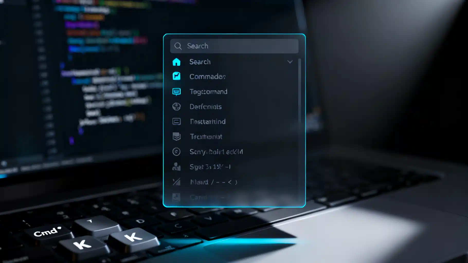
Image used for representation purposes only.
Why a command palette belongs in your React app
A command palette is a fast, keyboard‑first launcher for actions—think of the one in VS Code, Figma, or Notion. It helps power users stay in flow, reduces navigation friction for everyone, and centralizes infrequent commands that don’t deserve precious UI real estate. In this article, we’ll design and implement a robust, accessible, and high‑performance command palette for React, with TypeScript examples, fuzzy search, keyboard navigation, and extensibility built in.
UX and accessibility requirements
Before coding, lock down the experience:
- Quick invoke: Cmd/Ctrl+K opens the palette from anywhere.
- Fluid search: Instant fuzzy filtering with typo tolerance and keyword support.
- Keyboard native: Arrow keys to move, Enter to execute, Esc to close; shortcuts visible.
- Accessible by default: Proper roles (dialog, combobox, listbox, option), labels, focus management, and ARIA states.
- Snappy at scale: Handle hundreds to thousands of commands without jank (debounce, memoization, virtualization).
- Extensible: Allow feature teams to register commands dynamically with grouping and permissions.
Data model for commands
We’ll define a single, typed shape for every action so it can be indexed, searched, rendered, and invoked consistently.
export type Command = {
  id: string;
  title: string;
  subtitle?: string;
  keywords?: string[]; // extra terms for search
  group?: string;      // e.g., "Navigation", "Project", "Admin"
  shortcut?: string[]; // e.g., ["G", "P"] to show ⇧+G,P hint
  icon?: React.ReactNode;
  perform: () => void | Promise<void>; // can be async
};
Index fields you’ll search against into a single normalized string:
export function buildHaystack(cmd: Command): string {
  const parts = [cmd.title, cmd.subtitle, ...(cmd.keywords ?? [])]
    .filter(Boolean)
    .join(" ");
  return parts.toLocaleLowerCase();
}
A tiny fuzzy search that feels good
You can pull in a library like Fuse.js, but a compact custom scorer is often enough. This implementation rewards sequential matches and small gaps while tolerating typos.
export type Match = { score: number; positions: number[] };

export function fuzzyMatch(query: string, target: string): Match | null {
  if (!query) return { score: 0, positions: [] };
  query = query.toLocaleLowerCase();
  target = target.toLocaleLowerCase();

  let qi = 0;
  let score = 0;
  const pos: number[] = [];
  let streak = 0;

  for (let ti = 0; ti < target.length && qi < query.length; ti++) {
    if (target[ti] === query[qi]) {
      pos.push(ti);
      qi++;
      streak++;
      score += 5 + Math.min(streak, 3); // reward streaks
    } else if (streak > 0) {
      score -= 1; // penalize gaps
      streak = 0;
    }
  }

  if (qi < query.length) return null; // not all chars matched

  // bonus: earlier matches and shorter targets rank higher
  score += Math.max(0, 10 - (pos[0] ?? 10));
  score += Math.max(0, 10 - Math.floor(target.length / 10));
  return { score, positions: pos };
}
For performance with large lists, precompute each command’s haystack and cache results by query.
Palette state and registration
Use a lightweight registry so features can register/unregister commands at runtime.
import React from 'react';

export type Registry = {
  commands: Command[];
  register: (cmds: Command[]) => () => void; // returns unsubscriber
};

const CommandContext = React.createContext<Registry | null>(null);

export function CommandProvider({ children }: { children: React.ReactNode }) {
  const [commands, setCommands] = React.useState<Command[]>([]);

  const register = React.useCallback((cmds: Command[]) => {
    setCommands(prev => {
      const map = new Map(prev.map(c => [c.id, c]));
      cmds.forEach(c => map.set(c.id, c));
      return Array.from(map.values());
    });
    return () => setCommands(prev => prev.filter(c => !cmds.some(x => x.id === c.id)));
  }, []);

  const value = React.useMemo(() => ({ commands, register }), [commands, register]);
  return <CommandContext.Provider value={value}>{children}</CommandContext.Provider>;
}

export function useCommandRegistry() {
  const ctx = React.useContext(CommandContext);
  if (!ctx) throw new Error('useCommandRegistry must be used within CommandProvider');
  return ctx;
}
Opening the palette with a global shortcut
Listen at the document level for Cmd/Ctrl+K. Respect form fields and system modifiers.
export function usePaletteHotkey(onToggle: () => void) {
  React.useEffect(() => {
    function onKeyDown(e: KeyboardEvent) {
      const isMac = navigator.platform.toLowerCase().includes('mac');
      const cmd = isMac ? e.metaKey : e.ctrlKey;
      if (cmd && !e.shiftKey && !e.altKey && e.key.toLowerCase() === 'k') {
        // Avoid triggering while typing in an input with modifiers
        const el = document.activeElement as HTMLElement | null;
        const tag = el?.tagName?.toLowerCase();
        const isTyping = tag === 'input' || tag === 'textarea' || el?.isContentEditable;
        if (!isTyping) {
          e.preventDefault();
          onToggle();
        }
      }
    }
    window.addEventListener('keydown', onKeyDown);
    return () => window.removeEventListener('keydown', onKeyDown);
  }, [onToggle]);
}
The CommandPalette component
We’ll build an accessible dialog that contains a combobox and listbox. To keep the example focused, we’ll implement a simple focus trap and recommend swapping in a battle‑tested trap for production.
import React from 'react';

type Props = { isOpen: boolean; onClose: () => void };

export function CommandPalette({ isOpen, onClose }: Props) {
  const { commands } = useCommandRegistry();
  const [query, setQuery] = React.useState('');
  const [active, setActive] = React.useState(0);
  const inputRef = React.useRef<HTMLInputElement>(null);
  const listId = React.useId();
  const labelId = React.useId();

  const indexed = React.useMemo(() =>
    commands.map(c => ({ cmd: c, hay: buildHaystack(c) })),
  [commands]);

  const results = React.useMemo(() => {
    const q = query.trim();
    const scored = indexed
      .map(x => ({ x, m: fuzzyMatch(q, x.hay) }))
      .filter(r => r.m)
      .sort((a, b) => (b.m!.score - a.m!.score))
      .slice(0, 200); // cap results for speed
    return scored.map(r => ({ cmd: r.x.cmd, match: r.m! }));
  }, [indexed, query]);

  React.useEffect(() => { if (isOpen) setTimeout(() => inputRef.current?.focus(), 0); }, [isOpen]);
  React.useEffect(() => setActive(0), [query, isOpen]);

  React.useEffect(() => {
    function onKeyDown(e: KeyboardEvent) {
      if (!isOpen) return;
      const max = results.length - 1;
      if (e.key === 'Escape') { e.preventDefault(); onClose(); }
      else if (e.key === 'ArrowDown') { e.preventDefault(); setActive(a => Math.min(a + 1, max)); }
      else if (e.key === 'ArrowUp') { e.preventDefault(); setActive(a => Math.max(a - 1, 0)); }
      else if (e.key === 'Enter') { e.preventDefault(); results[active]?.cmd.perform(); onClose(); }
    }
    window.addEventListener('keydown', onKeyDown);
    return () => window.removeEventListener('keydown', onKeyDown);
  }, [isOpen, results, active, onClose]);

  if (!isOpen) return null;

  return (
    <div className="cp-backdrop" role="dialog" aria-modal="true" aria-labelledby={labelId} onClick={onClose}>
      <div className="cp-panel" onClick={e => e.stopPropagation()}>
        <h2 id={labelId} className="sr-only">Command Palette</h2>
        <div className="cp-input-row">
          <input
            ref={inputRef}
            className="cp-input"
            role="combobox"
            aria-autocomplete="list"
            aria-controls={listId}
            aria-expanded={true}
            placeholder="Type a command or search…"
            value={query}
            onChange={e => setQuery(e.target.value)}
          />
          <kbd className="cp-hint">Esc</kbd>
        </div>
        <ul id={listId} role="listbox" className="cp-list" aria-label="Command results">
          {results.length === 0 && (
            <li className="cp-empty">No results</li>
          )}
          {results.map(({ cmd }, i) => (
            <li
              key={cmd.id}
              role="option"
              aria-selected={i === active}
              className={i === active ? 'cp-item active' : 'cp-item'}
              onMouseEnter={() => setActive(i)}
              onClick={() => { cmd.perform(); onClose(); }}
            >
              {cmd.icon && <span className="cp-icon">{cmd.icon}</span>}
              <div className="cp-text">
                <div className="cp-title">{cmd.title}</div>
                {cmd.subtitle && <div className="cp-subtitle">{cmd.subtitle}</div>}
              </div>
              {cmd.shortcut && (
                <div className="cp-shortcut">
                  {cmd.shortcut.map((k, idx) => <kbd key={idx}>{k}</kbd>)}
                </div>
              )}
            </li>
          ))}
        </ul>
      </div>
    </div>
  );
}
Notes:
- The backdrop uses click‑to‑close. Pressing Esc also closes.
- For a production focus trap, integrate a small utility like focus‑trap or use the native dialog element plus inert styles.
Minimal styles and theming
CSS variables make theming trivial. Add gentle motion for perceived performance.
.cp-backdrop { position: fixed; inset: 0; background: color-mix(in oklab, black 50%, transparent); display: grid; place-items: start center; padding-top: 10vh; z-index: 1000; }
.cp-panel { width: min(720px, 92vw); background: var(--cp-bg, #111); color: var(--cp-fg, #eee); border: 1px solid var(--cp-border, #2a2a2a); border-radius: 12px; box-shadow: 0 20px 60px rgba(0,0,0,.5); overflow: hidden; animation: cp-in .12s ease-out; }
.cp-input-row { display: flex; align-items: center; gap: 8px; padding: 12px 12px 8px; border-bottom: 1px solid var(--cp-border, #2a2a2a); }
.cp-input { flex: 1; background: transparent; color: inherit; border: 0; outline: none; font: inherit; padding: 10px; }
.cp-hint { opacity: .6; border: 1px solid var(--cp-border, #2a2a2a); border-radius: 6px; padding: 2px 6px; font-size: .8rem; }
.cp-list { max-height: 60vh; overflow: auto; padding: 6px; margin: 0; list-style: none; }
.cp-item { display: grid; grid-template-columns: 24px 1fr auto; align-items: center; gap: 10px; padding: 10px 8px; border-radius: 8px; cursor: pointer; }
.cp-item.active { background: color-mix(in oklab, var(--cp-accent, #3b82f6) 20%, transparent); }
.cp-icon { opacity: .9; }
.cp-title { font-weight: 600; }
.cp-subtitle { font-size: .85rem; opacity: .7; }
.cp-shortcut kbd { margin-left: 6px; border: 1px solid var(--cp-border, #2a2a2a); border-bottom-width: 2px; border-radius: 6px; padding: 2px 6px; font-size: .8rem; }
.cp-empty { padding: 16px; opacity: .7; }
@keyframes cp-in { from { transform: translateY(8px); opacity: 0 } to { transform: translateY(0); opacity: 1 } }
.sr-only { position: absolute; width: 1px; height: 1px; padding: 0; margin: -1px; overflow: hidden; clip: rect(0,0,0,0); white-space: nowrap; border: 0; }
Registering commands in features
Wrap your app with the provider and register commands where they live.
function ProjectsFeature() {
  const { register } = useCommandRegistry();

  React.useEffect(() => {
    const unreg = register([
      {
        id: 'nav-projects',
        title: 'Go to Projects',
        subtitle: 'Jump to the projects dashboard',
        group: 'Navigation',
        keywords: ['dashboard', 'work'],
        shortcut: ['G', 'P'],
        perform: () => navigate('/projects'),
      },
      {
        id: 'create-project',
        title: 'Create Project',
        group: 'Project',
        keywords: ['new', 'add'],
        perform: () => openProjectCreateModal(),
      },
    ]);
    return unreg;
  }, [register]);

  return null;
}
Mount the palette once near the root and tie it to the global hotkey:
function AppShell() {
  const [open, setOpen] = React.useState(false);
  usePaletteHotkey(() => setOpen(o => !o));
  return (
    <CommandProvider>
      <ProjectsFeature />
      {/* …other features that register commands… */}
      <CommandPalette isOpen={open} onClose={() => setOpen(false)} />
    </CommandProvider>
  );
}
Highlighting matches
Use the positions returned by fuzzyMatch to emphasize matched letters. This tiny helper renders spans for you.
function Highlight({ text, positions }: { text: string; positions: number[] }) {
  const parts: React.ReactNode[] = [];
  let last = 0;
  const set = new Set(positions);
  for (let i = 0; i < text.length; i++) {
    const ch = text[i];
    if (set.has(i)) {
      if (i > last) parts.push(<span key={last}>{text.slice(last, i)}</span>);
      parts.push(<mark key={i}>{ch}</mark>);
      last = i + 1;
    }
  }
  if (last < text.length) parts.push(<span key={last}>{text.slice(last)}</span>);
  return <>{parts}</>;
}
Swap the title element in the list item with:
<div className="cp-title"><Highlight text={cmd.title} positions={match.positions} /></div>
Performance tips for large command sets
- Precompute haystacks: Build once per command and memoize.
- Debounce input: 50–100 ms is enough to batch keystrokes without feeling laggy.
- Virtualize long lists: Plug in react-window or react-virtual for thousands of rows.
- Web workers: For extreme sizes, move scoring to a worker and postMessage results back.
- Cache by query prefix: Reuse previous results when users type additional characters.
Accessibility checklist
- Dialog semantics: role=“dialog” with aria-modal=“true” and a programmatic label.
- Combobox pattern: input with role=“combobox”, aria-expanded, aria-controls linking to the listbox.
- List semantics: role=“listbox” and role=“option” for rows, with aria-selected on the active item.
- Focus: Send focus to the input on open. Trap focus within the dialog while open. Restore focus to the invoker on close.
- Contrast and motion: Meet WCAG contrast; respect prefers-reduced-motion for animations.
- Screen reader hints: Provide an instructive placeholder and an invisible h2 label.
Async and conditional commands
Some actions are inherently async (e.g., “Invite user” triggers a network call). Support promises in perform and consider visual feedback:
- Disable the palette while invoking to prevent double triggers.
- Close the palette immediately for navigation, or keep it open while showing a progress indicator for long tasks.
- Conditionally register commands based on permissions, feature flags, or current route.
Grouping, sections, and nested palettes
- Group commands with a group field and render section headers.
- Use prefixes for modes, e.g., “>” for commands vs plain text for search.
- For nested flows (e.g., “Change theme” → list of themes), either push a new temporary command set or filter by a group key.
Testing the palette
- Unit test the fuzzy scorer with a range of inputs, including empty and whitespace‑only queries.
- With React Testing Library, verify that Cmd/Ctrl+K opens the dialog, Esc closes it, and Enter executes the active command.
- Add axe or jest‑axe to catch ARIA errors and insufficient labels early.
When to use a library instead
If you prefer to adopt instead of build, these mature options can save time:
- cmdk: A highly polished, accessible command palette base with primitives and good defaults.
- kbar: Registry‑driven, batteries‑included options for search, groups, and animations.
- Headless approaches: Downshift or Radix primitives to mix and match combobox/listbox semantics with your own styling.
Choosing a library is great when you want consistency and fast iteration; rolling your own can be better for tight bundles, bespoke UX, or deep integration with your app’s state.
Wrap‑up
A command palette pays for itself by streamlining navigation and surfacing power features. With a clear data model, a lightweight fuzzy search, disciplined accessibility, and attention to performance, you can build a palette that feels instantaneous and integrates seamlessly across your React app. Start minimal, lock in the ergonomics, and iterate—your users’ muscle memory will do the rest.
Related Posts
Building a Fast, Accessible React Multi‑Select Dropdown: Patterns, Code, and Pitfalls
Build a fast, accessible React multi-select dropdown: API design, ARIA patterns, code, virtualization, async loading, performance, and testing.

React Skeleton Screen Shimmer Effect: Accessible and Fast
Build an accessible, high-performance React skeleton screen with a polished shimmer effect, plus Suspense integration, theming, and pro tips.
Build an Accessible React Color Picker: A Practical Guide
Build a fast, accessible React color picker from scratch: HSV logic, sliders, popover, keyboard/mouse support, CSS variables, tests, and library options.