
React Phone Input with Country Codes: Best Practices, Code, and A11y
Build a robust React phone input with country codes: E.164 storage, validation, accessibility, i18n, performance, and TypeScript examples.
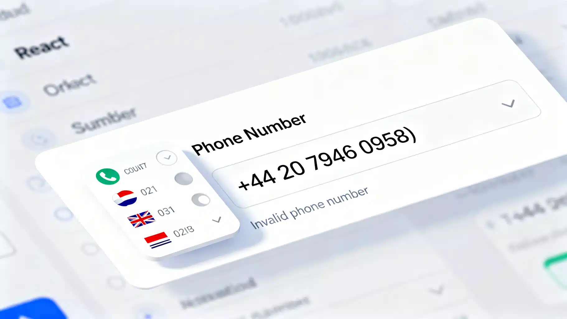
Image used for representation purposes only.
Overview
Designing a great phone number input in React is deceptively hard. You have to juggle formatting as-you-type, international country codes, validation against real-world numbering plans, accessibility, localization, and performance. This guide walks you through best practices and concrete implementations—from choosing a library to building a robust component with TypeScript, React Hook Form, and libphonenumber-js—so you can ship a production-ready phone input that works worldwide.
What “good” looks like
A high-quality phone input should:
- Store numbers in E.164 format (e.g., +14155552671) for consistency.
- Auto-format as the user types based on the selected country.
- Validate against real numbering plans (not just length).
- Offer a searchable country selector with flags and dial codes.
- Respect accessibility (labels, roles, keyboard navigation, ARIA states).
- Support localization of country names and right-to-left (RTL) layouts.
- Be performant (lazy metadata, virtualized lists) and SSR-safe.
- Allow form-library integration and server-side revalidation.
Build vs. buy
You have three common approaches:
- Lightweight: input type=“tel” + minimal pattern. Fastest to ship but weak validation/formatting.
- Library combo: react-phone-number-input (UI) + libphonenumber-js (metadata/logic). A strong balance for most apps.
- Custom: build your own UI around libphonenumber-js. Maximum control, more effort.
If you need a fast, proven solution, start with react-phone-number-input. If you have strict design or a11y needs, a custom wrapper is straightforward once you understand the pieces.
Data and standards you must know
- E.164: canonical international format to store phone numbers.
- libphonenumber-js: a popular port of Google’s libphonenumber for parsing, formatting, and validation.
- Country metadata sizes: “min”, “mobile”, and “max/full” affect bundle size and validation fidelity.
Designing a clean component API
Plan a clear interface so you can swap internals later without breaking consumers:
- value: string | undefined — E.164 string like “+14155552671”.
- onChange: (value?: string, meta?: ParsedMeta) => void — meta can include country, type, isPossible, isValid.
- defaultCountry: ISO 3166-1 alpha-2 (e.g., “US”).
- preferredCountries?: string[] — e.g., [“US”,“GB”,“CA”].
- allowedCountries?: string[] — restrict the menu.
- placeholder?: string — localized.
- disabled?: boolean; required?: boolean.
- error?: string — for a11y and visual feedback.
- onCountryChange?: (iso2: string) => void.
Quick win: using react-phone-number-input
react-phone-number-input pairs nicely with libphonenumber-js and handles a lot for you.
npm i react-phone-number-input libphonenumber-js
Basic usage with TypeScript:
import React, { useState } from 'react'
import PhoneInput, { isValidPhoneNumber } from 'react-phone-number-input'
import 'react-phone-number-input/style.css'

export function PhoneField() {
  const [value, setValue] = useState<string | undefined>() // E.164 like +1415...

  return (
    <div>
      <label htmlFor="phone">Phone</label>
      <PhoneInput
        id="phone"
        placeholder="Enter phone number"
        value={value}
        onChange={setValue}
        defaultCountry="US"
        international
        countryCallingCodeEditable={false}
      />
      {value && !isValidPhoneNumber(value) && (
        <p role="alert" style={{ color: 'crimson' }}>Invalid phone number</p>
      )}
    </div>
  )
}
With React Hook Form (RHF):
import { useForm, Controller } from 'react-hook-form'
import PhoneInput, { isValidPhoneNumber } from 'react-phone-number-input'

type FormValues = { phone?: string }

export function SignupForm() {
  const { control, handleSubmit, formState: { errors } } = useForm<FormValues>()

  const onSubmit = (data: FormValues) => {
    // Send E.164 to your backend
    console.log(data.phone)
  }

  return (
    <form onSubmit={handleSubmit(onSubmit)}>
      <Controller
        name="phone"
        control={control}
        rules={{
          validate: (value) => !value || isValidPhoneNumber(value) || 'Enter a valid phone number',
        }}
        render={({ field }) => (
          <div>
            <label htmlFor="phone">Mobile number</label>
            <PhoneInput id="phone" {...field} defaultCountry="US" />
            {errors.phone && (
              <span role="alert" style={{ color: 'crimson' }}>{errors.phone.message}</span>
            )}
          </div>
        )}
      />
      <button type="submit">Continue</button>
    </form>
  )
}
Pros of this approach:
- Solid defaults and UX out of the box.
- E.164 values by default, validation helpers included.
- Easy integration with form libraries.
Rolling your own with libphonenumber-js
If you need a custom dropdown, special keyboard interactions, or a bespoke look, pair a country selector with a text input and wire them with libphonenumber-js.
npm i libphonenumber-js
A minimal TypeScript implementation:
import React, { useId, useMemo, useState } from 'react'
import { AsYouType, parsePhoneNumberFromString, isValidNumberForRegion } from 'libphonenumber-js'

type CountryOption = { iso2: string; dialCode: string; name: string }

// Example: load only what you need. Consider lazy-loading a larger list on dropdown open.
const BASE_COUNTRIES: CountryOption[] = [
  { iso2: 'US', dialCode: '1', name: 'United States' },
  { iso2: 'GB', dialCode: '44', name: 'United Kingdom' },
  { iso2: 'CA', dialCode: '1', name: 'Canada' },
  { iso2: 'DE', dialCode: '49', name: 'Germany' },
]

interface PhoneInputProps {
  value?: string // E.164 e.g. +14155552671
  onChange: (v?: string) => void
  defaultCountry?: string
  countries?: CountryOption[]
  placeholder?: string
  disabled?: boolean
  error?: string
}

export function PhoneInputCountry({
  value,
  onChange,
  defaultCountry = 'US',
  countries = BASE_COUNTRIES,
  placeholder = 'Enter phone number',
  disabled,
  error,
}: PhoneInputProps) {
  const id = useId()
  const [country, setCountry] = useState(defaultCountry)
  const [display, setDisplay] = useState<string>('')

  // When E.164 value comes from outside, show a national format for the selected country if possible
  useMemo(() => {
    if (!value) { setDisplay(''); return }
    const p = parsePhoneNumberFromString(value)
    if (p) {
      setCountry(p.country || defaultCountry)
      setDisplay(p.formatNational())
    }
  }, [value])

  const selected = countries.find(c => c.iso2 === country) || countries[0]

  function handleTyped(input: string) {
    setDisplay(input)
    const ayt = new AsYouType(country as any)
    const formatted = ayt.input(input)
    // Optionally reflect formatted text back to the UI
    // setDisplay(formatted)

    // Try to parse to E.164
    const parsed = parsePhoneNumberFromString(formatted, country as any)
    if (parsed && parsed.isValid()) {
      onChange(parsed.number) // E.164, e.g. +14155552671
    } else {
      onChange(undefined)
    }
  }

  return (
    <div>
      <label htmlFor={id}>Phone</label>
      <div style={{ display: 'flex', gap: 8 }}>
        <div role="combobox" aria-expanded="false" aria-controls={`${id}-list`}>
          <select
            aria-label="Country"
            value={country}
            onChange={(e) => setCountry(e.target.value)}
            disabled={disabled}
          >
            {countries.map(c => (
              <option key={c.iso2} value={c.iso2}>
                +{c.dialCode} {c.name}
              </option>
            ))}
          </select>
        </div>
        <input
          id={id}
          type="tel"
          inputMode="tel"
          autoComplete="tel"
          placeholder={placeholder}
          value={display}
          onChange={(e) => handleTyped(e.target.value)}
          aria-invalid={!!error}
          aria-describedby={error ? `${id}-error` : undefined}
          disabled={disabled}
        />
      </div>
      {error && (
        <p id={`${id}-error`} role="alert" style={{ color: 'crimson' }}>{error}</p>
      )}
    </div>
  )
}
Notes:
- AsYouType provides region-aware formatting while the user types.
- Always send E.164 upstream via onChange. Keep display state separate.
- Consider lazy-loading a full country list and metadata only when the dropdown opens to keep initial bundles small.
Localizing country names
You can localize country labels using Intl.DisplayNames:
const regionNames = new Intl.DisplayNames(['fr'], { type: 'region' })
const nameInFrench = regionNames.of('DE') // "Allemagne"
Inject these into your options so the dropdown and search respect the user’s locale. For RTL languages, set dir=“rtl” at the container and ensure your CSS mirrors paddings and icons.
Accessibility essentials
- Label the input, not just the dropdown. Use htmlFor + id.
- Expose errors via role=“alert” and aria-describedby.
- For the country control, use the native select for free a11y, or if you custom-build, apply role=“combobox” + listbox semantics, keyboard navigation, and focus outlines.
- Visible focus states and 44×44px touch targets improve mobile usability.
- Don’t rely solely on flag icons; include country names for screen readers.
Performance and bundle size
- Choose libphonenumber-js metadata wisely: “min” for core + only the countries you need, “mobile” or “full” when accuracy matters for many regions. You can dynamically import the heavier metadata only when the user opens the dropdown.
- Virtualize long country lists with react-window or react-virtualized.
- Prefer SVG flag sprites over many individual images; or use emoji flags with a fallback font.
- Debounce expensive parsing on each keystroke (AsYouType is already optimized, but you can still debounce validation).
- Server-render safely; if a dependency expects window, dynamically import it on the client.
Example dynamic import in Next.js:
import dynamic from 'next/dynamic'
const PhoneInput = dynamic(() => import('../components/PhoneInputCountry'), { ssr: false })
Validation and storage
- Client-side: format-as-you-type + “isValid” checks improve UX.
- Server-side: always re-validate and re-normalize to E.164 before persisting. Never trust client input.
- Store only E.164; derive display formats per request/locale. This avoids migration pain when rules change.
- Mask analytics logs; phone numbers are PII. Redact or hash before logging.
Default country strategy
- Use the user’s saved profile country if available.
- Fall back to Accept-Language (e.g., en-US → US). If you consider IP-based geolocation, ask for consent and always allow manual override.
- Prepend preferredCountries (e.g., user’s region) to the top of the list for speed.
Common edge cases to handle
- National prefixes (leading zeros) that should not be stripped from local formatting but won’t appear in E.164.
- Shared country calling codes (e.g., NANP +1 for US/CA/others). Region matters for formatting.
- Changing numbering plans: keeping libphonenumber metadata up to date ensures new lengths/ranges validate correctly.
- Copy/paste with spaces, dots, and dashes—strip and reformat.
- International users typing “00” for +; normalize to +.
Testing checklist
Unit tests:
- Parsing: valid → E.164; invalid → undefined.
- Country switching keeps E.164 value stable but changes display format.
- As-you-type formatting doesn’t corrupt caret position on insert/delete.
- RTL snapshot with Arabic/Hebrew locales.
E2E tests (Playwright/Cypress):
- Keyboard-only use: open country list, filter, select, type number.
- Screen reader smoke test: ARIA labels/roles present; errors announced.
- Mobile viewports: tap targets and scrolling behavior.
Example Jest test for validation logic:
import { parsePhoneNumberFromString } from 'libphonenumber-js'

test('returns E.164 for valid US number', () => {
  const p = parsePhoneNumberFromString('(415) 555-2671', 'US')
  expect(p?.isValid()).toBe(true)
  expect(p?.number).toBe('+14155552671')
})
Styling tips
- Keep country code visually distinct (monospace for dial code helps readability).
- Show the selected country’s flag as a non-essential affordance; ensure the country name is visible for clarity.
- Use inputMode=“tel” and autocomplete=“tel” for better mobile keyboards.
- Provide clear error text and don’t block users until they blur the field (validate on submit or after a pause).
Putting it all together: a production checklist
- Stores E.164 only; displays localized national format.
- Validates with libphonenumber-js; revalidates on server.
- Accessible labels, roles, errors; keyboard friendly.
- Localized country names; RTL-safe.
- Lazy metadata and virtualized dropdown; SSR-safe imports.
- Preferred countries and search; copy/paste resilient.
- Tested across browsers/devices; analytics redaction in place.
Conclusion
A polished React phone input is a small feature with outsized impact on onboarding and conversion. By anchoring on E.164, leveraging libphonenumber-js for correctness, and paying attention to accessibility and performance, you’ll deliver a control that feels effortless to users across the world—while keeping your data clean and your codebase adaptable.
Related Posts

React Breadcrumbs: A Practical Guide to Router Integration
Build an accessible, dynamic React Breadcrumbs component and integrate it with React Router using useLocation and useMatches.

Building a Fast, Accessible React Autocomplete with Search Suggestions
Build a fast, accessible React autocomplete with debounced fetch, ARIA, keyboard support, caching, and virtualization—complete with TypeScript code.

Build a Fast, Accessible React Notification Bell Dropdown (with Real‑Time Updates)
Build an accessible, real-time React notification bell dropdown with unread badges, keyboard support, virtualization, and robust data handling.