Building an Accessible React Tabs Component (with TypeScript)
Build an accessible React Tabs component with correct ARIA roles, roving tabindex, keyboard support, and a clean API. Includes TypeScript code.
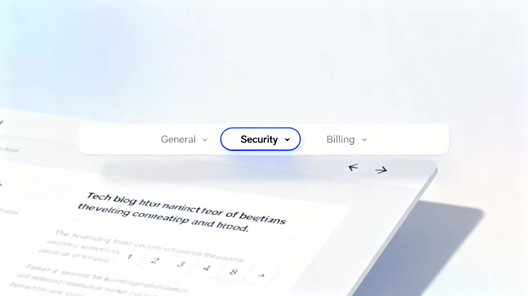
Image used for representation purposes only.
Why Accessible Tabs Matter
Tabs are a familiar pattern for organizing related content without forcing a page reload or long scrolling. But tabs are also easy to get wrong from an accessibility perspective. Screen reader users, keyboard-only users, and users with cognitive or motion sensitivities depend on predictable structure, correct ARIA roles, and robust keyboard interaction. In this article, you’ll learn how to build an accessible, production-ready Tabs component in React that follows the WAI-ARIA Authoring Practices while remaining ergonomic for developers.
Accessibility Requirements at a Glance
A conformant Tabs widget should:
- Present a container with role=“tablist” and one or more elements with role=“tab”.
- Associate each tab with a corresponding panel element with role=“tabpanel” via id/aria-controls and aria-labelledby.
- Indicate the active tab with aria-selected=“true” and set other tabs to aria-selected=“false”.
- Manage focus using roving tabindex: only one tab is tabbable (tabIndex=0), others are not (tabIndex=-1).
- Support keyboard interaction: Left/Right (and optionally Up/Down for vertical), Home, End to move focus; Enter/Space to activate a tab in “manual” mode; automatic activation when navigating in “auto” mode.
- Hide inactive panels from the accessibility tree and visual layout (e.g., hidden attribute), but ensure activation doesn’t trap focus.
Designing the Component API
A clean API makes accessible behavior easy by default.
Recommended props:
- Tabs
- defaultIndex?: number — uncontrolled initial selection.
- index?: number — controlled selection.
- onIndexChange?: (index: number) => void — controlled updates.
- orientation?: ‘horizontal’ | ‘vertical’ — sets keyboard behavior and aria-orientation on the tablist.
- activationMode?: ‘auto’ | ‘manual’ — whether arrow keys immediately select or only move focus until Enter/Space.
- id?: string — optional base id (for SSR/testing).
- TabList — wraps Tab children; sets role and orientation.
- Tab — a single trigger; supports disabled.
- TabPanels — wraps TabPanel children; keeps order aligned with TabList.
- TabPanel — the associated content region.
Implementation (TypeScript + Hooks)
Below is a compact but complete implementation that follows the ARIA pattern, supports manual/auto activation, and works with both controlled and uncontrolled usage.
import React from 'react';

// —————————————————————————————————————————
// Context and Types
// —————————————————————————————————————————

type Orientation = 'horizontal' | 'vertical';
type ActivationMode = 'auto' | 'manual';

interface TabsContextValue {
  selectedIndex: number;
  setSelectedIndex: (i: number) => void;
  focusIndex: number;
  setFocusIndex: (i: number) => void;
  orientation: Orientation;
  activationMode: ActivationMode;
  baseId: string;
  isTabDisabled: (i: number) => boolean;
}

const TabsCtx = React.createContext<TabsContextValue | null>(null);

function useTabsCtx() {
  const ctx = React.useContext(TabsCtx);
  if (!ctx) throw new Error('Tabs components must be used within <Tabs>');
  return ctx;
}

// —————————————————————————————————————————
// Tabs Root
// —————————————————————————————————————————

interface TabsProps {
  defaultIndex?: number;
  index?: number;
  onIndexChange?: (i: number) => void;
  orientation?: Orientation;
  activationMode?: ActivationMode;
  id?: string; // base id
  children: React.ReactNode;
}

export function Tabs({
  defaultIndex = 0,
  index,
  onIndexChange,
  orientation = 'horizontal',
  activationMode = 'auto',
  id,
  children,
}: TabsProps) {
  const reactId = (React as any).useId ? (React as any).useId() : 'rt-' + Math.random().toString(36).slice(2);
  const baseId = id ?? `tabs-${reactId}`;

  const isControlled = index != null;
  const [uncontrolledIndex, setUncontrolledIndex] = React.useState(defaultIndex);
  const selectedIndex = isControlled ? (index as number) : uncontrolledIndex;
  const setSelectedIndex = (i: number) => {
    if (!isControlled) setUncontrolledIndex(i);
    onIndexChange?.(i);
  };

  // Keep a separate focusIndex for roving tabindex
  const [focusIndex, setFocusIndex] = React.useState(selectedIndex);
  React.useEffect(() => setFocusIndex(selectedIndex), [selectedIndex]);

  // For disabled logic (TabList will register them)
  const disabledSetRef = React.useRef<Set<number>>(new Set());
  const isTabDisabled = (i: number) => disabledSetRef.current.has(i);

  return (
    <TabsCtx.Provider
      value={{ selectedIndex, setSelectedIndex, focusIndex, setFocusIndex, orientation, activationMode, baseId, isTabDisabled }}
    >
      {/* Hidden node to expose registration API to TabList */}
      <TabRegistryContext.Provider value={disabledSetRef.current}>
        {children}
      </TabRegistryContext.Provider>
    </TabsCtx.Provider>
  );
}

// —————————————————————————————————————————
// Registration for disabled tabs (simple pattern)
// —————————————————————————————————————————

const TabRegistryContext = React.createContext<Set<number> | null>(null);
function useTabRegistry() {
  const set = React.useContext(TabRegistryContext);
  if (!set) throw new Error('Tab components must be within <Tabs>');
  return set;
}

// —————————————————————————————————————————
// TabList (clones children with index)
// —————————————————————————————————————————

interface TabListProps {
  children: React.ReactNode;
  className?: string;
}

export function TabList({ children, className }: TabListProps) {
  const { orientation } = useTabsCtx();
  const tabs = React.Children.toArray(children);
  return (
    <div role="tablist" aria-orientation={orientation} className={className}>
      {tabs.map((child, i) => (React.isValidElement(child) ? React.cloneElement(child, { index: i }) : child))}
    </div>
  );
}

// —————————————————————————————————————————
// Tab
// —————————————————————————————————————————

interface TabProps extends React.ButtonHTMLAttributes<HTMLButtonElement> {
  children: React.ReactNode;
  index?: number; // injected by TabList
  disabled?: boolean;
}

export function Tab({ children, index = 0, disabled, ...rest }: TabProps) {
  const {
    selectedIndex,
    setSelectedIndex,
    focusIndex,
    setFocusIndex,
    orientation,
    activationMode,
    baseId,
    isTabDisabled,
  } = useTabsCtx();

  const registry = useTabRegistry();
  React.useEffect(() => {
    if (disabled) registry.add(index); else registry.delete(index);
    return () => registry.delete(index);
  }, [disabled, index, registry]);

  const isSelected = index === selectedIndex;
  const isFocused = index === focusIndex;
  const tabId = `${baseId}-tab-${index}`;
  const panelId = `${baseId}-panel-${index}`;

  const ref = React.useRef<HTMLButtonElement>(null);
  React.useEffect(() => {
    if (isFocused) ref.current?.focus();
  }, [isFocused]);

  function nextEnabled(start: number, dir: 1 | -1) {
    const limit = 200; // guard against infinite loops
    let i = start;
    for (let step = 0; step < limit; step++) {
      i = i + dir;
      if (i < 0) i = start; // stop at first cycle backward
      if (isTabDisabled(i)) continue;
      return i;
    }
    return start;
  }

  const onKeyDown = (e: React.KeyboardEvent) => {
    const horizontal = orientation === 'horizontal';
    const key = e.key;
    const rtl = false; // add RTL detection if needed

    const move = (dir: 1 | -1) => {
      e.preventDefault();
      const computedDir = rtl && horizontal ? (dir === 1 ? -1 : 1) : dir;
      const target = nextEnabled(index, computedDir);
      setFocusIndex(target);
      if (activationMode === 'auto') setSelectedIndex(target);
    };

    switch (key) {
      case 'ArrowRight': if (horizontal) move(1); break;
      case 'ArrowLeft': if (horizontal) move(-1); break;
      case 'ArrowDown': if (!horizontal) move(1); break;
      case 'ArrowUp': if (!horizontal) move(-1); break;
      case 'Home': e.preventDefault(); setFocusIndex(0); if (activationMode==='auto') setSelectedIndex(0); break;
      case 'End': e.preventDefault(); {
        const last = Number.MAX_SAFE_INTEGER; // nextEnabled will clamp
        setFocusIndex(last); if (activationMode==='auto') setSelectedIndex(last); break;
      }
      case 'Enter':
      case ' ': // Space
        if (activationMode === 'manual') { e.preventDefault(); setSelectedIndex(index); }
        break;
    }
  };

  return (
    <button
      {...rest}
      ref={ref}
      role="tab"
      id={tabId}
      aria-controls={panelId}
      aria-selected={isSelected}
      aria-disabled={disabled || undefined}
      tabIndex={disabled ? -1 : isFocused ? 0 : -1}
      disabled={disabled}
      onClick={(e) => { rest.onClick?.(e); if (!disabled) setSelectedIndex(index); }}
      onKeyDown={onKeyDown}
      type="button"
    >
      {children}
    </button>
  );
}

// —————————————————————————————————————————
// TabPanels + TabPanel
// —————————————————————————————————————————

interface TabPanelsProps { children: React.ReactNode; }
export function TabPanels({ children }: TabPanelsProps) {
  const panels = React.Children.toArray(children);
  return <>{panels.map((child, i) => (React.isValidElement(child) ? React.cloneElement(child, { index: i }) : child))}</>;
}

interface TabPanelProps extends React.HTMLAttributes<HTMLDivElement> {
  index?: number; // injected by TabPanels
}

export function TabPanel({ index = 0, children, ...rest }: TabPanelProps) {
  const { selectedIndex, baseId } = useTabsCtx();
  const tabId = `${baseId}-tab-${index}`;
  const panelId = `${baseId}-panel-${index}`;
  const isSelected = selectedIndex === index;

  return (
    <div
      {...rest}
      role="tabpanel"
      id={panelId}
      aria-labelledby={tabId}
      hidden={!isSelected}
      tabIndex={0}
    >
      {children}
    </div>
  );
}
Notes on the implementation:
- The roving tabindex pattern is implemented via focusIndex, which is synchronized with selectedIndex but remains independent in “manual” mode.
- The Tab clones receive an index from TabList so the developer doesn’t have to manage indices.
- Each Tab/Panel pair is linked by id and aria-controls/aria-labelledby.
- We keep a simple disabled registry so arrow navigation can skip disabled tabs.
Example Usage
export function SettingsTabs() {
  return (
    <Tabs defaultIndex={0} activationMode="manual">
      <TabList className="tabs">
        <Tab>General</Tab>
        <Tab>Security</Tab>
        <Tab disabled>Billing</Tab>
      </TabList>
      <TabPanels>
        <TabPanel>
          <h3>General</h3>
          <p>Profile, language, and time zone.</p>
        </TabPanel>
        <TabPanel>
          <h3>Security</h3>
          <p>Two-factor auth and password management.</p>
        </TabPanel>
        <TabPanel>
          <h3>Billing</h3>
          <p>Invoices and payment methods.</p>
        </TabPanel>
      </TabPanels>
    </Tabs>
  );
}
Styling and Motion Considerations
You can style tabs with your utility or CSS-in-JS system. Important considerations:
- Use the [hidden] attribute to visually hide inactive panels and ensure they’re removed from the accessibility tree.
- Provide visible focus states on tabs (e.g., focus ring). Avoid removing outlines unless you replace them meaningfully.
- Respect reduced motion: if you animate panel transitions, gate with a prefers-reduced-motion media query and provide an instant fallback.
Example CSS snippet:
.tabs [role="tab"] { padding: .5rem 1rem; border: 0; background: none; }
.tabs [role="tab"][aria-selected="true"] { border-bottom: 2px solid currentColor; font-weight: 600; }
.tabs [role="tab"]:focus-visible { outline: 2px solid Highlight; outline-offset: 2px; }
[role="tabpanel"][hidden] { display: none; }
@media (prefers-reduced-motion: reduce) {
  .panel-enter, .panel-exit { transition: none !important; }
}
Controlled vs. Uncontrolled
- Uncontrolled: Use defaultIndex to set the initial tab and let the component manage state.
- Controlled: Pass index and onIndexChange to integrate with routers or external state (e.g., sync with URL hash like #tab=security). The component will never update selection on its own in controlled mode; it only requests changes via onIndexChange.
Keyboard Behavior Details
- ArrowLeft/ArrowRight move focus among tabs when orientation is horizontal; ArrowUp/ArrowDown when vertical.
- Home moves focus to the first enabled tab; End to the last enabled tab.
- In “manual” mode, pressing Enter or Space activates the focused tab. In “auto” mode, moving focus with arrows activates automatically.
- Only the focused tab has tabIndex=0; all others are -1 to avoid extra Tab key presses.
Handling Disabled Tabs
- Disabled tabs must be skipped during keyboard navigation.
- aria-disabled=true is communicated; the element should not be focusable.
- Our implementation sets disabled on the button and maintains a registry to skip them.
Async and Heavy Panels
Some panels may fetch data or mount heavy trees. Consider:
- Mount-on-demand: Render only the active panel to reduce initial cost. But ensure focus is not lost; keep a stable tabIndex on the panel.
- Preserve state: If you need to preserve offscreen state, keep all panels mounted but hidden. For large trees, use React.Suspense or virtualization.
Testing Accessibility
Automate confidence with tests:
- Rendering and ARIA attributes
- Each Tab has role=“tab”, correct id, aria-controls, and proper aria-selected.
- The TabList has role=“tablist” and aria-orientation.
- Only one tab has tabIndex=0 at a time.
- Keyboard navigation
- Arrow keys move focus; Home/End jump; Enter/Space activate in manual mode.
- Disabled tabs are skipped.
- AXE/Lighthouse checks
- Run @axe-core/react in development or use cypress-axe in E2E.
Example with React Testing Library (pseudo):
import { render, screen } from '@testing-library/react';
import userEvent from '@testing-library/user-event';

it('moves focus with arrows and activates with Space in manual mode', async () => {
  render(<SettingsTabs />);
  const tabs = screen.getAllByRole('tab');
  await userEvent.tab();
  expect(tabs[0]).toHaveFocus();
  await userEvent.keyboard('{ArrowRight}');
  expect(tabs[1]).toHaveFocus();
  expect(tabs[1]).toHaveAttribute('aria-selected', 'false');
  await userEvent.keyboard(' ');
  expect(tabs[1]).toHaveAttribute('aria-selected', 'true');
});
Common Pitfalls and How to Avoid Them
- Missing relationships: If id/aria-controls and aria-labelledby don’t match, screen readers can’t tie tabs to panels. Always generate deterministic ids.
- Making all tabs tabbable: This forces excessive Tab presses. Use roving tabindex so only one tab is in the tab order.
- Hiding panels incorrectly: visibility:hidden or off-screen CSS may still expose content to assistive tech. Prefer hidden or aria-hidden in tandem with display:none.
- Stealing focus: Don’t send focus to the panel automatically upon activation; per common patterns, keep focus on the tab so users can continue exploring tabs. Offer in-panel focus management only when there’s a strong reason.
- Over-animating: Motion-heavy transitions can disorient users. Respect prefers-reduced-motion.
Performance and DX Tips
- Memoize Tab and TabPanel when content is heavy.
- Defer non-visible panel data fetching until selected where possible, but cache results to avoid refetch loops.
- Provide a small CSS API (data-selected, data-disabled) to style without querying ARIA attributes repeatedly.
Extending the Pattern
- Vertical tabs: Pass orientation=“vertical” and adjust styles to stack tabs in a column.
- RTL support: Flip ArrowLeft/ArrowRight semantics based on document direction.
- Removable tabs: Add close buttons inside tabs; ensure they are not part of the roving set (separate tab stops) and that removal updates indices predictably.
- URL sync: Map indices to slugs (e.g., /settings#security) for shareable deep links.
Conclusion
Building accessible tabs in React is straightforward when you embrace the core ARIA semantics, roving tabindex, and robust keyboard interactions. The implementation above provides a dependable foundation that you can adapt for your design system—supporting manual and auto activation, disabled tabs, and both controlled and uncontrolled usage. With thoughtful testing and motion-sensitive styling, your Tabs will feel polished for everyone.
Related Posts
Building a Robust React Numeric Input Stepper: Accessibility, Precision, and UX
Build an accessible, locale-aware React numeric input stepper with precise stepping, robust parsing, and a production-ready TypeScript component.
Building an Accessible, Animated Expandable Card in React
Build an accessible, animated React expandable card with TypeScript. Covers ARIA, controlled/uncontrolled state, CSS and Framer Motion, and testing.
Building a Production‑Ready React Calendar Scheduling Component
Design and build a production-ready React calendar scheduling component with rich UX, timezone safety, recurrence, and accessibility.