
React Toast vs Snackbar: A Practical Comparison of Popular Libraries
Compare React toast/snackbar libraries—APIs, accessibility, theming, SSR tips, and use‑case picks—with concise code examples.
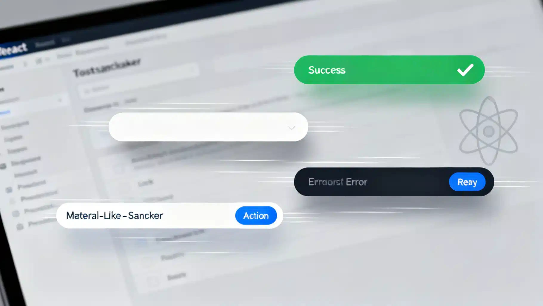
Image used for representation purposes only.
Overview
Toast and snackbar components are small, ephemeral notifications that surface status, feedback, and next steps without hijacking focus. In React apps, they’re often wired to async flows—saving forms, uploading files, handling payments—and they must balance visibility with accessibility. In this article, we compare five popular options: React-Toastify, Notistack (MUI), React Hot Toast, Radix UI Toast, and Sonner.
We’ll look at API ergonomics, accessibility, theming, composition, SSR/Next.js behavior, and performance trade‑offs, then close with concrete “pick this if…” recommendations.
Evaluation criteria
- Accessibility: announces text properly, keyboard support, screen reader behavior, reduced motion.
- API ergonomics: minimal ceremony to show/dismiss, promise helpers, and typed options.
- Theming and customization: dark mode, variants, icons, progress, and layout control.
- Composition: custom content, actions, and integration with your design system.
- Positioning and stacking: viewport management, queueing, and edge cases with portals/z-index.
- SSR/Next.js: client/server boundaries, hydration, and window-safe behavior.
- Performance: rendering strategy, animation cost, and predictable unmounting.
The contenders at a glance
- React-Toastify: feature-rich, “drop‑in” DX with a global container, presets for success/error/info, progress bar, and deep configuration. Good defaults, large ecosystem mindshare.
- Notistack (MUI): a thin ergonomic layer over MUI’s Snackbar. Great if you already use Material UI; integrates theming and variants out of the box.
- React Hot Toast: minimal API with polished defaults and promise helpers. Easy to style with utility CSS. Emphasizes speed and simplicity.
- Radix UI Toast: low-level, accessible primitives for building your own toast system. Max control and a11y; you provide styling and patterns.
- Sonner: modern design, simple API, promise helpers, and sensible defaults. Feels “headless‑but‑polished,” with easy theming and dark mode.
Quick-start examples
Below are minimal usage snippets to illustrate each library’s mental model. Omit imports/styles for brevity where obvious.
React-Toastify
import { ToastContainer, toast } from 'react-toastify';
import 'react-toastify/dist/ReactToastify.css';

function App() {
  return (
    <>
      <button onClick={() => toast.success('Profile saved')}>Save</button>
      <ToastContainer position="top-right" closeOnClick autoClose={3000} />
    </>
  );
}
Notistack (MUI)
import { SnackbarProvider, useSnackbar } from 'notistack';

function SaveButton() {
  const { enqueueSnackbar } = useSnackbar();
  return (
    <button onClick={() => enqueueSnackbar('Profile saved', { variant: 'success' })}>
      Save
    </button>
  );
}

export default function App() {
  return (
    <SnackbarProvider maxSnack={3}>
      <SaveButton />
    </SnackbarProvider>
  );
}
React Hot Toast
import { Toaster, toast } from 'react-hot-toast';

function App() {
  return (
    <>
      <button onClick={() => toast.success('Profile saved')}>Save</button>
      <Toaster position="top-right" />
    </>
  );
}
Radix UI Toast
import * as Toast from '@radix-ui/react-toast';
import { useState } from 'react';

export default function App() {
  const [open, setOpen] = useState(false);
  return (
    <Toast.Provider swipeDirection="right">
      <button onClick={() => setOpen(true)}>Save</button>
      <Toast.Root open={open} onOpenChange={setOpen} className="toast">
        <Toast.Title>Profile saved</Toast.Title>
        <Toast.Action asChild altText="Undo">
          <button>Undo</button>
        </Toast.Action>
      </Toast.Root>
      <Toast.Viewport className="toast-viewport" />
    </Toast.Provider>
  );
}
Sonner
import { Toaster, toast } from 'sonner';

function App() {
  return (
    <>
      <button onClick={() => toast.success('Profile saved')}>Save</button>
      <Toaster position="top-right" />
    </>
  );
}
Accessibility
- Announcements: All contenders expose ARIA-live regions; Radix UI provides primitives that align with WAI‑ARIA patterns, and MUI (via Notistack) follows Material guidelines. For critical errors, prefer “assertive”; for routine updates, “polite.”
- Focus: Toasts shouldn’t steal focus; actions must be keyboard reachable. Radix and MUI give you robust focus handling patterns; the others handle the basics well, but test custom content.
- Timing: Provide enough time to read or allow pausing. Offer close buttons and pause-on-hover. React-Toastify, Sonner, and Hot Toast commonly include this.
- Motion: Respect prefers-reduced-motion for entry/exit animations. Most libraries allow disabling or softening transitions.
Accessibility tips
- Keep messages concise; screen readers announce the entire text.
- If toasts include actions (Undo, Retry), ensure they’re reachable via Tab and labeled with alt text where needed.
- Avoid toasting every keystroke or minor success; it’s noisy and harms a11y.
Theming and customization
- React-Toastify: themable via props and CSS; includes light/dark and progress bars, icons, and className hooks.
- Notistack: inherits MUI theme, color tokens, and variants; aligns perfectly with Material look‑and‑feel.
- React Hot Toast: utility-first friendly; override styles inline or via classNames; minimal default chrome.
- Radix UI Toast: you own the CSS; pair with Tailwind, CSS Modules, or design tokens for a system-level fit.
- Sonner: tasteful defaults with easy color tweaks and dark mode; supports rich content without much boilerplate.
Practical advice
- If your product has a strong design system, Radix UI or Notistack will conform cleanly.
- If you want fast, pretty defaults, Sonner or Hot Toast often gets you there with minimal CSS.
- For maximum preset features (progress, close behavior, drag-to-dismiss), React-Toastify is a strong pick.
API ergonomics and async flows
- Minimal toast: All provide a one-liner like toast.success(‘Saved’).
- Promise toasts: React Hot Toast and Sonner shine with toast.promise; React-Toastify offers similar patterns via update APIs.
- Dismiss/control: Programmatic dismissal is supported everywhere; Notistack returns a key you can close explicitly; Radix uses controlled state.
- Queues and maxSnack: Notistack controls concurrency with maxSnack; others stack in a viewport with sensible defaults and caps.
Example with promises (React Hot Toast / Sonner pattern)
async function handleSave() {
  await toast.promise(saveProfile(), {
    loading: 'Saving…',
    success: 'Profile saved',
    error: 'Could not save',
  });
}
Positioning, stacking, and portals
- Viewports: All expose a “Toaster/Viewport/Container” that portals to the document body to avoid layout shifts.
- Positions: Top-right/bottom-right are common; some support per-toast overrides.
- Stacking: Libraries deduplicate toasts and manage margins to avoid overlap. If you hit z-index conflicts (e.g., modals), raise the viewport z-index.
Edge cases to test
- Modal focus traps: Ensure the toast portal’s z-index sits above modal backdrops, or render inside the modal root if required.
- Mobile safe areas: Add padding for iOS safe areas when positioning at the bottom.
- RTL: Verify positions and slide directions respect dir=“rtl”.
Composition and custom content
- Action buttons: All can render arbitrary JSX as content; Radix/Notistack make action patterns explicit.
- Rich content: Include links, avatars, or progress indicators. Keep it concise; long content becomes intrusive.
- Global vs local: React-Toastify/Hot Toast/Sonner favor a global singleton toaster; Radix encourages scoped, controlled toasts per subtree if you want that level of control.
SSR and Next.js considerations
- Client components: The Toaster/Viewport should render on the client. In Next.js App Router, mark the file ‘use client’ or import dynamically as needed.
- Hydration: Avoid rendering toasts during SSR. Trigger them in effects or event handlers.
- Edge runtimes: No special concerns for the libraries themselves; just ensure any window access occurs client-side.
Implementation tip
- Create a ToastProvider component that mounts your Toaster with project-wide defaults (position, duration, theme). Use this in your layout once.
Performance perspective
- Render cost: Most libraries render a single portal and lightweight items; the main cost is animation and content you add.
- Updates: Promise patterns batch state nicely; rapid-fire toasts still create DOM churn. Throttle repeated events.
- Animations: Prefer transform/opacity transitions. Respect reduced motion for users who opt out.
- Bundle impact: Differences exist but are typically modest; measure with a bundle analyzer. Prefer your team’s DX and a11y needs over chasing a few kilobytes.
Testing and reliability
- Unit tests: Extract your toast calls to a tiny utility so you can mock them in tests.
- E2E: Assert that a toast with text appears after an action; also test keyboard interaction on action buttons.
- A11y checks: Use axe or Testing Library’s a11y helpers to validate roles and contrast.
Library-by-library recommendations
- Choose React-Toastify if you want: a mature, batteries‑included solution with progress bars, gestures, and many props to fine‑tune behavior.
- Choose Notistack if you use MUI: seamless theming, variants, and layout consistent with Material UI. Great for enterprise apps standardized on MUI.
- Choose React Hot Toast if you value: minimal API, beautiful defaults, and excellent promise flows. Perfect for startups and small teams.
- Choose Radix UI Toast if you need: design‑system purity, maximum control, and first‑principles accessibility. Ideal when building a custom UI kit.
- Choose Sonner if you want: modern aesthetics out of the box, simple code, dark mode, and promise helpers without much configuration.
Migration tips
- Abstract a toast service: Create toast.ts with helpers (success, error, promise) mapped to your chosen library. Your app imports from this facade.
- Map concepts: success → variant, duration → autoClose, action → action renderer, id/key for dismissal.
- Run both briefly: During migration, mount the new Toaster and route only new calls to it; slowly phase out old calls.
- Visual parity: Snapshot key flows to ensure spacing, motion, and timing feel consistent after the switch.
Common pitfalls and how to avoid them
- Spamming users: Debounce repeated “Saved!” messages; coalesce multiple updates into one toast with updated content.
- Blocking focus: Never trap focus inside a toast unless it has a high‑stakes action; prefer non‑modal patterns.
- Inaccessible actions: Provide clear labels and adequate hit targets; keep actions to a single primary choice when possible.
- Overlong durations: If the message requires reading or includes an action, extend duration or require explicit dismissal.
Final take
There is no universal “best” toast—choose the one that best matches your stack and team:
- For velocity with pleasant defaults: React Hot Toast or Sonner.
- For a design‑system or Material‑first enterprise: Radix UI Toast or Notistack.
- For maximum features without building primitives: React-Toastify.
Whichever you choose, prioritize accessibility, keep messages succinct, and treat toasts as quiet helpers—not the main event of your UI.
Related Posts
Build an Accessible, Dynamic React Breadcrumb Component (React Router v6 + Next.js)
Build an accessible, responsive React breadcrumb with dynamic routes, a11y, SEO, and examples for React Router v6 and Next.js.
React Loading Spinner Variants Collection: Accessible, Themeable Patterns
A curated, accessible collection of React loading spinner variants with code, theming, performance tips, and patterns for buttons, overlays, and Suspense.

Build an Accessible, Production‑Ready React OTP/PIN Input
Build an accessible, secure, paste-aware React OTP/PIN input with Web OTP, mobile keypad, and full keyboard support.