
Flutter Accessibility: A Screen Reader Guide for Real-World Apps
A practical, code-first guide to making Flutter apps work flawlessly with screen readers: labels, focus order, semantics, announcements, and testing.
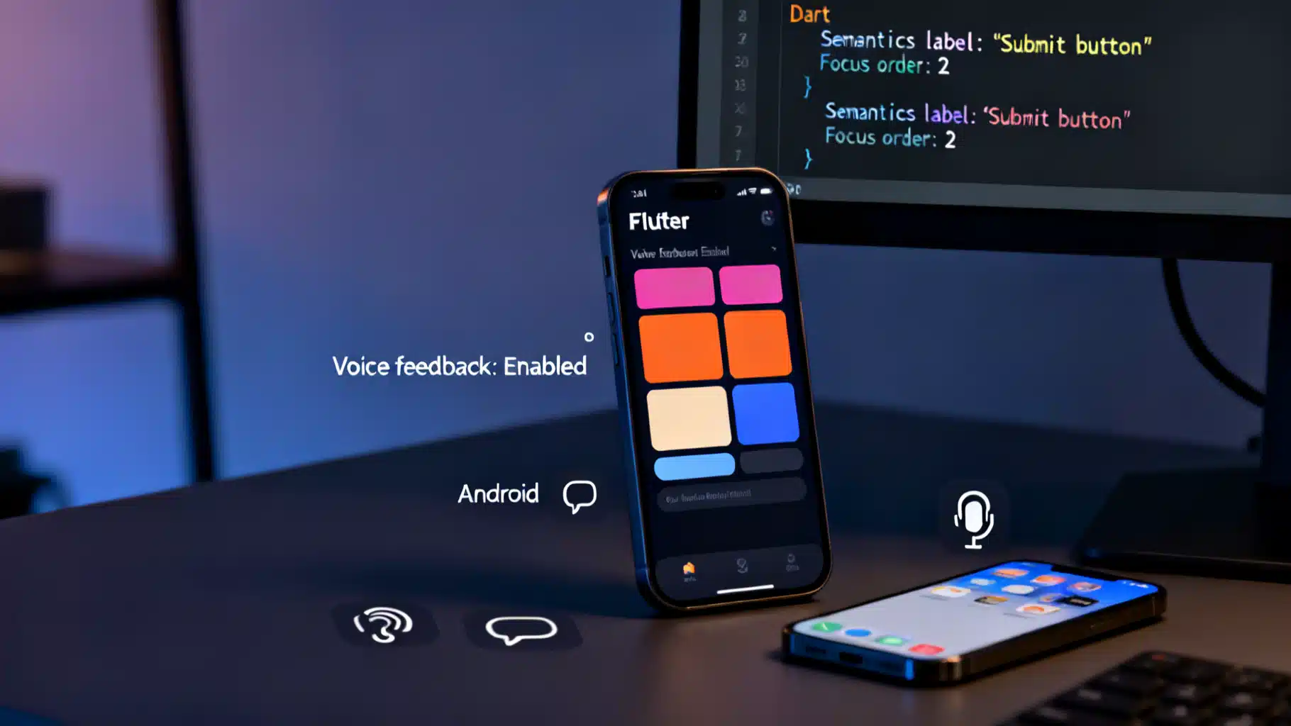
Image used for representation purposes only.
Overview
Screen readers like TalkBack (Android) and VoiceOver (iOS) make Flutter apps usable for people who are blind or have low vision. This guide shows how to build, test, and debug a screen‑reader‑friendly Flutter experience using the Semantics system, proper focus order, clear labels, and robust announcements.
How Screen Readers Interact With Flutter
Flutter builds a Semantics tree parallel to the render tree. Screen readers consume this tree to announce:
- What a widget is (role: button, slider, image)
- What it’s called (label)
- Its current state or value
- What actions are available (tap, long‑press, increase/decrease)
- The order items should be navigated in
Your job is to ensure that tree is complete, concise, and consistent with what users see and can do.
Start With Accessible Building Blocks
Whenever possible, use the built‑in Material and Cupertino widgets. They expose roles, states, and actions automatically:
- Buttons: ElevatedButton, TextButton, IconButton
- Toggles: Switch, Checkbox, Radio
- Inputs: TextField, DropdownButton, Slider
- Structure: ListTile, NavigationBar, AppBar, TabBar
These widgets already annotate themselves in the Semantics tree and respond to screen‑reader gestures (e.g., double‑tap to activate, swipe up/down to adjust sliders).
Label Everything That’s Not Obvious
Prefer visible labels that double as accessible names. When that’s not possible, add a semanticLabel or wrap with Semantics.
Images
- Informative image:
Image.asset(
  'assets/chef.png',
  semanticLabel: 'Chef plating a pasta dish',
)
- Decorative image (do not announce):
Image.asset(
  'assets/divider.png',
  excludeFromSemantics: true,
)
Icon-only Controls
IconButton(
  icon: const Icon(Icons.search),
  onPressed: _onSearch,
  tooltip: 'Search', // Shown on long-press; also announced by screen readers
)
Tip: Prefer tooltip for IconButton. For complex custom widgets use Semantics(label: …).
Craft Accessible Custom Widgets
When you build custom UI with GestureDetector, Canvas, or complex composition, provide semantics explicitly.
class ProductCard extends StatelessWidget {
  final String name;
  final double price;
  final VoidCallback onAdd;

  const ProductCard({super.key, required this.name, required this.price, required this.onAdd});

  @override
  Widget build(BuildContext context) {
    return Semantics(
      label: '$name, \$${price.toStringAsFixed(2)}',
      hint: 'Double tap to add to cart',
      button: true,
      onTap: onAdd,
      child: ExcludeSemantics( // avoid duplicate reads from child text
        child: Card(
          child: ListTile(
            title: Text(name),
            subtitle: Text('\$${price.toStringAsFixed(2)}'),
            trailing: const Icon(Icons.add_shopping_cart),
            onTap: onAdd,
          ),
        ),
      ),
    );
  }
}
Notes:
- Semantics(button: true) conveys the role.
- ExcludeSemantics prevents the inner labels from being read twice.
Control Focus And Reading Order
Screen readers navigate in a logical order. Ensure the next item makes sense in linear navigation.
Traversal by Order
Use FocusTraversalGroup and FocusTraversalOrder for keyboard/screen‑reader linear order.
FocusTraversalGroup(
  policy: OrderedTraversalPolicy(),
  child: Column(
    children: [
      FocusTraversalOrder(order: NumericFocusOrder(1), child: _nameField),
      FocusTraversalOrder(order: NumericFocusOrder(2), child: _emailField),
      FocusTraversalOrder(order: NumericFocusOrder(3), child: _submitButton),
    ],
  ),
)
Traversal by Semantics Sort Keys
If you need to reorder reading independent of focus, use Semantics sort keys.
Semantics(
  sortKey: OrdinalSortKey(1.0),
  child: _nameField,
)
Group or Merge Semantics
- MergeSemantics combines multiple children into one coherent announcement.
- Semantics(container: true) creates a boundary so children don’t leak into surrounding nodes.
MergeSemantics(
  child: Row(
    children: const [Icon(Icons.wifi), Text('Connected')],
  ),
)
Provide Values, States, And Hints
Give users the information they need to decide and act.
- State: toggled, checked, selected, disabled
- Value: current slider value, progress, stepper position
- Hint: what will happen on activation, or extra context
Semantics(
  label: 'Download',
  hint: 'Double tap to start',
  button: true,
  enabled: true,
  child: ElevatedButton(onPressed: _download, child: const Text('Download')),
)
For adjustable controls:
Semantics(
  label: 'Font size',
  value: 'Medium',
  increasedValue: 'Large',
  decreasedValue: 'Small',
  onIncrease: _increase,
  onDecrease: _decrease,
  child: _fontSizePreview,
)
Announce Dynamic Changes
Sometimes state changes off‑screen or without focus need explicit announcements.
- Live regions (polite updates):
Semantics(
  liveRegion: true,
  child: Text('Uploading… 50%'),
)
- Immediate announcements:
import 'package:flutter/semantics.dart';

void announceAddedToCart(BuildContext context) {
  SemanticsService.announce('Added to cart', Directionality.of(context));
}
Use sparingly; too many announcements overwhelm users.
Forms That Read Well
TextField and InputDecoration integrate tightly with screen readers.
TextField(
  keyboardType: TextInputType.emailAddress,
  decoration: const InputDecoration(
    labelText: 'Email',
    hintText: 'name@example.com',
    helperText: 'We’ll only use this to send receipts',
  ),
)
- Use labelText for the accessible name.
- errorText is announced when present.
- Associate fields with purpose using autofillHints to reduce input burden.
TextField(
  autofillHints: const [AutofillHints.email],
  decoration: const InputDecoration(labelText: 'Email'),
)
Navigation And Route Changes
When pages change via Navigator, screen readers generally announce the new route’s title. Ensure your Scaffold/AppBar provides a concise title. For fully custom shells, add a top‑level Semantics node with an appropriate label describing the new view.
class DetailsPage extends StatelessWidget {
  const DetailsPage({super.key});
  @override
  Widget build(BuildContext context) {
    return Semantics(
      container: true,
      label: 'Order details',
      child: Scaffold(
        appBar: AppBar(title: const Text('Order details')),
        body: const _OrderDetailsBody(),
      ),
    );
  }
}
Gestures And Custom Actions
GestureDetector exposes basic semantics for onTap, onLongPress, etc. If you need multi‑action cells (common in mail apps), add custom semantics actions so screen‑reader users can discover and invoke them quickly.
Semantics(
  label: 'Message from Alex, subject Project Update',
  hint: 'Swipe for actions',
  customSemanticsActions: {
    CustomSemanticsAction(label: 'Reply'): _reply,
    CustomSemanticsAction(label: 'Archive'): _archive,
  },
  child: ListTile(
    title: const Text('Project Update'),
    subtitle: const Text('Alex — 2:14 PM'),
    onTap: _open,
  ),
)
Respect User Settings
- Text scaling: never assume fixed heights. Test at 200%+ textScaleFactor.
- Reduce motion: prefer subtle transitions; avoid critical information in animations alone.
- Contrast and themes: maintain legible contrast in both light and dark modes; this benefits low‑vision users even if they use a screen reader occasionally.
MediaQuery(
  data: MediaQuery.of(context).copyWith(textScaleFactor: 1.6),
  child: const Preview(),
)
Internationalize Your Accessibility
Localize labels, hints, and announcements. Don’t hard‑code English strings in Semantics. Use your i18n solution everywhere you provide semantic text.
Semantics(
  label: S.of(context).productLabel(name, price),
  hint: S.of(context).doubleTapToAdd,
  child: _productTile,
)
Test On Real Devices And Emulators
Hands‑on testing is essential. Try both linear (swipe) and explore‑by‑touch navigation.
- Android TalkBack:
- Settings > Accessibility > TalkBack
- Explore by touch; swipe right/left to move; double‑tap to activate; swipe up/down to change actions.
- iOS VoiceOver:
- Settings > Accessibility > VoiceOver
- Swipe right/left to move; double‑tap to activate; use the Rotor to navigate by headings, links, form controls.
- Emulators/Simulators:
- Enable TalkBack/VoiceOver in the virtual device settings.
- On macOS, you can also use Accessibility Inspector to see labels and traits on iOS Simulator.
Tips:
- Navigate every interactive element without looking.
- Verify each control’s role, label, value, and hint are accurate and non‑redundant.
- Confirm that route changes, dialogs, snack bars, and toasts are announced.
Debug The Semantics Tree
Use Flutter’s semantics debugging to visualize what the screen reader “sees.”
// Wrap your app during debugging only
Widget build(BuildContext context) {
  return SemanticsDebugger(
    labelStyle: const TextStyle(fontSize: 12, color: Colors.white),
    child: const MyApp(),
  );
}
You can also inspect semantics in tests.
import 'package:flutter_test/flutter_test.dart';

void main() {
  testWidgets('Checkout button is exposed correctly', (tester) async {
    final semantics = SemanticsTester(tester);

    await tester.pumpWidget(const MyApp());

    expect(
      tester.getSemantics(find.text('Checkout')),
      matchesSemantics(
        label: 'Checkout',
        isButton: true,
        hasEnabledState: true,
        isEnabled: true,
      ),
    );

    semantics.dispose();
  });
}
Common Pitfalls And Fixes
- Duplicate announcements: Use ExcludeSemantics or MergeSemantics to avoid reading the same text twice.
- Icon-only buttons with no tooltip/label: add tooltip or wrap with Semantics(label: …).
- Custom painted controls: provide roles, states, and onTap/onIncrease/onDecrease.
- Wrong order: explicitly set FocusTraversalOrder or Semantics sort keys.
- Hidden content still announced: wrap subtrees with ExcludeSemantics when content is visually hidden.
- Snackbar/toast not announced: call SemanticsService.announce or use live regions.
Example: Accessible “Quantity Stepper”
class QuantityStepper extends StatelessWidget {
  final int value;
  final VoidCallback onDecrease;
  final VoidCallback onIncrease;

  const QuantityStepper({
    super.key,
    required this.value,
    required this.onDecrease,
    required this.onIncrease,
  });

  @override
  Widget build(BuildContext context) {
    return Semantics(
      label: 'Quantity',
      value: '$value',
      increasedValue: '${value + 1}',
      decreasedValue: '${value - 1}',
      onIncrease: onIncrease,
      onDecrease: onDecrease,
      child: Row(
        mainAxisSize: MainAxisSize.min,
        children: [
          IconButton(
            icon: const Icon(Icons.remove),
            onPressed: onDecrease,
            tooltip: 'Decrease quantity',
          ),
          Text('$value'),
          IconButton(
            icon: const Icon(Icons.add),
            onPressed: onIncrease,
            tooltip: 'Increase quantity',
          ),
        ],
      ),
    );
  }
}
Accessibility Review Checklist
- Roles: Every interactive control has the right role.
- Names: Clear, concise labels—no jargon, no duplication.
- Values/States: Exposed and updated as state changes.
- Hints: Only where necessary; avoid “double tap to …” if the role already implies it.
- Order: Logical traversal and grouping.
- Visibility: Decorative elements are excluded; hidden content isn’t announced.
- Dynamics: Important updates are politely announced.
- Internationalization: All semantic strings are localized.
- Testing: Verified with TalkBack and VoiceOver at large text sizes.
Wrap‑Up
Accessible Flutter apps are faster to use, easier to learn, and better for everyone. Rely on built‑in widgets, add precise semantics to custom UI, respect user settings, and test thoroughly with both TalkBack and VoiceOver. With a thoughtful semantics tree and good focus management, your app will “speak” clearly to all users.
Related Posts
Flutter Screen Recording Tutorial: Widget Capture and Native APIs
A practical Flutter screen recording tutorial: record widgets with FFmpeg or use native APIs (MediaProjection, ReplayKit), with code and performance tips.
Flutter Screenshot Capture and Sharing: From RepaintBoundary to share_plus
Capture any Flutter widget as an image and share it cross‑platform. Learn RepaintBoundary, screenshot, and share_plus with production tips.
Flutter NFC: Read and Write NDEF Tags on Android and iOS
Learn to read and write NFC tags in Flutter with nfc_manager: setup, NDEF records, code, UX, capacity, and cross‑platform pitfalls.